Chapter 10 Evaluating Regression Models
Imagine that we, the authors, invite you over for dinner. It took us hours to forage mushrooms and cook them up into something delicious. Putting niceties aside, you might have some questions for us: Do you know what you’re doing? Are these mushrooms safe to eat? After dinner, we offer to drive you home in a new car that we just built. Before obliging, it would be wise to check: Is this car safe? How did it perform in crash tests? Just as one should never eat a foraged mushroom or get in a new car without questioning their safety, one should never apply a model without first evaluating its quality. No matter whether we’re talking about frequentist or Bayesian models, “simple” or “big” models, there are three critical questions to ask. Examining these questions is the goal of Chapter 10.
How fair is the model?
How was the data collected? By whom and for what purpose? How might the results of the analysis, or the data collection itself, impact individuals and society? What biases or power structures might be baked into this analysis?How wrong is the model?
George Box famously said: “All models are wrong, but some are useful.” What’s important to know then is, how wrong is our model? Are our model assumptions reasonable?How accurate are the posterior predictive models?
How far are the posterior predictive models from reality?
# Load packages
library(bayesrules)
library(tidyverse)
library(bayesplot)
library(rstanarm)
10.1 Is the model fair?
We’ll explore the model evaluation process in the context of the Normal regression analysis from Chapter 9. Letting \(Y_i\) denote the number of Capital Bikeshare rides and \(X_i\) denote the temperature on day \(i\), we built and simulated the following model:
\[\begin{split} Y_i | \beta_0, \beta_1, \sigma & \stackrel{ind}{\sim} N\left(\mu_i, \sigma^2\right) \;\; \text{ with } \;\; \mu_i = \beta_0 + \beta_1X_i \\ \beta_{0c} & \sim N\left(5000, 1000^2 \right) \\ \beta_1 & \sim N\left(100, 40^2 \right) \\ \sigma & \sim \text{Exp}(0.0008) .\\ \end{split}\]
The first question in evaluating this or any other Bayesian model is context specific and gets at the underlying ethical implications: Is the model fair? We must always ask this question, even when the consideration is uneventful, as it is in our bike example. Let’s break it down into a series of smaller questions:
How was the data collected?
Presumably, data is electronically recorded for each bike ride, without any harm to the riders. By the time the data gets into our hands, it has been anonymized. Seems fair.By whom and for what purpose was the data collected?
A company like Capital Bikeshare tracks their own data for the purpose of better serving their customers and informing their business decisions.How might the results of the analysis, or the data collection itself, impact individuals and society?
We can’t imagine how the data collection process or analysis could negatively impact individuals or society. In fact, helping improve Capital Bikeshare’s service might help get some cars off the road. However, just because we, the authors, cannot imagine negative societal impacts does not mean that none exist. In any analysis, it’s critical to recognize your own perspective, and that no perspective is natural or neutral. It’s then easier to admit that you might not perceive any negative consequences simply because they do not affect you. To truly determine the impact of our analysis, we’d need to engage and partner with D.C. residents who are impacted by Capital Bikeshare’s decisions, especially those that have not been part of the decision-making processes.What biases might be baked into this analysis?
We only have data on rides taken by people that use the Capital Bikeshare service. Thus, our analysis might better inform how to serve this population at the exclusion of serving others.
Upon these reflections, we don’t find anything ethically dubious or biased about the data collection or analysis for bike ridership in D.C. We think this analysis could be fair.
Models aren’t always fair
Unfair models are unfortunately abundant. Consider just three recent examples. These complex examples are overly simplified here, thus we encourage you to read more outside this book.
As recently as 2015, a major corporation reportedly utilized a model to evaluate applicants’ résumés for technical posts. They scrapped this model upon discovering that, by building this model using résumé data from its current technical employees (mostly men), it reinforced a preference for male job applicants (Dastin 2018).
Facial recognition models, increasingly used in police surveillance, are often built using image data of researchers that do not represent the whole of society. Thus, when applied in practice, misidentification is more common among people that are underrepresented in the research process. Given the severe consequences of misidentification, including false arrest, citizens are pushing back on the use of this technology in their communities (Harmon 2019).
In 2020, the New York Civil Liberties Union filed a lawsuit against the U.S. Immigration and Customs Enforcement’s (ICE) use of a “risk classification assessment” model that evaluates whether a subject should be detained or released (Hadavas 2020). This model is notably unfair, recommending detention in nearly all cases.
10.2 How wrong is the model?
All models are wrong. Mainly, statistical models are idealistic representations of more complex realities. Even so, good statistical models can still be useful and inform our understanding of the world’s complexities. Thus, the next question to ask in evaluating our model is not, is the model wrong, but how wrong is the model? Specifically, to what extent do the assumptions behind our Bayesian linear regression model (9.6) match reality?
10.2.1 Checking the model assumptions
Recall from Chapter 9 the three assumptions baked into the data model,
\[Y_i | \beta_0, \beta_1, \sigma \stackrel{ind}{\sim} N(\mu_i, \sigma^2) \;\; \text{ with } \;\; \mu_i = \beta_0 + \beta_1 X_i .\]
- Conditioned on \(X\), the observed data \(Y_i\) on case \(i\) is independent of the observed data on any other case \(j\).
- The typical \(Y\) outcome can be written as a linear function of \(X\), \(\mu = \beta_0 + \beta_1 X\).
- At any \(X\) value, \(Y\) varies normally around \(\mu\) with consistent variability \(\sigma\).
Though formal hypothesis tests for assumption 1 do exist, we can typically evaluate its appropriateness by the data collection context.
In our bikes analysis, we have 500 daily observations within the two-year period from 2011 to 2012.
When taken alone, ridership \(Y\) is likely correlated over time – today’s ridership likely tells us something about tomorrow’s ridership.
Yet much of this correlation, or dependence, can be explained by the time of year and features associated with the time of year – like temperature \(X\).
Thus, knowing the temperature on two subsequent days may very well “cancel out” the time correlation in their ridership data.
For example, if we know that today was 70 degrees and tomorrow will be 75 degrees, then information about today’s ridership might not inform us of tomorrow’s ridership.
In short, it’s reasonable to assume that, in light of the temperature \(X\), ridership data \(Y\) is independent from day to day.
(“Reasonable” does not mean “perfect,” but rather “good enough to proceed.”)
Revisiting a scatterplot of the raw data provides insight into assumptions 2 and 3. The relationship between ridership and temperature does appear to be linear. Further, with the slight exception of colder days on which ridership is uniformly small, the variability in ridership does appear to be roughly consistent across the range of temperatures \(X\):
ggplot(bikes, aes(y = rides, x = temp_feel)) +
  geom_point(size = 0.2) +
  geom_smooth(method = "lm", se = FALSE)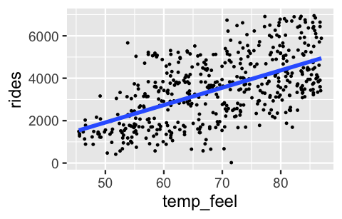
FIGURE 10.1: A scatterplot of daily bikeshare ridership vs temperature.
Now, not only are humans known to misinterpret visualizations, relying upon such visualizations of \(Y\) vs \(X\) to evaluate assumptions ceases to be possible for more complicated models that have more than one predictor \(X\).
To rigorously evaluate assumptions 2 and 3 in a way that scales up to other model settings, we can conduct a posterior predictive check.
We’ll provide a more general definition below, but the basic idea is this.
If the combined model assumptions are reasonable, then our posterior model should be able to simulate ridership data that’s similar to the original 500 rides observations.
To assess whether this is the case, for each of the 20,000 posterior plausible parameter sets \((\beta_0,\beta_1,\sigma)\) in our Markov chain simulation from Chapter 9, we can predict 500 days of ridership data from the 500 days of observed temperature data.
The end result is 20,000 unique sets of predicted ridership data, each of size 500, here represented by the rows of the right matrix:
\[\begin{array}{lll} \text{Markov chain parameter sets} & & \text{Simulated samples} \\ \left[ \begin{array}{lll} \beta_0^{(1)} & \beta_1^{(1)} & \sigma^{(1)} \\ \hline \beta_0^{(2)} & \beta_1^{(2)} & \sigma^{(2)} \\ \hline \vdots & \vdots & \vdots \\ \hline \beta_0^{(20000)} & \beta_1^{(20000)} & \sigma^{(20000)} \\ \end{array} \right] & \; \longrightarrow \; & \left[ \begin{array}{llll} Y_1^{(1)} & Y_2^{(1)} & \cdots & Y_{500}^{(1)} \\ \hline Y_1^{(2)} & Y_2^{(2)} & \cdots & Y_{500}^{(2)} \\ \hline \vdots & \vdots & & \vdots \\ \hline Y_1^{(20000)} & Y_2^{(20000)} & \cdots & Y_{500}^{(20000)} \\ \end{array} \right] \end{array}\]
Specifically, for each parameter set \(j \in \{1,2,...,20000\}\), we predict the ridership on day \(i \in \{1,2,...,500\}\) by drawing from the Normal data model evaluated at the observed temperature \(X_i\) on day \(i\):
\[Y_{i}^{(j)} | \beta_0, \beta_1, \sigma \; \sim \; N\left(\mu^{(j)}, \left(\sigma^{(j)}\right)^2\right) \;\; \text{ with } \;\; \mu^{(j)} = \beta_0^{(j)} + \beta_1^{(j)} X_i .\]
Consider this process for the first parameter set in bike_model_df, a data frame with the Markov chain values we simulated in Chapter 9:
first_set <- head(bike_model_df, 1)
first_set
  (Intercept) temp_feel sigma
1       -2657     88.16  1323
From the observed temp_feel on each of the 500 days in the bikes data, we simulate a ridership outcome from the Normal data model tuned to this first parameter set:
beta_0 <- first_set$`(Intercept)`
beta_1 <- first_set$temp_feel
sigma  <- first_set$sigma
set.seed(84735)
one_simulation <- bikes %>%
  mutate(mu = beta_0 + beta_1 * temp_feel,
         simulated_rides = rnorm(500, mean = mu, sd = sigma)) %>%
  select(temp_feel, rides, simulated_rides)
Check out the original rides alongside the simulated_rides for the first two data points:
head(one_simulation, 2)
  temp_feel rides simulated_rides
1     64.73   654            3932
2     49.05  1229            1503
Of course, on any given day, the simulated ridership is off (very off in the case of the first day in the dataset). The question is whether, on the whole, the simulated data is similar to the observed data. To this end, Figure 10.2 compares the density plots of the 500 days of simulated ridership (light blue) and observed ridership (dark blue):
ggplot(one_simulation, aes(x = simulated_rides)) +
  geom_density(color = "lightblue") +
  geom_density(aes(x = rides), color = "darkblue")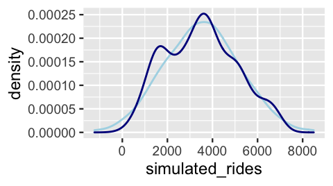
FIGURE 10.2: One posterior simulated dataset of ridership (light blue) along with the actual observed ridership data (dark blue).
Though the simulated data doesn’t exactly replicate all original ridership features, it does capture the big things such as the general center and spread.
And before further picking apart this plot, recall that we generated the simulated data here from merely one of 20,000 posterior plausible parameter sets.
The rstanarm and bayesplot packages make it easy to repeat the data simulation process for each parameter set.
The pp_check() function plots 50 of these 20,000 simulated datasets (labeled \(\text{y}_\text{rep}\)) against a plot of the original ridership data (labeled \(\text{y}\)).
(It would be computationally and logically excessive to examine all 20,000 sets.)
# Examine 50 of the 20000 simulated samples
pp_check(bike_model, nreps = 50) +
  xlab("rides")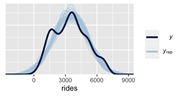
FIGURE 10.3: 50 datasets of ridership simulated from the posterior (light blue) alongside the actual observed ridership data (dark blue).
This plot highlights both things to cheer and lament. What’s there to cheer about? Well, the 50 sets of predictions well capture the typical ridership as well as the observed range in ridership. However, most sets don’t pick up the apparent bimodality in the original bike data. This doesn’t necessarily mean that our model of bike ridership is bad – we certainly know more about bikeshare demand than we did before. It just means that it could be better, or less wrong. We conclude this section with a general summary of the posterior predictive check process.
Posterior predictive check
Consider a regression model with response variable \(Y\), predictor \(X\), and a set of regression parameters \(\theta\). For example, in the model above \(\theta = (\beta_0,\beta_1,\sigma)\). Further, suppose that based on a data sample of size \(n\), we simulate an \(N\)-length Markov chain \(\left\lbrace \theta^{(1)}, \theta^{(2)}, \ldots, \theta^{(N)}\right\rbrace\) for the posterior model of \(\theta\). Then a “good” Bayesian model produces posterior predicted sets of \(n\) \(Y\) values with features similar to the original \(Y\) data. To evaluate whether your model satisfies this goal, do the following:
- At each set of posterior plausible parameters \(\theta^{(i)}\), simulate a sample of \(Y\) values from the data model, one corresponding to each \(X\) in the original sample of size \(n\). This produces \(N\) separate samples of size \(n\).
- Compare the features of the \(N\) simulated \(Y\) samples, or a subset of these samples, to those of the original \(Y\) data.
10.2.2 Dealing with wrong models
Our discussion has thus far focused on an ideal setting in which our model assumptions are reasonable. Stopping here would be like an auto mechanic only learning about mint condition cars. Not a great idea. Though it’s impossible to enumerate everything that might go wrong in modeling, we can address some basic principles. Let’s begin with assumption 1, that of independence. There are a few common scenarios in which this assumption is unreasonable. In Unit 4 we address scenarios where \(Y\) values are correlated across multiple data points observed on the same “group” or subject. For example, to explore the association between memory and age, researchers might give each of \(n\) adults three tests in which they’re asked to recall a sequence of 10 words:
| subject | age (\(X\)) | number of words remembered (\(Y\)) |
|---|---|---|
| 1 | 51 | 9 |
| 1 | 51 | 7 |
| 1 | 51 | 10 |
| 2 | 38 | 6 |
| 2 | 38 | 8 |
| 2 | 38 | 8 |
Naturally, how well any particular adult performs in one trial tells us something about how well they might perform in another. Thus, within any given subject, the observed \(Y\) values are dependent. You will learn how to incorporate and address such dependent, grouped data using hierarchical Bayesian models in Unit 4.
Correlated data can also pop up when modeling changes in \(Y\) over time, space, or time and space. For example, we might study historical changes in temperatures \(Y\) in different parts of the world. In doing so, it would be unreasonable to assume that the temperatures in one location are independent of those in neighboring locations, or that the temperatures in one month don’t tell us about the next. Though applying our Normal Bayesian regression model to study these spatiotemporal dynamics might produce misleading results, there do exist Bayesian models that are tailor-made for this task: times series models, spatial regression models, and their combination, spatiotemporal models. Though beyond the scope of this book, we encourage the interested reader to check out Blangiardo and Cameletti (2015).
Next, let’s consider violations of assumptions 2 and 3, which often go hand in hand. Figure 10.4 provides an example. The relationship between \(Y\) and \(X\) is nonlinear (violating assumption 2) and the variability in \(Y\) increases with \(X\) (violating assumption 3).
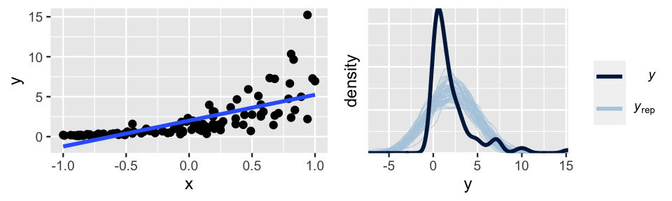
FIGURE 10.4: Simulated data with corresponding Bayesian posterior predictive model checks.
Even if we hadn’t seen this raw data, the pp_check() (right) would confirm that a Normal regression model of this relationship is wrong – the posterior simulations of \(Y\) exhibit higher central tendency and variability than the observed \(Y\) values.
There are a few common approaches to addressing such violations of assumptions 2 and 3:
Assume a different data structure. Not all data and relationships are Normal. In Chapters 12 and 13 we will explore models in which the data structure of a regression model is better described by a Poisson, Negative Binomial, or Binomial than by a Normal.
Make a transformation. When the data model structure isn’t the issue we might do the following:
Transform \(Y\). For some function \(g(\cdot)\), assume \(g(Y_i) | \beta_0, \beta_1, \sigma \stackrel{ind}{\sim}N(\mu_i, \sigma^2)\) with \(\mu_i = \beta_0 + \beta_1 X_i\).
Transform \(X\). For some function of \(h(\cdot)\), assume \(Y_i | \beta_0, \beta_1, \sigma \stackrel{ind}{\sim}N(\mu_i, \sigma^2)\) with \(\mu_i = \beta_0 + \beta_1 h(X_i)\).
Transform \(Y\) and \(X\). Assume \(g(Y_i) | \beta_0, \beta_1, \sigma \stackrel{ind}{\sim}N(\mu_i, \sigma^2)\) with \(\mu_i = \beta_0 + \beta_1 h(X_i)\).
In our simulated example, the second approach proves to be the winner. Based on the skewed pattern in the raw data, we take a log transform of \(Y\):
\[\log(Y_i) | \beta_0, \beta_1, \sigma \stackrel{ind}{\sim}N(\mu_i, \sigma^2) \;\; \text{ with } \; \mu_i = \beta_0 + \beta_1 X_i .\]
Figure 10.5 confirms that this transformation addresses the violations of both assumptions 2 and 3: the relationship between \(\text{log}(Y)\) and \(X\) is linear and the variability in \(Y\) is consistent across the range of \(X\) values.
The ideal pp_check() at right further confirms that this transformation turns our model from wrong to good.
Better yet, when transformed off the log scale, we can still use this model to learn about the relationship between \(Y\) and \(X\).
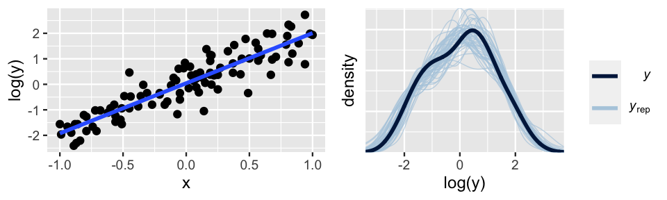
FIGURE 10.5: Simulated data, after a log transform of Y, with corresponding Bayesian posterior predictive model checks.
When you find yourself in a situation like that above, there is no transformation recipe to follow. The appropriate transformation depends upon the context of the analysis. However, log and polynomial transformations provide a popular starting point (e.g., \(\log(X), \sqrt{X}, X^2, X^3\)).
10.3 How accurate are the posterior predictive models?
In an ideal world, not only is our Bayesian model fair and not too wrong, it can be used to accurately predict the outcomes of new data \(Y\). That is, a good model will generalize beyond the data we used to build it. We’ll explore three approaches to evaluating predictive quality, starting from the most straightforward to the most technical.
10.3.1 Posterior predictive summaries
Our ultimate goal is to determine how well our Bayesian model predicts ridership on days in the future. Yet we can first assess how well it predicts the sample data points that we used to build this model. For starters, consider the sample data point from October 22, 2012:
bikes %>%
  filter(date == "2012-10-22") %>%
  select(temp_feel, rides)
  temp_feel rides
1     75.46  6228
On this 75-degree day, Capital Bikeshare happened to see 6228 rides. To see how this observation compares to the posterior prediction of ridership on this day, we can simulate and plot the posterior predictive model using the same code from Section 9.5.
# Simulate the posterior predictive model
set.seed(84735)
predict_75 <- bike_model_df %>%
  mutate(mu = `(Intercept)` + temp_feel*75,
         y_new = rnorm(20000, mean = mu, sd = sigma))

# Plot the posterior predictive model
ggplot(predict_75, aes(x = y_new)) +
  geom_density()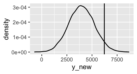
FIGURE 10.6: The posterior predictive model of ridership on October 22, 2012, a 75-degree day. The actual 6228 riders observed that day are marked by the vertical line.
So how good was this predictive model at anticipating what we actually observed? There are multiple ways to answer this question. First, in examining Figure 10.6, notice how far the observed \(Y =\) 6228 rides fall from the center of the predictive model, i.e., the expected outcome of \(Y\). We can measure this expected outcome by the posterior predictive mean, denoted \(Y'\). Then the distance between the observed \(Y\) and its posterior predictive mean provides one measurement of posterior prediction error:
\[Y - Y' .\]
For example, our model under-predicted ridership. The \(Y = 6228\) rides we observed were 2261 rides greater than the \(Y' = 3967\) rides we expected:
predict_75 %>%
  summarize(mean = mean(y_new), error = 6228 - mean(y_new))
  mean error
1 3967  2261
It’s also important to consider the relative, not just absolute, distance between the observed value and its posterior predictive mean.
Figure 10.7 compares the posterior predictive model of \(Y\), the ridership on October 22, 2012, from our Bayesian model to that of an alternative Bayesian model. In both cases, the posterior predictive mean is 3967. Which model produces the better posterior predictive model of the 6228 rides we actually observed on October 22?
- Our Bayesian model
- The alternative Bayesian model
- The quality of these models’ predictions are equivalent
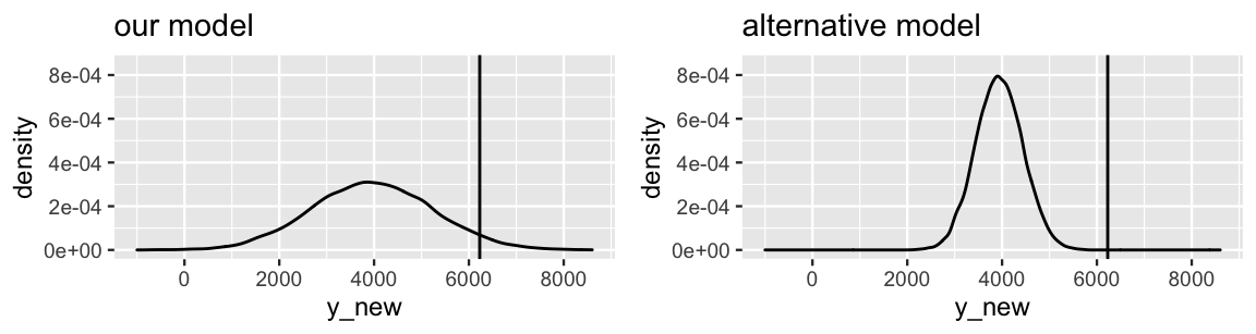
FIGURE 10.7: Posterior predictive models of the ridership on October 22, 2012 are shown for our Bayesian regression model (left) and an alternative model (right), both having a mean of 3967. The actual 6228 rides observed on that day is represented by the black line.
If you answered a, you were correct. Though the observed ridership (\(Y\) = 6228) is equidistant from the posterior predictive mean (\(Y'\) = 3967) in both scenarios, the scale of this error is much larger for the alternative model – the observed ridership falls entirely outside the plausible range of its posterior predictive model. We can formalize this observation by standardizing our posterior prediction errors. To this end, we can calculate how many posterior standard deviations our observed value falls from the posterior predictive mean:
\[\frac{Y - Y'}{\text{sd}} .\]
When a posterior predictive model is roughly symmetric, absolute values beyond 2 or 3 on this standardized scale indicate that an observation falls quite far, more than 2 or 3 standard deviations, from its posterior mean prediction. In our October 22 example, the posterior predictive model of ridership has a standard deviation of 1280 rides. Thus, the 6228 rides we observed were 2261 rides, or 1.767 standard deviations, above the mean prediction:
predict_75 %>%
  summarize(sd = sd(y_new), error = 6228 - mean(y_new),
            error_scaled = error / sd(y_new))
    sd error error_scaled
1 1280  2261        1.767
In comparison, the alternative model in Figure 10.7 has a standard deviation of 500. Thus, the observed 6228 rides fell a whole 4.5 standard deviations (far!) above its mean prediction. This clarifies the comparison of our model and the alternative model. Though the absolute prediction error is the same for both models, the scaled prediction errors indicate that our model provided the more accurate posterior prediction of ridership on October 22.
Though we’re getting somewhere now, these absolute and scaled error calculations don’t capture the full picture. They give us a mere sense of how far an observation falls from the center of its posterior predictive model. In Bayesian statistics, the entire posterior predictive model serves as a prediction of \(Y\). Thus, to complement the error calculations, we can track whether an observed \(Y\) value falls into its posterior prediction interval, and hence the general range of the posterior predictive model. For our October 22 case, our posterior predictive model places a 0.5 probability on ridership being between 3096 and 4831, and a 0.95 probability on ridership being between 1500 and 6482. The observed 6228 rides lie outside the 50% interval but inside the 95% interval. That is, though we didn’t think this was a very likely ridership outcome, it was still within the realm of possibility.
predict_75 %>%
  summarize(lower_95 = quantile(y_new, 0.025),
            lower_50 = quantile(y_new, 0.25),
            upper_50 = quantile(y_new, 0.75),
            upper_95 = quantile(y_new, 0.975))
  lower_95 lower_50 upper_50 upper_95
1     1500     3096     4831     6482
Great – we now understand the posterior predictive accuracy for one case in our dataset.
We can take these same approaches to evaluate the accuracy for all 500 cases in our bikes data.
As discussed in Section 10.2, at each set of model parameters in the Markov chain, we can predict the 500 ridership values \(Y\) from the corresponding temperature data \(X\) :
\[\begin{array}{lll} \text{Markov chain parameter sets} & & \text{Simulated posterior predictive models} \\ \left[ \begin{array}{lll} \beta_0^{(1)} & \beta_1^{(1)} & \sigma^{(1)} \\ \hline \beta_0^{(2)} & \beta_1^{(2)} & \sigma^{(2)} \\ \hline \vdots & \vdots & \vdots \\ \hline \beta_0^{(20000)} & \beta_1^{(20000)} & \sigma^{(20000)} \\ \end{array} \right] & \; \longrightarrow \; & \left[ \begin{array}{l|l|l|l} Y_1^{(1)} & Y_2^{(1)} & \cdots & Y_{500}^{(1)} \\ Y_1^{(2)} & Y_2^{(2)} & \cdots & Y_{500}^{(2)} \\ \vdots & \vdots & & \vdots \\ Y_1^{(20000)} & Y_2^{(20000)} & \cdots & Y_{500}^{(20000)} \\ \end{array} \right] \end{array}\]
The result is represented by the \(20000 \times 500\) matrix of posterior predictions (right matrix).
Whereas the 20,000 rows of this matrix provide 20,000 simulated sets of ridership data which provide insight into the validity of our model assumptions (Section 10.2), each of the 500 columns provides 20,000 posterior predictions of ridership for a unique day in the bikes data.
That is, each column provides an approximate posterior predictive model for the corresponding day.
We can obtain these sets of 20,000 predictions per day by applying posterior_predict() to the full bikes dataset:
set.seed(84735)
predictions <- posterior_predict(bike_model, newdata = bikes)
dim(predictions)
[1] 20000   500
The ppc_intervals() function in the bayesplot package provides a quick visual summary of the 500 approximate posterior predictive models stored in predictions.
For each data point in the bikes data, ppc_intervals() plots the bounds of the 95% prediction interval (narrow, long blue bars), 50% prediction interval (wider, short blue bars), and posterior predictive median (light blue dots).
This information offers a glimpse into the center and spread of each posterior predictive model, as well as the compatibility of each model with the corresponding observed outcome (dark blue dots).
For illustrative purposes, the posterior predictive models for just 25 days in the dataset (Figure 10.8 right) provide a cleaner picture.
In general, notice that almost all of the observed ridership data points fall within the bounds of their 95% prediction interval, and fewer fall within the bounds of their 50% interval.
However, the 95% prediction intervals are quite wide – the posterior predictions of ridership on a given day span a range of more than 4000 rides.
ppc_intervals(bikes$rides, yrep = predictions, x = bikes$temp_feel,
              prob = 0.5, prob_outer = 0.95)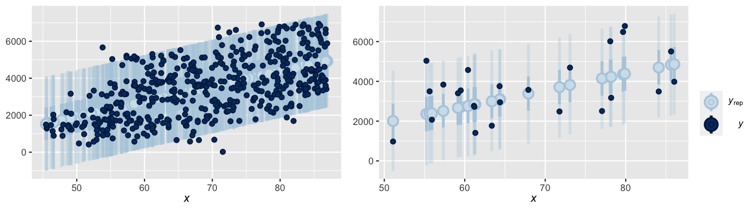
FIGURE 10.8: At left are the posterior predictive medians (light blue dots), 50% prediction intervals (wide, short blue bars), and 95% prediction intervals (narrow, long blue bars) for each day in the bikes dataset, along with the corresponding observed data points (dark blue dots). This same information is shown at right for just 25 days in the dataset.
The prediction_summary() function in the bayesrules package formalizes these visual observations with four numerical posterior predictive summaries.
Posterior predictive summaries
Let \(Y_1, Y_2, \ldots, Y_n\) denote \(n\) observed outcomes. Then each \(Y_i\) has a corresponding posterior predictive model with mean \(Y_i'\) and standard deviation \(\text{sd}_i\). We can evaluate the overall posterior predictive model quality by the following measures:
mae
The median absolute error (MAE) measures the typical difference between the observed \(Y_i\) and their posterior predictive means \(Y_i'\),\[\text{MAE} = \text{median}|Y_i - Y_i'|.\]
mae_scaled
The scaled median absolute error measures the typical number of standard deviations that the observed \(Y_i\) fall from their posterior predictive means \(Y_i'\):\[\text{MAE scaled} = \text{median}\frac{|Y_i - Y_i'|}{\text{sd}_i}.\]
within_50andwithin_95
Thewithin_50statistic measures the proportion of observed values \(Y_i\) that fall within their 50% posterior prediction interval. Thewithin_95statistic is similar, but for 95% posterior prediction intervals.
NOTE: For stability across potentially skewed posteriors, we could measure the center of the posterior predictive model by the median (instead of mean) and the scale by the median absolute deviation (instead of standard deviation). This option is provided by setting stable = TRUE in the prediction_summary() function, though we don’t utilize it here.
Let’s examine the posterior predictive summaries for our data:
# Posterior predictive summaries
set.seed(84735)
prediction_summary(bike_model, data = bikes)
    mae mae_scaled within_50 within_95
1 989.7     0.7712     0.438     0.968
Among all 500 days in the dataset, we see that the observed ridership is typically 990 rides, or 0.77 standard deviations, from the respective posterior predictive mean.
Further, only 43.8% of test observations fall within their respective 50% prediction interval whereas 96.8% fall within their 95% prediction interval.
This is compatible with what we saw in the ppc_intervals() plot above: almost all dark blue dots are within the span of the corresponding 95% predictive bars and fewer are within the 50% bars (naturally).
So what can we conclude in light of these observations: Does our Bayesian model produce accurate predictions?
The answer to this question is context dependent and somewhat subjective.
For example, knowing whether a typical prediction error of 990 rides is reasonable would require a conversation with Capital Bikeshare.
As is a theme in this book, there’s not a yes or no answer.
10.3.2 Cross-validation
The posterior prediction summaries in Section 10.3.1 can provide valuable insight into our Bayesian model’s predictive accuracy.
They can also be flawed.
Consider an analogy.
Suppose you want to open a new taco stand.
You build all of your recipes around Reem, your friend who prefers that every meal include anchovies.
You test your latest “anchov-ladas” dish on her and it’s a hit.
Does this imply that this dish will enjoy broad success among the general public?
Probably not!
Not everybody shares Reem’s particular tastes.51
Similarly, a model is optimized to capture the features in the data with which it’s trained or built.
Thus, evaluating a model’s predictive accuracy on this same data, as we did above, can produce overly optimistic assessments.
Luckily, we don’t have to go out and collect new data with which to evaluate our model.
Rather, only for the purposes of model evaluation, we can split our existing bikes data into different pieces that play distinct “training” and “testing” roles in our analysis.
The basic idea is this:
- Train the model.
Randomly select only, say, 90% (or 450) of our 500bikesdata points. Use these training data points to build the regression model of ridership. - Test the model.
Test or evaluate the training model using the other 10% of (or 50) data points. Specifically, use the training model to predict our testing data points, and record the corresponding measures of model quality (e.g., MAE).
Figure 10.9 provides an example.
The scatterplot at left exhibits the relationship between ridership and temperature for 450 randomly selected training data points.
Upon building a model from this training data, we then use it to predict the other 50 data points that we left out for testing.
The ppc_intervals() plot at right provides a visual evaluation of the posterior predictive accuracy.
In general, our training model did a decent job of predicting the outcomes of the testing data – all 50 testing data points fall within their 95% prediction intervals.
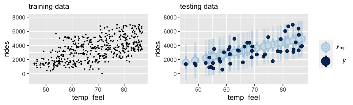
FIGURE 10.9: At left is a scatterplot of the relationship between ridership and temperature for 450 training data points. A model built using this training data is evaluated against 50 testing data points (right).
Since it trains and tests our model using different portions of the bikes data, this procedure would provide a more honest or conservative estimate of how well our model generalizes beyond our particular bike sample, i.e., how well it predicts future ridership.
But there’s a catch.
Performing just one round of training and testing can produce an unstable estimate of posterior predictive accuracy – it’s based on only one random split of our bikes data and uses only 50 data points for testing.
A different random split might paint a different picture.
The \(k\)-fold cross-validation algorithm, outlined below, provides a more stable approach by repeating the training / testing process multiple times and averaging the results.
The k-fold cross-validation algorithm
Create folds.
Let \(k\) be some integer from 2 to our original sample size \(n\). Split the data into \(k\) non-overlapping folds, or subsets, of roughly equal size.Train and test the model.
- Train the model using the combined data in the first \(k - 1\) folds.
- Test this model on the \(k\)th data fold.
- Measure the prediction quality (e.g., by MAE).
Repeat.
Repeat step 2 \(k - 1\) more times, each time leaving out a different fold for testing.Calculate cross-validation estimates.
Steps 2 and 3 produce \(k\) different training models and \(k\) corresponding measures of prediction quality. Average these \(k\) measures to obtain a single cross-validation estimate of prediction quality.
Consider the cross-validation procedure using \(k = 10\) folds.
In this case, our 500 bikes data points will be split into 10 subsets, each of size 50.
We will then build 10 separate training models.
Each model will be built using 450 days of data (9 folds), and then tested on the other 50 days (1 fold).
To be clear, \(k = 10\) is not some magic number.
However, it strikes a nice balance in the Goldilocks challenge.
Using only \(k = 2\) folds would split the data in half, into 2 subsets of only 250 days each.
Using so little data to train our models would likely underestimate the posterior predictive accuracy we achieve when using all 500 data points.
At the other extreme, suppose we used \(k = 500\) folds where each fold consists of only one data point.
This special case of the cross-validation procedure is known as leave-one-out (LOO) – each training model is built using 499 data points and tested on the one we left out.
Further, since we have to use each of the 500 folds for testing, leave-one-out cross-validation would require us to train 500 different models!
That would take a long time.
Now that we’ve settled on 10-fold cross-validation, we can implement this procedure using the prediction_summary_cv() function in the bayesrules package.
Note: Since this procedure trains 10 different models of ridership, you will have to be a little patient.
set.seed(84735)
cv_procedure <- prediction_summary_cv(
  model = bike_model, data = bikes, k = 10)
Below are the resulting posterior prediction metrics corresponding to each of the 10 testing folds in this cross-validation procedure.
Since the splits are random, the training models perform better on some test sets than on others, essentially depending on how similar the testing data is to the training data.
For example, the mae was as low as 786.8 rides for one fold and as high as 1270.9 for another:
cv_procedure$folds
   fold    mae mae_scaled within_50 within_95
1     1  990.2     0.7699      0.46      0.98
2     2  963.8     0.7423      0.40      1.00
3     3  951.3     0.7300      0.42      0.98
4     4 1018.6     0.7910      0.46      0.98
5     5 1161.5     0.9091      0.36      0.96
6     6  937.6     0.7327      0.46      0.94
7     7 1270.9     1.0061      0.32      0.96
8     8 1111.9     0.8605      0.36      1.00
9     9 1098.7     0.8679      0.40      0.92
10   10  786.8     0.6060      0.56      0.96
Averaging across each set of 10 mae, mae_scaled, within_50, and within_95 values produces the ultimate cross-validation estimates of posterior predictive accuracy:
cv_procedure$cv
   mae mae_scaled within_50 within_95
1 1029     0.8015      0.42     0.968
Having split our data into distinct training and testing roles, these cross-validated summaries provide a fairer assessment of how well our Bayesian model will predict the outcomes of new cases, not just those on which it’s trained.
For a point of comparison, recall our posterior predictive assessment based on using the full bikes dataset for both training and testing:
# Posterior predictive summaries for original data
set.seed(84735)
prediction_summary(bike_model, data = bikes)
    mae mae_scaled within_50 within_95
1 989.7     0.7712     0.438     0.968
In light of the original and cross-validated posterior predictive summaries above, take the following quiz.52
If we were to apply our model to predict ridership tomorrow, we should expect that our prediction will be off by:
- 1029 rides
- 990 rides
Remember Reem and the anchovies?
Remember how we thought she’d like your anchov-lada recipe better than a new customer would?
The same is true here.
Our original posterior model was optimized to our full bikes dataset.
Thus, evaluating its posterior predictive accuracy on this same dataset seems to have produced an overly rosy picture – the stated typical prediction error (990 rides) is smaller than when we apply our model to predict the outcomes of new data (1029 rides).
In the spirit of “better safe than sorry,” it’s thus wise to supplement any measures of model quality with their cross-validated counterparts.
10.3.3 Expected log-predictive density
Our running goal in Section 10.3 has been to evaluate the posterior predictive accuracy of a Bayesian regression model. Of interest is the compatibility of \(Y_{\text{new}}\), the yet unobserved ridership on a future day, with its corresponding posterior predictive model. This model is specified by pdf
\[f\left(y' | \vec{y}\right) = \int\int\int f\left(y' | \beta_0,\beta_1,\sigma\right) f(\beta_0,\beta_1,\sigma|y) d\beta_0 d\beta_1 d\sigma\]
where \(y'\) represents a possible \(Y_{\text{new}}\) value and \(\vec{y} = (y_1,y_2,...,y_n)\) represents our original \(n = 500\) ridership observations. Two hypothetical posterior predictive pdfs of \(Y_{\text{new}}\) are plotted in Figure 10.10. Though the eventual observed value of \(Y_{\text{new}}\), \(y_{\text{new}}\), is squarely within the range of both pdfs, it’s closer to the posterior predictive mean in Scenario 1 (left) than in Scenario 2 (right). That is, \(Y_{\text{new}}\) is more compatible with Scenario 1.
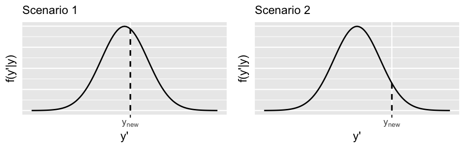
FIGURE 10.10: Two hypothetical posterior predictive pdfs for \(Y_{\text{new}}\), the yet unobserved ridership on a new day. The eventual observed value of \(Y_{\text{new}}\), \(y_{\text{new}}\), is represented by a dashed vertical line.
Also notice that the posterior predictive pdf is relatively higher at \(y_{\text{new}}\) in Scenario 1 than in Scenario 2, providing more evidence in favor of Scenario 1. In general, the greater the posterior predictive pdf evaluated at \(y_{\text{new}}\), \(f(y_{\text{new}} | \vec{y})\), the more accurate the posterior prediction of \(Y_{\text{new}}\). Similarly, the greater the logged pdf at \(y_{\text{new}}\), \(\log(f(y_{\text{new}} | \vec{y}))\), the more accurate the posterior prediction. With this, we present you with a final numerical assessment of posterior predictive accuracy.
Expected log-predictive density (ELPD)
ELPD measures the average log posterior predictive pdf, \(\log(f(y_{\text{new}} | \vec{y}))\), across all possible new data points \(y_{\text{new}}\). The higher the ELPD, the better. Higher ELPDs indicate greater posterior predictive accuracy when using our model to predict new data points.
The loo() function in the rstanarm package utilizes leave-one-out cross-validation to estimate the ELPD of a given model:
model_elpd <- loo(bike_model)
model_elpd$estimates
         Estimate      SE
elpd_loo  -4289.0 13.1186
p_loo         2.5  0.1638
looic      8578.1 26.2371
From the loo() output, we learn that the ELPD for our Bayesian Normal regression model of bike ridership is -4289.
But what does this mean?!?
Per our earlier warning, this final approach to evaluating posterior predictions is the most technical.
It isn’t easy to interpret.
As is true of any pdf, the ELPD scale can be different in each analysis.
Thus, though the higher the better, there’s not a general scale by which to interpret our ELPD – an ELPD of -4289 might be good in some settings and bad in others.
So what’s the point?
Though ELPD is a tough-to-interpret assessment of predictive accuracy for any one particular model of ridership, it provides us with a useful metric for comparing the predictive accuracies of multiple potential models of ridership.
We’ll leave you with this unsatisfying conclusion for now but will give the ELPD another chance to shine in Section 11.5.
10.3.4 Improving posterior predictive accuracy
With all of this talk of evaluating a model’s posterior predictive accuracy, you might have questioned how to improve it. Again, we can provide some common principles, but no rule will apply to all situations:
Collect more data. Though gathering more data can’t change an underlying weak relationship between \(Y\) and \(X\), it can improve our model or understanding of this relationship, and hence the model’s posterior predictions.
Use different or more predictors. If the goal of your Bayesian analysis is to accurately predict \(Y\), you can play around with different predictors. For example, humidity level might be better than temperature at predicting ridership. Further, you will learn in Chapter 11 that we needn’t restrict our models to include just one predictor. Rather, we might improve our model and its predictions of \(Y\) by including 2 or more predictors (e.g., we might model ridership by both temperature and humidity). Though throwing more predictors into a model is a common and enticing strategy, you’ll also learn that there are limits to its effectiveness.
10.4 How good is the MCMC simulation vs how good is the model?
In Chapters 6 and 10, we’ve learned two big questions to ask ourselves when performing a Bayesian analysis: How good is the MCMC simulation and how good is the model? These are two different questions. The first question is concerned with how well our MCMC simulation approximates the model. It ponders whether our MCMC simulation is long enough and mixes quickly enough to produce a reliable picture of the model. The second question is concerned with the fitness of our model. It ponders whether the assumptions of our model are reasonable, whether the model is fair, and whether it produces good predictions. Ideally, the answer to both questions is yes. Yet this isn’t always the case. We might have a good model framework, but an unstable chain that produces inaccurate approximations of this model. Or, we might do a good job of approximating a bad model. Please keep this in mind moving forward.
10.5 Chapter summary
In Chapter 10, you learned how to rigorously evaluate a Bayesian regression model:
The determination of whether a model is fair is context dependent and requires careful attention to the potential implications of your analysis, from the data collection to the conclusions.
To determine how wrong a model is, we can conduct a posterior predictive check using
pp_check(). If \(Y\) values simulated from the Bayesian model are similar in feature to the original \(Y\) data, we have reason to believe that our model assumptions are reasonable.To determine our model’s posterior predictive accuracy, we can calculate posterior predictive summaries of (a) the typical distance between observed \(Y\) values and their posterior predictive means \(Y'\); and (b) the frequency with which observed \(Y\) values fall within the scope of their posterior predictive models. For a more honest assessment of how well our model generalizes to new data beyond our original sample, we can estimate these properties using cross-validation techniques.
10.6 Exercises
10.6.1 Conceptual exercises
- How the data was collected.
- The purpose of the data collection.
- Impact of analysis on society.
- Bias baked into the analysis.
- Identify two aspects of your life experience that inform your standpoint or perspective. (Example: Bill grew up in Maryland on the east coast of the United States and he is 45 years old.)
- Identify how those two aspects of your life experience might limit your evaluation of future analyses.
- Identify how those two aspects of your life experience might benefit your evaluation of future analyses.
- How would you respond if your colleague were to tell you “I’m just a neutral observer, so there’s no bias in my data analysis?”
- Your colleague now admits that they are not personally neutral, but they say “my model is neutral.” How do you respond to your colleague now?
- Give an example of when your personal experience or perspective has informed a data analysis.
- In our first simulated parameter set, \(\left(\beta_0^{(1)}, \beta_1^{(1)}, \sigma^{(1)} \right) = (-1.8, 2.1, 0.8)\). Explain how you would use these values, combined with the data, to generate a prediction for \(Y_1\).
- Using the first parameter set, generate predictions for \((Y_1, Y_2, \ldots, Y_5)\). Comment on the difference between the predictions and the observed values \(\vec{y}\).
- The goal of a posterior predictive check.
- How to interpret the posterior predictive check results.
- What the median absolute error tells us about your model.
- What the scaled median absolute error is, and why it might be an improvement over median absolute error.
- What the within-50 statistic tells us about your model.
- In
pp_check()plots, what does the darker density represent? What does a single lighter-colored density represent? - If our model fits well, describe how its
pp_check()will appear. Explain why a good fitting model will produce a plot like this. - If our model fits poorly, describe how its
pp_check()might appear.
- What is the “data” in this analogy?
- What is the “model” in this analogy?
- How could you use cross-validation to evaluate a new taco recipe?
- Why would cross-validation help you develop a successful recipe?
- What are the four steps for the k-fold cross-validation algorithm?
- What problems can occur when you use the same exact data to train and test a model?
- What questions do you have about k-fold cross-validation?
10.6.2 Applied exercises
Some people take their coffee very seriously.
And not every coffee bean is of equal quality.
In the next set of exercises, you’ll model a bean’s rating (on a 0–100 scale) by grades on features such as its aroma and aftertaste using the coffee_ratings data in the bayesrules package.
This data was originally processed by James LeDoux (@jmzledoux) and distributed through the R for Data Science (2020a) TidyTuesday project:
library(bayesrules)
data("coffee_ratings")
coffee_ratings <- coffee_ratings %>%
select(farm_name, total_cup_points, aroma, aftertaste)coffee_ratings data.
The
coffee_ratingsdata includes ratings and features of 1339 different batches of beans grown on 571 different farms. Explain why using this data to model ratings (total_cup_points) byaromaoraftertastelikely violates the independence assumption of the Bayesian linear regression model. NOTE: Check out thehead()of the dataset.You’ll learn how to utilize this type of data in Unit 4. But solely for the purpose of simplifying things here, take just one observation per farm. Use this
new_coffeedata for the remaining exercises.set.seed(84735) new_coffee <- coffee_ratings %>% group_by(farm_name) %>% sample_n(1) %>% ungroup() dim(new_coffee) [1] 572 4
- Plot and discuss the relationship between a coffee’s rating (
total_cup_points) and itsaromagrade (the higher the better). - Use
stan_glm()to simulate the Normal regression posterior model. - Provide visual and numerical posterior summaries for the
aromacoefficient \(\beta_1\). - Interpret the posterior median of \(\beta_1\).
- Do you have significant posterior evidence that, the better a coffee bean’s aroma, the higher its rating tends to be? Explain.
- Your posterior simulation contains multiple sets of posterior plausible parameter sets, \((\beta_0,\beta_1,\sigma)\). Use the first of these to simulate a sample of 572 new coffee ratings from the observed aroma grades.
- Construct a density plot of your simulated sample and superimpose this with a density plot of the actual observed
total_cup_pointsdata. Discuss. - Think bigger. Use
pp_check()to implement a more complete posterior predictive check. - Putting this together, do you think that assumptions 2 and 3 of the Normal regression model are reasonable? Explain.
- The first batch of coffee beans in
new_coffeehas anaromagrade of 7.67. Without usingposterior_predict(), simulate and plot a posterior predictive model for the rating of this batch. - In reality, this batch of beans had a rating of 84. Without using
prediction_summary(), calculate and interpret two measures of the posterior predictive error for this batch: both the raw and standardized error. - To get a sense of the posterior predictive accuracy for all batches in
new_coffee, construct and discuss appc_intervals()plot. - How many batches have ratings that are within their 50% posterior prediction interval? (Answer this using R code; don’t try to visually count it up!)
- Use
prediction_summary_cv()to obtain 10-fold cross-validated measurements of our model’s posterior predictive quality. - Interpret each of the four cross-validated metrics reported in part a.
- Verify the reported cross-validated MAE using information from the 10 folds.
- Use
stan_glm()to simulate the Normal regression posterior model oftotal_cup_pointsbyaftertaste. - Produce a quick plot to determine whether this model is wrong.
- Obtain 10-fold cross-validated measurements of this model’s posterior predictive quality.
- Putting it all together, if you could only pick one predictor of coffee bean ratings, would it be
aromaoraftertaste? Why?
10.6.3 Open-ended exercises
weather_perth data in the bayesrules package to explore the Normal regression model of the maximum daily temperature (maxtemp) by the minimum daily temperature (mintemp) in Perth, Australia. You can either tune or utilize weakly informative priors.
- Fit the model using
stan_glm(). - Summarize your posterior understanding of the relationship between
maxtempandmintemp. - Evaluate your model and summarize your findings.
bikes data in the bayesrules package to explore the Normal regression model of rides by humidity. You can either tune or utilize weakly informative priors.
- Fit the model using
stan_glm(). - Summarize your posterior understanding of the relationship between
ridesandhumidity. - Evaluate your model and summarize your findings.