Chapter 11 Extending the Normal Regression Model
The Bayesian simple Normal linear regression model in Chapters 9 and 10 is like a bowl of plain rice – delicious on its own, while also providing a strong foundation to build upon. In Chapter 11, you’ll consider extensions of this model that greatly expand its flexibility in broader modeling settings. You’ll do so in an analysis of weather in Australia, the ultimate goal being to predict how hot it will be in the afternoon based on information we have in the morning. We have a vague prior understanding here that, on an average day in Australia, the typical afternoon temperature is somewhere between 15 and 35 degrees Celsius. Yet beyond this baseline assumption, we are unfamiliar with Australian weather patterns, thus we will utilize weakly informative priors throughout our analysis.
To build upon our weak prior understanding of Australian weather, we’ll explore the weather_WU data in the bayesrules package.
This wrangled subset of the weatherAUS data in the rattle package (Williams 2011) contains 100 days of weather data for each of two Australian cities: Uluru and Wollongong.
A call to ?weather_WU from the console will pull up a detailed codebook.
# Load some packages
library(bayesrules)
library(rstanarm)
library(bayesplot)
library(tidyverse)
library(broom.mixed)
library(tidybayes)

# Load the data
data(weather_WU)
weather_WU %>%
  group_by(location) %>%
  tally()
# A tibble: 2 x 2
  location       n
  <fct>      <int>
1 Uluru        100
2 Wollongong   100
To simplify things, we’ll retain only the variables on afternoon temperatures (temp3pm) and a subset of possible predictors that we’d have access to in the morning:
weather_WU <- weather_WU %>%
  select(location, windspeed9am, humidity9am, pressure9am, temp9am, temp3pm)
Let’s begin our analysis with the familiar: a simple Normal regression model of temp3pm with one quantitative predictor, the morning temperature temp9am, both measured in degrees Celsius.
As you might expect, there’s a positive association between these two variables – the warmer it is in the morning, the warmer it tends to be in the afternoon:
ggplot(weather_WU, aes(x = temp9am, y = temp3pm)) +
  geom_point(size = 0.2)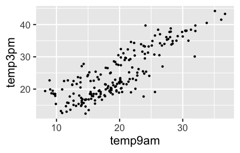
FIGURE 11.1: A scatterplot of 3 p.m. versus 9 a.m. temperatures, in degrees Celsius, collected in two Australian cities.
To model this relationship, let \(Y_i\) denote the 3 p.m. temperature and \(X_{i1}\) denote the 9 a.m. temperature on a given day \(i\). Notice that we’re representing our predictor by \(X_{i1}\) here, instead of simply \(X_i\), in order to distinguish it from other predictors used later in the chapter. Then the Bayesian Normal regression model of \(Y\) by \(X_1\) is represented by (11.1):
\[\begin{equation} \begin{split} Y_i | \beta_0, \beta_1, \sigma & \stackrel{ind}{\sim} N\left(\mu_i, \sigma^2\right) \;\; \text{ with } \;\; \mu_i = \beta_0 + \beta_1X_{i1} \\ \beta_{0c}& \sim N\left(25, 5^2\right) \\ \beta_1 & \sim N\left(0, 3.1^2\right) \\ \sigma & \sim \text{Exp}(0.13) .\\ \end{split} \tag{11.1} \end{equation}\]
Consider the independent priors utilized by this model:
- Since 0-degree mornings are rare in Australia, it’s difficult to state our prior understanding of the typical afternoon temperature on such a rare day, \(\beta_0\). Instead, the Normal prior model on the centered intercept \(\beta_{0c}\) reflects our prior understanding that the average afternoon temperature on a typical day is somewhere between 15 and 35 degrees (\(25 \pm 2*5\)).
- The weakly informative priors for \(\beta_1\) and \(\sigma\) are auto-scaled by
stan_glm()to reflect our lack of prior information about Australian weather, as well as reasonable ranges for these parameters based on the simple scales of our temperature data. - The fact that the Normal prior for \(\beta_1\) is centered around 0 reflects a default, conservative prior assumption that the relationship between 3 p.m. and 9 a.m. temperatures might be positive (\(\beta_1 > 0\)), negative (\(\beta_1 < 0\)), or even non-existent (\(\beta_1 = 0\)).
We simulate the model posterior below and encourage you to follow this up with a check of the prior model specifications and some MCMC diagnostics (which all look good!):
weather_model_1 <- stan_glm(
  temp3pm ~ temp9am,
  data = weather_WU, family = gaussian,
  prior_intercept = normal(25, 5),
  prior = normal(0, 2.5, autoscale = TRUE),
  prior_aux = exponential(1, autoscale = TRUE),
  chains = 4, iter = 5000*2, seed = 84735)

# Prior specification
prior_summary(weather_model_1)

# MCMC diagnostics
mcmc_trace(weather_model_1, size = 0.1)
mcmc_dens_overlay(weather_model_1)
mcmc_acf(weather_model_1)
neff_ratio(weather_model_1)
rhat(weather_model_1)
The simulation results provide finer insight into the association between afternoon and morning temperatures.
Per the 80% credible interval for \(\beta_1\), there’s an 80% posterior probability that for every one degree increase in temp9am, the average increase in temp3pm is somewhere between 0.98 and 1.1 degrees.
Further, per the 80% credible interval for standard deviation \(\sigma\), this relationship is fairly strong – observed afternoon temperatures tend to fall somewhere between only 3.87 and 4.41 degrees from what we’d expect based on the corresponding morning temperature.
# Posterior credible intervals
posterior_interval(weather_model_1, prob = 0.80)
               10%   90%
(Intercept) 2.9498 5.449
temp9am     0.9803 1.102
sigma       3.8739 4.409
But is this a “good” model?
We’ll more carefully address this question in Section 11.5.
For now, we’ll leave you with a quick pp_check(), which illustrates that we can do better (Figure 11.2).
Though the 50 sets of afternoon temperature data simulated from the weather_model_1 posterior (light blue) tend to capture the general center and spread of the afternoon temperatures we actually observed (dark blue), none capture the bimodality in these temperatures.
That is, none reflect the fact that there’s a batch of temperatures around 20 degrees and another batch around 35 degrees.
pp_check(weather_model_1)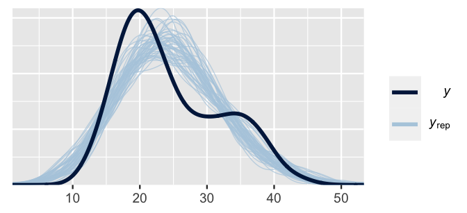
FIGURE 11.2: 50 posterior simulated sets of temperature data (light blue) alongside the actual observed temperature data (dark blue).
This comparison of the observed and posterior simulated temperature data indicates that, though temp9am contains some useful information about temp3pm, it doesn’t tell us everything.
Throughout Chapter 11 we’ll expand upon weather_model_1 in the hopes of improving our model of afternoon temperatures.
The main idea is this.
If we’re in Australia at 9 a.m., the current temperature isn’t the only factor that might help us predict 3 p.m. temperature.
Our model might be improved by incorporating information about our location or humidity or air pressure and so on.
It might be further improved by incorporating multiple predictors in the same model!
- Extend the Normal linear regression model of a quantitative response variable \(Y\) to settings in which we have:
- a categorical predictor \(X\);
- multiple predictors (\(X_1,X_2,...,X_p\)); or
- predictors which interact.
- Compare and evaluate competing models of \(Y\) to answer the question, “Which model should I choose?”
- Consider the bias-variance trade-off in building a regression model of \(Y\) with multiple predictors.
11.1 Utilizing a categorical predictor
Again, suppose we find ourselves in Australia at 9 a.m. Our exact location can shed some light on what temperature we can expect at 3 p.m. Density plots of the temperatures in both locations indicate that it tends to be colder in the southeastern coastal city of Wollongong than in the desert climate of Uluru:
ggplot(weather_WU, aes(x = temp3pm, fill = location)) +
  geom_density(alpha = 0.5)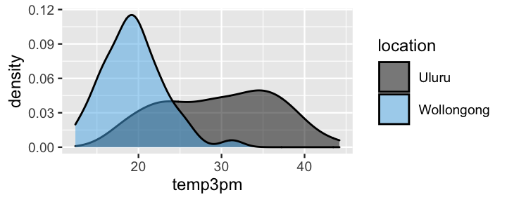
FIGURE 11.3: Density plots of afternoon temperatures in Uluru and Wollongong.
Given the useful information it provides, we’re tempted to incorporate location into our temperature analysis.
We can!
But in doing so, it’s important to recognize that location would be a categorical predictor variable.
We are either in Uluru or Wollongong.
Though this impacts the details, we can model the relationship between temp3pm and location much as we modeled the relationship between temp3pm and the quantitative temp9am predictor.
11.1.1 Building the model
For day \(i\), let \(Y_i\) denote the 3 p.m. temperature and \(X_{i2}\) be an indicator for the location being Wollongong. That is, \(X_{i2}\) is 1 if we’re in Wollongong and 0 otherwise:
\[X_{i2} = \begin{cases} 1 & \text{ Wollongong} \\ 0 & \text{ otherwise (i.e., Uluru).} \\ \end{cases}\]
Since \(X_{i2}\) is 0 if we’re in Uluru, we can think of Uluru as the baseline or reference level of the location variable.
(Uluru is the default reference level since it’s first alphabetically.)
Then the Bayesian Normal regression model between 3 p.m. temperature and location has the same structure as (11.1), with a \(N(25,5^2)\) prior model for the centered intercept \(\beta_{0c}\) and weakly informative prior models for \(\beta_1\) and \(\sigma\) tuned by stan_glm():
\[\begin{equation} \begin{array}{lcrl} \text{data:} & \hspace{.05in} & Y_i|\beta_0,\beta_1,\sigma & \stackrel{ind}{\sim} N(\mu_i, \; \sigma^2) \;\; \text{ with } \;\; \mu_i = \beta_0 + \beta_1 X_{i2}\\ \text{priors:} & & \beta_{0c} & \sim N\left(25, 5^2\right) \\ & & \beta_1 & \sim N\left(0, 38^2 \right) \\ & & \sigma & \sim \text{Exp}(0.13) .\\ \end{array} \tag{11.2} \end{equation}\]
Though the model structure is unchanged, the interpretation is impacted by the categorical nature of \(X_{i2}\). The model mean \(\mu_i = \beta_0 + \beta_1 X_{i2}\) no longer represents a line with intercept \(\beta_0\) and slope \(\beta_1\). In fact, \(\mu_i = \beta_0 + \beta_1 X_{i2}\) more simply describes the typical 3 p.m. temperature under only two scenarios. Scenario 1: For Uluru, \(X_{i2} = 0\) and the typical 3 p.m. temperature simplifies to
\[\beta_0 + \beta_1 \cdot 0 = \beta_0 .\]
Scenario 2: For Wollongong, \(X_{i2} = 1\) and the typical 3 p.m. temperature is
\[\beta_0 + \beta_1 \cdot 1 = \beta_0 + \beta_1 .\]
That is, the typical 3 p.m. temperature in Wollongong is equal to that in Uluru (\(\beta_0\)) plus some adjustment or tweak \(\beta_1\). Putting this together, we can reinterpret the model parameters as follows:
- Intercept coefficient \(\beta_0\) represents the typical 3 p.m. temperature in Uluru (\(X_2 = 0\)).
- Wollongong coefficient \(\beta_1\) represents the typical difference in 3 p.m. temperature in Wollongong (\(X_2 = 1\)) versus Uluru (\(X_2 = 0\)). Thus, \(\beta_1\) technically still measures the typical change in 3 p.m. temperature for a 1-unit increase in \(X_2\), it’s just that this increase from 0 to 1 corresponds to a change in the
locationcategory. - The standard deviation parameter \(\sigma\) still represents the variability in \(Y\) at a given \(X_2\) value. Thus, here, \(\sigma\) measures the standard deviation in 3 p.m. temperatures in Wollongong (when \(X_2 = 1\)) and in Uluru (when \(X_2 = 0\)).
We can now interpret our prior models in (11.2) with this in mind. First, the Normal prior model on the centered intercept \(\beta_{0c}\) reflects a prior understanding that the average afternoon temperature in Uluru is somewhere between 15 and 35 degrees. Further, the weakly informative Normal prior for \(\beta_1\) is centered around 0, reflecting a default, conservative prior assumption that the average 3 p.m. temperature in Wollongong might be greater (\(\beta_1 > 0\)), less (\(\beta_1 < 0\)), or even no different (\(\beta_1 = 0\)) from that in Uluru. Finally, the weakly informative prior for \(\sigma\) expresses our lack of understanding about the degree to which 3 p.m. temperatures vary at either location.
11.1.2 Simulating the posterior
To simulate the posterior model of (11.2) with weakly informative priors, we run four parallel Markov chains, each of length 10,000.
Other than changing the formula argument from temp3pm ~ temp9am to temp3pm ~ location, the syntax is equivalent to that for weather_model_1:
weather_model_2 <- stan_glm(
  temp3pm ~ location,
  data = weather_WU, family = gaussian,
  prior_intercept = normal(25, 5),
  prior = normal(0, 2.5, autoscale = TRUE),
  prior_aux = exponential(1, autoscale = TRUE),
  chains = 4, iter = 5000*2, seed = 84735)
Trace plots and autocorrelation plots (omitted here for space), as well as density plots (Figure 11.4) suggest that our posterior simulation has sufficiently stabilized:
# MCMC diagnostics
mcmc_trace(weather_model_2, size = 0.1)
mcmc_dens_overlay(weather_model_2)
mcmc_acf(weather_model_2)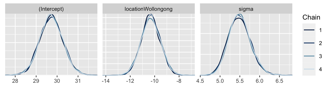
FIGURE 11.4: Four parallel Markov chain approximations of the weather_model_2 posterior models.
These density plots and the below numerical posterior summaries for \(\beta_0\) (Intercept), \(\beta_1\) (locationWollongong), and \(\sigma\) (sigma) reflect our posterior understanding of 3 p.m. temperatures in Wollongong and Uluru.
Consider the message of the posterior median values for \(\beta_0\) and \(\beta_1\): the typical 3 p.m. temperature is around 29.7 degrees in Uluru and, comparatively, around 10.3 degrees lower in Wollongong.
Combined then, we can say that the typical 3 p.m. temperature in Wollongong is around 19.4 degrees (29.7 - 10.3).
For context, Figure 11.5 frames these posterior median estimates of 3 p.m. temperatures in Uluru and Wollongong among the observed data.
# Posterior summary statistics
tidy(weather_model_2, effects = c("fixed", "aux"),
     conf.int = TRUE, conf.level = 0.80) %>%
  select(-std.error)
# A tibble: 4 x 4
  term               estimate conf.low conf.high
  <chr>                 <dbl>    <dbl>     <dbl>
1 (Intercept)           29.7     29.0      30.4
2 locationWollongong   -10.3    -11.3      -9.30
3 sigma                  5.48     5.14      5.86
4 mean_PPD 24.6 23.9 25.3 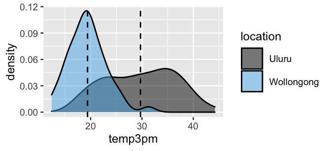
FIGURE 11.5: Density plots of afternoon temperatures in Uluru and Wollongong, with posterior median estimates of temperature (dashed lines).
Though the posterior medians provide a quick comparison of the typical temperatures in our two locations, they don’t reflect the full picture or our posterior uncertainty in this comparison.
To this end, we can compare the entire posterior model of the typical temperature in Uluru (\(\beta_0\)) to that in Wollongong (\(\beta_0 + \beta_1\)).
The 20,000 (Intercept) Markov chain values provide a direct approximation of the \(\beta_0\) posterior, \(\left\lbrace \beta_0^{(1)},\beta_0^{(2)}, \ldots, \beta_0^{(20000)}\right\rbrace\).
As for \(\beta_0 + \beta_1\), we can approximate the posterior for this function of model parameters by the corresponding function of Markov chains.
Specifically, we can approximate the \(\beta_0 + \beta_1\) posterior using the chain produced by summing each pair of (Intercept) (\(\beta_0\)) and locationWollongong (\(\beta_1\)) chain values:
\[\left\lbrace \beta_0^{(1)} + \beta_1^{(1)}, \beta_0^{(2)}+ \beta_1^{(2)}, \ldots, \beta_0^{(20000)} + \beta_1^{(20000)}\right\rbrace .\]
The result below indicates that the typical Wollongong temperature is likely between 17 and 22 degrees, substantially below that in Uluru which is likely between 27 and 32 degrees.
as.data.frame(weather_model_2) %>%
  mutate(uluru = `(Intercept)`,
         wollongong = `(Intercept)` + locationWollongong) %>%
  mcmc_areas(pars = c("uluru", "wollongong"))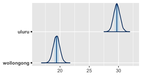
FIGURE 11.6: Posterior models of the typical 3 p.m. temperatures in Uluru and Wollongong.
11.2 Utilizing two predictors
We now know a couple of things about afternoon temperatures in Australia: (1) they’re positively associated with morning temperatures and (2) they tend to be lower in Wollongong than in Uluru.
This makes us think.
If 9 a.m. temperature and location both tell us something about 3 p.m. temperature, then maybe together they would tell us even more!
In fact, a plot of the sample data (Figure 11.7) reveals that, no matter the location, 3 p.m. temperature linearly increases with 9 a.m. temperature.
Further, at any given 9 a.m. temperature, there is a consistent difference in 3 p.m. temperature in Wollongong and Uluru.
Below, you will extend the one-predictor Normal regression models you’ve studied thus far to a two-predictor model of 3 p.m. temperature using both temp9am and location.
ggplot(weather_WU, aes(y = temp3pm, x = temp9am, color = location)) +
  geom_point() +
  geom_smooth(method = "lm", se = FALSE)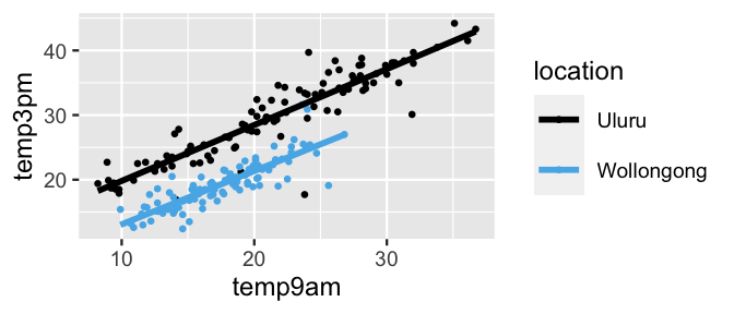
FIGURE 11.7: Scatterplot of 3 p.m. versus 9 a.m. temperatures in Uluru and Wollongong, superimposed with the observed linear relationships (solid lines).
11.2.1 Building the model
Letting \(X_{i1}\) denote the 9 a.m. temperature and \(X_{i2}\) the location on day \(i\), the multivariable Bayesian linear regression model of 3 p.m. temperature versus these two predictors is a small extension of the one-predictor model (11.2).
We state this model here and tune the weakly informative priors using stan_glm() below.
\[\begin{equation} \begin{array}{lcrl} \text{data:} & \hspace{.05in} & Y_i|\beta_0,\beta_1,\beta_2,\sigma & \stackrel{ind}{\sim} N(\mu_i, \; \sigma^2) \;\; \text{ with } \;\; \mu_i = \beta_0 + \beta_1X_{i1} + \beta_2X_{i2} \\ \text{priors:} & & \beta_{0c} & \sim N\left(25, 5^2 \right) \\ & & \beta_1 & \sim N\left(0, 3.11^2 \right) \\ & & \beta_2 & \sim N\left(0, 37.52^2 \right) \\ & & \sigma & \sim \text{Exp}(0.13) .\\ \end{array} \tag{11.3} \end{equation}\]
Interpreting the 9 a.m. temperature and location coefficients in this new model, \(\beta_1\) and \(\beta_2\), requires some care. We can’t simply interpret \(\beta_1\) and \(\beta_2\) as we did in our first two models, (11.1) and (11.2), when using either predictor alone. Rather, the meaning of our predictor coefficients changes depending upon the other predictors in the model. Let’s again consider two scenarios. Scenario 1: In Uluru, \(X_{i2} = 0\) and the relationship between 3 p.m. and 9 a.m. temperature simplifies to the following formula for a line:
\[\beta_0 + \beta_1 X_{i1} + \beta_2 \cdot 0 = \beta_0 + \beta_1 X_{i1} .\]
Scenario 2: In Wollongong, \(X_{i2} = 1\) and the relationship between 3 p.m. and 9 a.m. temperature simplifies to the following formula for a different line:
\[\beta_0 + \beta_1 X_{i1} + \beta_2 \cdot 1 = (\beta_0 + \beta_2) + \beta_1 X_{i1} .\]
Figure 11.8 combines Scenarios 1 and 2 into one picture, thereby illuminating the meaning of our regression coefficients:
- Intercept coefficient \(\beta_0\) is the intercept of the Uluru line. Thus, \(\beta_0\) represents the typical 3 p.m. temperature in Uluru on a (theoretical) day in which it was 0 degrees at 9 a.m., i.e., when \(X_{1} = X_{2} = 0\).
- 9am temperature coefficient \(\beta_1\) is the common slope of the Uluru and Wollongong lines. Thus, \(\beta_1\) represents the typical change in 3 p.m. temperature with every 1-degree increase in 9 a.m. temperature in both Uluru and Wollongong.
- Location coefficient \(\beta_2\) is the vertical distance, or adjustment, between the Wollongong versus Uluru line at any 9 a.m. temperature. Thus, \(\beta_2\) represents the typical difference in 3 p.m. temperature in Wollongong (\(X_{2} = 1\)) versus Uluru on days when they have equal 9 a.m. temperature \(X_1\).
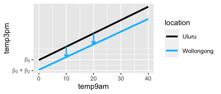
FIGURE 11.8: A graphical representation of the assumptions behind the multivariable model (11.3). The downward arrows reflect the meaning of the \(\beta_2\) coefficient.
11.2.2 Understanding the priors
Now that we have a better sense for the overall structure and assumptions behind our multivariable model of 3 p.m. temperatures (11.3), let’s go back and examine the meaning of our priors in this context.
Beyond a prior for the centered intercept \(\beta_{0c}\) which reflected our basic understanding that the typical temperature on a typical day in Australia is likely between 15 and 35 degrees, our priors were weakly informative.
We simulate these priors below using stan_glm() – the only difference between this and simulating the posteriors is the inclusion of prior_PD = TRUE.
Also note that we represent the multivariable model structure by temp3pm ~ temp9am + location:
weather_model_3_prior <- stan_glm(
  temp3pm ~ temp9am + location,
  data = weather_WU, family = gaussian,
  prior_intercept = normal(25, 5),
  prior = normal(0, 2.5, autoscale = TRUE),
  prior_aux = exponential(1, autoscale = TRUE),
  chains = 4, iter = 5000*2, seed = 84735,
  prior_PD = TRUE)
From these priors, we then simulate and plot 100 different sets of 3 p.m. temperature data (Figure 11.9). First, notice from the left plot that our combined priors produce sets of 3 p.m. temperatures that are centered around 25 degrees (per the \(\beta_{0c}\) prior), yet tend to range widely, from roughly -75 to 125 degrees. This wide range is the result of our weakly informative priors and, though it spans unrealistic temperatures, it’s at least in the right ballpark. After all, had we utilized vague instead of weakly informative priors, our prior simulated temperatures would span an even wider range, say on the order of millions of degrees Celsius.
Second, the plot at right displays our prior assumptions about the relationship between 3 p.m. and 9 a.m. temperature at each location. Per the prior model for slope \(\beta_1\) being centered at 0, these model lines reflect a conservative assumption that 3 p.m. temperatures might be positively or negatively associated with 9 a.m. temperatures in both locations. Further, per the prior model for the Wollongong coefficient \(\beta_2\) being centered at 0, the lack of a distinction among the model lines in the two locations reflects a conservative assumption that the typical 3 p.m. temperature in Wollongong might be hotter, cooler, or no different than in Uluru on days with similar 9 a.m. temperatures. In short, these prior assumptions reflect that when it comes to Australian weather, we’re just not sure what’s up.
set.seed(84735)
weather_WU %>%
  add_predicted_draws(weather_model_3_prior, n = 100) %>%
  ggplot(aes(x = .prediction, group = .draw)) +
    geom_density() +
    xlab("temp3pm")

weather_WU %>%
  add_fitted_draws(weather_model_3_prior, n = 100) %>%
  ggplot(aes(x = temp9am, y = temp3pm, color = location)) +
    geom_line(aes(y = .value, group = paste(location, .draw)))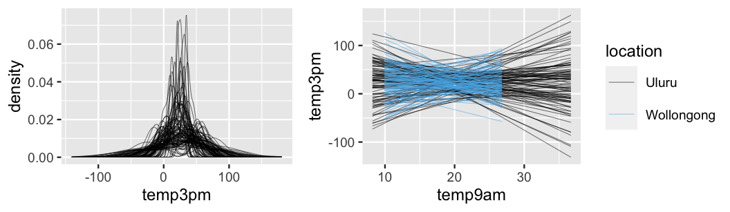
FIGURE 11.9: 100 datasets were simulated from the prior models. For each, we display a density plot of the 3 p.m. temperatures alone (left) and the relationship in 3 p.m. versus 9 a.m. temperatures by location (right).
11.2.3 Simulating the posterior
Finally, let’s combine our prior assumptions with data to simulate the posterior of (11.3).
Instead of starting the stan_glm() syntax from scratch, we can update() the weather_model_3_prior by setting prior_PD = FALSE:
weather_model_3 <- update(weather_model_3_prior, prior_PD = FALSE)This simulation produces 20,000 posterior plausible sets of regression parameters \(\beta_0\) (Intercept), 9 a.m. temperature coefficient \(\beta_1\) (temp9am), location coefficient \(\beta_2\) (locationWollongong), and regression standard deviation \(\sigma\) (sigma):
head(as.data.frame(weather_model_3), 3)
  (Intercept) temp9am locationWollongong sigma
1       13.05  0.8017             -7.663 2.392
2       12.73  0.8174             -7.839 2.445
3       11.81  0.8615             -7.648 2.414
Combined, these 20,000 parameter sets present us with 20,000 posterior plausible relationships between temperature and location.
The 100 relationships plotted below provide a representative glimpse.
Across all 100 scenarios, 3 p.m. temperature is positively associated with 9 a.m. temperature and tends to be higher in Uluru than in Wollongong.
Further, relative to the prior simulated relationships in Figure 11.9, these posterior relationships are very consistent – we have a much clearer understanding of 3 p.m. temperatures in light of information from the weather_WU data.
weather_WU %>%
  add_fitted_draws(weather_model_3, n = 100) %>%
  ggplot(aes(x = temp9am, y = temp3pm, color = location)) +
    geom_line(aes(y = .value, group = paste(location, .draw)), alpha = .1) +
    geom_point(data = weather_WU, size = 0.1)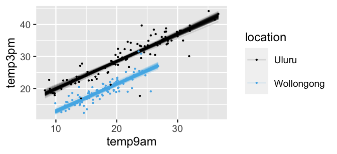
FIGURE 11.10: Scatterplot of 3 p.m. versus 9 a.m. temperatures in Uluru and Wollongong, superimposed with 100 posterior plausible models.
Inspecting the parameters themselves provides necessary details. In both Uluru and Wollongong, i.e., when controlling for location, there’s an 80% chance that for every one degree increase in 9 a.m. temperature, the typical increase in 3 p.m. temperature is somewhere between 0.82 and 0.89 degrees. When controlling for 9 a.m. temperature, there’s an 80% chance that the typical 3 p.m. temperature in Wollongong is somewhere between 6.6 and 7.51 degrees lower than that in Uluru.
# Posterior summaries
posterior_interval(weather_model_3, prob = 0.80,
                   pars = c("temp9am", "locationWollongong"))
                       10%     90%
temp9am             0.8196  0.8945
locationWollongong -7.5068 -6.5999
11.2.4 Posterior prediction
Next, let’s use this model to predict 3 p.m. temperature on specific days.
For example, consider a day in which it’s 10 degrees at 9 a.m. in both Uluru and Wollongong.
To simulate and subsequently plot the posterior predictive models of 3 p.m. temperatures in these locations, we can call posterior_predict() and mcmc_areas().
Roughly speaking, we can anticipate 3 p.m. temperatures between 15 and 25 degrees in Uluru, and cooler temperatures between 8 and 18 in Wollongong:
# Simulate a set of predictions
set.seed(84735)
temp3pm_prediction <- posterior_predict(
  weather_model_3,
  newdata = data.frame(temp9am = c(10, 10),
                       location = c("Uluru", "Wollongong")))

# Plot the posterior predictive models
mcmc_areas(temp3pm_prediction) +
  ggplot2::scale_y_discrete(labels = c("Uluru", "Wollongong")) +
  xlab("temp3pm")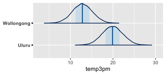
FIGURE 11.11: Posterior predictive models of the 3 p.m. temperatures in Uluru and Wollongong when the 9 a.m. temperature is 10 degrees.
11.3 Optional: Utilizing interaction terms
In the two-predictor model in Section 11.2, we assumed that the relationship between 3 p.m. temperature (\(Y\)) and 9 a.m. temperature (\(X_1\)) was the same in both locations (\(X_2\)). Or, visually, the relationship between \(Y\) and \(X_1\) had equal slopes \(\beta_1\) in both locations. This assumption isn’t always appropriate – in some cases, our predictors interact. We’ll explore interaction in this optional section, but you can skip right past to Section 11.4 if you choose.
Consider the relationship of 3 p.m. temperature (\(Y\)) with location (\(X_2\)) and 9 a.m. humidity (\(X_3\)). Visually, the relationships exhibit quite different slopes – afternoon temperatures and morning humidity are negatively associated in Uluru, yet weakly positively associated in Wollongong.
ggplot(weather_WU, aes(y = temp3pm, x = humidity9am, color = location)) +
  geom_point(size = 0.5) +
  geom_smooth(method = "lm", se = FALSE)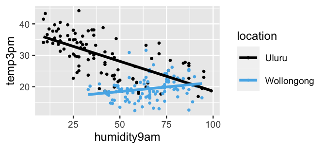
FIGURE 11.12: Scatterplot of 3 p.m. temperatures versus 9 a.m. humidity levels in Uluru and Wollongong, superimposed with the observed linear relationships (solid lines).
Think about this dynamic another way: the relationship between 3 p.m. temperature and 9 a.m. humidity varies by location. Equivalently, the relationship between 3 p.m. temperature and location varies by 9 a.m. humidity level. More technically, we say that the location and humidity predictors interact.
Interaction
Two predictors, \(X_1\) and \(X_2\), interact if the association between \(X_1\) and \(Y\) varies depending upon the level of \(X_2\).
11.3.1 Building the model
Consider modeling temperature (\(Y\)) by location (\(X_2\)) and humidity (\(X_3\)). If we were to assume that location and humidity do not interact, then we would describe their relationship by \(\mu = \beta_0 + \beta_1 X_{2} + \beta_2 X_{3}\). Yet to reflect the fact that the relationship between temperature and humidity is modified by location, we can incorporate a new predictor: the interaction term. This new predictor is simply the product of \(X_2\) and \(X_3\):
\[\mu = \beta_0 + \beta_1 X_{2} + \beta_2 X_{3} + \beta_3 X_{2}X_{3} .\]
Thus, the complete structure for our multivariable Bayesian linear regression model with an interaction term is as follows, where the weakly informative priors on the non-intercept parameters are auto-scaled by stan_glm() below:
\[\begin{equation} \begin{array}{lcrl} \text{data:} & \hspace{.05in} & Y_i|\beta_0,\beta_1,\beta_2,\beta_3,\sigma & \stackrel{ind}{\sim} N(\mu_i, \; \sigma^2) \;\; \text{ with } \; \mu_i = \beta_0 + \beta_1X_{i2} + \beta_2X_{i3} + \beta_3X_{i2}X_{i3} \\ \text{priors:} & & \beta_{0c} & \sim N\left(25, 5^2 \right) \\ & & \beta_1 & \sim N\left(0, 37.52^2 \right) \\ & & \beta_2 & \sim N\left(0, 0.82^2 \right) \\ & & \beta_3 & \sim N\left(0, 0.55^2 \right) \\ & & \sigma & \sim \text{Exp}(0.13) .\\ \end{array} \tag{11.4} \end{equation}\]
To understand how our assumed structure for \(\mu\) matches our observation of an interaction between 9 a.m. humidity and location, let’s break this down into two scenarios, as usual. Scenario 1: In Uluru, \(X_{2} = 0\) and the relationship between temperature and humidity simplifies to
\[\mu = \beta_0 + \beta_2 X_{3} .\]
Scenario 2: In Wollongong, \(X_{2} = 1\) and the relationship between temperature and humidity simplifies to
\[\mu = \beta_0 + \beta_1 + \beta_2 X_{3} + \beta_3 X_{3} = (\beta_0 + \beta_1) + (\beta_2 + \beta_3) X_3 .\]
Thus, we essentially have two types of regression coefficients:
Uluru coefficients
As we see in Scenario 1, intercept \(\beta_0\) and humidity (slope) coefficient \(\beta_2\) encode the relationship between temperature and humidity in Uluru.Modifications to the Uluru coefficients
In comparing Scenario 2 to Scenario 1, the location and interaction coefficients, \(\beta_1\) and \(\beta_3\), encode how the relationship between temperature and humidity in Wollongong compares to that in Uluru. Location coefficient \(\beta_1\) captures the difference in intercepts, and thus how the typical temperature in Wollongong compares to that in Uluru on days with 0% humidity (\(X_3 = 0\)). Interaction coefficient \(\beta_3\) captures the difference in slopes, and thus how the change in temperature with humidity differs between the two cities.
11.3.2 Simulating the posterior
To simulate (11.4) using weakly informative priors, we can represent the multivariable model structure by temp3pm ~ location + humidity9am + location:humidity9am, the last piece of this formula representing the interaction term:
interaction_model <- stan_glm(
  temp3pm ~ location + humidity9am + location:humidity9am,
  data = weather_WU, family = gaussian,
  prior_intercept = normal(25, 5),
  prior = normal(0, 2.5, autoscale = TRUE),
  prior_aux = exponential(1, autoscale = TRUE),
  chains = 4, iter = 5000*2, seed = 84735)
Posterior summary statistics for our regression parameters (\(\beta_0, \beta_1, \beta_2, \beta_3, \sigma\)) are printed below. The corresponding posterior median relationships between temperature and humidity by city reflect what we observed in the data – the association between temperature and humidity is negative in Uluru and slightly positive in Wollongong:
\[\begin{array}{lrl} \text{Uluru:} & \mu & = 37.586 - 0.19 \text{ humidity9am} \\ \text{Wollongong:} & \mu & = (37.586 - 21.879) + (-0.19 + 0.246) \text{ humidity9am}\\ && = 15.707 + 0.056 \text{ humidity9am}\\ \end{array}\]
# Posterior summary statistics
tidy(interaction_model, effects = c("fixed", "aux"))
# A tibble: 6 x 3
  term                           estimate std.error
  <chr>                             <dbl>     <dbl>
1 (Intercept)                      37.6      0.910
2 locationWollongong              -21.9      2.33
3 humidity9am                      -0.190    0.0193
4 locationWollongong:humidity9am    0.246    0.0375
5 sigma                             4.47     0.227
6 mean_PPD                         24.6      0.448
posterior_interval(interaction_model, prob = 0.80,
                   pars = "locationWollongong:humidity9am")
                                  10%    90%
locationWollongong:humidity9am 0.1973 0.2941
The 200 posterior simulated models in Figure 11.13 capture our posterior uncertainty in these relationships and provide ample posterior evidence of a significant interaction between location and humidity – almost all Wollongong posterior models are positive and all Uluru posterior models are negative. We can back this up with numerical evidence. The 80% posterior credible interval for interaction coefficient \(\beta_3\) is entirely and well above 0, ranging from 0.197 to 0.294, suggesting that the association between temperature and humidity is significantly more positive in Wollongong than in Uluru.
weather_WU %>%
  add_fitted_draws(interaction_model, n = 200) %>%
  ggplot(aes(x = humidity9am, y = temp3pm, color = location)) +
    geom_line(aes(y = .value, group = paste(location, .draw)), alpha = 0.1)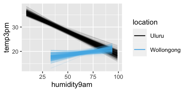
FIGURE 11.13: 200 posterior plausible relationships in 3 p.m. temperatures versus 9 a.m. humidity levels in Uluru and Wollongong.
11.3.3 Do you need an interaction term?
Now that you’ve seen that interaction terms allow us to capture even more nuance in a relationship, you might feel eager to include them in every model. Don’t. There’s nothing sophisticated about a model stuffed with unnecessary predictors. Though interaction terms are quite useful in some settings, they can overly complicate our models in others. Here are a few things to consider when weighing whether or not to go down the rabbit hole of interaction terms:
Context. In the context of your analysis, does it make sense that the relationship between \(Y\) and one predictor \(X_1\) varies depending upon the value of another predictor \(X_2\)?
Visualizations. As with our example here, interactions might reveal themselves when visualizing the relationships between \(Y\), \(X_1\), and \(X_2\).
Hypothesis tests. Suppose we do include an interaction term in our model, \(\mu = \beta_0 + \beta_1X_1 + \beta_2X_2 + \beta_3X_1X_2\). If there’s significant posterior evidence that \(\beta_3 \ne 0\), then it can make sense to include the interaction term. Otherwise, it’s typically a good idea to get rid of it.
Let’s practice the first two ideas with some informal examples.
The bike_users data is from the same source as the bikes data in Chapter 9.
Like the bikes data, it includes information about daily Capital Bikeshare ridership.
Yet bike_users contains data on both registered, paying bikeshare members (who tend to ride more often and use the bikes for commuting) and casual riders (who tend to just ride the bikes every so often):
data(bike_users)
bike_users %>%
  group_by(user) %>%
  tally()
# A tibble: 2 x 2
  user           n
  <fct>      <int>
1 casual       267
2 registered   267
We’ll use this data as a whole and to examine patterns among casual riders alone and registered riders alone:
bike_casual <- bike_users %>%
  filter(user == "casual")
bike_registered <- bike_users %>%
  filter(user == "registered")
To begin, let \(Y_c\) denote the number of casual riders and \(Y_r\) denote the number of registered riders on a given day. As with model (11.4), consider an analysis of ridership in which we have two predictors, one quantitative and one categorical: temperature (\(X_1\)) and weekend status (\(X_2\)). The observed relationships of \(Y_c\) and \(Y_r\) with \(X_1\) and \(X_2\) are shown below. Syntax is included for the former and is similar for the latter.
ggplot(bike_casual, aes(y = rides, x = temp_actual, color = weekend)) +
  geom_smooth(method = "lm", se = FALSE) +
  labs(title = "casual riders")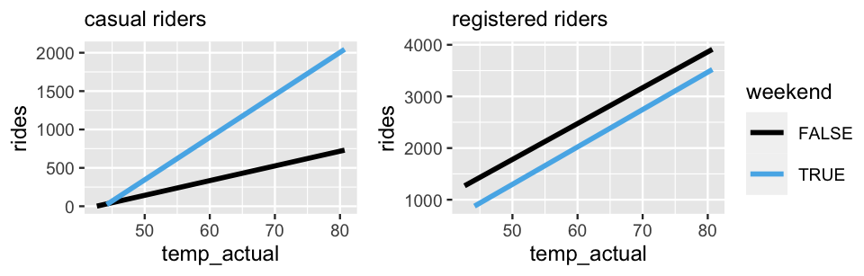
FIGURE 11.14: The observed relationships between ridership and temperature by weekend status for casual riders (left) and registered riders (right).
In their relationship with casual ridership \(Y_c\) (left), it seems that temperature and weekend status do interact. Ridership increases with temperature on both weekends and weekdays, yet the rate of this increase differs, being more rapid on weekends. In contrast, in their relationship with registered ridership \(Y_r\) (right), it seems that temperature and weekend status do not interact. Ridership increases with temperature at roughly the same rate on weekends and weekdays. Both observations make sense. Whereas registered riders tend to be more utility driven in their bikeshare use, casual riders tend to hop on for more occasional fun. Thus, casual ridership, more than registered ridership, might see disproportional increases in ridership on warm weekends than on warm weekdays.
Next, in a model of casual ridership \(Y_c\), suppose that we have two quantitative predictors: temperature (\(X_1\)) and humidity (\(X_2\)). Figure 11.15 takes two approaches to visualizing this relationship. The left plot utilizes color, yet the fact that this relationship lives in three dimensions makes it more challenging to identify any trends. For visualization purposes then, one strategy is to “cut” one predictor (here humidity) into categories (here high and low) based on its quantitative scale (Figure 11.15 right). Though “cutting” or “discretizing” humidity greatly oversimplifies the relationship among our original variables, it does reveal a potential interaction between \(X_1\) and \(X_2\). Mainly, it appears that the increase in ridership with temperature is slightly quicker when the humidity is low. If you’ve ever biked in warm, humid weather, this makes sense. High humidity can make hot weather pretty miserable. Our plots provide evidence that other people might agree.
ggplot(bike_casual, aes(y = rides, x = temp_actual, color = humidity)) +
  geom_point()

ggplot(bike_casual,
       aes(y = rides, x = temp_actual,
           color = cut(humidity, 2, labels = c("low","high")))) +
  geom_smooth(method = "lm", se = FALSE) +
  labs(color = "humidity_level") +
  lims(y = c(0, 2500))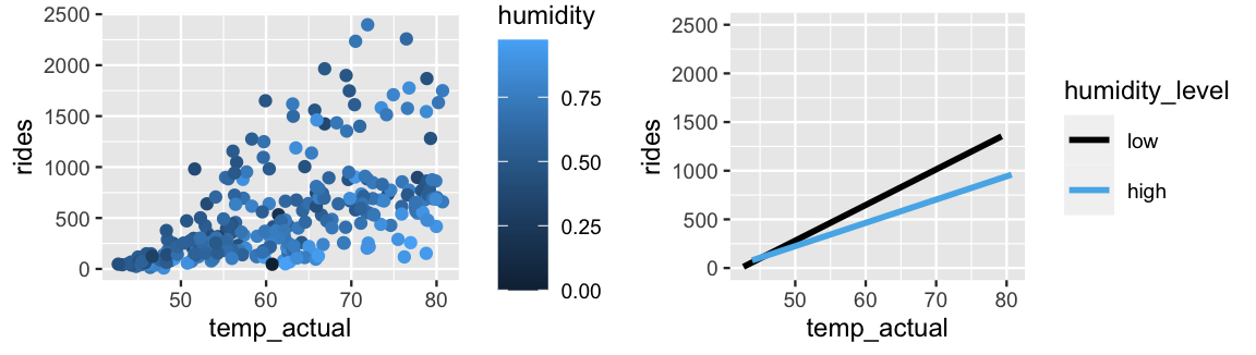
FIGURE 11.15: A scatterplot of ridership versus temperature, colored by humidity level (left). The relationships between ridership and temperature at two discretized humidity levels, low and high (right).
Finally, consider what it would mean for categorical predictors to interact. Let’s model \(Y\), the total ridership on any given day, by three potential predictors: user type \(X_1\) (casual or registered), weather category \(X_2\), and weekend status \(X_3\). The three weather categories here range from “1,” pleasant weather, to “3,” more severe weather. Figure 11.16 plots \(Y\) versus \(X_1\) and \(X_2\) (left) and \(Y\) versus \(X_1\) and \(X_3\) (right). Upon examining the results, take the following quiz.
- In their relationship with ridership, do user type and weather category appear to interact?
- In their relationship with ridership, do user type and weekend status appear to interact?
- In the context of our Capital Bikeshare analysis, explain why your answers to 1 and 2 make sense.
# Example syntax
ggplot(bike_users, aes(y = rides, x = user, fill = weather_cat)) +
geom_boxplot() 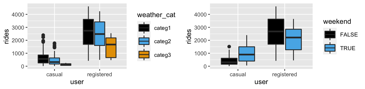
FIGURE 11.16: Boxplots of ridership for each combination of user status and weather category (left) and each combination of user status and weekend status (right).
In their relationship with ridership, user type and weather category do not appear to interact, at least not significantly. Among both casual and registered riders, ridership tends to decrease as weather worsens. Further, the degree of these decreases from one weather category to the next are certainly not equal, but they are similar. In contrast, in their relationship with ridership, user type and weekend status do appear to interact – the relationship between ridership and weekend status varies by user status. Whereas casual ridership is greater on weekends than on weekdays, registered ridership is greater on weekdays. Again, we might have anticipated this interaction given that casual and registered riders tend to use the bikeshare service to different ends.
The examples above have focused on examining interactions through visualizations and context. It remains to determine whether these interactions are actually significant or meaningful, thus whether we should include them in the corresponding models. To this end, we could simulate each model and formally test the significance of the interaction coefficient. In our opinion, after building up the necessary intuition, this formality is the easiest step.
11.4 Dreaming bigger: Utilizing more than 2 predictors!
Let’s return to our Australian weather analysis.
We can keep going!
To improve our understanding and posterior predictive accuracy of afternoon temperatures, we can incorporate more and more predictors into our model.
Now that you’ve explored models that include a quantitative predictor, a categorical predictor, and both, you are equipped to generalize regression models to include any number of predictors.
Let’s revisit the weather_WU data:
weather_WU %>%
  names()
[1] "location"     "windspeed9am" "humidity9am"
[4] "pressure9am"  "temp9am"      "temp3pm"
Beyond temp9am (\(X_1\)), location (\(X_2\)), and humidity9am (\(X_3\)), our sample data includes two more potential predictors of temp3pm: windspeed9am (km/hr) and atmospheric pressure9am (hpa) denoted \(X_4\) and \(X_5\), respectively.
We’ll put it all out there for our final model of Chapter 11 by including all five possible predictors of \(Y\), without the complication of interaction terms.
Simply to preserve space as our models grow, we do not write out the weakly informative priors for the regression coefficients (\(\beta_1, \beta_2, \ldots, \beta_5\)).
These are all Normal and centered at 0, with prior standard deviations that can be obtained by the prior_summary() below:
\[\begin{equation} \begin{array}{lcrl} \text{data:} & \hspace{.05in} & Y_i|\beta_0,\beta_1,\ldots,\beta_5,\sigma & \stackrel{ind}{\sim} N(\mu_i, \; \sigma^2) \;\; \text{ with } \;\; \mu_i = \beta_0 + \beta_1X_{i1} + \cdots + \beta_5X_{i5} \\ \text{priors:} & & \beta_{0c} & \sim N(25, 5^2) \\ && \beta_1, \ldots, \beta_5 & \sim N(0, \text{(some weakly informative sd)}^2) \\ & & \sigma & \sim \text{Exp}(0.13) .\\ \end{array} \tag{11.5} \end{equation}\]
For our previous three models of temp3pm, we paused to define each and every model parameter.
Here we have seven: (\(\beta_0, \beta_1, \ldots, \beta_5, \sigma\)).
It’s excessive and unnecessary to define each.
Rather, we can turn to the principles that we developed throughout our first three model analyses.
Principles for interpreting multivariable model parameters
In a multivariable regression model of \(Y\) informed by \(p\) predictors \((X_1,X_2,\ldots,X_p)\),
\[\mu = \beta_0 + \beta_1 X_1 + \beta_2 X_2 + \cdots + \beta_p X_p ,\]
we can interpret the \(\beta_i\) regression coefficients as follows. First, the intercept coefficient \(\beta_0\) represents the typical \(Y\) outcome when all predictors are 0, \(X_1 = X_2 = \cdots = X_p = 0\). Further, when controlling for or holding constant the other \(X_j\) predictors in our model:
- the \(\beta_i\) coefficient corresponding to a quantitative predictor \(X_{i}\) can be interpreted as the typical change in \(Y\) per one unit increase in \(X_{i}\);
- the \(\beta_i\) coefficient corresponding to a categorical level \(X_{i}\) can be interpreted as the typical difference in \(Y\) for level \(X_{i}\) versus the reference or baseline level.
As such, our interpretation of any predictor’s coefficient depends in part on what other predictors are in our model.
Let’s put these principles into practice in our analysis of (11.5).
To simulate the model posterior, we define the model structure using the shortcut syntax temp3pm ~ . instead of temp3pm ~ location + windspeed9am + (the rest of the predictors!).
Without having to write them all out, this indicates that we’d like to use all weather_WU predictors in our model.53
weather_model_4 <- stan_glm(
  temp3pm ~ .,
  data = weather_WU, family = gaussian,
  prior_intercept = normal(25, 5),
  prior = normal(0, 2.5, autoscale = TRUE),
  prior_aux = exponential(1, autoscale = TRUE),
  chains = 4, iter = 5000*2, seed = 84735)

# Confirm prior specification
prior_summary(weather_model_4)

# Check MCMC diagnostics
mcmc_trace(weather_model_4)
mcmc_dens_overlay(weather_model_4)
mcmc_acf(weather_model_4)
We can now pick through the posterior simulation results for our seven model parameters, here simplified to their corresponding 95% credible intervals:
# Posterior summaries
posterior_interval(weather_model_4, prob = 0.95)
                        2.5%    97.5%
(Intercept)        -23.92282 98.96185
locationWollongong  -7.19827 -5.66547
windspeed9am        -0.05491  0.02975
humidity9am         -0.05170 -0.01511
pressure9am         -0.08256  0.03670
temp9am              0.72893  0.87456
sigma                2.10497  2.57180
These intervals provide insight into some big picture questions.
When controlling for the other model predictors, which predictors are significantly associated with temp3pm?
Are these associations positive or negative?
Try to answer these big picture questions for yourself in the quiz below.
Though there’s some gray area, one set of reasonable answers is in the footnotes.54
When controlling for the other predictors included in weather_model_4, which predictors…
- have a significant positive association with
temp3pm? - have a significant negative association with
temp3pm? - are not significantly associated with
temp3pm?
Let’s see how you did.
To begin, the 95% posterior credible interval for the temp9am coefficient \(\beta_1\), (0.73, 0.87), is the only one that lies entirely above 0.
This provides us with hearty evidence that, even when controlling for the four other predictors in the model, there’s a significant positive association between morning and afternoon temperatures.
In contrast, the 95% posterior credible intervals for the locationWollongong and humidity9am coefficients lie entirely below 0, suggesting that both factors are negatively associated with temp3pm.
For example, when controlling for the other model factors, there’s a 95% chance that the typical temperature in Wollongong is between 5.67 and 7.2 degrees lower than in Uluru.
The windspeed9am and pressure9am coefficients are the only ones to have 95% credible intervals which straddle 0.
Though both intervals lie mostly below 0, suggesting afternoon temperature is negatively associated with morning windspeed and atmospheric pressure when controlling for the other model predictors, the waffling evidence invites some skepticism and follow-up questions.
11.5 Model evaluation & comparison
Throughout Chapter 11, we’ve explored five different models of 3 p.m. temperatures in Australia. We’ll consider four of these here:
| Model | Formula |
|---|---|
weather_model_1 |
temp3pm ~ temp9am |
weather_model_2 |
temp3pm ~ location |
weather_model_3 |
temp3pm ~ temp9am + location |
weather_model_4 |
temp3pm ~ . |
Naturally, you might have wondered which of these is the “best” model of temp3pm.
To solve this mystery, we can explore our three model evaluation questions from Chapter 10:
How fair is each model?
Since the context for their analysis and data collection is the same, these four models are equally fair.How wrong is each model?
Visual posterior predictive checks (Figure 11.17) suggest that the assumed structures underlyingweather_model_3andweather_model_4better capture the bimodality intemp3pm. Thus, these models are less wrong thanweather_model_1andweather_model_2.How accurate are each model’s posterior predictions?
We’ll address this question below using the three approaches we learned in Chapter 10: visualization, cross-validation, and ELPD.
# Posterior predictive checks. For example:
pp_check(weather_model_1)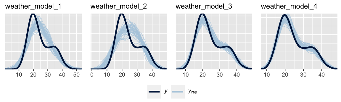
FIGURE 11.17: Posterior predictive checks for our four models of 3 p.m. temperature.
11.5.1 Evaluating predictive accuracy using visualizations
Visualizations provide a powerful first approach to assessing the quality of our models’ posterior predictions.
To begin, we’ll use all four models to construct posterior predictive models for each case in the weather_WU dataset.
Syntax is provided for weather_model_1 and is similar for the other models.
set.seed(84735)
predictions_1 <- posterior_predict(weather_model_1, newdata = weather_WU)
Figure 11.18 illustrates the resulting posterior predictive models of temp3pm from weather_model_1 (left) and weather_model_2 (right).
Both accurately capture the observed behavior in temp3pm – the majority of observed 3 p.m. temperatures fall within the bounds of their predictive models based on 9 a.m. temperatures alone (weather_model_1) or location alone (weather_model_2).
# Posterior predictive models for weather_model_1
ppc_intervals(weather_WU$temp3pm, yrep = predictions_1,
              x = weather_WU$temp9am, prob = 0.5, prob_outer = 0.95) +
  labs(x = "temp9am", y = "temp3pm")

# Posterior predictive models for weather_model_2
ppc_violin_grouped(weather_WU$temp3pm, yrep = predictions_2,
                   group = weather_WU$location, y_draw = "points") +
  labs(y = "temp3pm")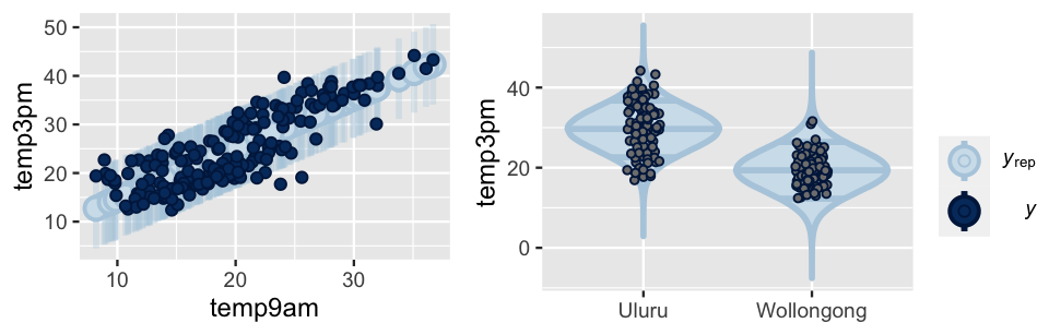
FIGURE 11.18: Posterior predictive models of 3 p.m. temperature corresponding to weather_model_1 (left) and weather_model_2 (right). In both plots, dark dots represent the observed 3 p.m. temperatures.
Further, not only do the weather_model_3 posterior predictive models also well anticipate the observed 3 p.m. temperatures (Figure 11.19), they’re much narrower than those from weather_model_1 and weather_model_2.
Essentially, using both temp9am and location, instead of either predictor alone, produces more precise posterior predictions of temp3pm.
# Posterior predictive models for weather_model_3
ppc_intervals_grouped(weather_WU$temp3pm, yrep = predictions_3,
                      x = weather_WU$temp9am, group = weather_WU$location,
                      prob = 0.5, prob_outer = 0.95,
                      facet_args = list(scales = "fixed")) +
  labs(x = "temp9am", y = "temp3pm")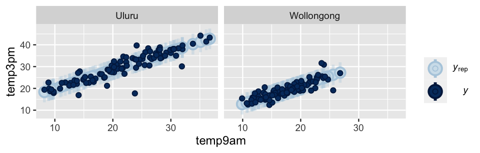
FIGURE 11.19: Posterior predictive models of 3 p.m. temperature corresponding to weather_model_3, alongside the observed 3 p.m. temperatures (dark dots).
What about weather_model_4?!
Well, with five predictors, this high-dimensional model is simply too difficult to visualize.
We thus have three motivations for not assessing posterior predictive accuracy using visual evidence alone: (1) we can’t actually visualize the posterior predictive quality of every model; (2) even if we could, it can be difficult to ascertain the comparative predictive quality of our models from visuals alone; and (3) the visuals above illustrate how well our models predict the same data points we used to build them (not how well they’d predict temperatures on days we haven’t yet observed), and thus might give overly optimistic assessments of predictive accuracy.
This is where cross-validated and ELPD numerical summaries can really help.
11.5.2 Evaluating predictive accuracy using cross-validation
To numerically assess the posterior predictive quality of our four models, we’ll apply the \(k\)-fold cross-validation procedure from Chapter 10.
Recall that this procedure effectively trains the model on one set of data and tests it on another (multiple times over), producing estimates of posterior predictive accuracy that are more honest than if we trained and tested the model using the same data.
To this end, we’ll run a 10-fold cross-validation for each of our four weather models.
Code is shown for weather_model_1 and can be extended to the other three models:
set.seed(84735)
prediction_summary_cv(model = weather_model_1, data = weather_WU, k = 10)
Table 11.1 summarizes the resulting cross-validation statistics.
| model | mae | mae scaled | within 50 | within 95 |
|---|---|---|---|---|
| weather model 1 | 3.285 | 0.79 | 0.405 | 0.97 |
| weather model 2 | 3.653 | 0.661 | 0.495 | 0.935 |
| weather model 3 | 1.142 | 0.483 | 0.67 | 0.96 |
| weather model 4 | 1.206 | 0.522 | 0.64 | 0.95 |
Utilize Table 11.1 to compare our four models.
- If your goal were to explore the relationship between
temp3pmandlocationwithout controlling for any other factors, which model would you use? - If your goal were to maximize the predictive quality of your model and you could only choose one predictor to use in your model, would you choose
temp9amorlocation? - Which of the four models produces the best overall predictions?
Quiz questions 1 through 3 present different frameworks by which to define which of our four models is “best.”
By the framework defined in Question 1, weather_model_2 is best – it’s the only model which studies the exact relationship of interest (that of temp3pm versus location).
By the framework defined in Question 2 in which we can only pick one predictor, weather_model_1 seems best.
That is, temp9am alone seems a better predictor of temp3pm than location alone.
Across all test cases, the posterior mean predictions of temp3pm calculated from weather_model_1 tend to be 3.3 degrees from the observed 3 p.m. temperature.
The error is higher among the posterior mean predictions calculated from weather_model_2 (3.7 degrees).55
Finally, by the framework defined by Question 3, we’re assuming that we can utilize any number or combination of the available predictors.
With this flexibility, weather_model_3 appears to provide the “best” posterior predictions of temp3pm – it has the smallest mae and mae_scaled among the four models and among the highest within_50 and within_95 coverage statistics.
Let’s put this into context.
In utilizing both temp9am and location predictors, weather_model_3 convincingly outperforms the models which use either predictor alone (weather_model_1 and weather_model_2).
Further, weather_model_3 seems to narrowly outperform that which uses all five predictors (weather_model_4).
In model building, more isn’t always better.
The fact that weather_model_4 has higher prediction errors indicates that its additional three predictors (windspeed9am, humidity9am, pressure9am) don’t substantially improve our understanding about temp3pm if we already have information about temp9am and location.
Thus, in the name of simplicity and efficiency, we would be happy to pick the smaller weather_model_3.
11.5.3 Evaluating predictive accuracy using ELPD
In closing out this section, we’ll compare the posterior predictive accuracy of our four models with respect to their expected log-predictive densities (ELPD). Recall the basic idea from Section 10.3.3: the larger the expected logged posterior predictive pdf across a new set of data points \(y_{\text{new}}\), \(\log(f(y_{\text{new}} | y))\), the more accurate the posterior predictions of \(y_{\text{new}}\). To begin, calculate the ELPD for each model:
# Calculate ELPD for the 4 models
set.seed(84735)
loo_1 <- loo(weather_model_1)
loo_2 <- loo(weather_model_2)
loo_3 <- loo(weather_model_3)
loo_4 <- loo(weather_model_4)

# Results
c(loo_1$estimates[1], loo_2$estimates[1],
  loo_3$estimates[1], loo_4$estimates[1])
[1] -568.4 -625.7 -461.1 -457.6
Though the ELPDs don’t provide interpretable metrics for the posterior predictive accuracy of any single model, they are useful in comparing the posterior predictive accuracy of multiple models.
We can do so using loo_compare():
# Compare the ELPD for the 4 models
loo_compare(loo_1, loo_2, loo_3, loo_4)
                elpd_diff se_diff
weather_model_4    0.0       0.0
weather_model_3   -3.5       4.0
weather_model_1 -110.8      18.1
weather_model_2 -168.1      21.5
To begin, loo_compare() lists the models in order from best to worst, or from the highest ELPD to the lowest: weather_model_4, weather_model_3, weather_model_1, weather_model_2.
The remaining output details the extent to which each model compares to the best model, weather_model_4.
For example, the ELPD for weather_model_3 is estimated to be 3.5 lower (worse) than that of weather_model_4 (-461.1 - -457.6).
Further, this estimated difference in ELPD has a corresponding standard error of 4.0.
That is, we believe that the true difference in the ELPDs for weather_model_3 and weather_model_4 is within roughly 2 standard errors, or 8 units, of the estimated -3.5 difference.
The ELPD model comparisons are consistent with our conclusions based upon the 10-fold cross-validation comparisons.
Mainly, weather_model_1 outperforms weather_model_2, and weather_model_3 outperforms both of them.
Further, the distinction between weather_model_3 and weather_model_4 is cloudy.
Though the ELPD for weather_model_4 is slightly higher (better) than that of weather_model_3, it is not significantly higher.
An ELPD difference of zero is within two standard errors of the estimated difference: -3.5 \(\pm\) 2*4 = (-11.5, 4.5).
Hence we don’t have strong evidence that the posterior predictive accuracy of weather_model_4 is significantly superior to that of weather_model_3, or vice versa.
Again, since weather_model_3 is simpler and achieves similar predictive accuracy, we’d personally choose to use it over the more complicated weather_model_4.
Comparing models via ELPD
Let \(\text{ELPD}_1\) and \(\text{ELPD}_2\) denote the estimated ELPDs for two different models, models 1 and 2. Further, let \(\text{se}_{\text{diff}}\) denote the standard error of the estimated difference in the ELPDs, \(\text{ELPD}_2 - \text{ELPD}_1\). Then the posterior predictive accuracy of model 1 is significantly greater than that of model 2 if:
- \(\text{ELPD}_1 > \text{ELPD}_2\); and
- \(\text{ELPD}_2\) is at least two standard errors below \(\text{ELPD}_1\). Equivalently, the difference in \(\text{ELPD}_2\) and \(\text{ELPD}_1\) is at least two standard errors below 0: \((\text{ELPD}_2 - \text{ELPD}_1) + 2\text{se}_{\text{diff}} < 0\).
11.5.4 The bias-variance trade-off
Our four weather models illustrate the fine balance we must strike in building statistical models. If our goal is to build a model that produces accurate predictions of our response variable \(Y\), we want to include enough predictors so that we have ample information about \(Y\), but not so many predictors that our model becomes overfit to our sample data. This riddle is known as the bias-variance trade-off. To examine this trade-off, we will take two separate 40-day samples of Wollongong weather:
# Take 2 separate samples
set.seed(84735)
weather_shuffle <- weather_australia %>%
  filter(temp3pm < 30, location == "Wollongong") %>%
  sample_n(nrow(.))
sample_1 <- weather_shuffle %>% head(40)
sample_2 <- weather_shuffle %>% tail(40)
We’ll use both samples to separately explore the relationship between 3 p.m. temperature (\(Y\)) by day of year (\(X\)), from 1 to 365.
The pattern that emerges in the sample_1 data is what you might expect for a city in the southern hemisphere.
Temperatures are higher at the beginning and end of the year, and lower in the middle of the year:
# Save the plot for later
g <- ggplot(sample_1, aes(y = temp3pm, x = day_of_year)) +
  geom_point()
g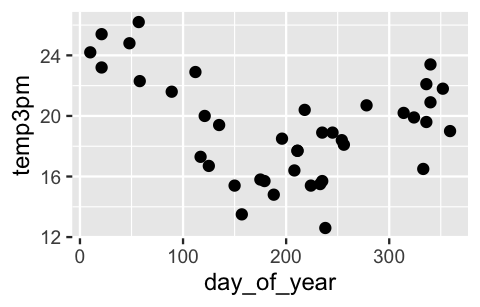
FIGURE 11.20: A scatterplot of 3 p.m. temperatures by the day of the year in Wollongong.
Consider three different polynomial models for the relationship between temperature and day of year:
\[\begin{array}{lrl} \text{model 1:} & \mu & = \beta_0 + \beta_1 X \\ \text{model 2:} & \mu & = \beta_0 + \beta_1 X + \beta_2 X^2\\ \text{model 3:} & \mu & = \beta_0 + \beta_1 X + \beta_2 X^2 + \beta_3 X^3 + \cdots + \beta_{12} X^{12}. \\ \end{array}\]
Don’t panic. We don’t expect you to interpret the polynomial terms or their coefficients. Rather, we want you to take in the fact that each polynomial term, a transformation of \(X\), is a separate predictor. Thus, model 1 has 1 predictor, model 2 has 2, and model 3 has 12. In obtaining posterior estimates of these three models, we know two things from past discussions. First, our two different data samples will produce different estimates (they’re using different information!). Second, models 1, 2, and 3 vary in quality – one is better than the others. Before examining the nuances, take a quick quiz.56
- Which of models 1, 2, and 3 would be the most variable from sample to sample? That is, for which model will the sample 1 and 2 estimates of the relationship between temperature and day of year differ the most?
- Which of models 1, 2, and 3 is the most biased? That is, which model will tend to be the furthest from the observed behavior in the data?
Figure 11.21 illustrates the three different models as estimated by both samples 1 and 2. For sample 1, these figures can be replicated as follows:
g + geom_smooth(method = "lm", se = FALSE)
g + stat_smooth(method = "lm", se = FALSE, formula = y ~ poly(x, 2))
g + stat_smooth(method = "lm", se = FALSE, formula = y ~ poly(x, 12))
Let’s connect what we see in this figure with some technical concepts and terminology. Starting at one extreme, model 1 assumes a linear relationship between temperature and day of year. Samples 1 and 2 produce similar estimates of this linear relationship. This stability is reassuring – no matter what data we happen to have, our posterior understanding of model 1 will be similar. However, model 1 turns out to be overly simple and rigid. It systematically underestimates temperatures on summer days and overestimates temperatures on winter days. Putting this together, we say that model 1 has low variance from sample to sample, but high bias.
To correct this bias, we can incorporate more flexibility into our model with the inclusion of more predictors, here polynomial terms. Yet we can get carried away. Consider the extreme case of model 3, which assumes a 12th-order polynomial relationship between temperature and day of year. Within both samples, model 3 does seem to be better than model 1 at following the trends in the relationship, and hence is less biased. However, this decrease in bias comes at a cost. Since model 3 is structured to pick up tiny, sample-specific details in the relationship, samples 1 and 2 produce quite different estimates of model 3, or two very distinct wiggly model lines. In this case, we say that model 3 has low bias but high variance from sample to sample. Utilizing this highly variable model would have two serious consequences. First, the results would be unstable – different data might produce very different model estimates, and hence conclusions about the relationship between temperature and day of year. Second, the results would be overfit to our sample data – the tiny, local trends in our sample likely don’t extend to the general daily weather patterns in Wollongong. As a result, this model wouldn’t do a good job of predicting temperatures for future days.
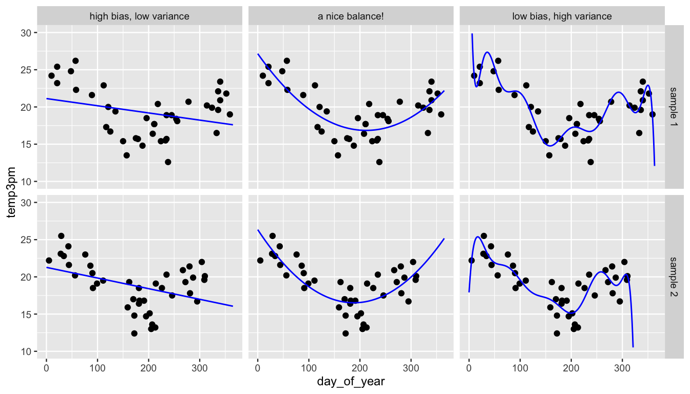
FIGURE 11.21: Sample 1 (top row) and sample 2 (bottom row) are used to model temperature by day of year under three assumptions: the relationship is linear (left), quadratic (center), or a 12th order polynomial (right).
Bringing this all together, in assuming a quadratic structure for the relationship between temperature and day of year, model 2 provides some good middle ground. It is neither too biased (simple) nor too variable (overfit). That is, it strikes a nice balance in the bias-variance trade-off.
Bias-variance trade-off
A model is said to have high bias if it tends to be “far” from the observed relationship in the data; and high variance if estimates of the model significantly differ depending upon what data is used. In model building, there are trade-offs between bias and variability:
- Overly simple models with few or no predictors tend to have high bias but low variability (high stability).
- Overly complicated models with lots of predictors tend to have low bias but high variability (low stability).
The goal is to build a model which strikes a good balance, enjoying relatively low bias and low variance.
Though the bias-variance trade-off speaks to the performance of a model across multiple different datasets, we don’t actually have to go out and collect multiple datasets to hedge against the extremes of the bias-variance trade-off.
Nor do we have to rely on intuition and guesswork.
The raw and cross-validated posterior prediction summaries that we’ve utilized throughout Chapters 10 and 11 can help us identify overly simple models and overfit models.
To explore this process with our three models of temp3pm by day_of_year, we first simulate the posteriors for each model.
We provide complete syntax for model_1.
The syntax for model_2 and model_3 is similar, but would use formulas temp3pm ~ poly(day_of_year, 2) and temp3pm ~ poly(day_of_year, 12), respectively.
model_1 <- stan_glm(
  temp3pm ~ day_of_year,
  data = sample_1, family = gaussian,
  prior_intercept = normal(25, 5),
  prior = normal(0, 2.5, autoscale = TRUE),
  prior_aux = exponential(1, autoscale = TRUE),
  chains = 4, iter = 5000*2, seed = 84735)

# Ditto the syntax for models 2 and 3
model_2 <- stan_glm(temp3pm ~ poly(day_of_year, 2), ...)
model_3 <- stan_glm(temp3pm ~ poly(day_of_year, 12), ...)
Next, we calculate raw and cross-validated posterior prediction summaries for each model.
We provide syntax for model_1 – it’s similar for model_2 and model_3.
set.seed(84735)
prediction_summary(model = model_1, data = sample_1)
prediction_summary_cv(model = model_1, data = sample_1, k = 10)$cv
Check out the results in Table 11.2.
By both measures, raw and cross-validated, model_1 tends to have the greatest prediction errors.
This suggests that model_1 is overly simple, or possibly biased, in comparison to the other two models.
At the other extreme, notice that the cross-validated prediction error for model_3 (2.12 degrees) is roughly double the raw prediction error (1.06 degrees).
Thus, model_3 is doubly worse at predicting temperatures for days we haven’t yet observed than temperatures for days in the sample_1 data.
This suggests that model_3 is overfit, or overly optimized, to the sample_1 data we used to build it.
As such, the discrepancy in its raw and cross-validated prediction errors tips us off that model_3 has low bias but high variance – a different sample of data might lead to very different posterior results.
Between the extremes of model_1 and model_3, model_2 presents the best option with a relatively low raw prediction error and the lowest cross-validated prediction error.
| model | raw mae | cross-validated mae |
|---|---|---|
| model 1 | 2.79 | 2.83 |
| model 2 | 1.53 | 1.86 |
| model 3 | 1.06 | 2.12 |
11.6 Chapter summary
In Chapter 11, we expanded our regression toolkit to include multivariable Bayesian Normal linear regression models. Letting \(Y\) denote a quantitative response variable and (\(X_1,X_2,\ldots,X_p\)) a set of \(p\) predictor variables which can be quantitative, categorical, interaction terms, or any combination thereof:
\[\begin{array}{lcrl} \text{data:} & \hspace{.05in} & Y_i|\beta_0,\beta_1,\ldots,\beta_p,\sigma & \stackrel{ind}{\sim} N(\mu_i, \; \sigma^2) \;\; \text{ with } \; \mu_i = \beta_0 + \beta_1X_{i1} + \cdots + \beta_p X_{ip} \\ \text{priors:} & & \beta_{0c} & \sim N\left(m_0, s_0^2 \right) \\ & & \beta_{1} & \sim N\left(m_1, s_1^2 \right) \\ && \vdots & \\ & & \beta_{p} & \sim N\left(m_p, s_p^2 \right) \\ & & \sigma & \sim \text{Exp}(l) .\\ \end{array}\]
By including more than one predictor, multivariable regression can improve our predictions and understanding of \(Y\). Yet we can take it too far. This conundrum is known as the bias-variance trade-off. If our model is too simple or rigid (including, say, only one predictor), its estimate of the model mean \(\mu\) can be biased, or far from the actual observed relationship in the data. If we greedily include more and more and more predictors into a regression model, its estimates of \(\mu\) can become overfit to our sample data and highly variable from sample to sample. Thus, in model building, we aim to strike a balance – a model which enjoys relatively low bias and low variability.
11.7 Exercises
11.7.1 Conceptual exercises
- Explain why there is no indicator term for the Ford category.
- Interpret the regression coefficient \(\beta_2\).
- Interpret the regression coefficient \(\beta_0\).
- Interpret each regression coefficient, \(\beta_0\), \(\beta_1\), and \(\beta_2\).
- What would it mean if \(\beta_2\) were equal to zero?
- Explain, in context, what it means for \(X_1\) and \(X_2\) to interact.
- Interpret \(\beta_3\).
- Sketch a model that would benefit from including an interaction term between a categorical and quantitative predictor.
- Sketch a model that would not benefit from including an interaction term between a categorical and quantitative predictor.
- Besides visualization, what are two other ways to determine if you should include interaction terms in your model?
- Generally speaking, why can it be beneficial to add predictors to models?
- Generally speaking, why can it be beneficial to remove predictors from models?
- What might you add to this model to improve your predictions of shoe size? Why?
- What might you remove from this model to improve it? Why?
- What are qualities of a good model?
- What are qualities of a bad model?
11.7.2 Applied exercises
In the next exercises you will use the penguins_bayes data in the bayesrules package to build various models of penguin body_mass_g.
Throughout, we’ll utilize weakly informative priors and a basic understanding that the average penguin weighs somewhere between 3,500 and 4,500 grams.
Further, one predictor of interest is penguin species: Adelie, Chinstrap, or Gentoo.
We’ll get our first experience with a 3-level predictor like this in Chapter 12.
If you’d like to work with only 2 levels as you did in Chapter 11, you can utilize the penguin_data which includes only Adelie and Gentoo penguins:
# Alternative penguin data
penguin_data <- penguins_bayes %>%
filter(species %in% c("Adelie", "Gentoo"))body_mass_g by exploring its relationship with flipper_length_mm and species.
- Plot and summarize the observed relationships among these three variables.
- Use
stan_glm()to simulate a posterior Normal regression model ofbody_mass_gbyflipper_length_mmandspecies, without an interaction term. - Create and interpret both visual and numerical diagnostics of your MCMC simulation.
- Produce a
tidy()summary of this model. Interpret the non-intercept coefficients’ posterior median values in context. - Simulate, plot, and describe the posterior predictive model for the body mass of an Adelie penguin that has a flipper length of 197.
body_mass_g by flipper_length_mm and species with an interaction term between these two predictors.
- Use
stan_glm()to simulate the posterior for this model, with four chains at 10,000 iterations each. - Simulate and plot 50 posterior model lines. Briefly describe what you learn from this plot.
- Produce a
tidy()summary for this model. Based on the summary, do you have evidence that the interaction terms are necessary for this model? Explain your reasoning.
body_mass_g by three predictors: flipper_length_mm, bill_length_mm, and bill_depth_mm. Do not use any interactions in this model.
- Use
stan_glm()to simulate the posterior for this model. - Use
posterior_interval()to produce 95% credible intervals for the model parameters. - Based on these 95% credible intervals, when controlling for the other predictors in the model, which predictors have a significant positive association with body mass, which have significant negative association with body mass, and which have no significant association?
body_mass_g:
| model | formula |
|---|---|
| 1 | body_mass_g ~ flipper_length_mm |
| 2 | body_mass_g ~ species |
| 3 | body_mass_g ~ flipper_length_mm + species |
| 4 | body_mass_g ~ flipper_length_mm + bill_length_mm + bill_depth_mm |
Simulate these four models using the
stan_glm()function.Produce and compare the
pp_check()plots for the four models.Use 10-fold cross-validation to assess and compare the posterior predictive quality of the four models using the
prediction_summary_cv(). NOTE: We can only predict body mass for penguins that have complete information on our model predictors. Yet two penguins have NA values for multiple of these predictors. To remove these two penguins, weselect()our columns of interest before removing penguins with NA values. This way, we don’t throw out penguins just because they’re missing information on variables we don’t care about:penguins_complete <- penguins_bayes %>% select(flipper_length_mm, body_mass_g, species, bill_length_mm, bill_depth_mm) %>% na.omit()Evaluate and compare the ELPD posterior predictive accuracy of the four models.
In summary, which of these four models is “best?” Explain.
11.7.3 Open-ended exercises
bill_length_mm. You get to choose which predictors to use, and whether to include interaction terms. Evaluate and compare these models. Which do you prefer and why?
weather_perth data in the bayesrules package to develop a “successful” model of afternoon temperatures (temp3pm) in Perth, Australia. You get to choose which predictors to use, and whether to include interaction terms. Be sure to evaluate your model and explain your modeling process.
References
This shortcut should be used with caution! First make sure that you actually want to use every variable in the
weather_WUdata.↩︎1.
temp9am; 2.location,humidity9am; 3.windspeed9am,pressure9am↩︎There’s some nuance here. Though
weather_model_1has a lowermaethanweather_model_2, it’s not best by all measures. However, the discrepancies aren’t big enough to make us change our minds here.↩︎Answer: 1 = model 3; 2 = model 1↩︎