Chapter 12 Poisson & Negative Binomial Regression
Step back from the details of the previous few chapters and recall the big goal: to build regression models of quantitative response variables \(Y\). We’ve only shared one regression tool with you so far, the Bayesian Normal regression model. The name of this “Normal” regression tool reflects its broad applicability. But (luckily!), not every model is “Normal.” We’ll expand upon our regression tools in the context of the following data story.
As of this book’s writing, the Equality Act sits in the United States Senate awaiting consideration. If passed, this act or bill would ensure basic LGBTQ+ rights at the national level by prohibiting discrimination in education, employment, housing, and more. As is, each of the 50 individual states has their own set of unique anti-discrimination laws, spanning issues from anti-bullying to health care coverage. Our goal is to better understand how the number of laws in a state relates to its unique demographic features and political climate. For the former, we’ll narrow our focus to the percentage of a state’s residents that reside in an urban area. For the latter, we’ll utilize historical voting patterns in presidential elections, noting whether a state has consistently voted for the Democratic candidate, consistently voted for the “GOP” Republican candidate,57 or is a swing state that has flip flopped back and forth. Throughout our analysis, please recognize that the number of laws is not a perfect proxy for the quality of a state’s laws – it merely provides a starting point in understanding how laws vary from state to state.
For each state \(i \in \{1,2,\ldots,50\}\), let \(Y_i\) denote the number of anti-discrimination laws and predictor \(X_{i1}\) denote the percentage of the state’s residents that live in urban areas. Further, our historical political climate predictor variable is categorical with three levels: Democrat, GOP, or swing. This is our first time working with a three-level variable, so let’s set this up right. Recall from Chapter 11 that one level of a categorical predictor, here Democrat, serves as a baseline or reference level for our model. The other levels, GOP and swing, enter our model as indicators. Thus, \(X_{i2}\) indicates whether state \(i\) leans GOP and \(X_{i3}\) indicates a swing state:
\[X_{i2} = \begin{cases} 1 & \text{ GOP} \\ 0 & \text{ otherwise} \\ \end{cases} \;\;\;\; \text{ and } \;\;\;\; X_{i3} = \begin{cases} 1 & \text{ swing} \\ 0 & \text{ otherwise}. \\ \end{cases}\]
Since it’s the only technique we’ve explored thus far, our first approach to understanding the relationship between our quantitative response variable \(Y\) and our predictors \(X\) might be to build a regression model with a Normal data structure:
\[Y_i | \beta_0, \beta_1, \beta_2, \beta_3, \sigma \stackrel{ind}{\sim} N\left(\mu_i, \; \sigma^2 \right) \;\; \text{ with } \;\; \mu_i = \beta_0 + \beta_1 X_{i1} + \beta_2 X_{i2} + \beta_3 X_{i3}.\]
Other than an understanding that a state that’s “typical” with respect to its urban population and historical voting patterns has around 7 laws, we have very little prior knowledge about this relationship. Thus, we’ll set a \(N(7, 1.5^2)\) prior for the centered intercept \(\beta_{0c}\), but utilize weakly informative priors for the other three parameters.
Next, let’s consider some data.
Each year, the Human Rights Campaign releases a “State Equality Index” which monitors the number of LQBTQ+ rights laws in each state.
Among other state features, the equality_index dataset in the bayesrules package includes data from the 2019 index compiled by Sarah Warbelow, Courtnay Avant, and Colin Kutney (2019).
To obtain a detailed codebook, type ?equality in the console.
# Load packages
library(bayesrules)
library(rstanarm)
library(bayesplot)
library(tidyverse)
library(tidybayes)
library(broom.mixed)

# Load data
data(equality_index)
equality <- equality_index
The histogram below indicates that the number of laws ranges from as low as 1 to as high as 155, yet the majority of states have fewer than ten laws:
ggplot(equality, aes(x = laws)) +
  geom_histogram(color = "white", breaks = seq(0, 160, by = 10))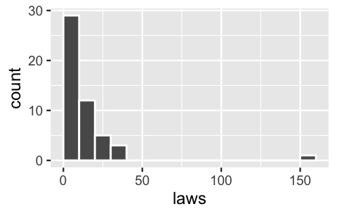
FIGURE 12.1: A histogram of the number of laws in each of the 50 states.
The state with 155 laws happens to be California. As a clear outlier, we’ll remove this state from our analysis:
# Identify the outlier
equality %>%
  filter(laws == max(laws))
# A tibble: 1 x 6
  state  region gop_2016  laws historical percent_urban
  <fct>  <fct>     <dbl> <dbl> <fct>              <dbl>
1 calif… west       31.6   155 dem                   95

# Remove the outlier
equality <- equality %>%
  filter(state != "california")
Next, in a scatterplot of the number of state laws versus its percent_urban population and historical voting patterns, notice that historically dem states and states with greater urban populations tend to have more LGBTQ+ anti-discrimination laws in place:
ggplot(equality, aes(y = laws, x = percent_urban, color = historical)) +
  geom_point()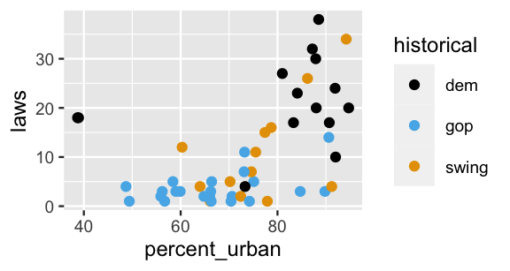
FIGURE 12.2: A scatterplot of the number of anti-discrimination laws in a state versus its urban population percentage and historical voting trends.
Using stan_glm(), we combine this data with our weak prior understanding to simulate the posterior Normal regression model of laws by percent_urban and historical voting trends.
In a quick posterior predictive check of this equality_normal_sim model, we compare a histogram of the observed anti-discrimination laws to five posterior simulated datasets (Figure 12.3).
(A histogram is more appropriate than a density plot here since our response variable is a non-negative count.)
The results aren’t good – the posterior predictions from this model do not match the features of the observed data.
You might not be surprised.
The observed number of anti-discrimination laws per state are right skewed (not Normal!).
In contrast, the datasets simulated from the posterior Normal regression model are roughly symmetric.
Adding insult to injury, these simulated datasets assume that it is quite common for states to have a negative number of laws (not possible!).
# Simulate the Normal model
equality_normal_sim <- stan_glm(laws ~ percent_urban + historical,
                                data = equality,
                                family = gaussian,
                                prior_intercept = normal(7, 1.5),
                                prior = normal(0, 2.5, autoscale = TRUE),
                                prior_aux = exponential(1, autoscale = TRUE),
                                chains = 4, iter = 5000*2, seed = 84735)

# Posterior predictive check
pp_check(equality_normal_sim, plotfun = "hist", nreps = 5) +
  geom_vline(xintercept = 0) +
  xlab("laws")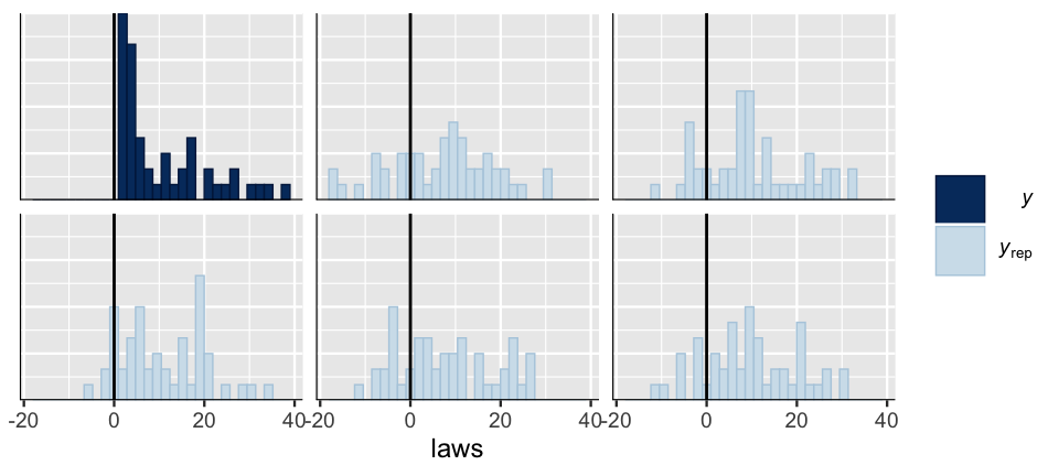
FIGURE 12.3: A posterior predictive check of the Normal regression model of anti-discrimination laws. A histogram of the observed laws (\(y\)) is plotted alongside five posterior simulated datasets (\(y_{\text{rep}}\)).
This sad result reveals the limits of our lone tool. Luckily, probability models come in all shapes, and we don’t have to force something to be Normal when it’s not.
You will extend the Normal regression model of a quantitative response variable \(Y\) to settings in which \(Y\) is a count variable whose dependence on predictors \(X\) is better represented by the Poisson or Negative Binomial, not Normal, models.
12.1 Building the Poisson regression model
12.1.1 Specifying the data model
Recall from Chapter 5 that the Poisson model is appropriate for modeling discrete counts of events (here anti-discrimination laws) that happen in a fixed interval of space or time (here states) and that, theoretically, have no upper bound. The Poisson is especially handy in cases like ours in which counts are right-skewed, and thus can’t reasonably be approximated by a Normal model. Moving forward, let’s assume a Poisson data model for the number of LGBTQ+ anti-discrimination laws in each state \(i\) (\(Y_i\)) where the rate of anti-discrimination laws \(\lambda_i\) depends upon demographic and voting trends (\(X_{i1}\), \(X_{i2}\), and \(X_{i3}\)):
\[Y_i | \lambda_i \stackrel{ind}{\sim} Pois\left(\lambda_i \right) .\]
Under this Poisson structure, the expected or average number of laws \(Y_i\) in states with similar predictor values \(X\) is captured by \(\lambda_i\):
\[E(Y_i | \lambda_i) = \lambda_i . \]
If we proceeded as in Normal regression, we might assume that the average number of laws is a linear combination of our predictors, \(\lambda_i = \beta_0 + \beta_1 X_{i1} + \beta_2 X_{i2} + \beta_3 X_{i3}\). This assumption is illustrated by the lines in Figure 12.4, one per historical voting trend.
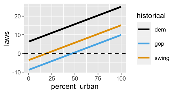
FIGURE 12.4: A graphical depiction of the (incorrect) assumption that, no matter the historical politics, the typical number of state laws is linearly related to urban population. The dashed horizontal line represents the x-axis.
Figure 12.4 highlights a flaw in assuming that the expected number of laws in a state, \(\lambda_i\), is a linear combination of percent_urban and historical. What is it?
When we assume that \(\lambda_i\) can be expressed by a linear combination of the \(X\) predictors, the model of \(\lambda_i\) spans both positive and negative values, and thus suggests that some states have a negative number of anti-discrimination laws. That doesn’t make sense. Like the number of laws, a Poisson rate \(\lambda_i\), must be positive. To avoid this violation, it is common to use a log link function.58 That is, we’ll assume that \(log(\lambda_i)\), which does span both positive and negative values, is a linear combination of the \(X\) predictors:
\[Y_i | \beta_0,\beta_1, \beta_2, \beta_3 \stackrel{ind}{\sim} Pois\left(\lambda_i \right) \;\;\; \text{ with } \;\;\; \log\left( \lambda_i \right) = \beta_0 + \beta_1 X_{i1} + \beta_2 X_{i2} + \beta_3 X_{i3} .\]
At the risk of projecting, interpreting the logged number of laws isn’t so easy. Instead, we can always transform the model relationship off the log scale by appealing to the fact that if \(\log(\lambda) = a\), then \(\lambda = e^a\) for natural number \(e\):
\[Y_i | \beta_0,\beta_1, \beta_2, \beta_3 \stackrel{ind}{\sim} Pois\left(\lambda_i\right) \;\; \text{ with } \;\; \lambda_i = e^{\beta_0 + \beta_1 X_{i1} + \beta_2 X_{i2} + \beta_3 X_{i3}} .\]
Figure 12.5 presents a prior plausible outcome for this model on both the \(\log(\lambda)\) and \(\lambda\) scales. In both cases there are three curves, one per historical voting category. On the \(\log(\lambda)\) scale, these curves are linear. Yet when transformed to the \(\lambda\) or (unlogged) laws scale, these curves are nonlinear and restricted to be at or above 0. This was the point – we want our model to preserve the fact that a state can’t have a negative number of laws.
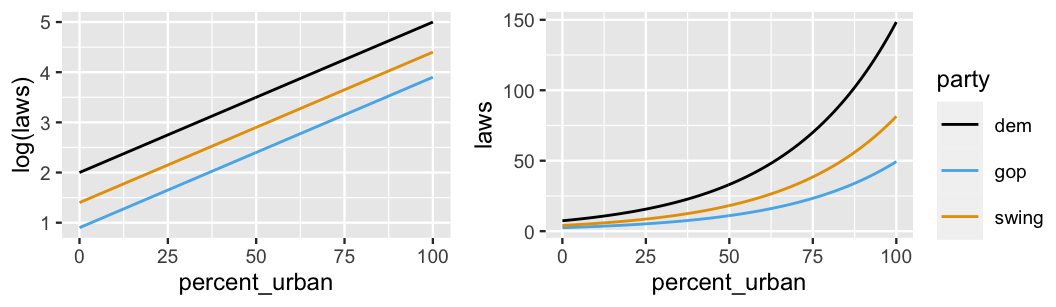
FIGURE 12.5: An example relationship between the logged number of laws (left) or number of laws (right) in a state with its urban percentage and historical voting trends.
The model curves on both the \(\log(\lambda)\) and \(\lambda\) scales are defined by the (\(\beta_0, \beta_1, \beta_2, \beta_3)\) parameters. When describing the linear model of the logged number of laws in a state, these parameters take on the usual meanings related to intercepts and slopes. Yet (\(\beta_0, \beta_1, \beta_2, \beta_3)\) take on new meanings when describing the nonlinear model of the (unlogged) number of laws in a state.
Interpreting Poisson regression coefficients
Consider two equivalent formulations of the Poisson regression model: \(Y|\beta_0,\beta_1,\ldots,\beta_p \sim \text{Pois}(\lambda)\) with
\[\begin{equation} \begin{split} \log(\lambda) & = \beta_0 + \beta_1 X_1 + \cdots \beta_p X_p \\ \lambda & = e^{\beta_0 + \beta_1 X_1 + \cdots \beta_p X_p}. \\ \end{split} \tag{12.1} \end{equation}\]
Interpreting \(\beta_0\)
When \(X_1, X_2, \ldots, X_p\) are all 0, \(\beta_0\) is the logged average \(Y\) value and \(e^{\beta_0}\) is the average \(Y\) value.
Interpreting \(\beta_1\) (and similarly \(\beta_2, \ldots, \beta_p\))
Let \(\lambda_x\) represent the average \(Y\) value when \(X_1 = x\) and \(\lambda_{x+1}\) represent the average \(Y\) value when \(X_1 = x + 1\). When we control for all other predictors \(X_2, \ldots, X_p\) and increase \(X_1\) by 1, from \(x\) to \(x + 1\): \(\beta_1\) is the change in the logged average \(Y\) value and \(e^{\beta_1}\) is the multiplicative change in the (unlogged) average \(Y\) value. That is,
\[\beta_1 = \log(\lambda_{x+1}) - \log(\lambda_x) \;\;\;\; \text{ and } \;\;\;\; e^{\beta_1} = \frac{\lambda_{x+1}}{\lambda_x} .\]
Let’s apply these concepts to the hypothetical models of the logged and unlogged number of state laws in Figure 12.5. In this figure, the curves are defined by:
\[\begin{equation} \begin{split} \log(\lambda) & = 2 + 0.03X_{i1} - 1.1X_{i2} - 0.6X_{i3} \\ \lambda & = e^{2 + 0.03X_{i1} - 1.1X_{i2} - 0.6X_{i3}}. \\ \end{split} \tag{12.2} \end{equation}\]
Consider the intercept parameter \(\beta_0 = 2\). This intercept reflects the trends in anti-discrimination laws in historically Democratic states with 0 urban population, i.e., states with \(X_{i1} = X_{i2} = X_{i3} = 0\). As such, we expect the logged number of laws in such states to be \(\beta_0 = 2\). More meaningfully, and equivalently, we expect historically Democratic states with 0 urban population to have roughly 7.4 anti-discrimination laws:
\[e^{\beta_0} = e^2 = 7.389 .\]
Now, since there are no states in which the urban population is close to 0, it doesn’t make sense to put too much emphasis on these interpretations of \(\beta_0\). Rather, we can just understand \(\beta_0\) as providing a baseline for our model, on both the \(\log(\lambda)\) and \(\lambda\) scales.
Next, consider the urban percentage coefficient \(\beta_1 = 0.03\).
On the linear \(\log(\lambda)\) scale, we can still interpret this value as the shared slope of the lines in Figure 12.5 (left).
Specifically, no matter a state’s historical voting trends, we expect the logged number of laws in states to increase by 0.03 for every extra percentage point in urban population.
We can interpret the relationship between state laws and urban percentage more meaningfully on the unlogged scale of \(\lambda\) by examining
\[e^{\beta_1} = e^{0.03} = 1.03 .\]
To this end, reexamine the nonlinear models of anti-discrimination laws in Figure 12.5 (right).
Though the model curves don’t increase by the same absolute amount for each incremental increase in percent_urban, they do increase by the same percentage.
Thus, instead of representing a linear slope, \(e^{\beta_1}\) measures the nonlinear percentage or multiplicative increase in the average number of laws with urban percentage.
In this case, if the urban population in one state is 1 percentage point greater than another state, we’d expect it to have 1.03 times the number of, or 3% more, anti-discrimination laws.
Finally, consider the GOP coefficient \(\beta_2 = -1.1\). Recall from Chapter 11 that when interpreting a coefficient for a categorical indicator, we must do so relative to the reference category, here Democrat leaning states. On the linear \(\log(\lambda)\) scale, \(\beta_2\) serves as the vertical difference between the GOP versus Democrat model lines in Figure 12.5 (left). Thus, at any urban percentage, we’d expect the logged number of laws to be 1.1 lower in historically GOP states than Democrat states. Though we also see a difference between the GOP and Democrat curves on the nonlinear \(\lambda\) scale (Figure 12.5 right), the difference isn’t constant – the gap in the number of laws widens as urban percentage increases. In this case, instead of representing a constant difference between two lines, \(e^{\beta_2}\) measures the percentage or multiplicative difference in the GOP versus Democrat curve. Thus, at any urban percentage level, we’d expect a historically GOP state to have 1/3 as many anti-discrimination laws as a historically Democrat state:
\[e^{\beta_2} = e^{-1.1} = 0.333 .\]
We conclude this section with the formal assumptions encoded by the Poisson data model.
Poisson regression assumptions
Consider the Bayesian Poisson regression model with \(Y_i | \beta_0,\beta_1, \ldots, \beta_p \stackrel{ind}{\sim} Pois\left(\lambda_i \right)\) where
\[\log\left( \lambda_i \right) = \beta_0 + \beta_1 X_{i1} + \cdots + \beta_p X_{ip} .\]
The appropriateness of this model depends upon the following assumptions.
- Structure of the data
Conditioned on predictors \(X\), the observed data \(Y_i\) on case \(i\) is independent of the observed data on any other case \(j\). - Structure of variable \(Y\)
Response variable \(Y\) has a Poisson structure, i.e., is a discrete count of events that happen in a fixed interval of space or time. - Structure of the relationship
The logged average \(Y\) value can be written as a linear combination of the predictors, \(\log\left( \lambda_i \right) = \beta_0 + \beta_1 X_{i1} + \beta_2 X_{i2}+ \beta_3 X_{i3}\). - Structure of the variability in \(Y\)
A Poisson random variable \(Y\) with rate \(\lambda\) has equal mean and variance, \(E(Y) = \text{Var}(Y) = \lambda\) (5.3). Thus, conditioned on predictors \(X\), the typical value of \(Y\) should be roughly equivalent to the variability in \(Y\). As such, the variability in \(Y\) increases as its mean increases. See Figure 12.6 for examples of when this assumption does and does not hold.
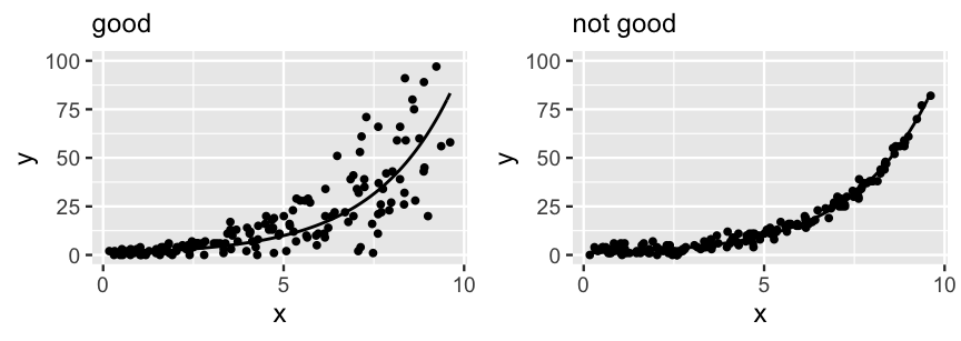
FIGURE 12.6: Two simulated datasets. The data on the left satisfies the Poisson regression assumption that, at any given \(X\), the variability in \(Y\) is roughly on par with the average \(Y\) value. The data on the right does not, exhibiting consistently low variability in \(Y\) across all \(X\) values.
12.1.2 Specifying the priors
To complete our Bayesian model, we must express our prior understanding of regression coefficients \((\beta_0, \beta_1, \beta_2, \beta_3)\). Since these coefficients can each take on any value on the real line, it’s again reasonable to utilize Normal priors. Further, as was the case for our Normal regression model, we’ll assume these priors (i.e., our prior understanding of the model coefficients) are independent. The complete representation of our Poisson regression model of \(Y_i\) is as follows:
\[\begin{equation} \begin{array}{lcrl} \text{data:} & \hspace{.025in} & Y_i|\beta_0,\beta_1,\beta_2,\beta_3 & \stackrel{ind}{\sim} Pois\left(\lambda_i \right) \;\; \text{ with } \;\; \log\left( \lambda_i \right) = \beta_0 + \beta_1 X_{i1} + \beta_2 X_{i2}+ \beta_3 X_{i3} \\ \text{priors:} & & \beta_{0c} & \sim N\left(2, 0.5^2 \right) \\ && \beta_1 & \sim N(0, 0.17^2) \\ && \beta_2 & \sim N(0, 4.97^2) \\ && \beta_3 & \sim N(0, 5.60^2) \\ \end{array} \tag{12.3} \end{equation}\]
First, consider the prior for the centered intercept \(\beta_{0c}\). Recall our prior assumption that the average number of laws in “typical” states is around \(\lambda = 7\). As such, we set the Normal prior mean for \(\beta_{0c}\) to 2 on the log scale:
\[\log(\lambda) = \log(7) \approx 1.95 .\]
Further, the range of this Normal prior indicates our relative uncertainty about this baseline. Though the logged average number of laws is most likely around 2, we think it could range from roughly 1 to 3 (\(2 \pm 2*0.5\)). Or, more intuitively, we think that the average number of laws in typical states might be somewhere between 3 and 20:
\[(e^1, e^3) \approx (3, 20).\]
Beyond this baseline, we again used weakly informative default priors for (\(\beta_1,\beta_2,\beta_3\)), tuned by stan_glm() below.
Being centered at zero with relatively large standard deviation on the scale of our variables, these priors reflect a general uncertainty about whether and how the number of anti-discrimination laws is associated with a state’s urban population and voting trends.
To examine whether these combined priors accurately reflect our uncertain understanding of state laws, we’ll simulate 20,000 draws from the prior models of \((\beta_0, \beta_1, \beta_2, \beta_3)\).
To this end, we can run the same stan_glm() function that we use to simulate the posterior with two new arguments: prior_PD = TRUE specifies that we wish to simulate the prior, and family = poisson indicates that we’re using a Poisson data model (not Normal or gaussian).
equality_model_prior <- stan_glm(laws ~ percent_urban + historical,
                                 data = equality,
                                 family = poisson,
                                 prior_intercept = normal(2, 0.5),
                                 prior = normal(0, 2.5, autoscale = TRUE),
                                 chains = 4, iter = 5000*2, seed = 84735,
                                 prior_PD = TRUE)
A call to prior_summary() confirms the specification of our weakly informative priors in (12.3):
prior_summary(equality_model_prior)Next, we plot 100 prior plausible models, \(e^{\beta_0 + \beta_1x_1 + \beta_2x_2 + \beta_3x_3}\). The mess of curves here certainly reflects our prior uncertainty! These are all over the map, indicating that the number of laws might increase or decrease with urban population and might or might not differ by historical voting trends. We don’t really know.
equality %>%
  add_fitted_draws(equality_model_prior, n = 100) %>%
  ggplot(aes(x = percent_urban, y = laws, color = historical)) +
    geom_line(aes(y = .value, group = paste(historical, .draw))) +
    ylim(0, 100)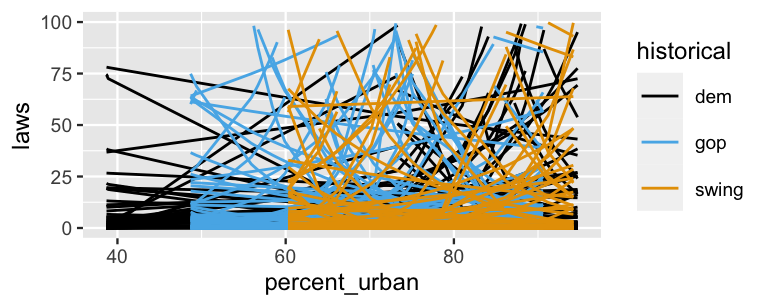
FIGURE 12.7: 100 prior plausible models of state anti-discrimination laws, \(e^{\beta_0 + \beta_1 x_1 + \beta_2 x_2 + \beta_3 x_3}\), under the prior models of \((\beta_0,\beta_1,\beta_2,\beta_3)\).
12.2 Simulating the posterior
With all the pieces in place, let’s simulate the Poisson posterior regression model of anti-discrimination laws versus urban population and voting trends (12.3).
Instead of starting from scratch with the stan_glm() function, we’ll take a shortcut: we update() the equality_model_prior simulation, indicating prior_PD = FALSE (i.e., we wish to simulate the posterior, not the prior).
equality_model <- update(equality_model_prior, prior_PD = FALSE)MCMC trace, density, and autocorrelation plots confirm that our simulation has stabilized:
mcmc_trace(equality_model)
mcmc_dens_overlay(equality_model)
mcmc_acf(equality_model)
And before we get too far into our analysis of these simulation results, a quick posterior predictive check confirms that we’re now on the right track (Figure 12.8). First, histograms of just five posterior simulations of state law data exhibit similar skew, range, and trends as the observed law data. Second, though density plots aren’t the best display of count data, they allow us to more directly compare a broader range of 50 posterior simulated datasets to the actual observed law data. These simulations aren’t perfect, but they do reasonably capture the features of the observed law data.
set.seed(1)
pp_check(equality_model, plotfun = "hist", nreps = 5) +
  xlab("laws")
pp_check(equality_model) +
  xlab("laws")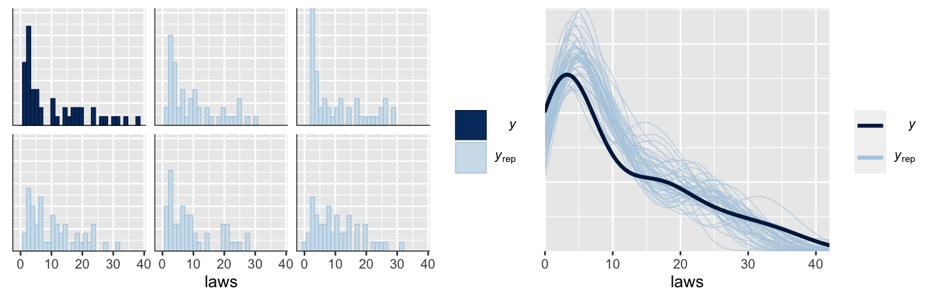
FIGURE 12.8: A posterior predictive check of the Poisson regression model of anti-discrimination laws compares the observed laws (\(y\)) to five posterior simulated datasets (\(y_{\text{rep}}\)) via histograms (left) and to 50 posterior simulated datasets via density plots (right).
12.3 Interpreting the posterior
With the reassurance that our model isn’t too wrong, let’s dig into the posterior results, beginning with the big picture. The 50 posterior plausible models in Figure 12.9, \(\lambda = e^{\beta_0 + \beta_1X_1 + \beta_2X_2 + \beta_3X_3}\), provide insight into our overall understanding of anti-discrimination laws.
equality %>%
  add_fitted_draws(equality_model, n = 50) %>%
  ggplot(aes(x = percent_urban, y = laws, color = historical)) +
    geom_line(aes(y = .value, group = paste(historical, .draw)),
              alpha = .1) +
    geom_point(data = equality, size = 0.1)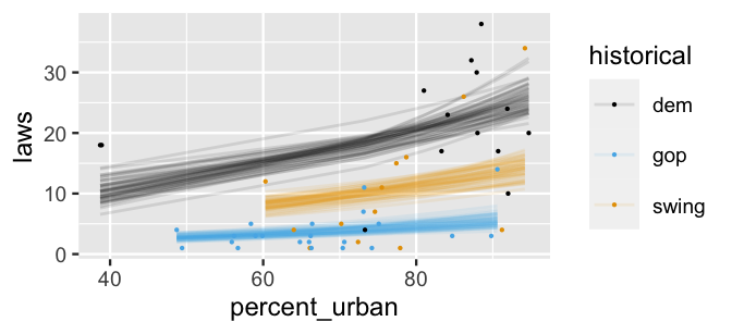
FIGURE 12.9: 50 posterior plausible models for the relationship of a state’s number of anti-discrimination laws with its urban population rate and historical voting trends.
Unlike the prior plausible models in Figure 12.7, which were all over the place, the messages are clear.
At any urban population level, historically dem states tend to have the most anti-discrimination laws and gop states the fewest.
Further, the number of laws in a state tend to increase with urban percentage.
To dig into the details, we can examine the posterior models for the regression parameters \(\beta_0\) (Intercept), \(\beta_1\) (percent_urban), \(\beta_2\) (historicalgop), and \(\beta_3\) (historicalswing):
tidy(equality_model, conf.int = TRUE, conf.level = 0.80)
# A tibble: 4 x 5
  term            estimate std.error conf.low conf.high
  <chr>              <dbl>     <dbl>    <dbl>     <dbl>
1 (Intercept)       1.71     0.303     1.31      2.09
2 percent_urban     0.0164   0.00353   0.0119    0.0210
3 historicalgop    -1.52     0.134    -1.69     -1.34
4 historicalswing  -0.610    0.103    -0.745    -0.477
Thus, the posterior median relationship of a state’s number of anti-discrimination laws with its urban population and historical voting trends can be described by:
\[\begin{equation} \begin{split} \log(\lambda_i) & = 1.71 + 0.0164 X_{i1} - 1.52 X_{i2} - 0.61 X_{i3} \\ \lambda_i & = e^{1.71 + 0.0164 X_{i1} - 1.52 X_{i2} - 0.61 X_{i3}}. \\ \end{split} \tag{12.4} \end{equation}\]
Consider the percent_urban coefficient \(\beta_1\), which has a posterior median of roughly 0.0164.
Then, when controlling for historical voting trends, we expect the logged number of anti-discrimination laws in states to increase by 0.0164 for every extra percentage point in urban population.
More meaningfully (on the unlogged scale), if the urban population in one state is 1 percentage point greater than another state, we’d expect it to have 1.0165 times the number of, or 1.65% more, anti-discrimination laws:
\[e^{0.0164} = 1.0165 .\]
Or, if the urban population in one state is 25 percentage points greater than another state, we’d expect it to have roughly one and a half times the number of, or 51% more, anti-discrimination laws (\(e^{25 \cdot 0.0164} = 1.5068\)).
Take a quick quiz to similarly interpret the \(\beta_3\) coefficient for historically swing states.59
The posterior median of \(\beta_3\) is roughly -0.61. Correspondingly, \(e^{-0.61}\) \(=\) 0.54. How can we interpret this value? When holding constant percent_urban…
- The number of anti-discrimination laws tends to decrease by roughly 54 percent for every extra
swingstate. swingstates tend to have 54 percent as many anti-discrimination laws asdemleaning states.swingstates tend to have 0.54 fewer anti-discrimination laws thandemleaning states.
The key here is remembering that the categorical swing state indicator provides a comparison to the dem state reference level.
Then, when controlling for a state’s urban population, we’d expect the logged number of anti-discrimination laws to be 0.61 lower in a swing state than in a dem leaning state.
Equivalently, on the unlogged scale, swing states tend to have 54 percent as many anti-discrimination laws as dem leaning states (\(e^{-0.61} = 0.54\)).
In closing out our posterior interpretation, notice that the 80% posterior credible intervals for (\(\beta_1, \beta_2, \beta_3)\) in the above tidy() summary provide evidence that each coefficient significantly differs from 0.
For example, there’s an 80% posterior chance that the percent_urban coefficient \(\beta_1\) is between 0.0119 and 0.021.
Thus, when controlling for a state’s historical political leanings, there’s a significant positive association between the number of anti-discrimination laws in a state and its urban population.
Further, when controlling for a state’s percent_urban makeup, the number of anti-discrimination laws in gop leaning and swing states tend to be significantly below that of dem leaning states – the 80% credible intervals for \(\beta_2\) and \(\beta_3\) both fall below 0.
These conclusions are consistent with the posterior plausible models in Figure 12.9.
12.4 Posterior prediction
To explore how the general Poisson model plays out in individual states, consider the state of Minnesota, a historically dem state with 73.3% of residents residing in urban areas and 4 anti-discrimination laws:
equality %>%
  filter(state == "minnesota")
# A tibble: 1 x 6
  state  region gop_2016  laws historical percent_urban
  <fct>  <fct>     <dbl> <dbl> <fct>              <dbl>
1 minne… midwe…     44.9     4 dem                 73.3
Based on the state’s demographics and political leanings, we can approximate a posterior predictive model for its number of anti-discrimination laws. Importantly, reflecting the Poisson data structure of our model, the 20,000 simulated posterior predictions are counts:
# Calculate posterior predictions
set.seed(84735)
mn_prediction <- posterior_predict(
  equality_model, newdata = data.frame(percent_urban = 73.3,
                                       historical = "dem"))
head(mn_prediction, 3)
      1
[1,] 20
[2,] 17
[3,] 21
The resulting posterior predictive model anticipates that Minnesota has between 10 and 30 anti-discrimination laws (roughly), a range that falls far above the actual number of laws in that state (4). This discrepancy reveals that a state’s demographics and political leanings, and thus our Poisson model, don’t tell the full story behind its anti-discrimination laws. It also reveals something about Minnesota itself. For a state with such a high urban population and historically Democratic voting trends, it has an unusually small number of anti-discrimination laws. (Again, the number of laws in a state isn’t necessarily a proxy for the overall quality of laws.)
mcmc_hist(mn_prediction, binwidth = 1) +
  geom_vline(xintercept = 4) +
  xlab("Predicted number of laws in Minnesota")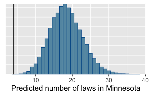
FIGURE 12.10: Posterior predictive model of the number of anti-discrimination laws in Minnesota. The vertical line marks the actual number of laws, 4.
Recall that we needn’t use the posterior_predict() shortcut function to simulate the posterior predictive model for Minnesota.
Rather, we could directly predict the number of laws in that state from each of the 20,000 posterior plausible parameter sets \(\left(\beta_0^{(i)}, \beta_1^{(i)}, \beta_2^{(i)}, \beta_3^{(i)}\right)\).
To this end, from each parameter set we:
calculate the logged average number of laws in states like Minnesota, with a 73.3% urban percentage and historically Democrat voting patterns:
\[\log(\lambda^{(i)}) = \beta_0^{(i)} + \beta_1^{(i)}\cdot 73.3 + \beta_2^{(i)}\cdot0 + \beta_3^{(i)} \cdot 0;\]
transform \(\log(\lambda^{(i)})\) to obtain the (unlogged) average number of laws in states like Minnesota, \(\lambda^{(i)}\); and
simulate a Pois\(\left(\lambda^{(i)}\right)\) outcome for the number of laws in Minnesota, \(Y_{\text{new}}^{(i)}\), using
rpois().
The result matches the shortcut!
# Predict number of laws for each parameter set in the chain
set.seed(84735)
as.data.frame(equality_model) %>%
  mutate(log_lambda = `(Intercept)` + percent_urban*73.3 +
           historicalgop*0 + historicalswing*0,
         lambda = exp(log_lambda),
         y_new = rpois(20000, lambda = lambda)) %>%
  ggplot(aes(x = y_new)) +
    stat_count()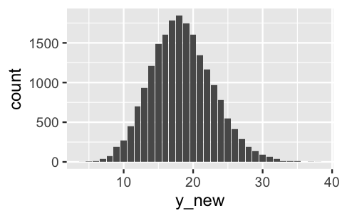
FIGURE 12.11: Posterior predictive model of the number of anti-discrimination laws in Minnesota, simulated from scratch.
12.5 Model evaluation
To close out our analysis, let’s evaluate the quality of our Poisson regression model of anti-discrimination laws.
The first two of our model evaluation questions are easy to answer.
How fair is our model?
Though we don’t believe there to be bias in the data collection process, we certainly do warn against mistaking the general state-level trends revealed by our analysis as cause to make assumptions about individuals based on their voting behavior or where they live.
Further, as we noted up front, an analysis of the number of state laws shouldn’t be confused with an analysis of the quality of state laws.
How wrong is our model?
Our pp_check() in Figure 12.8 demonstrated that our Poisson regression assumptions are reasonable.
Consider the third model evaluation question: How accurate are our model predictions?
As we did for the state of Minnesota, we can examine the posterior predictive models for each of the 49 states in our dataset.
The plot below illustrates the posterior predictive credible intervals for the number of laws in each state alongside the actual observed data.
Overall, our model does better at anticipating the number of laws in gop states than in dem or swing states – more of the observed gop data points fall within the bounds of their credible intervals.
As exhibited by the narrower intervals, we also have more posterior certainty about the gop states where the number of laws tends to be consistently small.
# Simulate posterior predictive models for each state
set.seed(84735)
poisson_predictions <- posterior_predict(equality_model, newdata = equality)

# Plot the posterior predictive models for each state
ppc_intervals_grouped(equality$laws, yrep = poisson_predictions,
                      x = equality$percent_urban,
                      group = equality$historical,
                      prob = 0.5, prob_outer = 0.95,
                      facet_args = list(scales = "fixed"))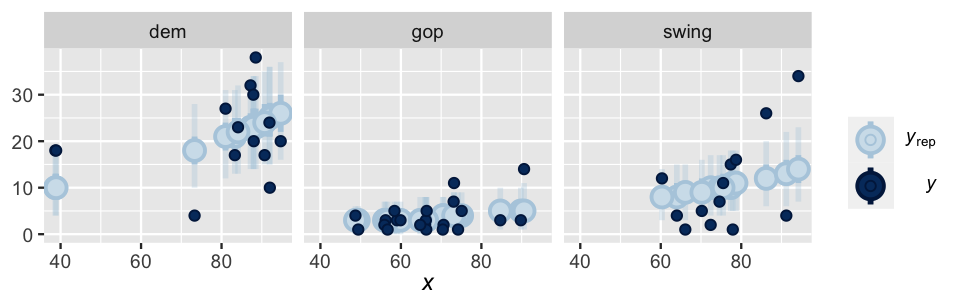
FIGURE 12.12: 50% and 95% posterior credible intervals (blue lines) for the number of anti-discrimination laws in a state. The actual number of laws are represented by the dark blue dots.
We can formalize our observations from Figure 12.12 with a prediction_summary().
Across the 49 states in our study, the observed numbers of anti-discrimination laws tend to fall only 3.4 laws, or 1.3 posterior standard deviations, from their posterior mean predictions.
Given the range of the number of state laws, from 1 to 38, a typical prediction error of 3.4 is pretty good!
Countering this positive with a negative, the observed number of laws for only roughly 78% of the states fall within their corresponding 95% posterior prediction interval.
This means that our posterior predictive models “missed” or didn’t anticipate the number of laws in 22%, or 11, of the 49 states.
prediction_summary(model = equality_model, data = equality)
    mae mae_scaled within_50 within_95
1 3.407      1.304    0.3265    0.7755
For due diligence, we also calculate the cross-validated posterior predictive accuracy in applying this model to a “new” set of 50 states, or the same set of 50 states under the recognition that our current data is just a random snapshot in time. In this case, the results are similar, suggesting that our model is not overfit to our sample data – we expect it to perform just as well at predicting “new” states.
# Cross-validation
set.seed(84735)
poisson_cv <- prediction_summary_cv(model = equality_model,
                                    data = equality, k = 10)
poisson_cv$cv
    mae mae_scaled within_50 within_95
1 3.788      1.264       0.3     0.725
12.6 Negative Binomial regression for overdispersed counts
In 2017, Cards Against Humanity Saves America launched a series of monthly surveys in order to get the “Pulse of the nation” (2017). We’ll use their September 2017 poll results to model the number of books somebody has read in the past year (\(Y\)) by two predictors: their age (\(X_1\)) and their response to the question of whether they’d rather be wise but unhappy or happy but unwise:
\[X_2 = \begin{cases} 1 & \text{wise but unhappy} \\ 0 & \text{otherwise (i.e., happy but unwise)}. \\ \end{cases}\]
Because we really don’t have any prior understanding of this relationship, we’ll utilize weakly informative priors throughout our analysis.
Moving on, let’s load and process the pulse_of_the_nation data from the bayesrules package.
In doing so, we’ll remove some outliers, focusing on people that read fewer than 100 books:
# Load data
data(pulse_of_the_nation)
pulse <- pulse_of_the_nation %>%
  filter(books < 100)
Figure 12.13 reveals some basic patterns in readership. First, though most people read fewer than 11 books per year, there is a lot of variability in reading patterns from person to person. Further, though there appears to be a very weak relationship between book readership and one’s age, readership appears to be slightly higher among people that would prefer wisdom over happiness (makes sense to us!).
ggplot(pulse, aes(x = books)) +
  geom_histogram(color = "white")
ggplot(pulse, aes(y = books, x = age)) +
  geom_point()
ggplot(pulse, aes(y = books, x = wise_unwise)) +
  geom_boxplot()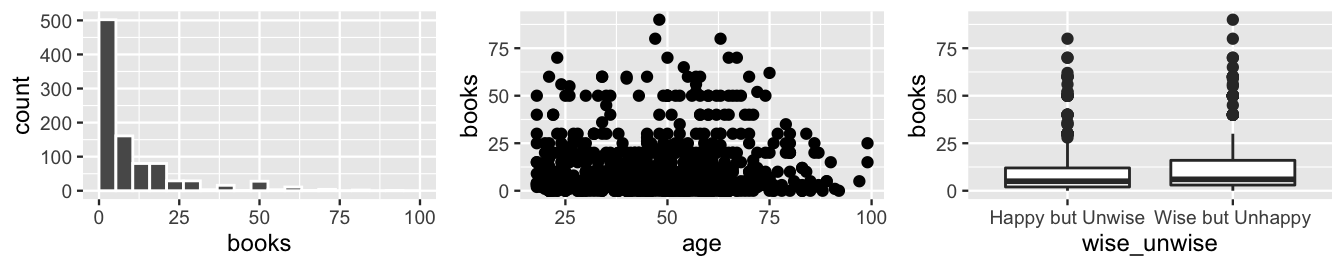
FIGURE 12.13: Survey responses regarding the number of books a person has read in the past year, and how this is associated with age and a person’s prioritization of wisdom versus happiness.
Given the skewed, count structure of our books variable \(Y\), the Poisson regression tool is a reasonable first approach to modeling readership by a person’s age and their prioritization of wisdom versus happiness:
books_poisson_sim <- stan_glm(
  books ~ age + wise_unwise,
  data = pulse, family = poisson,
  prior_intercept = normal(0, 2.5, autoscale = TRUE),
  prior = normal(0, 2.5, autoscale = TRUE),
  prior_aux = exponential(1, autoscale = TRUE),
  chains = 4, iter = 5000*2, seed = 84735)
BUT the results are definitely not great.
Check out the pp_check() in Figure 12.14.
pp_check(books_poisson_sim) +
  xlab("books")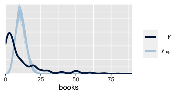
FIGURE 12.14: Posterior predictive summary for the Poisson regression model of readership.
Counter to the observed book readership, which is right skewed and tends to be below 11 books per year, the Poisson posterior simulations of readership are symmetric around 11 books year.
Simply put, the Poisson regression model is wrong.
Why?
Well, recall that Poisson regression preserves the Poisson property of equal mean and variance.
That is, it assumes that among subjects of similar age and perspectives on wisdom versus happiness (\(X_1\) and \(X_2\)), the typical number of books read is roughly equivalent to the variability in books read.
Yet the pp_check() highlights that, counter to this assumption, we actually observe high variability in book readership relative to a low average readership.
We can confirm this observation with some numerical summaries.
First, the discrepancy in the mean and variance in readership is true across all subjects in our survey.
On average, people read 10.9 books per year, but the variance in book readership was a whopping 198 \(\text{books}^2\):
# Mean and variability in readership across all subjects
pulse %>%
  summarize(mean = mean(books), var = var(books))
# A tibble: 1 x 2
   mean   var
  <dbl> <dbl>
1  10.9  198.
When we cut() the age range into three groups, we see that this is also true among subjects in the same general age bracket and with the same take on wisdom versus happiness, i.e., among subjects with similar \(X_1\) and \(X_2\) values.
For example, among respondents in the 45 to 72 year age bracket that prefer wisdom to happiness, the average readership was 12.5 books, a relatively small number in comparison to the variance of 270 \(\text{books}^2\).
# Mean and variability in readership
# among subjects of similar age and wise_unwise response
pulse %>%
  group_by(cut(age,3), wise_unwise) %>%
  summarize(mean = mean(books), var = var(books))
# A tibble: 6 x 4
# Groups:   cut(age, 3) [3]
  `cut(age, 3)` wise_unwise       mean   var
  <fct>         <fct>            <dbl> <dbl>
1 (17.9,45]     Happy but Unwise  9.23 138.
2 (17.9,45]     Wise but Unhappy 12.6  195.
3 (45,72]       Happy but Unwise  9.36 183.
4 (45,72]       Wise but Unhappy 12.5  270.
5 (72,99.1]     Happy but Unwise 12.6  236.
6 (72,99.1]     Wise but Unhappy 10.2   97.0
In this case, we say that book readership \(Y\) is overdispersed.
Overdispersion
A random variable \(Y\) is overdispersed if the observed variability in \(Y\) exceeds the variability expected by the assumed probability model of \(Y\).
When our count response variable \(Y\) is too overdispersed to squeeze into the Poisson regression assumptions, we have some options. Two common options, which produce similar results, are to (1) include an overdispersion parameter in the Poisson data model or (2) utilize a non-Poisson data model. Since it fits nicely into the modeling framework we’ve established, we’ll focus on the latter approach. To this end, the Negative Binomial probability model is a useful alternative to the Poisson when \(Y\) is overdispersed. Like the Poisson model, the Negative Binomial is suitable for count data \(Y \in \{0,1,2,\ldots\}\). Yet unlike the Poisson, the Negative Binomial does not make the restrictive assumption that \(E(Y) = \text{Var}(Y)\).
The Negative Binomial model
Let random variable \(Y\) be some count, \(Y \in \{0,1,2,\ldots\}\), that can be modeled by the Negative Binomial with mean parameter \(\mu\) and reciprocal dispersion parameter \(r\):
\[Y | \mu, r \; \sim \; \text{NegBin}(\mu, r).\]
Then \(Y\) has conditional pmf
\[\begin{equation} f(y|\mu,r) = \left(\!\begin{array}{c} y + r - 1 \\ r \end{array}\!\right) \left(\frac{r}{\mu + r} \right)^r \left(\frac{\mu}{\mu + r} \right)^y\;\; \text{ for } y \in \{0,1,2,\ldots\} \tag{12.5} \end{equation}\]
with unequal mean and variance:
\[E(Y|\mu,r) = \mu \;\; \text{ and } \;\; \text{Var}(Y|\mu,r) = \mu + \frac{\mu^2}{r}.\]
Comparisons to the Poisson model
For large reciprocal dispersion parameters \(r\), \(\text{Var}(Y) \approx E(Y)\) and \(Y\) behaves much like a Poisson count variable. For small \(r\), \(\text{Var}(Y) > E(Y)\) and \(Y\) is overdispersed in comparison to a Poisson count variable with the same mean. Figure 12.15 illustrates these themes by example.
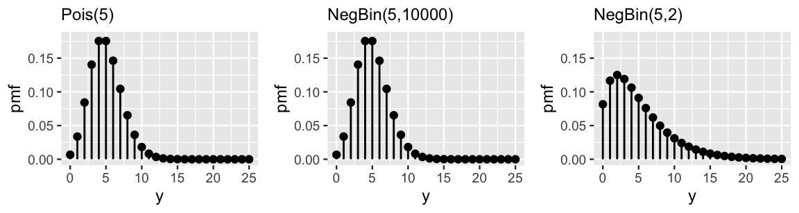
FIGURE 12.15: Pmfs for various Poisson and Negative Binomial random variables with a common mean of 5. The Negative Binomial model with a large dispersion parameter (r = 10000) is very similar to the Poisson, whereas that with a small dispersion parameter (r = 2) is relatively overdispersed.
To make the switch to the more flexible Negative Binomial regression model of readership, we can simply swap out a Poisson data model for a Negative Binomial data model.
In doing so, we also pick up the extra reciprocal dispersion parameter, \(r > 0\), for which the Exponential provides a reasonable prior structure.
Our Negative Binomial regression model, along with the weakly informative priors scaled by stan_glm() and obtained by prior_summary(), follows:
\[\begin{equation} \begin{array}{lcrl} \text{data:} & \hspace{.025in} & Y_i|\beta_0,\beta_1,\beta_2,r & \stackrel{ind}{\sim} \text{NegBin}\left(\mu_i, r \right) \;\; \text{ with } \;\; \log\left( \mu_i \right) = \beta_0 + \beta_1 X_{i1} + \beta_2 X_{i2} \\ \text{priors:} & & \beta_{0c} & \sim N\left(0, 2.5^2\right) \\ & & \beta_1 & \sim N\left(0, 0.15^2\right) \\ & & \beta_2 & \sim N\left(0, 5.01^2\right) \\ & & r & \sim \text{Exp}(1)\\ \end{array} \tag{12.6} \end{equation}\]
Similarly, to simulate the posterior of regression parameters \((\beta_0,\beta_1,\beta_2,r)\), we can swap out poisson for neg_binomial_2 in stan_glm():
books_negbin_sim <- stan_glm(
  books ~ age + wise_unwise,
  data = pulse, family = neg_binomial_2,
  prior_intercept = normal(0, 2.5, autoscale = TRUE),
  prior = normal(0, 2.5, autoscale = TRUE),
  prior_aux = exponential(1, autoscale = TRUE),
  chains = 4, iter = 5000*2, seed = 84735)

# Check out the priors
prior_summary(books_negbin_sim)
The results are fantastic. By incorporating more flexible assumptions about the variability in book readership, the posterior simulation of book readership very closely matches the observed behavior in our survey data (Figure 12.16). That is, the Negative Binomial regression model is not wrong (or, at least is much less wrong than the Poisson model).
pp_check(books_negbin_sim) +
  xlim(0, 75) +
  xlab("books")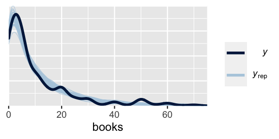
FIGURE 12.16: A posterior predictive check for the Negative Binomial regression model of readership.
With this peace of mind, we can continue just as we would with a Poisson analysis.
Mainly, since it utilizes a log transform, the interpretation of the Negative Binomial regression coefficients follows the same framework as in the Poisson setting.
Consider some posterior punchlines, supported by the tidy() summaries below:
- When controlling for a person’s prioritization of wisdom versus happiness, there’s no significant association between age and book readership – 0 is squarely in the 80% posterior credible interval for
agecoefficient \(\beta_1\). - When controlling for a person’s age, people that prefer wisdom over happiness tend to read more than those that prefer happiness over wisdom – the 80% posterior credible interval for \(\beta_2\) is comfortably above 0. Assuming they’re the same age, we’d expect a person that prefers wisdom to read 1.3 times as many, or 30% more, books as somebody that prefers happiness (\(e^{0.266} = 1.3\)).
# Numerical summaries
tidy(books_negbin_sim, conf.int = TRUE, conf.level = 0.80)
# A tibble: 3 x 5
  term            estimate std.error conf.low conf.high
  <chr>              <dbl>     <dbl>    <dbl>     <dbl>
1 (Intercept)     2.23       0.131    2.07      2.41
2 age             0.000365   0.00239 -0.00270   0.00339
3 wise_unwiseWis… 0.266      0.0798   0.162     0.368
12.7 Generalized linear models: Building on the theme
Though the Normal, Poisson, and Negative Binomial data structures are common among Bayesian regression models, we’re not limited to just these options.
We can also use stan_glm() to fit models with Binomial, Gamma, inverse Normal, and other data structures.
All of these options belong to a larger class of generalized linear models (GLMs).
We needn’t march through every single GLM to consider them part of our toolbox. We can build a GLM with any of the above data structures by drawing upon the principles we’ve developed throughout Unit 3. First, it’s important to note the structure in our response variable \(Y\). Is \(Y\) discrete or continuous? Symmetric or skewed? What range of values can \(Y\) take? These questions can help us identify an appropriate data structure. Second, let \(E(Y|\ldots)\) denote the average \(Y\) value as defined by its data structure. For all GLMs, the dependence of \(E(Y|\ldots)\) on a linear combination of predictors \((X_1, X_2, ..., X_p)\) is expressed by
\[g\left(E(Y|\ldots)\right) = \beta_0 + \beta_1 X_1 + \beta_2 X_2 + \cdots + \beta_p X_p\]
where the appropriate link function \(g(\cdot)\) depends upon the data structure. For example, in Normal regression, the data is modeled by
\[Y_i | \beta_0, \beta_1, \cdots, \beta_p, \sigma \sim N(\mu_i, \sigma^2)\]
and the dependence of \(E(Y_i | \beta_0, \beta_1, \cdots, \beta_p, \sigma) = \mu_i\) on the predictors by
\[g(\mu_i) = \mu_i = \beta_0 + \beta_1 X_{i1} + \beta_2 X_{i2} + \cdots + \beta_p X_{ip} .\]
Thus, Normal regression utilizes an identity link function since \(g(\mu_i)\) is equal to \(\mu_i\) itself. In Poisson regression, the count data is modeled by
\[Y_i | \beta_0, \beta_1, \cdots, \beta_p \sim Pois(\lambda_i)\]
and the dependence of \(E(Y_i | \beta_0, \beta_1, \cdots, \beta_p) = \lambda_i\) on the predictors by
\[g(\lambda_i) := \log(\lambda_i) = \beta_0 + \beta_1 X_{i1} + \beta_2 X_{i2} + \cdots + \beta_p X_{ip} .\]
Thus, Poisson regression utilizes a log link function since \(g(\lambda_i) = \log(\lambda_i)\). The same is true for Negative Binomial regression. We’ll dig into one more GLM, logistic regression, in the next chapter. We hope that our survey of these four specific tools (Normal, Poisson, Negative Binomial, and logistic regression) empowers you to implement other GLMs in your own Bayesian practice.
12.8 Chapter summary
Let response variable \(Y \in \{0,1,2,\ldots\}\) be a discrete count of events that occur in a fixed interval of time or space. In this context, using Normal regression to model \(Y\) by predictors \((X_1,X_2,\ldots,X_p)\) is often inappropriate – it assumes that \(Y\) is symmetric and can be negative. The Poisson regression model offers a promising alternative:
\[\begin{equation} \begin{array}{lcrl} \text{data:} & \hspace{.025in} & Y_i|\beta_0,\beta_1,\ldots,\beta_p & \stackrel{ind}{\sim} Pois\left(\lambda_i \right) \;\; \text{ with } \;\; \log\left( \lambda_i \right) = \beta_0 + \beta_1 X_{i1} + \cdots + \beta_p X_{ip} \\ \text{priors:} & & \beta_{0c} & \sim N(m_0, s_0^2) \\ & & \beta_{1} & \sim N(m_1, s_1^2) \\ && \vdots & \\ & & \beta_{p} & \sim N(m_p, s_p^2) \\ \end{array} \tag{12.7} \end{equation}\]
One major constraint of Poisson regression is its assumption that, at any set of predictor values, the typical value of \(Y\) and variability in \(Y\) are equivalent. Thus, when \(Y\) is overdispersed, i.e., its variability exceeds assumptions, we might instead utilize the more flexible Negative Binomial regression model:
\[\begin{equation} \begin{array}{lcrl} \text{data:} & \hspace{.025in} & Y_i|\beta_0,\beta_1,\ldots,\beta_p,r & \stackrel{ind}{\sim} \text{NegBin}\left(\mu_i, r \right) \;\; \text{ with } \;\; \log\left( \mu_i \right) = \beta_0 + \beta_1 X_{i1} + \cdots + \beta_p X_{ip} \\ \text{priors:} & & \beta_{0c} & \sim N(m_0, s_0^2) \\ & & \beta_{1} & \sim N(m_1, s_1^2) \\ && \vdots & \\ & & \beta_{p} & \sim N(m_p, s_p^2) \\ & & r & \sim \text{Exp}(\ldots)\\ \end{array} \tag{12.8} \end{equation}\]
12.9 Exercises
12.9.1 Conceptual exercises
- Give a new example (i.e., not the same as from the chapter) in which we would want to use a Poisson, instead of Normal, regression model.
- The Poisson regression model uses a log link function, while the Normal regression model uses an identity link function. Explain in one or two sentences what a link function is.
- Explain why the log link function is used in Poisson regression.
- List the four assumptions for a Poisson regression model.
- The response variable is a count.
- The link is a log.
- The link is the identity.
- We need to account for overdispersion.
- The response is a count variable, and as the expected response increases, the variability also increases.
- What’s the shortcoming of Poisson regression?
- How does Negative Binomial regression address the shortcoming of Poisson regression?
- Are there any situations in which Poisson regression would be a better choice than Negative Binomial?
Exercise 12.4 (Interpreting Poisson regression coefficients) As modelers, the ability to interpret regression coefficients is of utmost importance. Let \(Y\) be the number of “Likes” a tweet gets in an hour, \(X_1\) be the number of followers the person who wrote the tweet has, and \(X_2\) indicate whether the tweet includes an emoji (\(X_2=1\) if there is an emoji, \(X_2= 0\) if there is no emoji). Further, suppose \(Y|\beta_0, \beta_1, \beta_2 \sim \text{Pois}(\lambda)\) with
\[\text{log}(\lambda) = \beta_0 + \beta_1X_{1} + \beta_2X_{2} .\]- Interpret \(e^{\beta_0}\) in context.
- Interpret \(e^{\beta_1}\) in context.
- Interpret \(e^{\beta_2}\) in context.
- Provide the model equation for the expected number of “Likes” for a tweet in one hour, when the person who wrote the tweet has 300 followers, and the tweet does not use an emoji.
12.9.2 Applied exercises
bald_eagles data in the bayesrules package, which includes data on bald eagle sightings during 37 different one-week observation periods. First, get to know this data.
- Construct and discuss a univariate plot of
count, the number of eagle sightings across the observation periods. - Construct and discuss a plot of
countversusyear. - In exploring the number of eagle sightings over time, it’s important to consider the fact that the length of the observation periods vary from year to year, ranging from 134 to 248.75 hours. Update your plot from part b to also include information about the observation length in
hoursand comment on your findings.
- Simulate the model posterior and check the
prior_summary(). - Use careful notation to write out the complete Bayesian structure of the Normal regression model of \(Y\) by \(X_1\) and \(X_2\).
- Complete a
pp_check()for the Normal model. Use this to explain whether the model is “good” and, if not, what assumptions it makes that are inappropriate for the bald eagle analysis.
- In the bald eagle analysis, why might a Poisson regression approach be more appropriate than a Normal regression approach?
- Simulate the posterior of the Poisson regression model of \(Y\) versus \(X_1\) and \(X_2\). Check the
prior_summary(). - Use careful notation to write out the complete Bayesian structure of the Poisson regression model of \(Y\) by \(X_1\) and \(X_2\).
- Complete a
pp_check()for the Poisson model. Use this to explain whether the model is “good” and, if not, what assumptions it makes that are inappropriate for the bald eagle analysis.
- Simulate the model posterior and use a
pp_check()to confirm whether the Negative Binomial model is reasonable. - Use careful notation to write out the complete Bayesian structure of the Negative Binomial regression model of \(Y\) by \(X_1\) and \(X_2\).
- Interpret the posterior median estimates of the regression coefficients on
yearandhours, \(\beta_1\) and \(\beta_2\). Do so on the unlogged scale. - Construct and interpret a 95% posterior credible interval for the
yearcoefficient. - When controlling for the number of observation hours, do we have ample evidence that the rate of eagle sightings has increased over time?
- How fair is the model?
- How wrong is the model?
- How accurate are the model predictions?
airbnb_small data in the bayesrules package contains information on AirBnB rentals in Chicago. This data was originally collated by Trinh and Ameri (2016) and distributed by Legler and Roback (2021). In this open-ended exercise, build, interpret, and evaluate a model of the number of reviews an AirBnB property has by its rating, district, room_type, and the number of guests it accommodates.