Chapter 15 Hierarchical Models are Exciting
Welcome to Unit 4!
Unit 4 is all about hierarchies. Used in the sentence “my workplace is so hierarchical,” this word might have negative connotations. In contrast, “my Bayesian model is so hierarchical” often connotes a good thing! Hierarchical models greatly expand the flexibility of our modeling toolbox by accommodating hierarchical, or grouped data. For example, our data might consist of:
- a sampled group of schools and data \(y\) on multiple individual students within each school; or
- a sampled group of labs and data \(y\) from multiple individual experiments within each lab; or
- a sampled group of people on whom we make multiple individual observations of information \(y\) over time.
Ignoring this type of underlying grouping structure violates the assumption of independent data behind our Unit 3 models and, in turn, can produce misleading conclusions. In Unit 4, we’ll explore techniques that empower us to build this hierarchical structure into our models:
- Chapter 15: Why you should be excited about hierarchical modeling
- Chapter 16: (Normal) hierarchical models without predictors
- Chapter 17: (Normal) hierarchical models with predictors
- Chapter 18: Non-Normal hierarchical models
- Chapter 19: Adding more layers
Before we do, we want to point out that we’re using “hierarchical” as a blanket term for group-structured models. Across the literature, these are referred to as multilevel, mixed effects, or random effects models. These terms can serve to confuse, especially since some people use them interchangeably and others use them to make minor distinctions in group-structured models. It’s kind of like “pop” vs “soda” vs “cola.” We’ll avoid that confusion here but point it out so that you’re able to make that connection outside this book.
Before pivoting to hierarchical models, it’s crucial that we understand why we’d ever want to do so.
In Chapter 15, our sole purpose is to address this question.
We won’t build or interpret or simulate any hierarchical models.
We’ll simply build up a case for the importance of these techniques in filling some gaps of our existing Bayesian methodology.
To do so, we’ll explore the cherry_blossom_sample data in the bayesrules package, shortened to running here:
# Load packages
library(bayesrules)
library(tidyverse)
library(rstanarm)
library(broom.mixed)

# Load data
data(cherry_blossom_sample)
running <- cherry_blossom_sample %>%
  select(runner, age, net)
nrow(running)
[1] 252
This data, a subset of the Cherry data in the mdsr package (Baumer, Horton, and Kaplan 2021), contains the net running times (in minutes) for 36 participants in the annual 10-mile Cherry Blossom race held in Washington, D.C..
Each runner is in their 50s or 60s and has entered the race in multiple years.
The plot below illustrates the degree to which some runners are faster than others, as well as the variability in each runner’s times from year to year.
ggplot(running, aes(x = runner, y = net)) +
  geom_boxplot()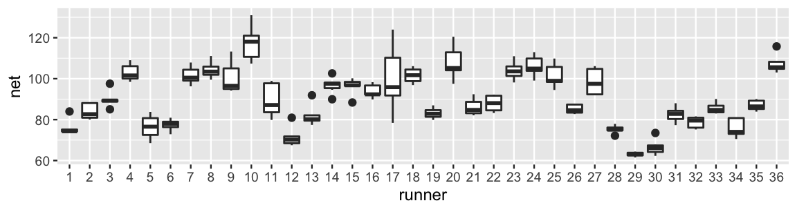
FIGURE 15.1: Boxplots of net running times (in minutes) for 36 runners that entered the Cherry Blossom race in multiple years.
For example, runner 17 tended to have slower times with a lot of variability from year to year. In contrast, runner 29 was the fastest in the bunch and had very consistent times. Looking more closely at the data, runner 1 completed the race in 84 minutes when they were 53 years old. In the subsequent year, they completed the race in 74.3 minutes:
head(running, 2)
# A tibble: 2 x 3
  runner   age   net
  <fct>  <int> <dbl>
1 1         53  84.0
2 1         54  74.3
Our goal is to better understand the relationship between running time and age for runners in this age group. What we’ll learn is that our current Bayesian modeling toolbox has some limitations.
- Explore the limitations of our current Bayesian modeling toolbox under two extremes, complete pooling and no pooling.
- Examine the benefits of the partial pooling provided by hierarchical Bayesian models.
- Focus on the big ideas and leave the details to subsequent chapters.
15.1 Complete pooling
We’ll begin our analysis of the relationship between running time and age using a complete pooling technique: combine all 252 observations across our 36 runners into one pool of information. In doing so, notice that the relationship appears weak – there’s quite a bit of variability in run times at each age with no clear trend as age increases:
ggplot(running, aes(y = net, x = age)) +
  geom_point()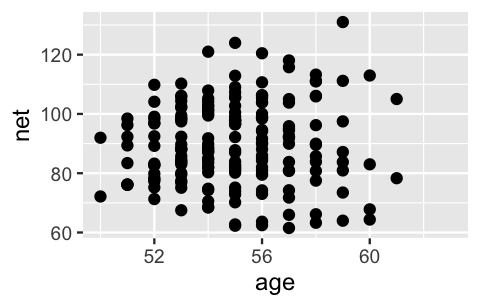
FIGURE 15.2: A scatterplot of net running time versus age for every race result.
To better understand this relationship, we can construct a familiar Normal regression model of running times by age. Letting \(Y_i\) and \(X_i\) denote the running time and age for the \(i\)th observation in our dataset, the data structure for this model is:
\[\begin{equation} Y_i | \beta_0, \beta_1, \sigma \stackrel{ind}{\sim} N\left(\mu_i, \sigma^2\right) \;\; \text{ with } \;\; \mu_i = \beta_0 + \beta_1X_i . \tag{15.1} \end{equation}\]
And we can simulate this complete pooled model as usual, here using weakly informative priors:
complete_pooled_model <- stan_glm(
  net ~ age,
  data = running, family = gaussian,
  prior_intercept = normal(0, 2.5, autoscale = TRUE),
  prior = normal(0, 2.5, autoscale = TRUE),
  prior_aux = exponential(1, autoscale = TRUE),
  chains = 4, iter = 5000*2, seed = 84735)
The simulation results match our earlier observations of a weak relationship between running time and age. The posterior median model suggests that running times tend to increase by a mere 0.27 minutes for each year in age. And with an 80% posterior credible interval for \(\beta_1\) which straddles 0 (-0.3, 0.84), this relationship is not significant:
# Posterior summary statistics
tidy(complete_pooled_model, conf.int = TRUE, conf.level = 0.80)
# A tibble: 2 x 5
  term        estimate std.error conf.low conf.high
  <chr>          <dbl>     <dbl>    <dbl>     <dbl>
1 (Intercept)   75.2      24.6     43.7     106.
2 age            0.268     0.446   -0.302     0.842
OK. We didn’t want to be the first to say it, but this seems a bit strange. Our own experience does not support the idea that we’ll continue to run at the same speed. In fact, check out Figure 15.3. If we examine the relationship between running time and age for each of our 36 runners (gray lines), almost all have gotten slower over time and at a more rapid rate than suggested by the posterior median model (blue line).
# Plot of the posterior median model
ggplot(running, aes(x = age, y = net, group = runner)) +
  geom_smooth(method = "lm", se = FALSE, color = "gray", size = 0.5) +
  geom_abline(aes(intercept = 75.2, slope = 0.268), color = "blue")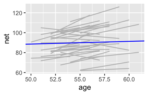
FIGURE 15.3: Observed trends in running time versus age for the 36 subjects (gray) along with the posterior median model (blue).
In Figure 15.4, we zoom in on the details for just three runners. Though the complete pooled model (blue line) does okay in some cases (e.g., runner 22), it’s far from universal. The general speed, and changes in speed over time, vary quite a bit from runner to runner. For example, runner 20 tends to run slower than average and, with age, is slowing down at a more rapid rate. Runner 1 has consistently run faster than the average.
# Select an example subset
examples <- running %>%
  filter(runner %in% c("1", "20", "22"))

ggplot(examples, aes(x = age, y = net)) +
  geom_point() +
  facet_wrap(~ runner) +
  geom_abline(aes(intercept = 75.2242, slope = 0.2678),
              color = "blue")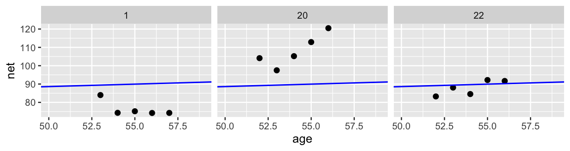
FIGURE 15.4: Scatterplots of running time versus age for 3 subjects, along with the posterior median model (blue).
With respect to these observations, our complete pooled model really misses the mark. As represented by the diagram in Figure 15.5, the complete pooled model lumps all observations of run time (\(y_1, y_2, \ldots, y_n\)) into one population or one “pool.” In doing so, it makes two assumptions:
- each observation is independent of the others (a blanket assumption behind our Unit 3 models); and
- information about the individual runners is irrelevant to our model of running time vs age.
We’ve now observed that these assumptions are inappropriate:
- Though the observations on one runner might be independent of those on another, the observations within a runner are correlated. That is, how fast a runner ran in their previous race tells us something about how fast they’ll run in the next.
- With respect to the relationship between running time and age, people are inherently different.
These assumption violations had a significant consequence: our complete pooled model failed to pick up on the fact that people tend to get slower with age. Though we’ve explored the complete pooling drawbacks in the specific context of the Cherry Blossom race, they are true in general.
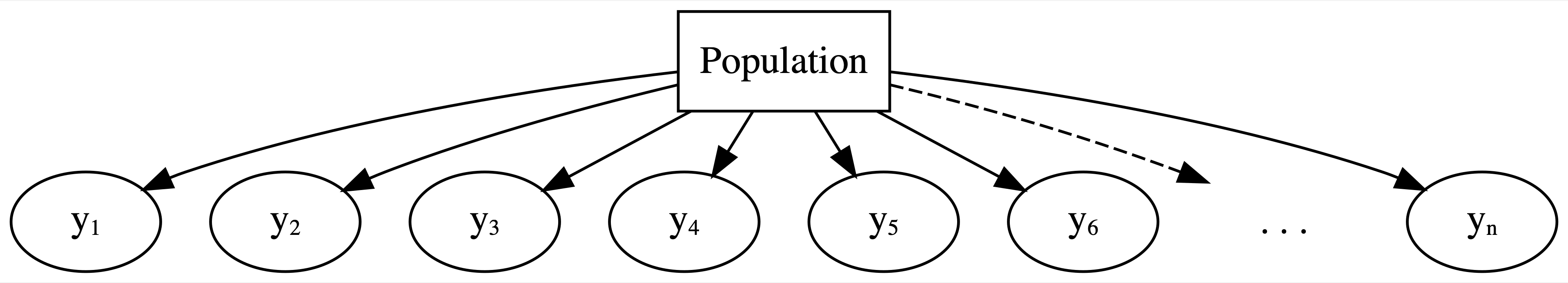
FIGURE 15.5: General framework for a complete pooled model.
Drawbacks of a complete pooling approach
There are two main drawbacks to taking a complete pooling approach to analyze group structured data:
- we violate the assumption of independence; and, in turn,
- we might produce misleading conclusions about the relationship itself and the significance of this relationship.
15.2 No pooling
Having failed with our complete pooled model, let’s swing to the other extreme. Instead of lumping everybody together into one pool and ignoring any information about runners, the no pooling approach considers each of our \(m = 36\) runners separately. This framework is represented by the diagram in Figure 15.6 where \(y_{ij}\) denotes the \(i\)th observation on runner \(j\).
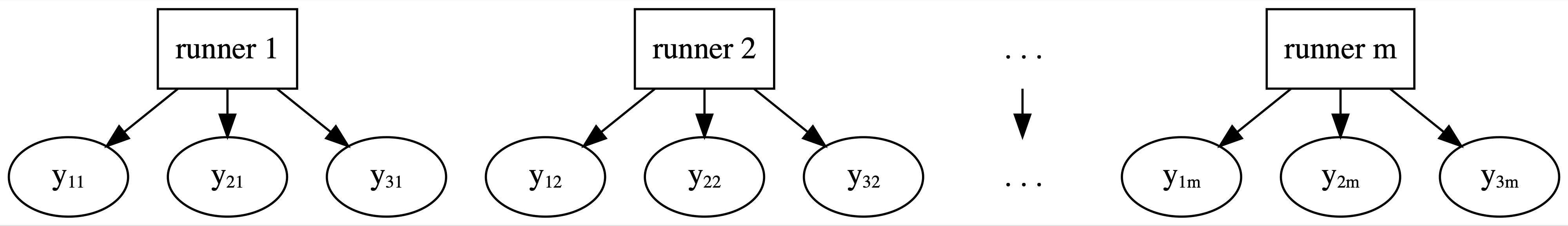
FIGURE 15.6: General framework for a no pooled model.
This framework also means that the no pooling approach builds a separate model for each runner. Specifically, let \((Y_{ij}, X_{ij})\) denote the observed run times and age for runner \(j\) in their \(i\)th race. Then the data structure for the Normal linear regression model of run time vs age for runner \(j\) is:
\[\begin{equation} Y_{ij} | \beta_{0j}, \beta_{1j}, \sigma \sim N\left(\mu_{ij}, \sigma^2\right) \;\; \text{ with } \;\; \mu_{ij} = \beta_{0j} + \beta_{1j} X_{ij}. \tag{15.2} \end{equation}\]
This model allows for each runner \(j\) to have a unique intercept \(\beta_{0j}\) and age coefficient \(\beta_{1j}\). Or, in the context of running, the no pooled models reflect the fact that some people tend to be faster than others (hence the different \(\beta_{0j}\)) and that changes in speed over time aren’t the same for everyone (hence the different \(\beta_{1j}\)). Though we won’t bother actually implementing these 36 no pooled models in R, if we utilized vague priors, the resulting individual posterior median models would be similar to those below:
ggplot(examples, aes(x = age, y = net)) +
  geom_point() +
  geom_smooth(method = "lm", se = FALSE, fullrange = TRUE) +
  facet_wrap(~ runner) +
  xlim(52, 62)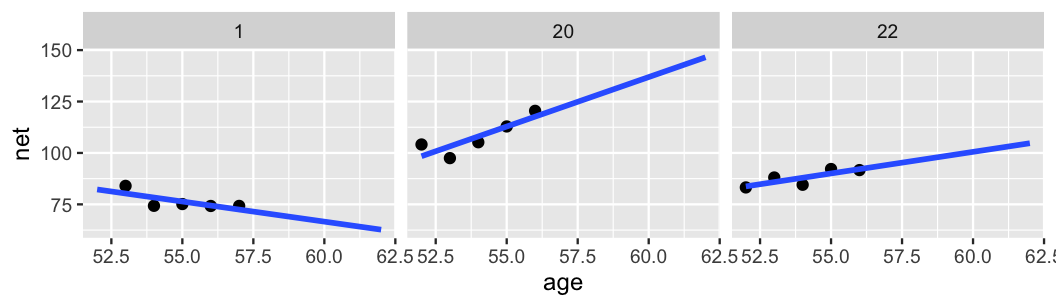
FIGURE 15.7: Scatterplots of running time versus age for 3 subjects, along with subject-specific trends (blue).
This seems great at first glance. The runner-specific models pick up on the runner-specific trends. However, there are two significant drawbacks to the no pooling approach. First, suppose that you planned to run in the Cherry Blossom race in each of the next few years. Based on the no pooling results for our three example cases, what do you anticipate your running times to be? Are you stumped? If not, you should be. The no pooling approach can’t help you answer this question. Since they’re tailored to the 36 individuals in our sample, the resulting 36 models don’t reliably extend beyond these individuals. To consider a second wrinkle, take a quick quiz.67
Reexamine runner 1 in Figure 15.7.
If they were to race a sixth time at age 62, 5 years after their most recent data point, what would you expect their net running time to be?
- Below 75 minutes
- Between 75 and 85 minutes
- Above 85 minutes
If you were utilizing the no pooled model to answer this question, your answer would be a. Runner 1’s model indicates that they’re getting faster with age and should have a running time under 75 minutes by the time they turn 62. Yet this no pooled conclusion exists in a vacuum, only taking into account data on runner 1. From the other 35 runners, we’ve observed that most people tend to get slower over time. It would be unfortunate to completely ignore this information, especially since we have a mere five race sample size for runner 1 (hence aren’t in the position to disregard the extra data!). A more reasonable prediction might be option b: though they might not maintain such a steep downward trajectory, runner 1 will likely remain a fast runner with a race time between 75 and 85 minutes. Again, this would be the reasonable conclusion, not the conclusion we’d make if using our no pooled models alone. Though we’ve explored the no pooling drawbacks in the specific context of the Cherry Blossom race, they are true in general.
Drawbacks of a no pooling approach
There are two main drawbacks to taking a no pooling approach to analyze group structured data:
- We cannot reliably generalize or apply the group-specific no pooled models to groups outside those in our sample.
- No pooled models assume that one group doesn’t contain relevant information about another, and thus ignores potentially valuable information. This is especially consequential when we have a small number of observations per group.
15.3 Hierarchical data
The Cherry Blossom data has presented us with a new challenge: hierarchical data.
The general structure for this hierarchy is represented in Figure 15.8.
The top layer of this hierarchy is the population of all runners, not just those in our sample.
In the next layer are our 36 runners, sampled from this population.
In every analysis up to this chapter, this is where things have stopped.
Yet in the running data, the final layer of the hierarchy holds the multiple observations per runner, often referred to as repeated measures or longitudinal data.
Hierarchical, or grouped, data structures are common in practice.
These don’t always arise from making multiple observations on a person as in the running data.
In an analysis of new teaching technologies, our groups might be schools and our observations multiple students within each school:
  school_id tech score
1         1    A    90
2         1    A    94
3         1    B    82
4         2    A    85
5         2    B    89
In an analysis of a natural mosquito repellent, our groups might be a sample of labs and our observations multiple experiments within each lab:
  lab_id repellant score
1      1         A    90
2      1         A    94
3      1         B    82
4      2         A    85
5      2         B    89
There are good reasons to collect data in this hierarchical manner. To begin, it’s often more sustainable with respect to time, money, logistics, and other resources. For example, though both data collection approaches produce 100 data points, it requires fewer resources to interview 20 students at each of 5 different schools than 1 student at each of 100 different schools. Hierarchical data also provides insights into two important features:
Within-group variability
The degree of the variability among multiple observations within each group can be interesting on its own. For example, we can examine how consistent an individual’s running times are from year to year.Between-group variability
Hierarchical data also allows us to examine the variability from group to group. For example, we can examine the degree to which running patterns vary from individual to individual.
15.4 Partial pooling with hierarchical models
Our existing Bayesian modeling toolbox presents two approaches to analyzing hierarchical data. We can ignore grouping structure entirely, lump all groups together, and assume that one model is appropriately universal through complete pooling (Figure 15.5). Or we can separately analyze each group and assume that one group’s model doesn’t tell us anything about another’s through no pooling (Figure 15.6). In between these “no room for individuality” and “every person for themselves” attitudes, hierarchical models offer a welcome middle ground through partial pooling (Figure 15.8). In general, hierarchical models embrace the following idea: though each group is unique, having been sampled from the same population, all groups are connected and thus might contain valuable information about one another. We dig into that idea here, and will actually start building hierarchical models in Chapter 16.
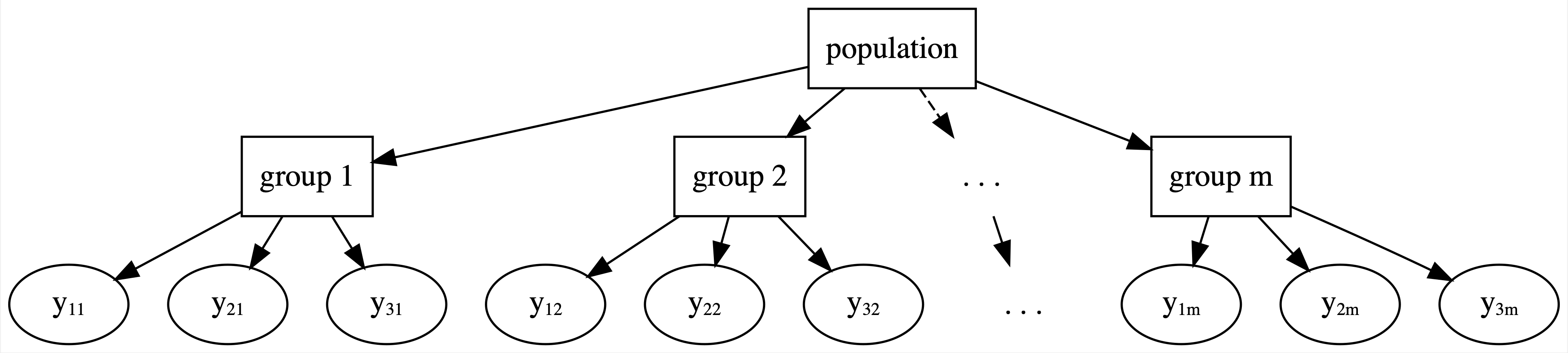
FIGURE 15.8: General framework for a hierarchical model.
Figure 15.9 compares hierarchical, no pooled, and complete pooled models of running time vs age for our three sample runners and you, a new runner that we haven’t yet observed. Consider our three sample runners. Though they utilized the same data, our three techniques produced different posterior median models for these runners. Unlike the complete pooled model (black), the hierarchical model (dashed) allows each individual runner to enjoy a unique posterior trend. These trends detect the fact that runner 1 is the fastest among our example runners. Yet unlike the no pooled model (blue), the runner-specific hierarchical models do not ignore data on other runners. For example, examine the results for runner 1. Based on the data for that runner alone, the no pooled model assumes that their downward trajectory will continue. In contrast, in the face of only five data points on runner 1 yet strong evidence from our other 35 runners that people tend to slow down, the slope of the hierarchical trend has been pulled up. In general, in recognizing that one runner’s data might contain valuable information about another, the hierarchical model trends are pulled away from the no pooled individual models and toward the complete pooled universal model.
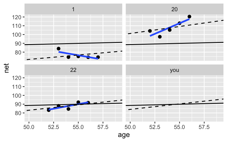
FIGURE 15.9: Posterior median models of the no pooled (blue), complete pooled (black), and hierarchical (dashed) models of running time vs age for three example runners and you.
Finally, consider the modeling results for you, a new runner.
Notice that there’s no blue line in your panel.
Since you weren’t in the original running sample, we can’t use the no pooled model to predict your running trend.
In contrast, since they don’t ignore the broader population from which our runners were sampled, the complete pooled and hierarchical models can both be used to predict your trend.
Yet the results are different!
Since the complete pooled model wasn’t able to detect the fact that runners in their 50s tend to get slower over time, your posterior median model (black) has a slope near zero.
Though this is a nice thought, the hierarchical model likely offers a more realistic prediction.
Based on the data across all 36 runners, you’ll probably get a bit slower.
Further, the anticipated rate at which you will slow down is comparable to the average rate across our 36 runners.
15.5 Chapter summary
In Chapter 15 we motivated the importance of incorporating another technique into our Bayesian toolbox: hierarchical models. Focusing on big ideas over details, we explored three approaches to studying group structured data:
Complete pooled models lump all data points together, assuming they are independent and that a universal model is appropriate for all groups. This can produce misleading conclusions about the relationship of interest and the significance of this relationship. Simply put, the vibe of complete pooled models is “no room for individuality.”
No pooled models build a separate model for each group, assuming that one group’s model doesn’t tell us anything about another’s. This approach underutilizes the data and cannot be generalized to groups outside our sample. Simply put, the vibe of no pooled models is “every group for themselves.”
Partial pooled or hierarchical models provide a middle ground. They acknowledge that, though each individual group might have its own model, one group can provide valuable information about another. That is, “let’s learn from one another while celebrating our individuality.”
15.6 Exercises
15.6.1 Conceptual exercises
- Complete pooling
- No pooling
- Partial pooling
- Can you give me an example when we might want to use the partial pooling approach?
- Why wouldn’t we always just use the complete pooling approach? It seems easier!
- Does the no pooled approach have any drawbacks? It seems that there are fewer assumptions.
- Can you remind me what the difference is between within-group variability and between-group variability? And how does that relate to partial pooling?
15.6.2 Applied exercises
Interested in the impact of sleep deprivation on reaction time, Belenky et al. (2003) enlisted 18 subjects in a study.
The subjects got a regular night’s sleep on “day 0” of the study, and were then restricted to 3 hours of sleep per night for the next 9 days.
Each day, researchers recorded the subjects’ reaction times (in ms) on a series of tests.
The results are provided in the sleepstudy dataset in the lme4 package.
sleepstudy data is hierarchical. Draw a diagram in the spirit of Figure 15.8 that captures the hierarchical framework. Think: What are the “groups?”
Reaction time (\(Y\)) by Days of sleep deprivation (\(X\)).
- To explore the complete pooled behavior of the data points, construct and discuss a plot of
ReactionbyDays. In doing so, ignore the subjects and include the observed trend in the relationship. - Draw a diagram in the spirit of Figure 15.8 that captures the complete pooling framework.
- Using careful notation, write out the structure for the complete pooled model of \(Y\) by \(X\).
- To explore the no pooled behavior of the data points, construct and discuss separate scatterplots of
ReactionbyDaysfor eachSubject, including subject-specific trend lines. - Draw a diagram in the spirit of Figure 15.6 that captures the no pooling framework.
- Using careful notation, write out the structure for the no pooled model of \(Y\) by \(X\).
Reaction time by Days.
References
Answer: There’s no definitive right answer here, but we think that b is the most reasonable.↩︎