Chapter 16 (Normal) Hierarchical Models without Predictors
In Chapter 16 we’ll build our first hierarchical models upon the foundations established in Chapter 15. We’ll start simply, by assuming that we have some response variable \(Y\), but no predictors \(X\). Consider the following data story. The Spotify music streaming platform provides listeners with access to more than 50 million songs. Of course, some songs are more popular than others. Let \(Y\) be a song’s Spotify popularity rating on a 0-100 scale. In general, the more recent plays that a song has on the platform, the higher its popularity rating. Thus, the popularity rating doesn’t necessarily measure a song’s overall quality, long-term popularity, or popularity beyond the Spotify audience. And though it will be tough to resist asking which song features \(X\) can help us predict ratings, we’ll focus on understanding \(Y\) alone. Specifically, we’d like to better understand the following:
- What’s the typical popularity of a Spotify song?
- To what extent does popularity vary from artist to artist?
- For any single artist, how much might popularity vary from song to song?
Other than a vague sense that the average popularity rating is around 50, we don’t have any strong prior understanding about these dynamics, and thus will be utilizing weakly informative priors throughout our Spotify analysis.
With that, let’s dig into the data.
The spotify data in the bayesrules package is a subset of data analyzed by Kaylin Pavlik (2019) and distributed through the #TidyTuesday project (R for Data Science 2020d).
It includes information on 350 songs on Spotify.68
# Load packages
library(bayesrules)
library(tidyverse)
library(rstanarm)
library(bayesplot)
library(tidybayes)
library(broom.mixed)
library(forcats)

# Load data
data(spotify)
Here we select only the few variables that are important to our analysis, and reorder the artist levels according to their mean song popularity using fct_reorder() in the forcats package (Wickham 2021):
spotify <- spotify %>%
  select(artist, title, popularity) %>%
  mutate(artist = fct_reorder(artist, popularity, .fun = 'mean'))
You’re encouraged to view the resulting spotify data in full.
But even just a few snippets reveal a hierarchical or grouped data structure:
# First few rows
head(spotify, 3)
# A tibble: 3 x 3
  artist title        popularity
  <fct>  <chr>             <dbl>
1 Alok   On & On              79
2 Alok   All The Lies         56
3 Alok   Hear Me Now          75

# Number of songs
nrow(spotify)
[1] 350

# Number of artists
nlevels(spotify$artist)
[1] 44
Specifically, our total sample of 350 songs is comprised of multiple songs for each of 44 artists who were, in turn, sampled from the population of all artists that have songs on Spotify (Figure 16.1).
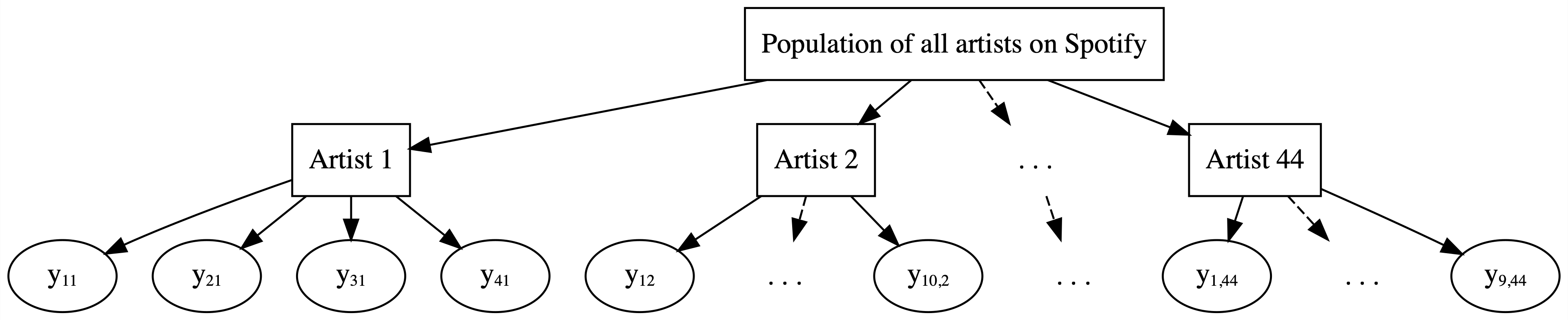
FIGURE 16.1: Hierarchical data on artists.
The artist_means data frame summarizes the number of songs observed on each artist along with the mean popularity of these songs.
Shown below are the two artists with the lowest and highest mean popularity ratings.
Keeping in mind that we’ve eliminated from our analysis the nearly 10% of Spotify songs which have a popularity rating of 0, each artist in our sample should be seen as a relative success story.
artist_means <- spotify %>%
  group_by(artist) %>%
  summarize(count = n(), popularity = mean(popularity))

artist_means %>%
  slice(1:2, 43:44)
# A tibble: 4 x 3
  artist        count popularity
  <fct>         <int>      <dbl>
1 Mia X             4       13.2
2 Chris Goldarg    10       16.4
3 Lil Skies         3       79.3
4 Camilo            9       81
Recalling Chapter 15, we will consider three different approaches to analyzing this Spotify popularity data:
Complete pooling
Ignore artists and lump all songs together (Figure 15.5).No pooling
Separately analyze each artist and assume that one artist’s data doesn’t contain valuable information about another artist (Figure 15.6).Partial pooling (via hierarchical models)
Acknowledge the grouping structure, so that even though artists differ in popularity, they might share valuable information about each other and about the broader population of artists (Figure 16.1).
As you might suspect, the first two approaches oversimplify the analysis. The good thing about trying them out is that it will remind us why we should care about hierarchical models in the first place.
- Build a hierarchical model of variable \(Y\) with no predictors \(X\).
- Simulate and analyze this hierarchical model using rstanarm.
- Utilize hierarchical models for predicting \(Y\).
To focus on the big picture, we keep this first exploration of hierarchical models to the Normal setting, a special case of the broader generalized linear hierarchical models we’ll study in Chapter 18.
As our Bayesian modeling toolkit expands, so must our R tools and syntax. Be patient with yourself here – as you see more examples throughout this unit, the patterns in the syntax will become more familiar.
16.1 Complete pooled model
Carefully analyzing group structured data requires some new notation. In general, we’ll use \(i\) and \(j\) subscripts to track two pieces of information about each song in our sample: \(j\) indicates a song’s artist and \(i\) indicates the specific song within each artist. To begin, let \(n_j\) denote the number of songs we have for artist \(j\) where \(j \in \{1,2,\ldots,44\}\). For example, the first two artists have \(n_1 = 4\) and \(n_2 = 10\) songs, respectively:
head(artist_means, 2)
# A tibble: 2 x 3
  artist        count popularity
  <fct>         <int>      <dbl>
1 Mia X             4       13.2
2 Chris Goldarg    10       16.4
Further, the number of songs per artist runs as low as 2 and as high as 40:
artist_means %>%
  summarize(min(count), max(count))
# A tibble: 1 x 2
  `min(count)` `max(count)`
         <int>        <int>
1            2           40
Summing the number of songs \(n_j\) across all artists produces our total sample size \(n\):
\[n = \sum_{j=1}^{44} n_j = n_1 + n_2 + \cdots + n_{44} = 350 .\]
Beyond the artists are the songs themselves. To distinguish between songs, we will let \(Y_{ij}\) (or \(Y_{i,j}\)) represent the \(i\)th song for artist \(j\) where \(i \in \{1,2,\ldots,n_j\}\) and \(j \in \{1,2, \ldots, 44\}\). Thus, we can think of our sample of 350 total songs as the collection of our smaller samples on each of 44 artists:
\[Y := \left((Y_{11}, Y_{21}, \ldots, Y_{n_1,1}), (Y_{12}, Y_{22}, \ldots, Y_{n_2,2}), \ldots, (Y_{1,44}, Y_{2,44}, \ldots, Y_{n_{44},44})\right) .\]
As a first approach to analyzing this data, we’ll implement a complete pooled model of song popularity which ignores the data’s grouped structure, lumping all songs together in one sample. A density plot of this pool illustrates that there’s quite a bit of variability in popularity from song to song, with ratings ranging from roughly 10 to 95.
ggplot(spotify, aes(x = popularity)) +
  geom_density()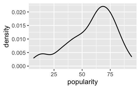
FIGURE 16.2: A density plot of the variability in popularity from song to song.
Though these ratings appear somewhat left skewed, we’ll make one more simplification in our complete pooling analysis by assuming Normality.
Specifically, we’ll utilize the following Normal-Normal complete pooled model with a prior for \(\mu\) that reflects our weak understanding that the average popularity rating is around 50 and, independently, a weakly informative prior for \(\sigma\).
These prior specifications can be confirmed using prior_summary().
\[\begin{equation} \begin{split} Y_{ij} | \mu, \sigma & \sim N(\mu, \sigma^2) \\ \mu & \sim N(50, 52^2) \\ \sigma & \sim \text{Exp}(0.048) \\ \end{split} \tag{16.1} \end{equation}\]
Though we saw similar models in Chapters 5 and 9, it’s important to review the meaning of parameters \(\mu\) and \(\sigma\) before shaking things up. Since \(\mu\) and \(\sigma\) are shared by every song \(Y_{ij}\), we can think of them as global parameters which do not vary by artist \(j\). Across all songs across all artists in the population:
- \(\mu\) = global mean popularity; and
- \(\sigma\) = global standard deviation in popularity from song to song.
To simulate the corresponding posterior, note that the complete pooled model (16.1) is a simple Normal regression model in disguise.
Specifically, if we substitute notation \(\beta_0\) for global mean \(\mu\), (16.1) is an intercept-only regression model with no predictors \(X\).
With this in mind, we can simulate the complete pooled model using stan_glm() with the formula popularity ~ 1 where the 1 specifies an “intercept-only” term:
spotify_complete_pooled <- stan_glm(
  popularity ~ 1,
  data = spotify, family = gaussian,
  prior_intercept = normal(50, 2.5, autoscale = TRUE),
  prior_aux = exponential(1, autoscale = TRUE),
  chains = 4, iter = 5000*2, seed = 84735)

# Get prior specifications
prior_summary(spotify_complete_pooled)
The posterior summaries below suggest that Spotify songs have a typical popularity rating, \(\mu\), around 58.39 points with a relatively large standard deviation from song to song, \(\sigma\), around 20.67 points.
complete_summary <- tidy(spotify_complete_pooled,
                         effects = c("fixed", "aux"),
                         conf.int = TRUE, conf.level = 0.80)
complete_summary
# A tibble: 3 x 5
  term        estimate std.error conf.low conf.high
  <chr>          <dbl>     <dbl>    <dbl>     <dbl>
1 (Intercept)     58.4     1.10      57.0      59.8
2 sigma           20.7     0.776     19.7      21.7
3 mean_PPD        58.4     1.57      56.4      60.4
In light of these results, complete the quiz below.69
Suppose the following three artists each release a new song on Spotify:
- Mia X, the artist with the lowest mean popularity in our sample (13).
- Beyoncé, an artist with nearly the highest mean popularity in our sample (70).
- Mohsen Beats, a musical group that we didn’t observe.
Using the complete pooled model, what would be the approximate posterior predictive mean of each song’s popularity?
Your intuition might have reasonably suggested that the predicted popularity for these three artists should be different – our data suggests that Beyoncé’s song will be more popular than Mia X’s. Yet, recall that by lumping all songs together, our complete pooled model ignores any artist-specific information. As a result, the posterior predicted popularity of any new song will be the same for every artist, those that are in our sample (Beyoncé and Mia X) and those that are not (Mohsen Beats). Further, the shared posterior predictive mean popularity will be roughly equivalent to the posterior expected value of the global mean, \(E(\mu|y)\) \(\approx\) 58.39. Plotting the posterior predictive popularity models (light blue) alongside the observed mean popularity levels (dark dots) for all 44 sampled artists illustrates the unfortunate consequences of this oversimplification – it treats all artists the same even though we know they’re not.
set.seed(84735)
predictions_complete <- posterior_predict(spotify_complete_pooled,
                                          newdata = artist_means)

ppc_intervals(artist_means$popularity, yrep = predictions_complete,
              prob_outer = 0.80) +
  ggplot2::scale_x_continuous(labels = artist_means$artist,
                              breaks = 1:nrow(artist_means)) +
  xaxis_text(angle = 90, hjust = 1)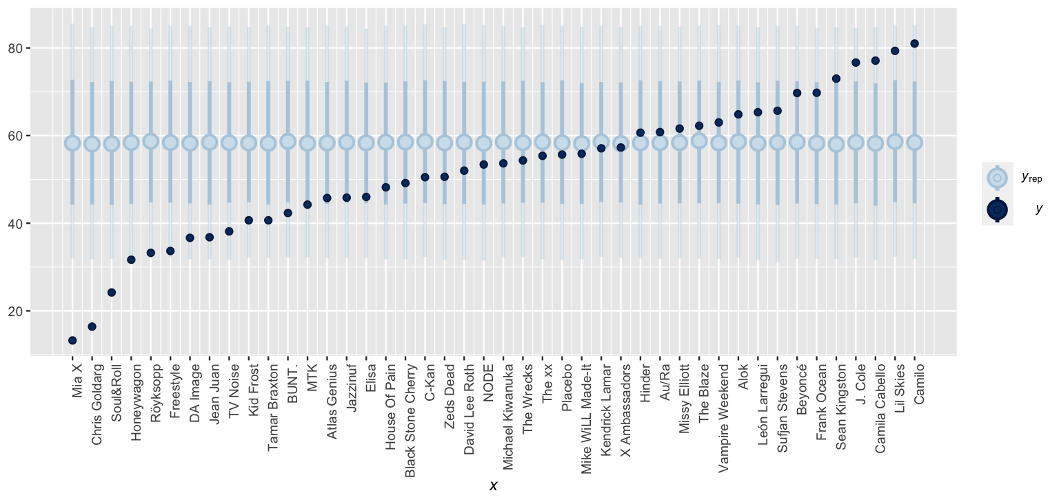
FIGURE 16.3: Posterior predictive intervals for artist song popularity, as calculated from a complete pooled model.
16.2 No pooled model
The complete pooled model ignored the grouped structure of our Spotify data – we have 44 unique artists in our sample and multiple songs per each. Next, consider a no pooled model which swings the opposite direction, separately analyzing the popularity rating of each individual artist. Figure 16.4 displays density plots of song popularity for each artist.
ggplot(spotify, aes(x = popularity, group = artist)) +
  geom_density()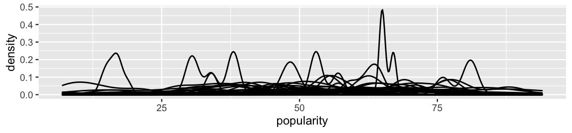
FIGURE 16.4: Density plots of the variability in popularity from song to song, by artist.
The punchline in this mess of lines is this: the typical popularity and variability in popularity differ by artist. Whereas some artists’ songs tend to have popularity levels below 25, others tend to have popularity levels higher than 75. Further, for some artists, the popularity from song to song is very consistent, or less variable. For others, song popularity falls all over the map – some of their songs are wildly popular and others not so much.
Instead of assuming a shared global mean popularity level, the no pooled model recognizes that artist popularity differs by incorporating group-specific parameters \(\mu_j\) which vary by artist. Specifically, within each artist \(j\), we assume that the popularity of songs \(i\) are Normally distributed around some mean \(\mu_j\) with standard deviation \(\sigma\):
\[\begin{equation} Y_{ij} | \mu_j, \sigma \sim N(\mu_j, \sigma^2) \tag{16.2} \end{equation}\]
Thus
- \(\mu_j\) = mean song popularity for artist \(j\); and
- \(\sigma\) = the standard deviation in popularity from song to song within each artist.
Figure 16.5 illustrates these parameters and the underlying model assumptions for just five of our 44 sampled artists. First, our Normal data model (16.2) assumes that the mean popularity \(\mu_j\) varies between different artists \(j\), i.e., some artists’ songs tend to be more popular than other artists’ songs. In contrast, it assumes that the variability in popularity from song to song, \(\sigma\), is the same for each artist, and hence its lack of a \(j\) subscript. Though Figure 16.4 might bring the assumptions of Normality and equal variability into question, with such small sample sizes per artist, we can’t put too much stock into the potential noise. The current simplifying assumptions are a reasonable place to start.
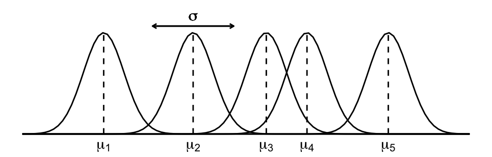
FIGURE 16.5: A representation of the no pooled model assumptions.
The notation of the no pooled data structure (16.2) also clarifies some features of our no pooling approach:
- Every song \(i\) by the same artist \(j\), \(Y_{ij}\), shares mean parameter \(\mu_j\).
- Songs by different artists \(j\) and \(k\), \(Y_{ij}\) and \(Y_{ik}\), have different mean parameters \(\mu_j\) and \(\mu_k\). Thus, each artist gets a unique mean and one artist’s mean doesn’t tell us anything about another’s.
- Whereas our model does not pool information about the players’ mean popularity levels \(\mu_j\), by assuming that the artists share the \(\sigma\) standard deviation parameter, it does pool information from the artists to learn about \(\sigma\). We could also assign unique standard deviation parameters to each artist, \(\sigma_j\), but the shared standard deviation assumption simplifies things a great deal. In this spirit of simplicity, we’ll continue to refer to (16.3) as a no pooled model, though “no” pooled would be more appropriate.
Finally, to complete the no pooled model, we utilize weakly informative Normal priors for the mean parameters \(\mu_j\) (each centered at an average popularity rating of 50) and an Exponential prior for the standard deviation parameter \(\sigma\). Since the 44 \(\mu_j\) priors are uniquely tuned for the corresponding artist \(j\), we do not list them here:
\[\begin{equation} \begin{split} Y_{ij} | \mu_j, \sigma_j & \sim N(\mu_j, \sigma^2) \\ \mu_j & \sim N(50, s_j^2) \\ \sigma & \sim \text{Exp}(0.048). \\ \end{split} \tag{16.3} \end{equation}\]
To simulate the no pooled model posteriors, we can make one call to stan_glm() by treating artist as a predictor in a regression model of popularity which lacks a global intercept term.70
This setting is specified by the formula popularity ~ artist - 1:
spotify_no_pooled <- stan_glm(
  popularity ~ artist - 1,
  data = spotify, family = gaussian,
  prior = normal(50, 2.5, autoscale = TRUE),
  prior_aux = exponential(1, autoscale = TRUE),
  chains = 4, iter = 5000*2, seed = 84735)
Based on your understanding of the no pooling strategy, complete the quiz below.71
Suppose the following three artists each release a new song on Spotify:
- Mia X, the artist with the lowest mean popularity in our sample (13).
- Beyoncé, an artist with nearly the highest mean popularity in our sample (70).
- Mohsen Beats, a musical group that we didn’t observe.
Using the no pooled model, what will be the approximate posterior predictive mean of each song’s popularity?
Since each artist gets a unique mean popularity parameter \(\mu_j\) which is modeled using their unique song data, they each get a unique posterior predictive model for their next song’s popularity. Having utilized weakly informative priors, it thus makes sense that Mia X’s posterior predictive model should be centered near her observed sample mean of 13, whereas Beyoncé’s should be near 70. In fact, Figure 16.6 confirms that the posterior predictive model for the popularity of each artist’s next song is centered around the mean popularity of their observed sample songs.
# Simulate the posterior predictive models
set.seed(84735)
predictions_no <- posterior_predict(
  spotify_no_pooled, newdata = artist_means)

# Plot the posterior predictive intervals
ppc_intervals(artist_means$popularity, yrep = predictions_no,
              prob_outer = 0.80) +
  ggplot2::scale_x_continuous(labels = artist_means$artist,
                              breaks = 1:nrow(artist_means)) +
  xaxis_text(angle = 90, hjust = 1)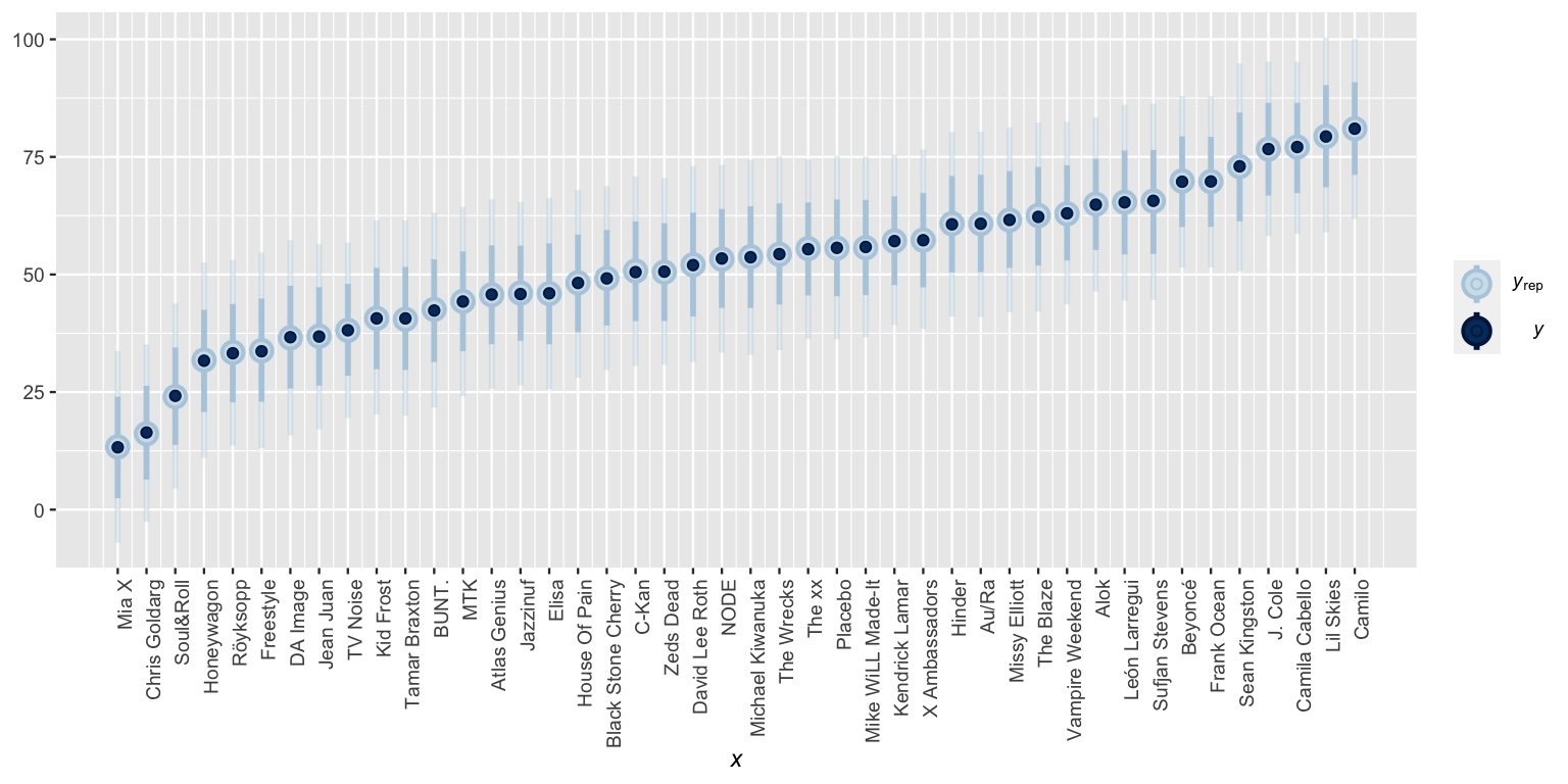
FIGURE 16.6: Posterior predictive intervals for artist song popularity, as calculated from a no pooled model.
If we didn’t pause and reflect, this result might seem good. The no pooled model acknowledges that some artists tend to be more popular than others. However, there are two critical drawbacks. First, the no pooled model ignores data on one artist when learning about the typical popularity of another. This is especially problematic when it comes to artists for whom we have few data points. For example, our low posterior predictions for Mia X’s next song were based on a measly 4 songs. The other artists’ data suggests that these low ratings might just be a tough break – her next song might be more popular! Similarly, our high posterior predictions for Lil Skies’ next song were based on only 3 songs. In light of the other artists’ data, we might wonder whether this was beginner’s luck that will be tough to maintain.
Second, the no pooled model cannot be generalized to artists outside our sample.
Remember Mohsen Beats?
Since the no pooled model is tailor-made to the artists in our sample, and Mohsen Beats isn’t part of this sample, it cannot be used to predict the popularity of Mohsen Beats’ next song.
That is, just as the no pooled model assumes that no artist in our sample contains valuable information about the typical popularity of another artist in our sample, it assumes that our sampled artists tell us nothing about the typical popularity of artists that didn’t make it into our sample.
This also speaks to why we cannot account for the grouped structure of our data by including artist as a categorical predictor \(X\).
On top of violating the assumption of independence, doing so would allow us to learn about only the 44 artists in our sample.
16.3 Building the hierarchical model
16.3.1 The hierarchy
We hope we’ve re-convinced you that we must pay careful attention to hierarchically structured data.
To this end, we’ll finally concretize a hierarchical Normal model of Spotify popularity.
There are a few layers to this model, two related to the hierarchically structured spotify data (Figure 16.1) and a third related to the prior models on our model parameters.
A very general outline for this model is below, the layers merely numbered for reference:
\[\begin{equation} \begin{array}{lrl} \text{Layer 1:} & \hspace{-0.05in} Y_{ij} | \mu_j, \sigma_y & \hspace{-0.075in} \sim \text{model of how song popularity varies WITHIN artist } j \\ \text{Layer 2:} & \hspace{-0.05in} \mu_j | \mu, \sigma_\mu & \hspace{-0.075in} \sim \text{model of how the typical popularity $\mu_j$ varies BETWEEN artists}\\ \text{Layer 3:} & \hspace{-0.05in} \mu, \sigma_y, \sigma_\mu & \hspace{-0.075in} \sim \text{prior models for shared global parameters} \\ \end{array} \tag{16.4} \end{equation}\]
Layer 1 deals with the smallest unit in our hierarchical data: individual songs within each artist. As with the no pooled model (16.2), this first layer is group or artist specific, and thus acknowledges that song popularity \(Y_{ij}\) depends in part on the artist. Specifically, within each artist \(j\), we assume that the popularity of songs \(i\) are Normally distributed around some mean \(\mu_j\) with standard deviation \(\sigma_y\):
\[Y_{ij} | \mu_j, \sigma_y \sim N(\mu_j, \sigma_y^2)\]
Thus, the meanings of the Layer 1 parameters are the same as they were for the no pooled model:
- \(\mu_j\) = mean song popularity for artist \(j\); and
- \(\sigma_y\) = within-group variability, i.e., the standard deviation in popularity from song to song within each artist.
Moving forward, if we were to place separate priors on each artist mean popularity parameter \(\mu_j\), we’d be right back at the no pooled model (16.3). Layer 2 of (16.4) is where the hierarchical model begins to distinguish itself. Instead of assuming that one artist’s popularity level can’t tell us about another, Layer 2 acknowledges that our 44 sampled artists are all drawn from the same broader population of Spotify artists. Within this population, popularity varies from artist to artist. We model this variability in mean popularity between artists by assuming that the individual mean popularity levels, \(\mu_j\), are Normally distributed around \(\mu\) with standard deviation \(\sigma_\mu\),
\[\mu_j | \mu, \sigma_\mu \sim N(\mu, \sigma^2_\mu) .\]
Thus, we can think of the two new parameters as follows:
- \(\mu\) = the global average of mean song popularity \(\mu_j\) across all artists \(j\), i.e., the mean popularity rating for the most average artist; and
- \(\sigma_\mu\) = between-group variability, i.e., the standard deviation in mean popularity \(\mu_j\) from artist to artist.
A density plot of the mean popularity levels for our 44 artists indicates that this prior assumption is reasonable. The artists’ observed sample means do appear to be roughly Normally distributed around some global mean:
ggplot(artist_means, aes(x = popularity)) +
  geom_density()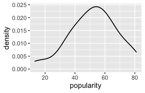
FIGURE 16.7: A density plot of the variability in mean song popularity from artist to artist.
Notation alert
There’s a difference between \(\mu_j\) and \(\mu\). When a parameter has a subscript \(j\), it refers to a feature of group \(j\). When a parameter doesn’t have a subscript \(j\), it’s the global counterpart, i.e., the same feature across all groups.
Subscripts signal the group or layer of interest. For example, \(\sigma_y\) refers to the standard deviation of \(Y\) values within each group, whereas \(\sigma_\mu\) refers to the standard deviation of means \(\mu_j\) from group to group.
Though Layers 1 and 2 inform our understanding of the hierarchically structured data, remember that this is a Bayesian book. Thus, in the final Layer 3 of our hierarchical model (16.4), we must specify prior models for the global parameters which describe and are shared across the entire population of Spotify artists: \(\mu\), \(\sigma_y\), and \(\sigma_\mu\). As usual, the Normal model provides a reasonable prior for the mean parameter \(\mu\) and the Exponential provides a reasonable prior for the standard deviation terms, \(\sigma_y\) and \(\sigma_\mu\).
Putting this all together, our final hierarchical model brings together the models of how individual song popularity \(Y_{ij}\) varies within artists (Layer 1) with the model of how mean popularity levels \(\mu_j\) vary between artists (Layer 2) with our prior understanding of the entire population of artists (Layer 3). The weakly informative priors are specified here and confirmed below. Note that we again assume a baseline song popularity rating of 50.
\[\begin{equation} \begin{array}{rll} Y_{ij} | \mu_j, \sigma_y & \sim N(\mu_j, \sigma_y^2) & \text{model of individual songs within artist $j$} \\ \mu_j | \mu, \sigma_\mu & \stackrel{ind}{\sim} N(\mu, \sigma_\mu^2) & \text{model of variability between artists}\\ \mu & \sim N(50, 52^2) & \text{prior models on global parameters} \\ \sigma_y & \sim \text{Exp}(0.048) & \\ \sigma_\mu & \sim \text{Exp}(1) & \\ \end{array} \tag{16.5} \end{equation}\]
This type of model has a special name: one-way analysis of variance. We’ll explore the motivation behind this moniker in Section 16.3.3.
One-way Analysis of Variance (ANOVA)
Suppose we have multiple data points on each of \(m\) groups. For each group \(j \in \{1,2,\ldots,m\}\), let \(Y_{ij}\) denote the \(i\)th observation and \(n_j\) denote the sample size. Then the one-way ANOVA model of \(Y_{ij}\) is:
\[\begin{equation} \begin{array}{rll} Y_{ij} | \mu_j, \sigma_y & \sim N(\mu_j, \sigma_y^2) & \text{model of individual observations within group $j$} \\ \mu_j | \mu, \sigma_\mu & \stackrel{ind}{\sim} N(\mu, \sigma_\mu^2) & \text{model of how parameters vary between groups}\\ \mu & \sim N(m, s^2) & \text{prior models on global parameters} \\ \sigma_y & \sim \text{Exp}(l_y) & \\ \sigma_\mu & \sim \text{Exp}(l_{\mu}) & \\ \end{array} \tag{16.6} \end{equation}\]
16.3.2 Another way to think about it
In our hierarchical Spotify analysis, we’ve incorporated artist-specific mean parameters \(\mu_j\) to indicate that the average song popularity can vary by artist \(j\). Our hierarchical model (16.5) presents these artist-specific means \(\mu_j\) as Normal deviations from the global mean song popularity \(\mu\) with standard deviation \(\sigma_\mu\): \(\mu_j \sim N(\mu, \sigma_\mu^2)\). Equivalently, we can think of the artist-specific means as random tweaks or adjustments \(b_{j}\) to \(\mu\),
\[\mu_j = \mu + b_{j} \]
where these tweaks are normal deviations from 0 with standard deviation \(\sigma_\mu\):
\[b_j \sim N(0, \sigma_\mu^2) .\]
For example, suppose that the average popularity of all songs on Spotify is \(\mu = 55\), whereas the average popularity for some artist \(j\) is \(\mu_j = 65\). Then this artist’s average popularity is 10 above the global average. That is, \(b_j = 10\) and
\[\mu_j = \mu + b_j = 55 + 10 = 65 .\]
In general, then, we can reframe Layers 1 and 2 of our hierarchical model (16.5) as follows:
\[\begin{equation} \begin{split} Y_{ij} | \mu_j, \sigma_y & \sim N(\mu_j, \sigma_y^2) \;\; \text{ with } \;\; \mu_j = \mu + b_{j} \\ b_{j} | \sigma_\mu & \stackrel{ind}{\sim} N(0, \sigma_\mu^2) \\ \mu & \sim N(50, 52^2) \\ \sigma_y & \sim \text{Exp}(0.048) \\ \sigma_\mu & \sim \text{Exp}(1) \\ \end{split} \tag{16.7} \end{equation}\]
Again, these two model formulations, (16.5) and (16.7), are equivalent. They’re just two different ways to think about the hierarchical structure of our data. We’ll use both throughout this book.
16.3.3 Within- vs between-group variability
Let’s take in the model we’ve just built. The models we studied prior to Unit 4 allow us to explore one source of variability, that in the individual observations \(Y\) across an entire population. In contrast, the aptly named one-way “analysis of variance” models of hierarchical data enable us to decompose the variance in \(Y\) into two sources: (1) the variance of individual observations \(Y\) within any given group, \(\sigma_y^2\); and (2) the variance of features between groups, \(\sigma_{\mu}^2\), i.e., from group to group. The total variance in \(Y\) is the sum of these two parts:
\[\begin{equation} \text{Var}(Y_{ij}) = \sigma_y^2 + \sigma_{\mu}^2 . \tag{16.8} \end{equation}\]
We can also think of this breakdown proportionately:
\[\begin{equation} \begin{split} \frac{\sigma^2_y}{\sigma^2_\mu + \sigma^2_y} & = \text{ proportion of $\text{Var}(Y_{ij})$ that can be explained by } \\[-2.5ex] & \; \;\;\;\; \text{ differences in the observations within each group} \\ \frac{\sigma^2_\mu}{\sigma^2_\mu + \sigma^2_y} & = \text{ proportion of $\text{Var}(Y_{ij})$ that can be explained by } \\[-2.5ex] & \;\;\;\;\; \text{ differences between groups} \\ \end{split} \tag{16.9} \end{equation}\]
Or in the context of our Spotify analysis, we can quantify how much of the total variability in popularity across all songs and artists (\(\text{Var}(Y_{ij})\)) can be explained by differences between the songs within each artist (\(\sigma_y^2\)) and differences between the artists themselves (\(\sigma_\mu\)).
Figure 16.8 illustrates three scenarios for the comparison of these two sources of variability. At one extreme is the scenario in which the variability between groups is much greater than that within groups, \(\sigma_\mu > \sigma_y\) (plot a). In this case, the majority of the variability in \(Y\) can be explained by differences between the groups. At the other extreme is the scenario in which the variability between groups is much less than that within groups, \(\sigma_\mu < \sigma_y\) (plot c). This leads to very little distinction between the \(Y\) values for the two groups. As such, the majority of the variability in \(Y\) can be explained by differences between the observations within each group, not between the groups themselves. With 44 artists, it’s tough to visually assess from the 44 density plots in Figure 16.4 where our Spotify data falls along this spectrum. However, our posterior analysis in Section 16.4 will reveal that our example is somewhere in the middle. The differences from song to song within any one artist are similar in scale to the differences between the artists themselves (à la plot b).
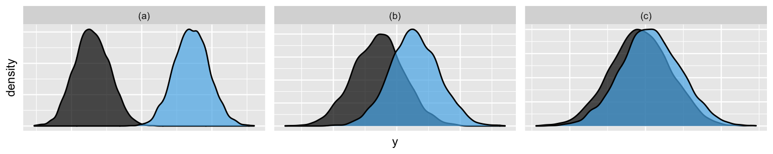
FIGURE 16.8: Simulated output for variable \(Y\) on two groups when \(\sigma_y = 0.25 \sigma_\mu\) (a), \(\sigma_y = \sigma_\mu\) (b), and \(\sigma_y = 4 \sigma_\mu\) (c). Correspondingly, the within-group correlation among the \(Y\) values is 0.8 (a), 0.5 (b), and 0.2 (c).
Plot (a) illuminates another feature of grouped data: the multiple observations within any given group are correlated. The popularity of one Beyoncé song is related to the popularity of other Beyoncé songs. The popularity of one Mia X song is related to the popularity of other Mia X songs. In general, the one-way ANOVA model (16.6) assumes that, though observations on one group are independent of those on another, the within-group correlation for two observations \(i\) and \(k\) on the same group \(j\) is
\[\begin{equation} \text{Cor}(Y_{ij}, Y_{kj}) = \frac{\sigma^2_\mu}{\sigma^2_\mu + \sigma^2_y} . \tag{16.10} \end{equation}\]
Thus, the more unique the groups, with relatively large \(\sigma_\mu\), the greater the correlation within each group. For example, the within-group correlation in plot (a) of Figure 16.8 is 0.8, a figure close-ish to 1. In contrast, the more similar the groups, with relatively small \(\sigma_\mu\), the smaller the correlation within each group. For example, the within-group correlation in plot (c) is 0.2, a figure close-ish to 0. We’ll return to these ideas once we simulate our model posterior, and thus can put some numbers to these metrics for our Spotify data.
16.4 Posterior analysis
16.4.1 Posterior simulation
Next step: posterior!
Notice that our hierarchical Spotify model (16.5) has a total of 47 parameters: 44 artist-specific parameters (\(\mu_j\)) and 3 global parameters (\(\mu\), \(\sigma_y\), \(\sigma_\mu\)).
Exploring the posterior models of these whopping 47 parameters requires MCMC simulation.
To this end, the stan_glmer() function operates very much like stan_glm(), with two small tweaks.
- To indicate that the
artistvariable defines the group structure of our data, as opposed to it being a predictor ofpopularity, the appropriate formula here ispopularity ~ (1 | artist). - The prior for \(\sigma_\mu\) is specified by
prior_covariance. For this particular model, with only one set of artist-specific parameters \(\mu_j\), this is equivalent to an Exp(1) prior. (You will learn more aboutprior_covariancein Chapter 17.)
spotify_hierarchical <- stan_glmer(
  popularity ~ (1 | artist),
  data = spotify, family = gaussian,
  prior_intercept = normal(50, 2.5, autoscale = TRUE),
  prior_aux = exponential(1, autoscale = TRUE),
  prior_covariance = decov(reg = 1, conc = 1, shape = 1, scale = 1),
  chains = 4, iter = 5000*2, seed = 84735)

# Confirm the prior tunings
prior_summary(spotify_hierarchical)
MCMC diagnostics for all 47 parameters confirm that our simulation has stabilized:
mcmc_trace(spotify_hierarchical)
mcmc_dens_overlay(spotify_hierarchical)
mcmc_acf(spotify_hierarchical)
neff_ratio(spotify_hierarchical)
rhat(spotify_hierarchical)
Further, a quick posterior predictive check confirms that, though we can always do better, our hierarchical model (16.5) isn’t too wrong when it comes to capturing variability in song popularity. A set of posterior simulated datasets of song popularity are consistent with the general features of the original popularity data.
pp_check(spotify_hierarchical) +
  xlab("popularity")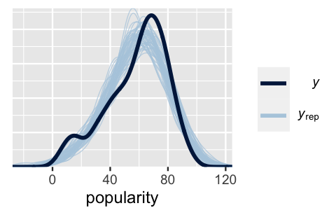
FIGURE 16.9: 100 posterior simulated datasets of song popularity (light blue) along with the actual observed popularity data (dark blue).
With this reassurance, let’s dig into the posterior results.
To begin, our spotify_hierarchical simulation contains Markov chains of length 20,000 for each of our 47 parameters.
To get a sense for how this information is stored, check out the labels of the first and last few parameters:
# Store the simulation in a data frame
spotify_hierarchical_df <- as.data.frame(spotify_hierarchical)

# Check out the first 3 and last 3 parameter labels
spotify_hierarchical_df %>%
  colnames() %>%
  as.data.frame() %>%
  slice(1:3, 45:47)
                                      .
1                           (Intercept)
2           b[(Intercept) artist:Mia_X]
3   b[(Intercept) artist:Chris_Goldarg]
4          b[(Intercept) artist:Camilo]
5                                 sigma
6 Sigma[artist:(Intercept),(Intercept)]
Due to the sheer number and type of parameters here, summarizing our posterior understanding of all of these parameters will take more care than it did for non-hierarchical models. We’ll take things one step at a time, putting in place the syntactical details we’ll need for all other hierarchical models in Unit 4, i.e., this won’t be a waste of your time!
16.4.2 Posterior analysis of global parameters
Let’s begin by examining the global parameters (\(\mu\), \(\sigma_y\), \(\sigma_\mu\)) which are shared by all artists within and beyond our particular sample.
These parameters appear at the very top and very bottom of the stan_glmer() output, and are labeled as follows:
- \(\mu\) =
(Intercept) - \(\sigma_y\) =
sigma - \(\sigma_\mu^2\) =
Sigma[artist:(Intercept),(Intercept)]72
To zero in on and obtain posterior summaries for \(\mu\), we can apply tidy() to the spotify_hierarchical model with effects = fixed, where “fixed” is synonymous with “non-varying” or “global.”
Per the results, there’s an 80% chance that the average artist has a mean popularity rating between 49.3 and 55.7.
tidy(spotify_hierarchical, effects = "fixed",
     conf.int = TRUE, conf.level = 0.80)
# A tibble: 1 x 5
  term        estimate std.error conf.low conf.high
  <chr>          <dbl>     <dbl>    <dbl>     <dbl>
1 (Intercept)     52.5      2.48     49.3      55.7
To call up the posterior medians for \(\sigma_y\) and \(\sigma_\mu\), we can specify effects = "ran_pars", i.e., parameters related to randomness or variability:
tidy(spotify_hierarchical, effects = "ran_pars")
# A tibble: 2 x 3
  term                    group    estimate
  <chr>                   <chr>       <dbl>
1 sd_(Intercept).artist   artist       15.1
2 sd_Observation.Residual Residual     14.0
The posterior median of \(\sigma_y\) (sd_Obervation.Residual) suggests that, within any given artist, popularity ratings tend to vary by 14 points from song to song.
The between standard deviation \(\sigma_\mu\) (sd_(Intercept).artist) tends to be slightly higher at around 15.1.
Thus, the mean popularity rating tends to vary by 15.1 points from artist to artist.
By (16.10), these two sources of variability suggest that the popularity levels among multiple songs by the same artist tend to have a moderate correlation near 0.54:
15.1^2 / (15.1^2 + 14.0^2)
[1] 0.5377
Thinking of this another way, 54% of the variability in song popularity is explained by differences between artists, whereas 46% is explained by differences among the songs within each artist:
14.0^2 / (15.1^2 + 14.0^2)
[1] 0.4623
16.4.3 Posterior analysis of group-specific parameters
Let’s now turn our focus from the global features to the artist-specific features for our 44 sample artists. Recall that we can write the artist-specific mean popularity levels \(\mu_j\) as tweaks to the global mean song popularity \(\mu\):
\[\mu_j = \mu + b_j .\]
Thus, \(b_j\) describes the difference between artist \(j\)’s mean popularity and the global mean popularity.
It’s these tweaks that are simulated by stan_glmer() – each \(b_j\) has a corresponding Markov chain labeled b[(Intercept) artist:j].
We can obtain a tidy() posterior summary of all \(b_j\) terms using the argument effects = "ran_vals" (i.e., random artist-specific values):
artist_summary <- tidy(spotify_hierarchical, effects = "ran_vals",
                       conf.int = TRUE, conf.level = 0.80)

# Check out the results for the first & last 2 artists
artist_summary %>%
  select(level, conf.low, conf.high) %>%
  slice(1:2, 43:44)
# A tibble: 4 x 3
  level         conf.low conf.high
  <chr>            <dbl>     <dbl>
1 Mia_X            -40.7     -23.4
2 Chris_Goldarg    -39.3     -26.8
3 Lil_Skies         11.1      30.2
4 Camilo            19.4      32.4
Consider the 80% credible interval for Camilo’s \(b_j\) tweak: there’s an 80% chance that Camilo’s mean popularity rating is between 19.4 and 32.4 above that of the average artist.
Similarly, there’s an 80% chance that Mia X’s mean popularity rating is between 23.4 and 40.7 below that of the average artist.
We can also combine our MCMC simulations for the global mean \(\mu\) and artist tweaks \(b_j\) to directly simulate posterior models for the artist-specific means \(\mu_j\).
For artist “j”:
\[\mu_j = \mu + b_j = \text{(Intercept) + b[(Intercept) artist:j]} .\]
The tidybayes package provides some tools for this task.
We’ll take this one step at a time here, but combine these steps in later analyses.
To begin, we use spread_draws() to extract the (Intercept) and b[(Intercept) artist:j] values for each artist in each iteration.
We then sum these two terms to define mu_j.
This produces an 880000-row data frame which contains 20000 MCMC samples of \(\mu_j\) for each of the 44 artists \(j\):
# Get MCMC chains for each mu_j
artist_chains <- spotify_hierarchical %>%
  spread_draws(`(Intercept)`, b[,artist]) %>%
  mutate(mu_j = `(Intercept)` + b)

# Check it out
artist_chains %>%
  select(artist, `(Intercept)`, b, mu_j) %>%
  head(4)
# A tibble: 4 x 4
# Groups:   artist [4]
  artist              `(Intercept)`     b  mu_j
  <chr>                       <dbl> <dbl> <dbl>
1 artist:Alok                  51.1 16.3   67.4
2 artist:Atlas_Genius          51.1  8.46  59.5
3 artist:Au/Ra                 51.1  4.18  55.3
4 artist:Beyoncé               51.1 15.0   66.1
For example, at the first set of chain values, Alok’s mean popularity (67.4) is 16.3 points above the average (51.1).
Next, mean_qi() produces posterior summaries for each artist’s mean popularity \(\mu_j\), including the posterior mean and an 80% credible interval:
# Get posterior summaries for mu_j
artist_summary_scaled <- artist_chains %>%
  select(-`(Intercept)`, -b) %>%
  mean_qi(.width = 0.80) %>%
  mutate(artist = fct_reorder(artist, mu_j))

# Check out the results
artist_summary_scaled %>%
  select(artist, mu_j, .lower, .upper) %>%
  head(4)
# A tibble: 4 x 4
  artist               mu_j .lower .upper
  <fct>               <dbl>  <dbl>  <dbl>
1 artist:Alok          64.3   60.3   68.3
2 artist:Atlas_Genius  46.9   38.8   55.0
3 artist:Au/Ra         59.5   52.1   66.7
4 artist:Beyoncé       69.1   65.6   72.7
For example, with 80% posterior certainty, we can say that Beyoncé’s mean popularity rating \(\mu_j\) is between 65.6 and 72.7. Plotting the 80% posterior credible intervals for all 44 artists illustrates the variability in our posterior understanding of their mean popularity levels \(\mu_j\):
ggplot(artist_summary_scaled,
       aes(x = artist, y = mu_j, ymin = .lower, ymax = .upper)) +
  geom_pointrange() +
  xaxis_text(angle = 90, hjust = 1)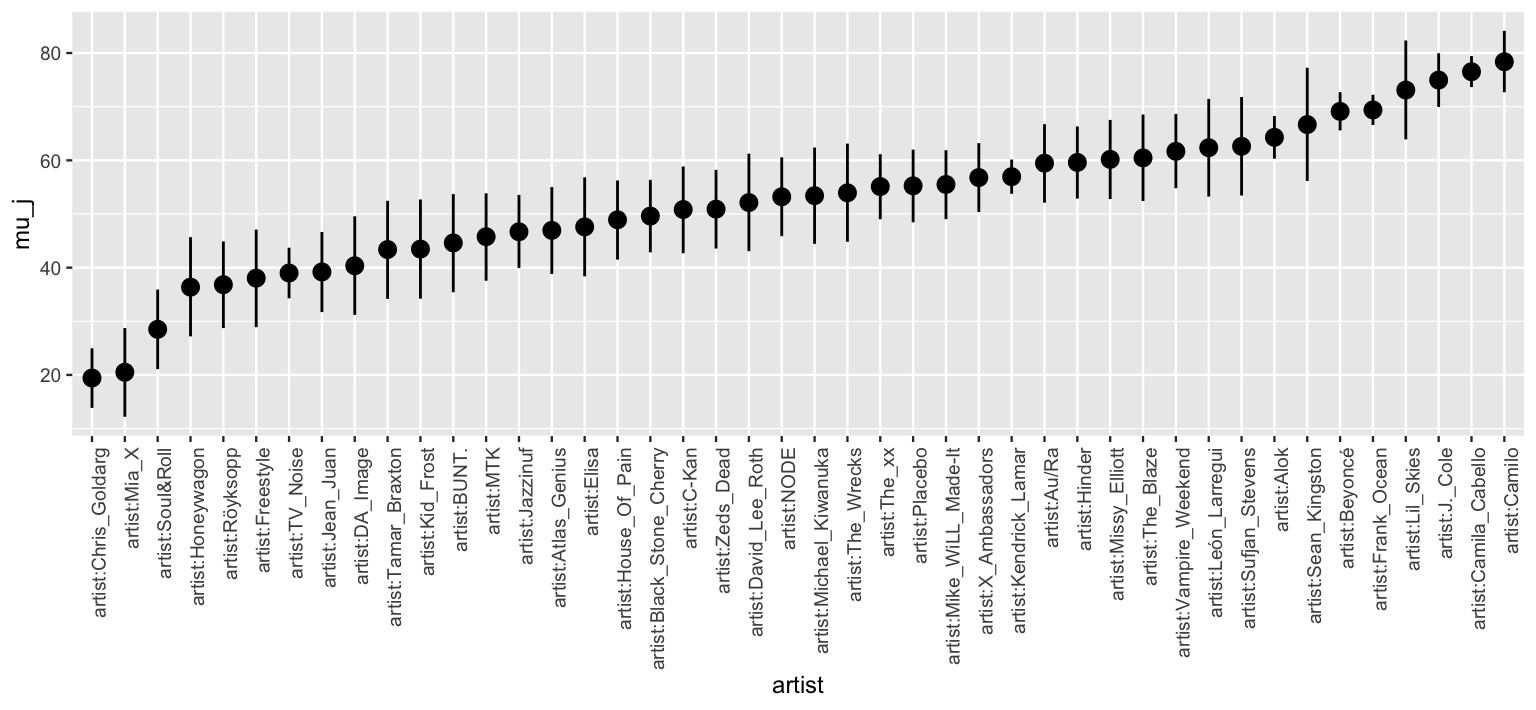
FIGURE 16.10: 80% posterior credible intervals for each artist’s mean song popularity.
Not only do the \(\mu_j\) posteriors vary in location, i.e., we expect some artists to be more popular than others, they vary in scale – some artists’ 80% posterior credible intervals are much wider than others. Pause to think about why in the following quiz.73
At the more popular end of the spectrum, Lil Skies and Frank Ocean have similar posterior mean popularity levels.
However, the 80% credible interval for Lil Skies is much wider than that for Frank Ocean.
Explain why.
To sleuth out exactly why Lil Skies and Frank Ocean have similar posterior means but drastically different intervals, it’s important to remember that not all is equal in our hierarchical data. Whereas our posterior understanding of Frank Ocean is based on 40 songs, the most of any artist in the dataset, we have only 3 songs for Lil Skies. Then we naturally have greater posterior certainty about Frank Ocean’s popularity, and hence narrower intervals.
artist_means %>%
  filter(artist %in% c("Frank Ocean", "Lil Skies"))
# A tibble: 2 x 3
  artist      count popularity
  <fct>       <int>      <dbl>
1 Frank Ocean    40       69.8
2 Lil Skies       3       79.3
16.5 Posterior prediction
Our above analysis of the \(\mu_j\) and \(\mu\) parameters informed our understanding about general trends in popularity within and between artists.
We now turn our attention from trends to specifics: predicting the popularity \(Y_{\text{new}, j}\) of the next new song released by artist \(j\) on Spotify.
Though the process is different, we can utilize our hierarchical model (16.5) to make such a prediction for any artist, both those that did and didn’t make it into our sample:
How popular will the next song by Frank Ocean, an artist in our original sample, be?
What about the next song by Mohsen Beats, an artist for whom we don’t yet have any data?
To connect this concept to hierarchical modeling, it’s important to go through this process “by hand” before relying on the shortcut posterior_predict() function.
We’ll do that here.
First consider the posterior prediction for an observed group or artist, Frank Ocean, the \(j\) = 39th artist in our sample. The first layer of our hierarchical model (16.5) holds the key in this situation: it assumes that the popularity of individual Frank Ocean songs are Normally distributed around his own mean popularity level \(\mu_j\) with standard deviation \(\sigma_y\). Thus, to approximate the posterior predictive model for the popularity of Ocean’s next song on Spotify, we can simulate a prediction from the Layer 1 model evaluated at each of the 20,000 MCMC parameter sets \(\left\lbrace \mu_j^{(i)}, \sigma_y^{(i)}\right\rbrace\):
\[\begin{equation} Y_{\text{new,j}}^{(i)} | \mu_j, \sigma_y \; \sim \; N\left(\mu_j^{(i)}, \left(\sigma_y^{(i)}\right)^2\right). \tag{16.11} \end{equation}\]
The resulting predictions \(\left\lbrace Y_{\text{new},j}^{(1)}, Y_{\text{new},j}^{(2)}, \ldots, Y_{\text{new},j}^{(20000)} \right\rbrace\) and corresponding posterior predictive model will reflect two sources of variability, and hence uncertainty, in the popularity of Ocean’s next song:
within-group sampling variability in \(Y\), i.e., not all of Ocean’s songs are equally popular; and
posterior variability in the model parameters \(\mu_j\) and \(\sigma_y\), i.e., the underlying mean and variability in popularity across Ocean’s songs are unknown and can, themselves, vary.
To construct this set of predictions, we first obtain the Markov chain for \(\mu_j\) (mu_ocean) by summing the global mean \(\mu\) (Intercept) and the artist adjustment (b[(Intercept) artist:Frank_Ocean]).
We then simulate a prediction (y_ocean) from the Layer 1 model at each MCMC parameter set:
# Simulate Ocean's posterior predictive model
set.seed(84735)
ocean_chains <- spotify_hierarchical_df %>%
  rename(b = `b[(Intercept) artist:Frank_Ocean]`) %>%
  select(`(Intercept)`, b, sigma) %>%
  mutate(mu_ocean = `(Intercept)` + b,
         y_ocean = rnorm(20000, mean = mu_ocean, sd = sigma))

# Check it out
head(ocean_chains, 3)
  (Intercept)     b sigma mu_ocean y_ocean
1       51.08 16.62 14.64    67.70   77.47
2       51.82 19.84 13.28    71.66   70.01
3       52.40 21.09 15.21    73.49   85.36
We summarize Ocean’s posterior predictive model using mean_qi() below.
There’s an 80% posterior chance that Ocean’s next song will enjoy a popularity rating \(Y_{\text{new,j}}\) between 51.3 and 87.6.
This range is much wider than the 80% credible interval for Ocean’s \(\mu_j\) parameter (66.6, 72.2).
Naturally, we can be much more certain about Ocean’s underlying mean song popularity than in the popularity of any single Ocean song.
# Posterior summary of Y_new,j
ocean_chains %>%
  mean_qi(y_ocean, .width = 0.80)
# A tibble: 1 x 6
  y_ocean .lower .upper .width .point .interval
    <dbl>  <dbl>  <dbl>  <dbl> <chr>  <chr>
1    69.4   51.3   87.6    0.8 mean   qi

# Posterior summary of mu_j
artist_summary_scaled %>%
  filter(artist == "artist:Frank_Ocean")
# A tibble: 1 x 7
  artist     mu_j .lower .upper .width .point .interval
  <fct>     <dbl>  <dbl>  <dbl>  <dbl> <chr>  <chr>
1 artist:F…  69.4   66.6   72.2    0.8 mean   qi
Next consider posterior prediction for a yet unobserved group. No observed songs for Mohsen Beats means that we do not have any information about their mean popularity \(\mu_j\), and thus can’t take the same approach as we did for Ocean. What we do know is this: (1) Mohsen Beats is an artist within the broader population of artists, (2) mean popularity levels among these artists are Normally distributed around some global mean \(\mu\) with between-artist standard deviation \(\sigma_\mu\) (Layer 2 of (16.5)), and (3) our 44 sampled artists have informed our posterior understanding of this broader population. Then to approximate the posterior predictive model for the popularity of Mohsen Beats’ next song, we can simulate 20,000 predictions \(\left\lbrace Y_{\text{new},\text{mohsen}}^{(1)}, Y_{\text{new},\text{mohsen}}^{(2)}, \ldots, Y_{\text{new},\text{mohsen}}^{(20000)} \right\rbrace\) through a two-step process:
Step 1: Simulate a potential mean popularity level \(\mu_{\text{mohsen}}\) for Mohsen Beats by drawing from the Layer 2 model evaluated at each MCMC parameter set \(\left\lbrace \mu^{(i)}, \sigma_\mu^{(i)}\right\rbrace\):
\[\mu_{\text{mohsen}}^{(i)} | \mu, \sigma_\mu \; \sim \; N\left(\mu^{(i)}, \left(\sigma_\mu^{(i)}\right)^2\right).\]
Step 2: Simulate a prediction of song popularity \(Y_{\text{new},\text{mohsen}}\) from the Layer 1 model evaluated at each MCMC parameter set \(\left\lbrace \mu_{\text{mohsen}}^{(i)}, \sigma_y^{(i)}\right\rbrace\):
\[Y_{\text{new},\text{mohsen}}^{(i)} | \mu_{\text{mohsen}}, \sigma_y \; \sim \; N\left(\mu_{\text{mohsen}}^{(i)}, \left(\sigma_y^{(i)}\right)^2\right).\]
The additional step in our Mohsen Beats posterior prediction process reflects a third source of variability. When predicting song popularity for a new group, we must account for:
within-group sampling variability in \(Y\), i.e., not all of Mohsen Beats’ songs are equally popular;
between-group sampling variability in \(\mu_j\), i.e., not all artists are equally popular; and
posterior variability in the global model parameters \((\sigma_y, \mu, \sigma_\mu)\).
We implement these ideas to simulate 20,000 posterior predictions for Mohsen Beats below. Knowing nothing about Mohsen Beats other than that they are an artist, we’re able to predict with 80% posterior certainty that their next song will have a popularity rating somewhere between 25.72 and 78.82:
set.seed(84735)
mohsen_chains <- spotify_hierarchical_df %>%
  mutate(sigma_mu = sqrt(`Sigma[artist:(Intercept),(Intercept)]`),
         mu_mohsen = rnorm(20000, `(Intercept)`, sigma_mu),
         y_mohsen = rnorm(20000, mu_mohsen, sigma))

# Posterior predictive summaries
mohsen_chains %>%
  mean_qi(y_mohsen, .width = 0.80)
# A tibble: 1 x 6
  y_mohsen .lower .upper .width .point .interval
     <dbl>  <dbl>  <dbl>  <dbl> <chr>  <chr>
1     52.3   25.7   78.8    0.8 mean   qi
Finally, below we replicate these “by hand” simulations for Frank Ocean and Mohsen Beats using the posterior_predict() shortcut function.
Plots of the resulting posterior predictive models illustrate two key features of our understanding about our two artists (Figure 16.11).
First, we anticipate that Ocean’s next song will have a higher probability rating.
This makes sense – since Ocean’s observed sample songs were popular, we’d expect his next song to be more popular than that of an artist for whom we have no information.
Second, we have greater posterior certainty about Ocean’s next song.
This again makes sense – since we actually have some data for Ocean (and don’t for Mohsen Beats), we should be more confident in our ability to predict his next song’s popularity.
We’ll continue our hierarchical posterior prediction exploration in the next section, paying special attention to how the results compare with those from no pooled and complete pooled models.
set.seed(84735)
prediction_shortcut <- posterior_predict(
  spotify_hierarchical,
  newdata = data.frame(artist = c("Frank Ocean", "Mohsen Beats")))

# Posterior predictive model plots
mcmc_areas(prediction_shortcut, prob = 0.8) +
  ggplot2::scale_y_discrete(labels = c("Frank Ocean", "Mohsen Beats"))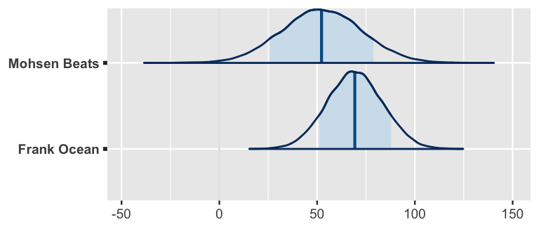
FIGURE 16.11: Posterior predictive models for the popularity of the next songs by Mohsen Beats and Frank Ocean.
16.6 Shrinkage & the bias-variance trade-off
In the previous section, we constructed posterior predictive models of song popularity for just one observed artist, Frank Ocean. We now apply these techniques to all 44 artists in our sample and plot the resulting 80% posterior prediction intervals and means (Figure 16.12).
set.seed(84735)
predictions_hierarchical <- posterior_predict(spotify_hierarchical,
                                              newdata = artist_means)

# Posterior predictive plots
ppc_intervals(artist_means$popularity, yrep = predictions_hierarchical,
              prob_outer = 0.80) +
  ggplot2::scale_x_continuous(labels = artist_means$artist,
                              breaks = 1:nrow(artist_means)) +
  xaxis_text(angle = 90, hjust = 1) +
  geom_hline(yintercept = 58.4, linetype = "dashed")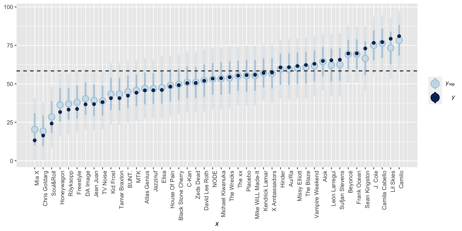
FIGURE 16.12: Posterior predictive intervals for artist song popularity, as calculated from a hierarchical model. The horizontal dashed line represents the average popularity across all songs.
In this plot we can observe a phenomenon called shrinkage.
What might “shrinkage” mean in this Spotify example and why might it occur?
To understand shrinkage, we first need to remember where we’ve been.
In Section 16.1 we started our Spotify analysis with a complete pooled model which entirely ignored the fact that our data is grouped by artist (16.1).
As a result, its posterior mean predictions of song popularity were the same for each artist (Figure 16.3).
When using weakly informative priors, this shared prediction is roughly equivalent to the global mean popularity level across all \(n\) = 350 songs in the spotify sample, ignoring artist:
\[\overline{y}_{\text{global}} = \frac{1}{n}\sum_{\text{all } i,j }y_{ij}.\]
We swung the other direction in Section 16.2, using a no pooled model which separately analyzed each artist (16.3). As such, when using weakly informative priors, the no pooled posterior predictive means were roughly equivalent to the sample mean popularity levels for each artist (Figure 16.6). For any artist \(j\), this sample mean is calculated by averaging the popularity levels \(y_{ij}\) of each song \(i\) across the artist’s \(n_j\) songs:
\[\overline{y}_j = \frac{1}{n_j}\sum_{i=1}^{n_j} y_{ij}.\]
Figure 16.12 contrasts the hierarchical model posterior mean predictions with the complete pooled model predictions (dashed horizontal line) and no pooled model predictions (dark blue dots). In general, our hierarchical posterior understanding of artists strikes a balance between these two extremes – the hierarchical predictions are pulled or shrunk toward the global trends of the complete pooled model and away from the local trends of the no pooled model. Hence the term shrinkage.
Shrinkage
Shrinkage refers to the phenomenon in which the group-specific local trends in a hierarchical model are pulled or shrunk toward the global trends.
When utilizing weakly informative priors, the posterior mean predictions of song popularity from the hierarchical model are (roughly) weighted averages of those from the complete pooled (\(\overline{y}_{\text{global}}\)) and no pooled (\(\overline{y}_j\)) models:
\[\frac{\sigma^2_y}{\sigma^2_y + n_j \sigma^2_\mu} \overline{y}_{\text{global}} + \frac{n_j\sigma^2_\mu}{\sigma^2_y + n_j \sigma^2_\mu} \overline{y}_j.\]
In posterior predictions for artist \(j\), the weights given to the global and local means depend upon how much data we have on artist \(j\) (\(n_j\)) as well as the comparison of the within-group and between-group variability in song popularity (\(\sigma_y\) and \(\sigma_\mu\)). These weights highlight a couple of scenarios in which individualism fades, i.e., our hierarchical posterior predictions shrink away from the group-specific means \(\overline{y}_j\) and toward the global mean \(\overline{y}_\text{global}\):
Shrinkage increases as the number of observations on group \(j\), \(n_j\), decreases. That is, we rely more and more on global trends to understand a group for which we have little data.
Shrinkage increases when the variability within groups, \(\sigma_y\), is large in comparison to the variability between groups, \(\sigma_\mu\). That is, we rely more and more on global trends to understand a group when there is little distinction in the patterns from one group to the next (see Figure 16.8).
We can see these dynamics at play in Figure 16.12 – some artists shrunk more toward the global mean popularity levels than others.
The artists that shrunk the most are those with smaller sample sizes \(n_j\) and popularity levels at the extremes of the spectrum.
Consider two of the most popular artists: Camila Cabello and Lil Skies.
Though Cabello’s observed mean popularity is slightly lower than that of Lil Skies, it’s based on a much bigger sample size:
artist_means %>%
  filter(artist %in% c("Camila Cabello", "Lil Skies"))
# A tibble: 2 x 3
  artist         count popularity
  <fct>          <int>      <dbl>
1 Camila Cabello    38       77.1
2 Lil Skies          3       79.3
As such, Lil Skies’ posterior predictive mean popularity shrunk closer to the global mean –
the data on the other artists in our sample suggests that Lil Skies might have beginner’s luck, and thus that their next song will likely be below their current three-song average.
This makes sense and is a compelling feature of hierarchical models.
Striking a balance between complete and no pooling, hierarchical models allow us to:
- generalize the observations on our sampled groups to the broader population; while
- borrowing strength or information from all sampled groups when learning about any individual sampled group.
Hierarchical models also offer balance in the bias-variance trade-off we discussed in Chapter 11. Before elaborating, take a quick quiz.
Consider the three modeling approaches in this chapter: no pooled, complete pooled, and hierarchical models.
- Suppose different researchers were to conduct their own Spotify analyses using different samples of artists and songs. Which approach would be the most variable from sample to sample? The least variable?
- Which approach would tend to be the most biased in estimating artists’ mean popularity levels? That is, which model’s posterior mean estimates will tend to be the furthest from the observed means? Which would tend to be the least biased?
The extremes presented by the complete pooled and no pooled models correspond to the extremes of the bias-variance trade-off. Consider the complete pooled model. By pooling all cases together, this model is very rigid and won’t vary much if based on a different sample of Spotify artists. BUT it also tends to be overly simple and miss the nuances in artists’ mean popularity (Figure 16.3). Thus, complete pooled models tend to have higher bias and lower variance.
No pooled models have the opposite problem. With the built-in flexibility to detect group-specific trends, they tend to have less bias than complete pooled models. BUT, since they’re tailored to the artists in our sample, if we sampled a different set of Spotify artists our no pooled models could change quite a bit, and thus produce unstable conclusions. Thus, no pooled models tend to have lower bias and higher variance.
Hierarchical models offer a balanced alternative. Unlike complete pooled models, hierarchical models take group-specific trends into account, and thus will be less biased. And unlike no pooled models, hierarchical models take global trends into account, and thus will be less variable. Hierarchical models!
16.7 Not everything is hierarchical
Now that we’ve seen the power of hierarchical models, you might question whether we should have been using them all along.
The answer is no.
To determine when hierarchical models are appropriate, we must understand how our data was collected – did it include some natural grouping structure?
Answering this question often comes down to understanding the role of a categorical variable within a dataset.
For example, in the no pooled model of song popularity, we essentially treated the categorical artist variable as a predictor.
In the hierarchical model, we treated artist as a grouping variable.
Grouping variable vs predictor
Suppose our dataset includes a categorical variable \(X\) for which we have multiple observations per category. To determine whether \(X\) encodes some grouping structure or is a potential predictor of our variable \(Y\), the following distinctions can help:
If the observed data on \(X\) covers all categories of interest, it’s likely not a grouping variable, but rather a potential predictor.
If the observed categories on \(X\) are merely a random sample from many of interest, it is a potential grouping variable.
Let’s apply this thinking to the categorical artist variable.
Our sample data included multiple observations for a mere random sample of 44 among thousands of artists on Spotify.
Hence, treating artist as a predictor (as in the no pooled model) would limit our understanding to only these artists.
In contrast, treating it as a grouping variable (as in the hierarchical model) allows us to not only learn about the 44 artists in our data, but the broader population of artists from which they were sampled.
Check out another example.
Reconsider the bikes data from Chapter 9 which, on each of 500 days, records the number of rides taken by Capital Bikeshare members and whether the day fell on a weekend:
data(bikes)
bikes %>%
  select(rides, weekend) %>%
  head(3)
  rides weekend
1   654    TRUE
2  1229   FALSE
3  1454   FALSE
In a model of rides, is the weekend variable a potential grouping variable or predictor?
There are only two possible categories for the weekend variable: each day either falls on a weekend (TRUE) or it doesn’t (FALSE).
Our dataset covers both instances:
bikes %>%
  group_by(weekend) %>%
  tally()
# A tibble: 2 x 2
  weekend     n
  <lgl>   <int>
1 FALSE     359
2 TRUE      141
Since the observed weekend values cover all categories of interest, it’s not a grouping variable.
Rather, it’s a potential predictor that can help us explore whether ridership is different on weekends vs weekdays.
Consider yet another example.
To address disparities in vocabulary levels among children from households with different income levels, the Abdul Latif Jameel Poverty Action Lab (J-PAL) evaluated the effectiveness of a digital vocabulary learning program, the Big Word Club (Kalil, Mayer, and Oreopoulos 2020).
To do so, they enrolled 818 students across 47 different schools in a vocabulary study.
Data on the students’ vocabulary levels after completing this program (score_a2) was obtained through the Inter-university Consortium for Political and Social Research (ICPSR) and stored in the big_word_club dataset in the bayesrules package.
We’ll keep only the students for whom we have a vocabulary score:
data(big_word_club)
big_word_club <- big_word_club %>%
  select(score_a2, school_id) %>%
  na.omit()

big_word_club %>%
  slice(1:2, 602:603)
  score_a2 school_id
1       28         1
2       25         1
3       31        47
4       34        47
In a model of score_a2, is the school_id variable a potential grouping variable or predictor?
In this setting, school_id is a grouping variable.
Consider two clues: we observed multiple students within each of 47 schools and these 47 schools are merely a small sample from the thousands of schools out there.
In this case, treating school_id as a predictor of score_a2 (à la no pooling) would only allow us to learn about our small sample of schools, whereas treating school_id as a grouping variable in a hierarchical model of score_a2 would allow us to extend our conclusions to the broader population of all schools.
16.8 Chapter summary
In Chapter 16 we explored how to model hierarchical data. Suppose we have multiple data points on each of \(m\) groups. For each group \(j \in \{1,2,\ldots,m\}\), let \(Y_{ij}\) denote the \(i\)th observation and \(n_j\) denote the sample size. Thus, our data on variable \(Y\) is the collection of smaller samples on each of the \(m\) groups:
\[Y := \left((Y_{11}, Y_{21}, \ldots, Y_{n_1,1}), (Y_{12}, Y_{22}, \ldots, Y_{n_2,2}), \ldots, (Y_{1,m}, Y_{2,m}, \ldots, Y_{n_m,m})\right) .\]
And the hierarchical one-way analysis of variance model of \(Y\) consists of three layers:
\[\begin{equation} \begin{array}{rll} Y_{ij} | \mu_j, \sigma_y & \sim N(\mu_j, \sigma_y^2) & \text{model of individual observations within group $j$} \\ \mu_j | \mu, \sigma_\mu & \stackrel{ind}{\sim} N(\mu, \sigma_\mu^2) & \text{model of how parameters vary between groups}\\ \mu & \sim N(m, s^2) & \text{prior models on global parameters} \\ \sigma_y & \sim \text{Exp}(l_y) & \\ \sigma_\mu & \sim \text{Exp}(l_{\mu}). & \\ \end{array} \tag{16.12} \end{equation}\]
Equivalently, we can decompose the \(\mu_j\) terms into \(\mu_j = \mu + b_j\) and model the variability in \(b_j\):
\[\begin{split} Y_{ij} | \mu_j, \sigma_y & \sim N(\mu_j, \sigma_y^2) \;\; \text{ with } \mu_j = \mu + b_j \\ b_j | \mu, \sigma_\mu & \stackrel{ind}{\sim} N(0, \sigma_\mu^2) \\ \mu & \sim N(m, s^2) \\ \sigma_y & \sim \text{Exp}(l_y) \\ \sigma_\mu & \sim \text{Exp}(l_{\mu}). \\ \end{split}\]
Here’s a list of cool things about this model:
- it acknowledges that, though observations on one group are independent of those on another, observations within any given group are correlated;
- group-varying or group-specific parameters \(\mu_j\) provide insight into group-specific trends;
- global parameters (\(\mu,\sigma_y,\sigma_\mu\)) provide insight into the broader population;
- to learn about any one group, this model borrows strength from the information on other groups, thereby shrinking group-specific local phenomena toward the global trends; and
- this model is less variable than the no pooling approach and less biased than the complete pooling approach.
16.9 Exercises
16.9.1 Conceptual exercises
- The
climbers_subdata in thebayesrulespackage contains outcomes for 2076 climbers that have sought to summit a Himalayan mountain peak. In a model of climbersuccess, isexpedition_ida potential predictor or a grouping variable? Explain. - In a model of climber
success, isseasona potential predictor or a grouping variable? Explain. - The
coffee_ratingsdata in thebayesrulespackage contains ratings for 1339 different coffee batches. In a model of coffee ratings (total_cup_points), isprocessing_methoda potential predictor or a grouping variable? Explain. - In a model of coffee ratings (
total_cup_points), isfarm_namea potential predictor or a grouping variable? Explain.
- In modeling \(Y_{ij}\), explain why it’s important to account for the grouping structure introduced by observing each friend multiple times.
- Suppose we were to model the outcomes \(Y_{ij}\) by (16.5). Interpret the meaning of all model coefficients in terms of what they might illuminate about typing speeds: \((\mu_j,\mu,\sigma_y,\sigma_\mu)\).
- The overall results of the 20 timed tests are remarkably similar among the four friends.
- Each person is quite consistent in their typing times, but there are big differences from person to person – some tend to type much faster than others.
- Within the subjects, there doesn’t appear to be much correlation in typing time from test to test.
16.9.2 Applied exercises
big_word_club data in the bayesrules package. For each student participant, big_word_club includes a school_id and the percentage change in vocabulary scores over the course of the study period (score_pct_change). We keep only the students that participated in the BWC program (treat == 1), and thus eliminate the control group.
data("big_word_club")
big_word_club <- big_word_club %>%
  filter(treat == 1) %>%
  select(school_id, score_pct_change) %>%
na.omit()- How many schools participated in the Big Word Club?
- What’s the range in the number of student participants per school?
- On average, at which school did students exhibit the greatest improvement in vocabulary? The least?
- Construct and discuss a plot which illustrates the variability in
score_pct_changewithin and between schools.
- Why is a hierarchical model, vs a complete or no pooled model, appropriate in our analysis of the BWC program?
- Compare and contrast the meanings of model parameters \(\mu\) and \(\mu_j\) in the context of this vocabulary study.
- Compare and contrast the meanings of model parameters \(\sigma_y\) and \(\sigma_\mu\) in the context of this vocabulary study.
- Simulate the hierarchical posterior model of parameters (\(\mu_j,\mu,\sigma_y,\sigma_\mu\)) using 4 chains, each of length 10000.
- Construct and discuss Markov chain trace, density, and autocorrelation plots.
- Construct and discuss a
pp_check()of the chain output.
- Construct and interpret a 95% credible interval for \(\mu\).
- Is there ample evidence that, on average, student vocabulary levels improve throughout the vocabulary program? Explain.
- Which appears to be larger: the variability in vocabulary performance between or within schools? Provide posterior evidence and explain the implication of this result in the context of the analysis.
- Construct and discuss a plot of the 80% posterior credible intervals for the average percent change in vocabulary score for all schools in the study, \(\mu_j\).
- Construct and interpret the 80% posterior credible interval for \(\mu_{10}\).
- Is there ample evidence that, on average, vocabulary scores at School 10 improved by more than 5% throughout the duration of the vocabulary program? Provide posterior evidence.
- Without using the
posterior_predict()shortcut function, simulate posterior predictive models of \(Y_{\text{new},j}\) for School 6 and Bayes Prep. Display the first 6 posterior predictions for both schools. - Using your simulations from part (a), construct, interpret, and compare the 80% posterior predictive intervals of \(Y_{\text{new},j}\) for School 6 and Bayes Prep.
- Using
posterior_predict()this time, simulate posterior predictive models of \(Y_{\text{new},j}\) for each of School 6, School 17, and Bayes Prep. Illustrate your simulation results usingmcmc_areas()and discuss your findings. - Finally, construct, plot, and discuss the 80% posterior prediction intervals for all schools in the original study.
voices data in the bayesrules package contains the results of an experiment in which subjects participated in role-playing dialog under various conditions. Of interest to the researchers was the subjects’ voice pitches (in Hz). In this open-ended exercise, complete a hierarchical analysis of voice pitch, without any predictors.
References
To focus on the new methodology, we analyze a tiny fraction of the nearly 33,000 songs analyzed by Pavlik. We COULD but won’t analyze all 33,000 songs.↩︎
Answer: The posterior predictive median will be around 58.39 for each artist.↩︎
To make the connection to the no pooled model, let predictor \(X_{ij}\) be 1 for artist \(j\) and 0 otherwise. Then
spotify_no_pooledmodels the mean in popularity \(Y_{ij}\), for song \(i\) by artist \(j\), by \(\mu_1 X_{i1} + \mu_2 X_{i2} + \cdots + \mu_{44}X_{i,44} = \mu_j\), the mean popularity for artist \(j\).↩︎Answer: a) Roughly 13; b) Roughly 70; c) NA. The no pooled model can’t be used to predict the popularity of a Mohsen Beats song, since Mohsen Beats does not have any songs included in this sample.↩︎
This is not a typo. The default output gives us information about the standard deviation within artists (\(\sigma_y\)) but the variance between artists (\(\sigma_\mu^2\)).↩︎
Answer: Lil Skies has a much smaller sample size.↩︎