Chapter 19 Adding More Layers
Throughout this book, we’ve laid the foundations for Bayesian thinking and modeling. But in the broader scheme of things, we’ve just scratched the surface. This last chapter marks the end of this book, not the end of the Bayesian modeling toolkit. There’s so much more we wish we could share, but one book can’t cover it all. (Perhaps a sequel?! Bayes Rules 2! The Bayesianing or Bayes Rules 2! Happy Bayes Are Here Again!) Hopefully Bayes Rules! has piqued your curiosity and you feel equipped to further your Bayesian explorations. We conclude here by nudging our hierarchical models one step further, to address two questions.
- We’ve utilized individual-level predictors to better understand the trends among individuals within groups. How can we also utilize group-level predictors to better understand the trends among the groups themselves?
- What happens when we have more than one grouping variable?
We’ll explore these questions through two case studies. To focus on the new concepts in this chapter, we’ll also utilize weakly informative priors throughout. For a more expansive treatment, we recommend Legler and Roback (2021) or Gelman and Hill (2006). Though these resources utilize a frequentist framework, if you’ve read this far, you have the skills to consider their work through a Bayesian lens.
# Load packages
library(bayesrules)
library(tidyverse)
library(bayesplot)
library(rstanarm)
library(janitor)
library(tidybayes)
library(broom.mixed)
19.1 Group-level predictors
In Chapter 18 we explored how the number of reviews varies from AirBnB listing to listing.
We might also ask: what makes some AirBnB listings more expensive than others?
We have a weak prior understanding here that the typical listing costs around $100 per night.
Beyond this baseline, we’ll supplement a weakly informative prior understanding of the AirBnB market by the airbnb dataset in the bayesrules package.
Recall that airbnb contains information on 1561 listings across 43 Chicago neighborhoods, and hence multiple listings per neighborhood:
data(airbnb)

# Number of listings
nrow(airbnb)
[1] 1561

# Number of neighborhoods & other summaries
airbnb %>%
  summarize(nlevels(neighborhood), min(price), max(price))
  nlevels(neighborhood) min(price) max(price)
1                    43         10       1000
The observed listing prices, ranging from $10 to $1000 per night, are highly skewed. Thus, to facilitate our eventual modeling of what makes some listings more expensive than others, we’ll work with the symmetric logged prices. (Trust us for now and we’ll provide further justification below!)
ggplot(airbnb, aes(x = price)) +
  geom_histogram(color = "white", breaks = seq(0, 500, by = 20))
ggplot(airbnb, aes(x = log(price))) +
  geom_histogram(color = "white", binwidth = 0.5)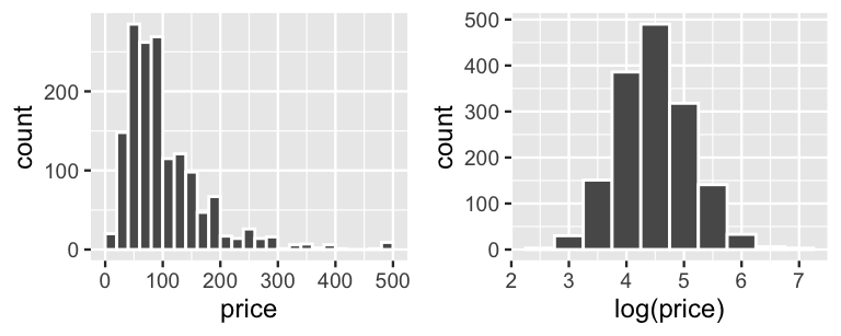
FIGURE 19.1: Histograms of AirBnB listing prices in dollars (left) and log(dollars) (right).
19.1.1 A model using only individual-level predictors
As you might expect, an AirBnB listing’s price is positively associated with the number of bedrooms it has, its overall user rating (on a 1 to 5 scale), and the privacy allotted by its room_type, i.e., whether the renter gets an entire private unit, gets a private room within a shared unit, or shares a room:
ggplot(airbnb, aes(y = log(price), x = bedrooms)) +
  geom_jitter()
ggplot(airbnb, aes(y = log(price), x = rating)) +
  geom_jitter()
ggplot(airbnb, aes(y = log(price), x = room_type)) +
  geom_boxplot()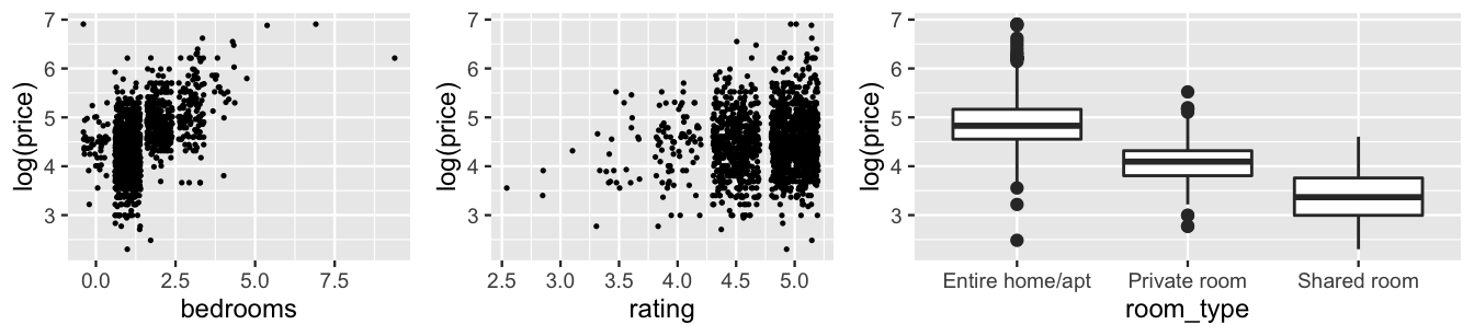
FIGURE 19.2: Plots of the log(price) of AirBnB listings by the number of bedrooms (left), user rating (middle), and room type (right).
Further, though we’re not interested in the particular Chicago neighborhoods in the airbnb data (rather we want to use this data to learn about the broader market), we shouldn’t simply ignore them either.
In fact, boxplots of the listing prices in each neighborhood hint at correlation within neighborhoods.
As is true with real estate in general, AirBnB listings tend to be less expensive in some neighborhoods (e.g., 13 and 41) and more expensive in others (e.g., 21 and 36):
ggplot(airbnb, aes(y = log(price), x = neighborhood)) +
  geom_boxplot() +
  scale_x_discrete(labels = c(1:44))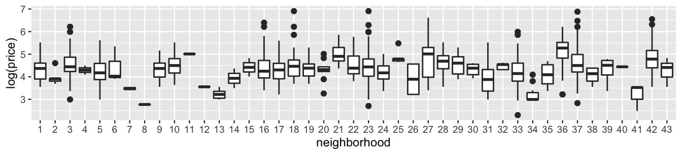
FIGURE 19.3: Boxplots of the log(price) for AirBnB listings, by neighborhood.
To this end, we can build a hierarchical model of AirBnB prices by a listing’s number of bedrooms, rating, and room type while accounting for the neighborhood grouping structure. For listing \(i\) in neighborhood \(j\), let \(Y_{ij}\) denote the price, \(X_{ij1}\) the number of bedrooms, \(X_{ij2}\) the rating,
\[X_{ij3} = \begin{cases} 1 & \text{private room} \\ 0 & \text{otherwise} \\ \end{cases} \;\; \text{ and } \;\; X_{ij4} = \begin{cases} 1 & \text{shared room} \\ 0 & \text{otherwise}. \\ \end{cases}\]
Given the symmetric, continuous nature of the logged prices, we’ll implement the following Normal hierarchical regression model of \(log(Y)\) by \((X_1,X_2,X_3,X_4)\):
\[\begin{equation} \begin{array}{rll} \log(Y_{ij}) | \beta_{0j}, \beta_1, \ldots, \beta_4, \sigma_y & \sim N(\mu_{ij}, \sigma_y^2) & \text{(within neighborhood $j$)} \\ \text{where } \mu_{ij} & = \beta_{0j} + \beta_1 X_{ij1} + \cdots + \beta_4 X_{ij4} & \\ \beta_{0j} | \beta_0, \sigma_0 & \stackrel{ind}{\sim} N(\beta_0, \sigma_0^2) & \text{(between neighborhoods)}\\ \beta_{0c} & \sim N(4.6, 1.6^2) & \text{(global priors)} \\ \beta_1 & \sim N(0, 2.01^2) & \\ \beta_2 & \sim N(0, 4.66^2) & \\ \beta_3 & \sim N(0, 3.19^2) & \\ \beta_4 & \sim N(0, 8.98^2) & \\ \sigma_y & \sim \text{Exp}(1.6) & \\ \sigma_0 & \sim \text{Exp}(1) & \\ \end{array} \tag{19.1} \end{equation}\]
Notice that (19.1) allows for random neighborhood-specific intercepts yet assumes shared predictor coefficients.
That is, we assume that the baseline listing prices might vary from neighborhood to neighborhood, but that the listing features have the same association with price in each neighborhood.
Further, beyond our vague understanding that the typical listing has a nightly price of $100 (hence a log(price) of roughly 4.6), our weakly informative priors are tuned by stan_glmer().
The corresponding posterior is simulated below with a prior_summary() which confirms the prior specifications in (19.1).
airbnb_model_1 <- stan_glmer(
  log(price) ~ bedrooms + rating + room_type + (1 | neighborhood),
  data = airbnb, family = gaussian,
  prior_intercept = normal(4.6, 2.5, autoscale = TRUE),
  prior = normal(0, 2.5, autoscale = TRUE),
  prior_aux = exponential(1, autoscale = TRUE),
  prior_covariance = decov(reg = 1, conc = 1, shape = 1, scale = 1),
  chains = 4, iter = 5000*2, seed = 84735
)

prior_summary(airbnb_model_1)
The pp_check() in Figure 19.4 (left) reassures us that ours is a reasonable model – 100 posterior simulated datasets of logged listing prices have features similar to the original logged listing prices.
It’s not because we’re brilliant, but because we tried other things first.
Our first approach was to model price, instead of logged price.
Yet a pp_check() confirmed that this original model didn’t capture the skewed nature in prices (Figure 19.4 right).
pp_check(airbnb_model_1) +
  labs(title = "airbnb_model_1 of log(price)") +
  xlab("log(price)")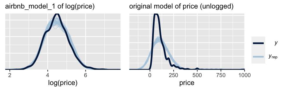
FIGURE 19.4: Posterior predictive checks of the Normal models of logged AirBnB listing prices (left) and raw, unlogged listing prices (right).
19.1.2 Incorporating group-level predictors
If this were Chapter 17, we might stop our analysis with this model – it’s pretty good!
Yet we wouldn’t be maximizing the information in our airbnb data.
In addition to features on the individual listings…
airbnb %>%
  select(price, neighborhood, bedrooms, rating, room_type) %>%
  head(3)
  price neighborhood bedrooms rating       room_type
1    85  Albany Park        1    5.0    Private room
2    35  Albany Park        1    5.0    Private room
3   175  Albany Park        2    4.5 Entire home/apt
we have features of the broader neighborhoods themselves, such as ratings for walkability and access to public transit (on 0 to 100 scales).
These features are shared by each listing in the neighborhood.
For example, all listings in Albany Park have a walk_score of 87 and a transit_score of 62:
airbnb %>%
  select(price, neighborhood, walk_score, transit_score) %>%
  head(3)
  price neighborhood walk_score transit_score
1    85  Albany Park         87            62
2    35  Albany Park         87            62
3   175  Albany Park         87            62
Putting this together, airbnb includes individual-level predictors (e.g., rating) and group-level predictors (e.g., walkability).
The latter are ignored by our current model (19.1).
Consider the neighborhood-specific intercepts \(\beta_{0j}\).
The original model (19.1) uses the same prior for each \(\beta_{0j}\), assuming that the baseline logged prices in neighborhoods are Normally distributed around some mean logged price \(\beta_0\) with standard deviation \(\sigma_0\):
\[\begin{equation} \beta_{0j} | \beta_0, \sigma_0 \stackrel{ind}{\sim} N(\beta_0, \sigma_0^2) . \tag{19.2} \end{equation}\]
By lumping them together in this way, (19.2) assumes that we have the same prior information about the baseline price in each neighborhood.
This is fine in cases where we truly don’t have any information to distinguish between groups, here neighborhoods.
Yet our airbnb analysis doesn’t fall into this category.
Figure 19.5 plots the average logged AirBnB price in each neighborhood by its walkability.
The results indicate that neighborhoods with greater walkability tend to have higher AirBnB prices.
(The same goes for transit access, yet we’ll limit our focus to walkability.)
# Calculate mean log(price) by neighborhood
nbhd_features <- airbnb %>%
  group_by(neighborhood, walk_score) %>%
  summarize(mean_log_price = mean(log(price)), n_listings = n()) %>%
  ungroup()

# Plot mean log(price) vs walkability
ggplot(nbhd_features, aes(y = mean_log_price, x = walk_score)) +
  geom_point() +
  geom_smooth(method = "lm", se = FALSE)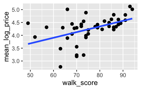
FIGURE 19.5: A scatterplot of the average logged AirBnB listing price by the walkability score for each neighborhood.
What’s more, the average logged price by neighborhood appears to be linearly associated with walkability. Incorporating this observation into our model of \(\beta_{0j}\), (19.2), isn’t much different than incorporating individual-level predictors \(X\) into the first layer of the hierarchical model. First, let \(U_j\) denote the walkability of neighborhood \(j\). Notice a couple of things about this notation:
- Though \(U_j\) is ultimately a predictor of price, we utilize “\(U\)” instead of “\(X\)” to distinguish it as a neighborhood-level, not listing-level predictor.
- Since all listings \(i\) in neighborhood \(j\) share the same walkability value, \(U_j\) needs only a \(j\) subscript.
Next, we can replace the global trend in \(\beta_{0j}\), \(\beta_0\), with a neighborhood-specific linear trend \(\mu_{0j}\) informed by walkability \(U_j\):
\[\begin{equation} \mu_{0j} = \gamma_0 + \gamma_1 U_{j} . \tag{19.3} \end{equation}\]
This switch introduces two new model parameters which describe the linear trend between the baseline listing price and walkability of a neighborhood:
intercept \(\gamma_0\) technically measures the average logged price we’d expect for neighborhoods with 0 walkability (though no such neighborhood exists); and
slope \(\gamma_1\) measures the expected change in a neighborhood’s typical logged price with each extra point in walkability score.
Our final AirBnB model thus expands upon (19.1) by incorporating the group-level regression model (19.3) along with prior models for the new group-level regression parameters.
Given the large number of model parameters, we do not write out the independent and weakly informative priors here.
These can be obtained using prior_summary() below.
\[\begin{equation} \begin{array}{rll} \log(Y_{ij}) | \beta_{0j}, \beta_1, \ldots, \beta_4, \sigma_y & \sim N(\mu_j, \sigma_y^2) & \text{with } \mu_j = \beta_{0j} + \beta_1 X_{ij1} + \cdots + \beta_4 X_{ij4} \\ \beta_{0j} | \gamma_0, \gamma_1, \sigma_0 & \stackrel{ind}{\sim} N(\mu_{0j}, \sigma_0^2) & \text{with } \mu_{0j} = \gamma_0 + \gamma_1 U_j \\ \beta_1,\ldots,\beta_4,\gamma_0,\gamma_1,\sigma_0, \sigma_y & \sim \text{ some priors} &\\ \end{array} \tag{19.4} \end{equation}\]
The new notation here might make this model appear more complicated or different than it is.
First, consider what this model implies about the expected price of an AirBnB listing.
For neighborhoods \(j\) that were included in our airbnb data, the expected log price of a listing \(i\) is defined by
\[\beta_{0j} + \beta_1 X_{ij1} + \beta_2 X_{ij2} + \beta_3 X_{ij3} + \beta_4 X_{ij4}\]
where intercepts \(\beta_{0j}\) vary from neighborhood to neighborhood according to their walkability. Beyond the included neighborhoods, the expected log price for an AirBnB listing is defined by replacing \(\beta_{0j}\) with its walkability-dependent mean \(\gamma_0 + \gamma_1 U_j\):
\[(\gamma_0 + \gamma_1 U_j) + \beta_1 X_{ij1} + \beta_2 X_{ij2} + \beta_3 X_{ij3} + \beta_4 X_{ij4} .\]
The parentheses here emphasize the structure of (19.4): the baseline price, \(\gamma_0 + \gamma_1 U_j\), varies from neighborhood to neighborhood depending upon the neighborhood walkability predictor, \(U_j\). Removing them emphasizes another point: walkability \(U_j\) is really just like every other predictor, except that all listings in the same neighborhood share a \(U_j\) value.
Finally, consider the within-group and between-group variability parameters, \(\sigma_y\) and \(\sigma_0\).
Since the first layers of both models utilize the same regression structure of price within neighborhoods, \(\sigma_y\) has the same meaning in our original model (19.1) and new model (19.4): \(\sigma_y\) measures the unexplained variability in listing prices within any neighborhood, given the listings’ bedrooms, rating, and room_type.
Yet, by altering our model of how the typical logged prices vary between neighborhoods, the meaning of \(\sigma_0\) has changed:
- in (19.1), \(\sigma_0\) reflects the unexplained variability in baseline prices \(\beta_{0j}\) from neighborhood to neighborhood;
- in (19.4), \(\sigma_0\) reflects the unexplained variability in baseline prices \(\beta_{0j}\) from neighborhood to neighborhood, after taking the neighborhoods’ walkability into account.
Incorporating group-level predictors
Consider grouped data, where individual \(i\) in group \(j\) has response variable \(Y_{ij}\) and individual-level predictor \(X_{ij}\). Further, let \(U_j\) denote a group-level predictor, the values of which are shared by every individual in group \(j\). The underlying structure of a hierarchical model of \(Y_{ij}\) which includes both individual- and group-level predictors is given by (19.5):
\[\begin{equation} \begin{split} \text{ model of } Y_{ij} \text{ within group $j$:} & \; \beta_{0j} + \beta_1 X_{ij} \\ \text{ model of } \beta_{0j} \text{ between groups:} & \; \gamma_0 + \gamma_1 U_j \\ \beta_1, \gamma_0, \gamma_1, ... & \sim \text{ some priors}. \\ \end{split} \tag{19.5} \end{equation}\]
The first layer of (19.5) reflects the relationship between individual \(Y_{ij}\) and \(X_{ij}\) values, with intercepts \(\beta_{0j}\) that vary by group \(j\). The next layer reflects how our prior understanding of the group parameters \(\beta_{0j}\) might be informed by the group-level predictor \(U_j\). Pulling these two layers together, the expected relationship between \(Y_{ij}\) and \(X_{ij}\) is
\[(\gamma_0 + \gamma_1 U_j) + \beta_1 X_{ij}\]
where intercept \((\gamma_0 + \gamma_1 U_j)\) depends upon a group’s \(U_j\) value.
19.1.3 Posterior simulation & global analysis
To simulate the posteriors of our hierarchical model (19.4), we need only plunk the group-level walk_score predictor directly into the stan_glmer() formula.
Since all listings in the same neighborhood share the same walk_score, it is automatically recognized as a group-level predictor.
airbnb_model_2 <- stan_glmer(
  log(price) ~ walk_score + bedrooms + rating + room_type +
    (1 | neighborhood),
  data = airbnb, family = gaussian,
  prior_intercept = normal(4.6, 2.5, autoscale = TRUE),
  prior = normal(0, 2.5, autoscale = TRUE),
  prior_aux = exponential(1, autoscale = TRUE),
  prior_covariance = decov(reg = 1, conc = 1, shape = 1, scale = 1),
  chains = 4, iter = 5000*2, seed = 84735
)

# Don't forget to check the prior specifications!
prior_summary(airbnb_model_2)
Let’s dig into and compare the global median models associated with airbnb_model_2 and airbnb_model_1, our original model which did not include the neighborhood-level walkability predictor (19.1).
We combine the summaries of the regression parameters for ease of comparison, yet encourage you to also check out the separate model_1_mean and model_2_mean summaries:
# Get relationship summaries for both models
model_1_mean <- tidy(airbnb_model_1, effects = "fixed")
model_2_mean <- tidy(airbnb_model_2, effects = "fixed")

# Combine the summaries for both models
combined_summaries <- model_1_mean %>%
  right_join(., model_2_mean, by = "term",
             suffix = c("_model_1", "_model_2")) %>%
  select(-starts_with("std.error"))

combined_summaries
# A tibble: 6 x 3
  term                estimate_model_1 estimate_model_2
  <chr>                          <dbl>            <dbl>
1 (Intercept)                    3.21            1.92
2 bedrooms                       0.265           0.265
3 rating                         0.220           0.221
4 room_typePrivate r…           -0.538          -0.537
5 room_typeShared ro…           -1.06           -1.06
6 walk_score                    NA               0.0166
Based on these tidy() summaries, the posterior median models of log(price) for the two models are:
\[\begin{array}{lr} \text{model 1:} & 3.21 + 0.265 X_{ij1} + 0.22 X_{ij2} - 0.538 X_{ij3} - 1.06 X_{ij4} \\ \text{model 2:} & (1.92 + 0.0166 U_j) + 0.265 X_{ij1} + 0.221 X_{ij2} - 0.537 X_{ij3} - 1.06 X_{ij4}. \\ \end{array}\]
With the exception of the intercept terms, the posterior median models are nearly indistinguishable.
This makes sense.
Including the group-level walkability predictor in airbnb_model_2 essentially replaces the original global intercept \(\beta_0\) in airbnb_model_1 with \(\gamma_0 + \gamma_1 U_j\), without tweaking the individual-level \(X\) predictors.
We can also interpret airbnb_model_2’s posterior median coefficients as usual, both listing- and neighborhood-level, while being mindful of the logged scale of the price response variable.
For example, when controlling for the other model predictors, the typical logged price for a shared room is roughly 1.06 less than that for an entire private home.
More meaningfully, the typical price for a shared room is roughly one-third of that for an entire private home (\(e^{-1.06}\)) \(\approx\) 0.35).
Further, for every extra 10 points in a neighborhood’s walkability rating, we expect the typical price of listings in that neighborhood to increase by roughly 18 percent (\(e^{10*0.0166} \approx 1.18\)).
In a similar spirit, let’s obtain and compare posterior summaries for the standard deviation parameters, \(\sigma_y\) (sd_Observation.Residual) and \(\sigma_0\) (sd_(Intercept).neighborhood):
# Get variance summaries for both models
model_1_var <- tidy(airbnb_model_1, effects = "ran_pars")
model_2_var <- tidy(airbnb_model_2, effects = "ran_pars")

# Combine the summaries for both models
model_1_var %>%
  right_join(., model_2_var, by = "term",
             suffix = c("_model_1", "_model_2")) %>%
  select(-starts_with("group"))
# A tibble: 2 x 3
  term                estimate_model_1 estimate_model_2
  <chr>                          <dbl>            <dbl>
1 sd_(Intercept).nei…            0.279            0.202
2 sd_Observation.Res…            0.365            0.366
The posterior medians of the within-group variability parameter \(\sigma_y\) are nearly indistinguishable for our two models: 0.365 vs 0.366.
This suggests that incorporating the neighborhood-level walkability predictor didn’t improve our understanding of the variability in individual listing prices within neighborhoods, i.e., why some listings are more expensive than others in the same neighborhood.
Makes sense!
Since all listings within a neighborhood share the same walkability value \(U_j\), including this information in airbnb_model_2 doesn’t help us distinguish between listings in the same neighborhood.
In contrast, the posterior median of the between-group variability parameter \(\sigma_0\) is notably smaller in airbnb_model_2 than in airbnb_model_1: 0.202 vs 0.279.
Recall that \(\sigma_0\) reflects our uncertainty about neighborhood baseline prices \(\beta_{0j}\).
Thus, the drop in \(\sigma_0\) from airbnb_model_1 to airbnb_model_2 indicates that, by including the neighborhood-level walkability predictor, we have increased our certainty about the neighborhood-level \(\beta_{0j}\) parameter.
Or, in words, walkability helps explain why some neighborhoods tend to have more expensive listings than others.
This, too, makes sense!
An observation about group-level predictors
Including a group-level predictor tends to increase our certainty about between-group trends (how groups differ from one another) while not improving our certainty about within-group trends (how individual observations within the same group differ from one another).
19.1.4 Posterior group-level analysis
In a final consideration of the impact of the walkability predictor on our AirBnB price model, let’s dig into the neighborhood-level trends. Consider two of the 43 neighborhoods: Edgewater and Pullman. The typical AirBnB listing prices in these two neighborhoods are nearly equivalent. However, Edgewater is much more walkable than Pullman (89 vs 49), something we’ve seen to be a desirable feature in the AirBnB market:
nbhd_features %>%
  filter(neighborhood %in% c("Edgewater", "Pullman"))
# A tibble: 2 x 4
  neighborhood walk_score mean_log_price n_listings
  <fct>             <int>          <dbl>      <int>
1 Edgewater            89           4.47         35
2 Pullman              49           4.47          5
Our two different models, (19.1) and (19.4), formulate different baseline prices \(\beta_{0j}\) for these two neighborhoods. Letting \(b_{0j}\) denote a neighborhood \(j\) adjustment:
\[\begin{equation} \begin{array}{lrr} \text{model 1:} & \beta_{0j} = & \beta_0 + b_{0j} \\ \text{model 2:} & \beta_{0j} = & \gamma_0 + \gamma_1 U_j + b_{0j}. \\ \end{array} \tag{19.6} \end{equation}\]
To calculate the posterior median intercepts \(\beta_{0j}\) for both neighborhoods in both models, we can utilize the posterior median values of \((\beta_0, \gamma_0, \gamma_1)\), (3.21, 1.92, 0.0166), from the earlier tidy(..., effects = "fixed") summaries:
combined_summaries %>%
  filter(term %in% c("(Intercept)", "walk_score"))
# A tibble: 2 x 3
  term        estimate_model_1 estimate_model_2
  <chr>                  <dbl>            <dbl>
1 (Intercept)             3.21           1.92
2 walk_score             NA              0.0166
Further, we can obtain the neighborhood adjustments \(b_{0j}\) for both models from the tidy(..., effects = "ran_vals") summaries below:
# Get neighborhood summaries from both models
model_1_nbhd <- tidy(airbnb_model_1, effects = "ran_vals")
model_2_nbhd <- tidy(airbnb_model_2, effects = "ran_vals")

# Combine the summaries for both models
model_1_nbhd %>%
  right_join(., model_2_nbhd, by = "level",
             suffix = c("_model_1", "_model_2")) %>%
  select(-starts_with(c("group", "term", "std.error"))) %>%
  filter(level %in% c("Edgewater", "Pullman"))
# A tibble: 2 x 3
  level     estimate_model_1 estimate_model_2
  <chr>                <dbl>            <dbl>
1 Edgewater           0.0705           -0.109
2 Pullman             0.0640            0.320
Then plugging into (19.6), the posterior median intercepts \(\beta_{0j}\) for both neighborhoods in both models are as follows:
| neighborhood | model 1 intercept | model 2 intercept |
|---|---|---|
| Edgewater | 3.21 + 0.0705 = 3.2805 | 1.92 + 0.0166*89 - 0.109 = 3.2884 |
| Pullman | 3.21 + 0.064 = 3.274 | 1.92 + 0.0166*49 + 0.32 = 3.0534 |
There are some cool and intuitive things to notice in this table:
In
airbnb_model_1, the two neighborhoods have nearly identical intercepts. This isn’t surprising –airbnb_model_1ignores the fact that Edgewater is much more walkable than Pullman. Thus, since the typical prices are so similar in the two neighborhoods, so too are their intercepts.In
airbnb_model_2, Pullman’s intercept is much lower than Edgewater’s. This also isn’t surprising –airbnb_model_2takes into account that neighborhood prices are positively associated with walkability (1.92 + 0.0166*\(U_j\)). Since Pullman’s walkability is so much lower than Edgewater’s, so too is its intercept.
Looking beyond Pullman and Edgewater, Figure 19.6 plots the pairs of airbnb_model_1 intercepts (open circles) and airbnb_model_2 intercepts (closed circles) for all 43 sample neighborhoods.
Like the observed average log(prices) in these neighborhoods (Figure 19.5), the airbnb_model_2 intercepts are positively associated with walkability.
The posterior median model of this association is captured by \(\gamma_0 + \gamma_1 U_j \approx 1.92 + 0.0166U_j\).
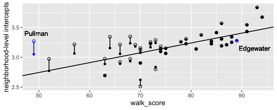
FIGURE 19.6: For each of the 43 neighborhoods in airbnb, the posterior median neighborhood-level intercepts from airbnb_model_1 (open circles) and airbnb_model_2 (closed circles) are plotted versus neighborhood walkability. Vertical lines connect the neighborhood intercept pairs. The sloped line represents the airbnb_model_2 posterior median model of log(price) by walkability, \(\gamma_0 + \gamma_1 U_j \approx 1.92 + 0.0166U_j\).
The comparison between the two models’ intercepts is also notable here.
As our numerical calculations above confirm, Edgewater’s intercepts are quite similar in the two models.
(It’s tough to even visually distinguish between them!)
Since its airbnb_model_1 intercept was already so close to the price vs walkability trend, incorporating the walkability predictor in airbnb_model_2 didn’t do much to change our mind about Edgewater.
In contrast, Pullman’s airbnb_model_1 intercept implied a much higher baseline price than we would expect for a neighborhood with such low walkability.
Upon incorporating walkability, airbnb_model_2 thus pulled Pullman’s intercept down, closer to the trend.
We’ve been here before.
Hierarchical models pool information across all groups, allowing what we learn about some groups to improve our understanding of others.
As evidenced by the airbnb_model_2 neighborhood intercepts that are pulled toward the trend with walkability, this pooling is intensified by incorporating a group-level predictor and is especially pronounced for neighborhoods that either (1) have airbnb_model_1 intercepts that fall far from the trend or (2) have small sample sizes.
For example, Pullman falls into both categories.
Not only is its airbnb_model_1 intercept quite far above the trend with walkability, our airbnb data included only 5 listings in Pullman (contrasted by 35 in Edgewater):
nbhd_features %>%
  filter(neighborhood %in% c("Edgewater", "Pullman"))
# A tibble: 2 x 4
  neighborhood walk_score mean_log_price n_listings
  <fct>             <int>          <dbl>      <int>
1 Edgewater            89           4.47         35
2 Pullman              49           4.47          5
In this case, the pooled information from the other neighborhoods regarding the relationship between prices and walkability has a lot of sway in our posterior understanding about Pullman.
Another observation about group-level predictors
Utilizing group-level predictors increases our ability to pool information across groups, thereby especially enhancing our understanding of groups with small sample sizes.
19.1.5 We’re just scratching the surface!
The model we’re considering here just scratches the surface. We can go deeper by connecting it to other themes we’ve considered throughout Units 3 and 4. To name a few:
- we can incorporate more than one group-level predictor;
- group-level and individual-level predictors might interact; and
- group-level predictors might help us better understand group-specific “slopes” or regression parameters, not just group-specific intercepts.
19.2 Incorporating two (or more!) grouping variables
19.2.1 Data with two grouping variables
In Chapter 18 we used the climbers data to model the success of a mountain climber in summiting a peak, by their age and use of oxygen:
# Import, rename, & clean data
data(climbers_sub)
climbers <- climbers_sub %>%
  select(peak_name, expedition_id, member_id, success,
         year, season, age, expedition_role, oxygen_used)
In doing so, we were mindful of the fact that climbers were grouped into different expeditions, the success of one climber in an exhibition being directly tied to the success of others. For example, 5 climbers participated in the “AMAD03107” expedition:
# Summarize expeditions
expeditions <- climbers %>%
  group_by(peak_name, expedition_id) %>%
  summarize(n_climbers = n())

head(expeditions, 2)
# A tibble: 2 x 3
# Groups:   peak_name [1]
  peak_name  expedition_id n_climbers
  <fct>      <chr>              <int>
1 Ama Dablam AMAD03107              5
2 Ama Dablam AMAD03327              6
But that’s not all! If you look more closely, you’ll notice another grouping factor in the data: the mountain peak being summited. For example, our dataset includes 27 different expeditions with a total of 210 different climbers that set out to summit the Ama Dablam peak:
# Summarize peaks
peaks <- expeditions %>%
  group_by(peak_name) %>%
  summarize(n_expeditions = n(), n_climbers = sum(n_climbers))

head(peaks, 2)
# A tibble: 2 x 3
  peak_name   n_expeditions n_climbers
  <fct>               <int>      <int>
1 Ama Dablam             27        210
2 Annapurna I             6         62
Altogether, the climbers dataset includes information about 2076 individual climbers, grouped together in 200 expeditions, to 46 different peaks:
# Number of climbers
nrow(climbers)
[1] 2076
# Number of expeditions
nrow(expeditions)
[1] 200
# Number of peaks
nrow(peaks)
[1] 46
Further, these groupings are nested: the data consists of climbers within expeditions and expeditions within peaks. That is, a given climber does not set out on every expedition nor does a given expedition set out to summit every peak. Figure 19.7 captures a simplified version of this nested structure in pictures, assuming only 2 climbers within each of 6 expeditions and 2 expeditions within each of 3 peaks.
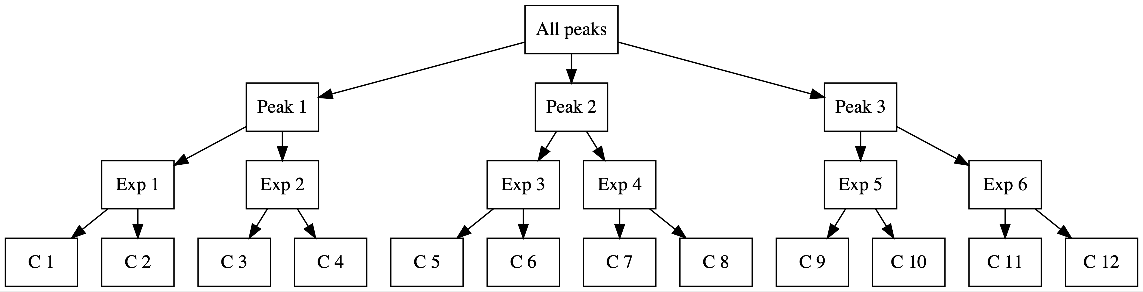
FIGURE 19.7: In the nested group structure, climbers (C) are nested within expeditions (Exp), which are nested within peaks.
19.2.2 Building a model with two grouping variables
Just as we shouldn’t ignore the fact that the climbers are grouped by expedition, we shouldn’t ignore the fact that expeditions are grouped by the peak they try to summit. After all, due to different elevations, steepness, etc., some peaks are easier to summit than others. Thus, the success of expeditions that pursue the same peak are inherently related. At the easier end of the climbing spectrum, 3 of the 46 sample peaks had a success rate of 1 – all sampled climbers that set out for those 3 peaks were successful. At the tougher end, 20 peaks had a success rate of 0 – none of the climbers that set out for those peaks were successful.
climbers %>%
  group_by(peak_name) %>%
  summarize(p_success = mean(success)) %>%
  ggplot(., aes(x = p_success)) +
    geom_histogram(color = "white")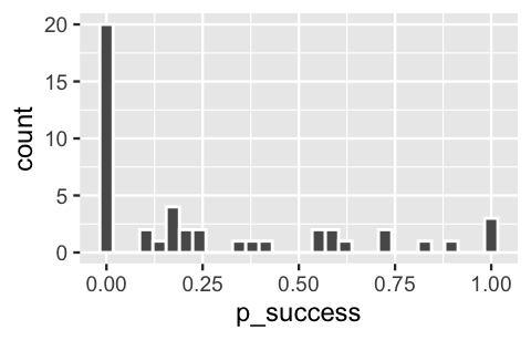
FIGURE 19.8: A histogram of the climbing success rates at 46 different mountain peaks.
Now, we don’t really care about the particular 46 peaks represented in the climbers dataset.
These are just a sample from a vast world of mountain climbing.
Thus, to incorporate it into our analysis of climber success, we’ll include peak name as a grouping variable, not a predictor.
This second grouping variable, in addition to expedition group, requires a new subscript.
Let \(Y_{ijk}\) denote whether or not climber \(i\) that sets out with expedition \(j\) to summit peak \(k\) is successful,
\[Y_{ijk} = \begin{cases} 1 & \text{yes} \\ 0 & \text{no} \\ \end{cases}\]
and \(\pi_{ijk}\) denote the corresponding probability of success. Further, let \(X_{ijk1}\) and \(X_{ijk2}\) denote the climber’s age and whether they received oxygen, respectively. In models where expedition \(j\) or peak \(k\) or both are ignored, we’ll drop the relevant subscripts.
Given the binary nature of response variable \(Y\), we can utilize hierarchical logistic regression for its analysis. Consider two approaches to this task. Like our approach in Chapter 18, Model 1 assumes that baseline success rates vary by expedition \(j\), and thus incorporates expedition-specific intercepts \(\beta_{0j}\). In past chapters, we learned that we can think of \(\beta_{0j}\) as a random tweak or adjustment \(b_{0j}\) to some global intercept \(\beta_0\):
\[\begin{array}{rcl} \log\left(\frac{\pi_{ij}}{1 - \pi_{ij}}\right) = & \beta_{0j} & + \beta_1 X_{ij1} + \beta_2 X_{ij2} \\ = & (\beta_0 + b_{0j}) & + \beta_1 X_{ij1} + \beta_2 X_{ij2} \\ \end{array}\]
Accordingly, we’ll specify Model 1 as follows, where the random tweaks \(b_{0j}\) are assumed to be Normally distributed around 0, and thus the random intercepts \(\beta_{0j}\) Normally distributed around \(\beta_0\), with standard deviation \(\sigma_b\).
Further, the weakly informative priors are tuned by stan_glmer() below, where we again utilize a baseline prior assumption that the typical climber has a 0.5 probability, or 0 log(odds), of success:
\[\begin{equation} \begin{array}{rll} Y_{ij}|\beta_0,\beta_1,\beta_2,b_{0j} & \sim \text{Bern}(\pi_{ij}) & \text{(within expedition $j$)}\\ \text{ with } \log\left(\frac{\pi_{ij}}{1 - \pi_{ij}}\right) & = (\beta_0 + b_{0j}) + \beta_1 X_{ij1} + \beta_2 X_{ij2} & \\ b_{0j} | \sigma_b & \stackrel{ind}{\sim} N(0, \sigma_b^2) & \text{(between expeditions)} \\ \beta_{0c} & \sim N(0, 2.5^2) & \text{(global priors)}\\ \beta_1 & \sim N(0, 0.24^2) & \\ \beta_2 & \sim N(0, 5.51^2) & \\ \sigma_b & \sim \text{Exp}(1). & \\ \end{array} \tag{19.7} \end{equation}\]
Next, let’s acknowledge our second grouping factor. Model 2 assumes that baseline success rates vary by expedition \(j\) AND peak \(k\), thereby incorporating expedition- and peak-specific intercepts \(\beta_{0jk}\). Following our approach to Model 1, we obtain these \(\beta_{0jk}\) intercepts by adjusting the global intercept \(\beta_0\) by expedition-tweak \(b_{0j}\) and peak-tweak \(p_{0k}\):
\[\begin{array}{rcl} \log\left(\frac{\pi_{ijk}}{1 - \pi_{ijk}}\right) = & \beta_{0jk} & + \beta_1 X_{ijk1} + \beta_2 X_{ijk2} \\ = & (\beta_0 + b_{0j} + p_{0k}) & + \beta_1 X_{ijk1} + \beta_2 X_{ijk2}. \\ \end{array}\]
Thus, for expedition \(j\) and peak \(k\), we’ve decomposed the intercept \(\beta_{0jk}\) into three pieces:
- \(\beta_0\) = the global baseline success rate across all climbers, expeditions, and peaks
- \(b_{0j}\) = an adjustment to \(\beta_0\) for climbers in expedition \(j\)
- \(p_{0k}\) = an adjustment to \(\beta_0\) for expeditions that try to summit peak \(k\).
The complete Model 2 specification follows, where the independent weakly informative priors are specified by stan_glmer() below:
\[\begin{equation} \begin{split} Y_{ijk}|\beta_0,\beta_1,\beta_2,b_{0j},p_{0k} & \sim \text{Bern}(\pi_{ijk}) \;\; \\ \text{ with } & \log\left(\frac{\pi_{ijk}}{1 - \pi_{ijk}}\right) = (\beta_0 + b_{0j} + p_{0k}) + \beta_1 X_{ijk1} + \beta_2 X_{ijk2} \\ b_{0j} | \sigma_b & \stackrel{ind}{\sim} N(0, \sigma_b^2) \\ p_{0k} | \sigma_p & \stackrel{ind}{\sim} N(0, \sigma_p^2) \\ \beta_{0c} & \sim N(0, 2.5^2) \\ \beta_1 & \sim N(0, 0.24^2) \\ \beta_2 & \sim N(0, 5.51^2) \\ \sigma_b & \sim \text{Exp}(1) \\ \sigma_p & \sim \text{Exp}(1). \\ \end{split} \tag{19.8} \end{equation}\]
Note that the two between variance parameters are interpreted as follows:
- \(\sigma_b\) = variability in success rates from expedition to expedition within a peak; and
- \(\sigma_{p}\) = variability in success rates from peak to peak.
This is quite a philosophical leap! We’ll put some specificity into the details by simulating the model posteriors in the next section.
19.2.3 Simulating models with two grouping variables
The posteriors corresponding to Models 1 and 2, (19.7) and (19.8), are simulated below.
Notice that to incorporate the additional peak-related grouping variable in Model 2, we merely add (1 | peak_name) to the model formula:
climb_model_1 <- stan_glmer(
  success ~ age + oxygen_used + (1 | expedition_id),
  data = climbers, family = binomial,
  prior_intercept = normal(0, 2.5, autoscale = TRUE),
  prior = normal(0, 2.5, autoscale = TRUE),
  prior_covariance = decov(reg = 1, conc = 1, shape = 1, scale = 1),
  chains = 4, iter = 5000*2, seed = 84735
)

climb_model_2 <- stan_glmer(
  success ~ age + oxygen_used + (1 | expedition_id) + (1 | peak_name),
  data = climbers, family = binomial,
  prior_intercept = normal(0, 2.5, autoscale = TRUE),
  prior = normal(0, 2.5, autoscale = TRUE),
  prior_covariance = decov(reg = 1, conc = 1, shape = 1, scale = 1),
  chains = 4, iter = 5000*2, seed = 84735
)
The tidy() summaries below illuminate the posterior models of the regression coefficients \((\beta_0, \beta_1, \beta_2)\) for both Models 1 and 2.
In general, these two models lead to similar conclusions about the expected relationship between climber success with age and use of oxygen: aging doesn’t help, but oxygen does.
For example, by the posterior median estimates of \(\beta_1\) and \(\beta_2\) from climb_model_2, the odds of success are roughly cut in half for every extra 15 years in age (\(e^{15*-0.0475} = 0.49\)) and increase nearly 500-fold with the use of oxygen (\(e^{6.19} = 486.65\)).
# Get trend summaries for both models
climb_model_1_mean <- tidy(climb_model_1, effects = "fixed")
climb_model_2_mean <- tidy(climb_model_2, effects = "fixed")

# Combine the summaries for both models
climb_model_1_mean %>%
  right_join(., climb_model_2_mean, by ="term",
             suffix = c("_model_1", "_model_2")) %>%
  select(-starts_with("std.error"))
# A tibble: 3 x 3
  term            estimate_model_1 estimate_model_2
  <chr>                      <dbl>            <dbl>
1 (Intercept)              -1.42            -1.55
2 age                      -0.0474          -0.0475
3 oxygen_usedTRUE           5.79             6.19
What does change quite a bit from climb_model_1 to climb_model_2 is our understanding of what contributes to the overall variability in success rates.
Both models acknowledge that some variability can be accounted for by the age and oxygen use among climbers within an expedition.
Yet individual climbers do not account for all variability in success.
To this end, climb_model_1 attributes the remaining variability to differences between expeditions – some expeditions are set up to be more successful than others.
Doubling down on this idea, climb_model_2 assumes that the remaining variability might be explained by both the inherent differences between expeditions and those between peaks – some peaks are easier to climb than others.
The posterior medians for these variability sources are summarized below, where sd_(Intercept).expedition_id corresponds to the standard deviation in success rates between expeditions (\(\sigma_b\)) and sd_(Intercept).peak_name to the standard deviation between peaks (\(\sigma_p\)):
# Get variance summaries for both models
climb_model_1_var <- tidy(climb_model_1, effects = "ran_pars")
climb_model_2_var <- tidy(climb_model_2, effects = "ran_pars")

# Combine the summaries for both models
climb_model_1_var %>%
  right_join(., climb_model_2_var, by = "term",
             suffix =c("_model_1", "_model_2")) %>%
  select(-starts_with("group"))
# A tibble: 2 x 3
  term                estimate_model_1 estimate_model_2
  <chr>                          <dbl>            <dbl>
1 sd_(Intercept).exp…             3.65             3.10
2 sd_(Intercept).pea…            NA                1.85
Starting with climb_model_1, the variability in success rates from expedition to expedition has a posterior median value of 3.65.
This variability is redistributed in climb_model_2 to both peaks and expeditions within peaks.
There are a few patterns to pick up on here:
The variability in success rates from peak to peak, \(\sigma_p\), is smaller than that from expedition to expedition within any given peak, \(\sigma_b\). This suggests that there are greater differences between expeditions on the same peak than between the peaks themselves.
The posterior median of \(\sigma_b\) drops from
climb_model_1toclimb_model_2. This makes sense for two reasons. First, some of the expedition-related variability inclimb_model_1is being redistributed and attributed to peaks inclimb_model_2. Second, \(\sigma_b\) measures the variability in success across all expeditions inclimb_model_1, but the variability across expeditions within the same peak inclimb_model_2– naturally, the outcomes of expeditions on the same peak are more consistent than the outcomes of expeditions across all peaks.
19.2.4 Examining the group-specific parameters
Finally, let’s examine what climb_model_2 indicates about the success rates \(\pi_{ijk}\) across different peaks \(k\), expeditions \(j\), and climbers \(i\):
\[\begin{equation} \log\left(\frac{\pi_{ijk}}{1 - \pi_{ijk}}\right) = (\beta_0 + b_{0j} + p_{0k}) + \beta_1 X_{ijk1} + \beta_2 X_{ijk2} . \tag{19.9} \end{equation}\]
Earlier we observed the posterior properties of the global parameters (\(\beta_0,\beta_1,\beta_2\)):
# Global regression parameters
climb_model_2_mean %>%
  select(term, estimate)
# A tibble: 3 x 2
  term            estimate
  <chr>              <dbl>
1 (Intercept)      -1.55
2 age              -0.0475
3 oxygen_usedTRUE   6.19
Further, for each of the 200 sample expeditions and 46 sample peaks, group_levels_2 provides a tidy posterior summary of the associated \(b_{0j}\) and \(p_{0k}\) adjustments to the global baseline success rate \(\beta_0\):
# Group-level terms
group_levels_2 <- tidy(climb_model_2, effects = "ran_vals") %>%
  select(level, group, estimate)
For example, expeditions to the Ama Dablam peak have a higher than average success rate, with a positive peak tweak of \(p_{0k}\) = 2.92. In contrast, expeditions to Annapurna I have a lower than average success rate, with a negative peak tweak of \(p_{0k}\) = -2.04:
group_levels_2 %>%
  filter(group == "peak_name") %>%
  head(2)
# A tibble: 2 x 3
  level       group     estimate
  <chr>       <chr>        <dbl>
1 Ama_Dablam  peak_name     2.92
2 Annapurna_I peak_name    -2.04
Further, among the various expeditions that tried to summit Ama Dablam, both AMAD03107 and AMAD03327 had higher than average success rates, and thus positive expedition tweaks \(b_{0j}\) (0.0058 and 3.32, respectively):
group_levels_2 %>%
  filter(group == "expedition_id") %>%
  head(2)
# A tibble: 2 x 3
  level     group         estimate
  <chr>     <chr>            <dbl>
1 AMAD03107 expedition_id  0.00575
2 AMAD03327 expedition_id  3.32
We can combine this global, peak-specific, and expedition-specific information to model the success rates for three different groups of climbers.
In cases where the group’s expedition or destination peak falls outside the observed groups in our climbers data, the corresponding tweak is set to 0 – i.e., in the face of the unknown, we assume average behavior for the new expedition or peak:
- Group a climbers join expedition
AMAD03327to Ama Dablam, and thus have positive expedition and peak tweaks, \(b_{0j} = 3.32\) and \(p_{0j} = 2.92\); - Group b climbers join a new expedition to Ama Dablam, and thus have a neutral expedition tweak and a positive peak tweak, \(b_{0j} = 0\) and \(p_{0j} = 2.92\); and
- Group c climbers join a new expedition to Mount Pants Le Pants, a peak not included in our
climbersdata, and thus have neutral expedition and peak tweaks, \(b_{0j} = p_{0j} = 0\).
Plugging these expedition and peak tweaks, along with the posterior medians for (\(\beta_0,\beta_1,\beta_2\)), into (19.9) reveals the posterior median models of success for the three groups of climbers:
\[\begin{array}{llcl} \text{Group a: } & \log\left(\frac{\pi}{1 - \pi}\right) = & (-1.55 + 3.32 + 2.92) & - 0.0475 X_1 + 6.19 X_2 \\ \text{Group b: } & \log\left(\frac{\pi}{1 - \pi}\right) = & (-1.55 + 0 + 2.92) & - 0.0475 X_1 + 6.19 X_2 \\ \text{Group c: } & \log\left(\frac{\pi}{1 - \pi}\right) = & (-1.55 + 0 + 0) & - 0.0475 X_1 + 6.19 X_2 \\ \end{array}\]
Since AMAD03327 has a higher-than-average success rate among expeditions to Ama Dablam, notice that climbers in Group a are “rewarded” with a positive expedition tweak.
Similarly, since Ama Dablam has a higher-than-average success rate among the peaks, the climbers in Groups a and b receive a positive peak tweak.
As a result, climbers in Group c on a new expedition to a new peak have the lowest expected success rate and climbers in Group a the highest.
19.2.5 We’re just scratching the surface!
The two-grouping structure we’re considering here just scratches the surface. We can expand on the theme. For example:
- we might have more than two grouping variables;
- we might incorporate these grouping variables for group-level “slopes” or regression parameters, not just group-level intercepts; and
- our grouping variables might have a crossed or non-nested structure in which levels of “grouping variable 1” might occur with multiple different levels of “grouping variable 2” (unlike the expedition teams which pursue one, not multiple, peaks).
19.3 Exercises
19.3.1 Conceptual exercises
book_banning data to model whether or not a book was removed while accounting for the grouping structure in state, i.e., there being multiple book challenges per state. Indicate whether each variable below is a potential book-level or state-level predictor of removed. Support your claim with evidence.
languagepolitical_value_indexhs_grad_rateantifamily
climbers_sub data to model whether or not a mountain climber had success, while accounting for the grouping structure in expedition_id and peak_id. Indicate whether each variable below is a potential climber-level, expedition-level, or peak-level predictor of success. Support your claim with evidence.
height_metresagecountexpedition_rolefirst_ascent_year
- There are two grouping variables in this study. Name them.
- In the spirit of Figure 19.7, draw a diagram which illustrates the grouping structure of the resulting study data.
- Is the study data “nested?” Explain.
\[\begin{split} Y_{ijk}|\beta_0,b_{0j},p_{0k} & \sim \text{N}(\mu_{ijk}, \sigma_y^2) \;\; \text{ with } \;\; \mu_{ijk} = \beta_0 + b_{0j} + f_{0k} \\ b_{0j} | \sigma_b & \stackrel{ind}{\sim} N(0, \sigma_b^2) \\ f_{0k} | \sigma_f & \stackrel{ind}{\sim} N(0, \sigma_f^2) \\ \beta_{0c}, \sigma_b, \sigma_f & \sim \text{some independent priors}. \\ \end{split}\]
- Explain the meaning of the \(\beta_0\) term in this context.
- Explain the meaning of the \(b_{0j}\) and \(f_{0k}\) terms in this context.
- Suppose that the variance parameters \((\sigma_y, \sigma_b, \sigma_f)\) have posterior median values \((2, 10, 1)\). Compare and contrast these values in the context of widget manufacturing.
19.3.2 Applied exercises
popularity by valence using the spotify data in the bayesrules package. In doing so, we’ll utilize weakly informative priors with a general understanding that the typical artist has a popularity rating of around 50. For illustrative purposes only, we’ll restrict our attention to just 6 artists:
data(spotify)
spotify_small <- spotify %>%
  filter(artist %in% c("Beyoncé", "Camila Cabello", "Camilo",
                       "Frank Ocean", "J. Cole", "Kendrick Lamar")) %>%
select(artist, album_id, popularity, valence)- In previous models of
popularity, we’ve only acknowledged the grouping structure imposed by theartist. Yet there’s a second grouping variable in thespotifydata. What is it? - In the spirit of Figure 19.7, draw a diagram which illustrates the grouping structure of the
spotifydata. - Challenge: plot the relationship between
popularityandvalence, while indicating the two grouping variables.
popularity by valence. For simplicity, utilize random intercepts but not random slopes throughout.
- Define and use careful notation to write out a model of
popularitybyvalencewhich accounts for theartistgrouping variable but ignores the other grouping variable. - Simulate this model and perform a
pp_check(). Use this to explain the consequence of ignoring the other grouping variable. - Define and use careful notation to write out an appropriate model of
popularitybyvalencewhich accounts for both grouping variables. - Simulate this model and perform a
pp_check(). How do thepp_check()results compare to those for your first model?
spotify data.
- Write out the posterior median model of the relationship between
popularityandvalencefor songs in the following groups:- Albums by artists not included in the
spotify_smalldataset - A new album by Kendrick Lamar
- Kendrick Lamar’s “good kid, m.A.A.d city” album (
album_id748dZDqSZy6aPXKcI9H80u)
- Albums by artists not included in the
- Compare the posterior median models from part a. What do they tell us about the relevant artists and albums?
- Which of the 6 sample artists gets the highest “bump” or tweak in their baseline popularity?
- Which sample album gets the highest “bump” or tweak in its baseline popularity? And which artist made this album?
big_word_club data to explore the effectiveness of a digital vocabulary learning program, the Big Word Club (BWC) (Kalil, Mayer, and Oreopoulos 2020). You will build upon this analysis here, modeling the percent change in students’ vocabulary scores throughout the study period (score_pct_change) while accounting for there being multiple student participants per school_id.
# Load & process the data
data("big_word_club")
bwc <- big_word_club %>%
mutate(treat = as.factor(treat))- Consider five potential predictors of
score_pct_change:treat(whether or not the student participated in the BWC or served as a control),age_months,private_school,esl_observed,free_reduced_lunch. Explain whether each is a student-level or school-level predictor. - Use careful notation to specify a hierarchical regression model of
score_pct_changeby these five predictors. Utilize weakly informative priors with a baseline understanding that the typical student might see 0 improvement in their vocabulary score. - Simulate the model posterior and perform a
pp_check().
- Discuss your conclusions from the output in
tidy(..., effects = "fixed", conf.int = TRUE). - Discuss your conclusions from the output in
tidy(..., effects = "ran_pars", conf.int = TRUE).
score_pct_change for students in each of the following schools.
- School “30,” which participated in the vocabulary study
- School “47,” which participated in the vocabulary study
- “Manz Elementary,” a public school at which 95% of students receive free or reduced lunch, and which did not participate in the vocabulary study
- “South Elementary,” a private school at which 10% of students receive free or reduced lunch, and which did not participate in the vocabulary study
- Reflecting on your work above, what school features are associated with greater vocabulary improvement among its students?
- Reflecting on your work above, what student features are associated with greater vocabulary improvement?
19.4 Goodbye!
Goodbye, dear readers. We hope that after working through this book, you feel empowered to go forth and do some Bayes things.