Chapter 6 Approximating the Posterior
Welcome to Unit 2!
Unit 2 serves as a critical bridge to applying the fundamental concepts from Unit 1 in the more sophisticated model settings of Unit 3 and beyond. In Unit 1, we learned to think like Bayesians and to build some fundamental Bayesian models in this spirit. Further, by cranking these models through Bayes’ Rule, we were able to mathematically specify the corresponding posteriors. Those days are over. Though merely hypothetical for now, some day (starting in Chapter 9) the models we’ll be interested in analyzing will get too complicated to mathematically specify. Never fear – data analysts are not known to throw up their hands in the face of the unknown. When we can’t know or specify something, we approximate it. In Unit 2 we’ll explore Markov chain Monte Carlo simulation techniques for approximating otherwise out-of-reach posterior models.
No matter whether we’re able to specify or must approximate a posterior model, we must then be able to understand and apply the results. To this end, we learned how to describe our posterior understanding using model features such as central tendency and variability in Unit 1. Yet in practice, we typically want to perform a deeper posterior analysis. This process of asking “what does it all mean?!” revolves around three major elements that we’ll explore in Unit 2: posterior estimation, hypothesis testing, and prediction.
Learning requires the occasional leap. You’ve already taken a few. From Chapter 2 to Chapter 3, you took the leap from using simple discrete priors to using continuous Beta priors for a proportion \(\pi\). From Chapter 3 to Chapter 5, you took the leap from engineering the Beta-Binomial model to a family of Bayesian models that can be applied in a wider variety of settings. With each leap, your Bayesian toolkit became more flexible and powerful, but at the cost of the underlying math becoming a bit more complicated. As you continue to generalize your Bayesian methods in more sophisticated settings, this complexity will continue to grow.
Consider Michelle’s run for president. In Chapter 3 you built a model of Michelle’s support in Minnesota based on polling data in that state. You could continue to refine your analysis of Michelle’s chances of becoming president. To begin, you could model Michelle’s support in each of the fifty states and Washington, D.C. Better yet, this model might incorporate data on past state-level voting trends and demographics. The trade-off is that increasing your model’s flexibility also makes it more complicated. Whereas your Minnesota-only model depended upon only one parameter \(\pi\), Michelle’s level of support in that state, the new model depends upon dozens of parameters. Here, let \(\theta = (\theta_1, \theta_2, \ldots, \theta_k)\) denote a generic set of \(k \ge 1\) parameters upon which a Bayesian model depends. In your growing Bayesian model of Michelle’s election chances, \(\theta\) includes 51 parameters that represent her support in each state as well as multiple parameters that define the relationships between Michelle’s support among voters, state-level demographics, and past voting trends. Our posterior analysis thus relies on building the posterior pdf of \(\theta\) given a set of observed data \(y\) on state-level polls, demographics, and voting trends,
\[f(\theta | y) = \frac{f(\theta)L(\theta | y)}{f(y)} \propto f(\theta)L(\theta | y) .\]
Though this formula looks familiar, complexity lurks beneath. Since \(\theta\) is a vector with \(k\) elements, \(f(\theta)\) and \(L(\theta|y)\) are complicated multivariate functions. And, if we value our time, we can forget about calculating the normalizing constant \(f(y)\) across all possible \(\theta\), an intractable multiple integral (or multiple sum) for which a closed form solution might not exist:
\[f(y) = \int_{\theta_1}\int_{\theta_2} \cdots \int_{\theta_k} f(\theta)L(\theta | y) d\theta_k \cdots d\theta_2 d\theta_1 .\]
Fortunately, when a Bayesian posterior is either impossible or prohibitively difficult to specify, we’re not out of luck. We must simply change our strategy: instead of specifying the posterior, we can approximate the posterior via simulation. We’ll explore two simulation techniques: grid approximation and Markov chain Monte Carlo (MCMC). When done well, both techniques produce a sample of \(N\) \(\theta\) values,
\[\left\lbrace \theta^{(1)}, \theta^{(2)}, \ldots, \theta^{(N)} \right\rbrace ,\]
with properties that reflect those of the posterior model for \(\theta\). In Chapter 6, we’ll explore these simulation techniques in the familiar Beta-Binomial and Gamma-Poisson model contexts. Though these models don’t require simulation (we can and did specify their posteriors in Unit 1), exploring simulation in these familiar settings will help us build intuition for the process and give us peace of mind that it actually works when we eventually do need it.
- Implement and examine the limitations of using grid approximation to simulate a posterior model.
- Explore the fundamental properties of MCMC posterior simulation techniques and how these differ from grid approximation.
- Implement MCMC simulation in R.
- Learn several Markov chain diagnostics for examining the quality of an MCMC posterior simulation.
But first, load some packages that we’ll be utilizing throughout the remainder of this chapter (and book). Among these, rstan is quite unique, thus be sure to revisit the Preface for directions on installing this package.
# Load packages
library(tidyverse)
library(janitor)
library(rstan)
library(bayesplot)
6.1 Grid approximation
Imagine there’s an image that you can’t view in its entirety – you only observe snippets along a grid that sweeps from left to right across the image. The finer the grid, the clearer the image. And if the grid is fine enough, the result is an excellent approximation of the complete image:

This is the big picture idea behind Bayesian grid approximation, in which case the target “image” is posterior pdf \(f(\theta | y)\). We needn’t observe \(f(\theta | y)\) at every possible \(\theta\) to get a sense of its structure. Rather, we can evaluate \(f(\theta | y)\) at a finite, discrete grid of possible \(\theta\) values. Subsequently, we can take random samples from this discretized pdf to approximate the full posterior pdf \(f(\theta | y)\). We formalize these ideas here and apply them below.
Grid approximation
Grid approximation produces a sample of \(N\) independent \(\theta\) values, \(\left\lbrace \theta^{(1)}, \theta^{(2)}, \ldots, \theta^{(N)} \right\rbrace\), from a discretized approximation of posterior pdf \(f(\theta|y)\). This algorithm evolves in four steps:
- Define a discrete grid of possible \(\theta\) values.
- Evaluate the prior pdf \(f(\theta)\) and likelihood function \(L(\theta|y)\) at each \(\theta\) grid value.
- Obtain a discrete approximation of the posterior pdf \(f(\theta |y)\) by: (a) calculating the product \(f(\theta)L(\theta|y)\) at each \(\theta\) grid value; and then (b) normalizing the products so that they sum to 1 across all \(\theta\).
- Randomly sample \(N\) \(\theta\) grid values with respect to their corresponding normalized posterior probabilities.
6.1.1 A Beta-Binomial example
To bring the grid approximation technique to life, let’s explore the following generic Beta-Binomial model (one without a corresponding data story):
\[\begin{equation} \begin{split} Y|\pi & \sim \text{Bin}(10, \pi) \\ \pi & \sim \text{Beta}(2, 2) . \\ \end{split} \tag{6.1} \end{equation}\]
We can interpret \(Y\) here as the number of successes in 10 independent trials. Each trial has probability of success \(\pi\) where our prior understanding about \(\pi\) is captured by a \(\text{Beta}(2, 2)\) model. Suppose we observe \(Y = 9\) successes. Then by our work in Chapter 3, we know that the updated posterior model of \(\pi\) is Beta with parameters 11 (\(Y + \alpha = 9 + 2\)) and 3 (\(n - Y + \beta = 10 - 9 + 2\)):
\[\pi | (Y = 9) \sim \text{Beta}(11, 3) .\]
We’re now going to ask you to forget that we were able to specify this posterior. Instead, we’ll try to approximate the posterior using grid approximation. As Step 1, we need to split the continuum of possible \(\pi\) values on 0 to 1 into a finite grid. We’ll start with a course grid of only 6 \(\pi\) values, \(\pi \in \{0, 0.2, 0.4, 0.6, 0.8, 1\}\):
# Step 1: Define a grid of 6 pi values
grid_data <- data.frame(pi_grid = seq(from = 0, to = 1, length = 6))
In Step 2 we use dbeta() and dbinom(), respectively, to evaluate the \(\text{Beta}(2,2)\) prior pdf and \(\text{Bin}(10, \pi)\) likelihood function with \(Y = 9\) at each \(\pi\) in pi_grid:
# Step 2: Evaluate the prior & likelihood at each pi
grid_data <- grid_data %>%
  mutate(prior = dbeta(pi_grid, 2, 2),
         likelihood = dbinom(9, 10, pi_grid))
In Step 3, we calculate the product of the likelihood and prior at each grid value.
This provides an unnormalized discrete approximation of the posterior pdf that doesn’t sum to one.
We subsequently normalize this approximation by dividing each unnormalized posterior value by their collective sum:
# Step 3: Approximate the posterior
grid_data <- grid_data %>%
  mutate(unnormalized = likelihood * prior,
         posterior = unnormalized / sum(unnormalized))

# Confirm that the posterior approximation sums to 1
grid_data %>%
  summarize(sum(unnormalized), sum(posterior))
  sum(unnormalized) sum(posterior)
1             0.318              1
The resulting discretized posterior pdf, rounded to 2 decimal places and plotted below, provides a very rigid glimpse into the actual posterior pdf. It places a roughly 99% chance on \(\pi\) being either 0.6 or 0.8, a 1% chance on \(\pi\) being 0.4, and a near 0% chance on the other 3 \(\pi\) grid values:
# Examine the grid approximated posterior
round(grid_data, 2)
  pi_grid prior likelihood unnormalized posterior
1     0.0  0.00       0.00         0.00      0.00
2     0.2  0.96       0.00         0.00      0.00
3     0.4  1.44       0.00         0.00      0.01
4     0.6  1.44       0.04         0.06      0.18
5     0.8  0.96       0.27         0.26      0.81
6     1.0  0.00       0.00         0.00      0.00

# Plot the grid approximated posterior
ggplot(grid_data, aes(x = pi_grid, y = posterior)) +
  geom_point() +
  geom_segment(aes(x = pi_grid, xend = pi_grid, y = 0, yend = posterior))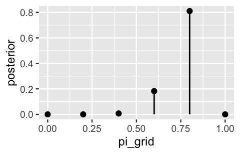
FIGURE 6.1: The discretized posterior pdf of \(\pi\) at only 6 grid values.
You might anticipate what will happen when we use this approximation to simulate samples from the posterior in Step 4.
Each sample draw has only 6 possible outcomes and is highly likely to be 0.6 or 0.8.
Let’s try it: use sample_n() to take a sample of size = 10000 values from the 6-length grid_data, with replacement, and using the discretized posterior probabilities as sample weights.
# Set the seed
set.seed(84735)

# Step 4: sample from the discretized posterior
post_sample <- sample_n(grid_data, size = 10000,
                        weight = posterior, replace = TRUE)
As expected, most of our 10,000 sample values of \(\pi\) were 0.6 or 0.8, few were 0.4, and none were below 0.4 or above 0.8:
# A table of the 10000 sample values
post_sample %>%
  tabyl(pi_grid) %>%
  adorn_totals("row")
 pi_grid     n percent
     0.4    69  0.0069
     0.6  1885  0.1885
     0.8  8046  0.8046
   Total 10000  1.0000
This is an extremely oversimplified approximation of the true \(\text{Beta}(11, 3)\) posterior. If you need any more convincing, Figure 6.2 superimposes the true posterior pdf \(f(\pi|y)\) on a scaled histogram of the 10,000 sample values. If this were a good approximation, the histogram would mimic the shape, location, and spread of the smooth pdf. It does not.
# Histogram of the grid simulation with posterior pdf
ggplot(post_sample, aes(x = pi_grid)) +
  geom_histogram(aes(y = ..density..), color = "white") +
  stat_function(fun = dbeta, args = list(11, 3)) +
  lims(x = c(0, 1))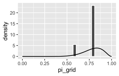
FIGURE 6.2: A grid approximation of the posterior pdf of \(\pi\) using only 6 grid values. The actual pdf is represented by the curve.
Remember the rainbow image and how we got a more complete picture by viewing snippets along a finer grid? Similarly, instead of chopping up the 0-to-1 continuum of possible \(\pi\) values into a grid of only 6 values, let’s try a more reasonable grid of 101 values: \(\pi \in \{0, 0.01, 0.02, \ldots, 0.99, 1\}\). The first 3 grid approximation steps using this refined grid are performed below:
# Step 1: Define a grid of 101 pi values
grid_data  <- data.frame(pi_grid = seq(from = 0, to = 1, length = 101))

# Step 2: Evaluate the prior & likelihood at each pi
grid_data <- grid_data %>%
  mutate(prior = dbeta(pi_grid, 2, 2),
         likelihood = dbinom(9, 10, pi_grid))


# Step 3: Approximate the posterior
grid_data <- grid_data %>%
  mutate(unnormalized = likelihood * prior,
         posterior = unnormalized / sum(unnormalized))
The resulting discretized posterior pdf is quite smooth, especially in comparison to the rigid approximation when we only used 6 grid values:
ggplot(grid_data, aes(x = pi_grid, y = posterior)) +
  geom_point() +
  geom_segment(aes(x = pi_grid, xend = pi_grid, y = 0, yend = posterior))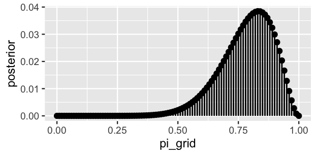
FIGURE 6.3: The discretized posterior pdf of \(\pi\) at 101 grid values.
Finally, in step 4 of the grid approximation, we sample 10,000 draws from the discretized posterior pdf.
# Set the seed
set.seed(84735)

# Step 4: sample from the discretized posterior
post_sample <- sample_n(grid_data, size = 10000,
                        weight = posterior, replace = TRUE)
Figure 6.4 displays a histogram of the resulting sample values. The shape, location, and spread of these values mimic those of the true target posterior pdf \(f(\pi|y)\), represented by the smooth curve. Exciting! Take a step back to appreciate what we’ve just accomplished. We’ve taken an independent sample from a discretized approximation of the posterior pdf \(f(\pi|y)\) that’s defined only on a grid of \(\pi\) values. The algorithm is pretty intuitive and didn’t require advanced programming skills to implement. Most of all, the result was a sample that behaves much like a random sample taken directly from \(f(\pi|y)\) itself. Thus, grid approximation can be a lifeline in scenarios in which the posterior is intractable, providing an approximation that’s nearly indistinguishable from the “real thing.”
ggplot(post_sample, aes(x = pi_grid)) +
  geom_histogram(aes(y = ..density..), color = "white", binwidth = 0.05) +
  stat_function(fun = dbeta, args = list(11, 3)) +
  lims(x = c(0, 1))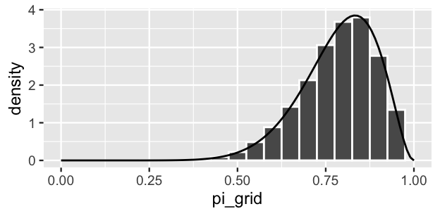
FIGURE 6.4: A grid approximation of the posterior pdf of \(\pi\) using 101 grid values. The actual pdf is represented by the curve.
6.1.2 A Gamma-Poisson example
For practice, let’s apply the grid approximation technique to simulate the posterior of another Bayesian model, this time a Gamma-Poisson. Let \(Y\) be the number of events that occur in a one-hour period, where events occur at an average rate of \(\lambda\) per hour. Further, suppose we collect two data points (\(Y_1,Y_2\)) and place a \(\text{Gamma}(3, 1)\) prior on \(\lambda\):
\[\begin{equation} \begin{split} Y_i|\lambda & \stackrel{ind}{\sim} \text{Pois}(\lambda) \\ \lambda & \sim \text{Gamma}(3, 1) . \\ \end{split} \tag{6.2} \end{equation}\]
If we observe \(Y_1 = 2\) events in the first one-hour observation period and \(Y_2 = 8\) in the next, then by our work in Chapter 5, the updated posterior model of \(\lambda\) is Gamma with parameters 13 (\(s + \sum Y = 3 + 10\)) and 3 (\(r + n = 1 + 2\)):
\[\lambda | ((Y_1,Y_2) = (2,3)) \sim \text{Gamma}(13, 3) .\]
To simulate this posterior using grid approximation, Step 1 is to specify a discrete grid of reasonable \(\lambda\) values. Unlike the \(\pi\) parameter in the Beta-Binomial which is restricted to the finite 0-to-1 interval, the Poisson parameter \(\lambda\) can technically take on any non-negative real value (\(\lambda \in [0,\infty)\)). However, in a plot of the Gamma prior pdf and Poisson likelihood function it appears that, though possible, values of \(\lambda\) beyond 15 are implausible (Figure 6.5). With this in mind, we’ll set up a discrete grid of \(\lambda\) values between 0 and 15, essentially truncating the posterior’s tail. Before completing the corresponding grid approximation together, we encourage you to challenge yourself by first trying the quiz below.
plot_gamma_poisson(s = 3, r = 1, sum_y = 10, n = 2, posterior = FALSE)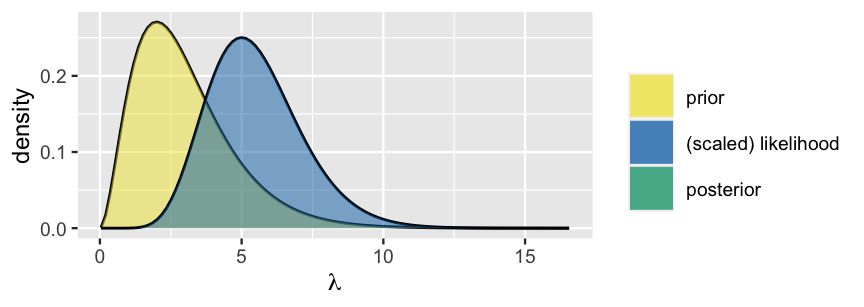
FIGURE 6.5: A Gamma prior pdf and scaled Poisson likelihood function for \(\lambda\).
Fill in the code below to construct a grid approximation of the Gamma-Poisson posterior corresponding to (6.2). In doing so, use a grid of 501 \(\lambda\) values between 0 and 15.
# Step 1: Define a grid of 501 lambda values
grid_data   <- data.frame(
  lambda_grid = seq(from = ___, to = ___, length = ___))

# Step 2: Evaluate the prior & likelihood at each lambda
grid_data <- grid_data %>%
  ___(prior = dgamma(___, ___, ___),
      likelihood = dpois(___, ___) * dpois(___, ___))

# Step 3: Approximate the posterior
grid_data <- grid_data %>%
  ___(unnormalized = ___,
      posterior = ___)

# Set the seed
set.seed(84735)

# Step 4: sample from the discretized posterior
post_sample <- sample_n(___, size = ___,
                        weight = ___, replace = ___)
Check out the complete code below.
Much of this is the same as it was for the Beta-Binomial model.
There are two key differences.
First, we use dgamma() and dpois() instead of dbeta() and dbinom() to evaluate the prior pdf and likelihood function of \(\lambda\).
Second, since we have a sample of two data points \((Y_1,Y_2) = (2,8)\), the Poisson likelihood function of \(\lambda\) must be calculated by the product of the marginal Poisson pdfs, \(L(\lambda | y_1,y_2) = f(y_1,y_2|\lambda) = f(y_1|\lambda) f(y_2|\lambda)\).
# Step 1: Define a grid of 501 lambda values
grid_data   <- data.frame(lambda_grid = seq(from = 0, to = 15, length = 501))

# Step 2: Evaluate the prior & likelihood at each lambda
grid_data <- grid_data %>%
  mutate(prior = dgamma(lambda_grid, 3, 1),
         likelihood = dpois(2, lambda_grid) * dpois(8, lambda_grid))

# Step 3: Approximate the posterior
grid_data <- grid_data %>%
  mutate(unnormalized = likelihood * prior,
         posterior = unnormalized / sum(unnormalized))

# Set the seed
set.seed(84735)

# Step 4: sample from the discretized posterior
post_sample <- sample_n(grid_data, size = 10000,
                        weight = posterior, replace = TRUE)
Most importantly, grid approximation again produced a decent approximation of our target posterior:
# Histogram of the grid simulation with posterior pdf
ggplot(post_sample, aes(x = lambda_grid)) +
  geom_histogram(aes(y = ..density..), color = "white") +
  stat_function(fun = dgamma, args = list(13, 3)) +
  lims(x = c(0, 15))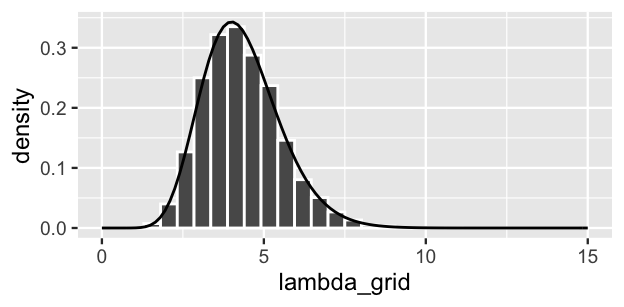
FIGURE 6.6: A grid approximation of the posterior pdf of \(\lambda\) using 101 grid values. The actual pdf is represented by the curve.
6.1.3 Limitations
Some say that all good things must come to an end. Though we don’t agree with this saying in general, it happens to be true in the case of grid approximation. Limitations in the grid approximation method quickly present themselves as our models get more complicated. For example, by the end of Unit 4 we’ll be working with models that have lots of model parameters \(\theta = (\theta_1, \theta_2, \ldots, \theta_k)\). In such settings, grid approximation suffers from the curse of dimensionality. Let’s return to our image approximation for some intuition. Above, we assumed that we could only see snippets of the image along a grid that sweeps from left to right along the x-axis. This is analogous to using grid approximation to simulate a model with one parameter. Suppose instead that our model has two parameters. Or, in the case of the image approximation, we can only see snippets along a grid that sweeps from left to right along the x-axis and from top to bottom along the y-axis:

When we chop both the x- and y-axes into grids, there are bigger gaps in the image approximation. To achieve a more refined approximation, we need a finer grid than when we only chopped the x-axis into a grid. Analogously, when using grid approximation to simulate multivariate posteriors, we need to divide the multidimensional sample space of \(\theta = (\theta_1, \theta_2, \ldots, \theta_k)\) into a very, very fine grid in order to prevent big gaps in our approximation. In practice, this might not be feasible. When evaluated on finer and finer grids, the grid approximation method becomes computationally expensive. You can’t merely start the simulation, get up for a cup of coffee, come back, and poof the simulation is done. You might have to start the simulation and go off to a month-long meditation retreat (to practice the patience you’ll need for grid approximation). MCMC methods provide a more flexible alternative.
6.2 Markov chains via rstan
MCMC methods and their coinage hold some historical significance. The Markov chain component of MCMC is named for the Russian mathematician Andrey Markov (1856–1922). The etymology of the Monte Carlo component is more dubious. As part of their top secret nuclear weapons project in the 1940s, Stanislav Ulam, John von Neumann, and their collaborators at the Los Alamos National Laboratory used Markov chains to simulate and better understand neutron travel (Eckhardt 1987). The Los Alamos team referred to their work by the code name “Monte Carlo,” a choice said to be inspired by the opulent Monte Carlo casino in the French Riviera. What inspired the link between random simulation methods and casinos? We can’t help you there.

FIGURE 6.7: A billboard at a uranium processing plant in Oak Ridge, TN, a sister site of Los Alamos. Image: https://commons.wikimedia.org/wiki/File:Oak_Ridge_Wise_Monkeys.jpg
Today, “Markov chain Monte Carlo” refers to the application of Markov chains to simulate probability models using methods pioneered by the Monte Carlo project. In contrast to grid approximation, MCMC simulation methods scale up for more complicated Bayesian models. But this flexibility doesn’t come for free. Like grid approximation samples, MCMC samples are not taken directly from the posterior pdf \(f(\theta|y)\). Yet unlike grid approximation samples, MCMC samples aren’t even independent – each subsequent sample value depends directly upon the previous value. This feature is evoked by the “chain” terminology. Specifically, let \(\left\lbrace \theta^{(1)}, \theta^{(2)}, \ldots, \theta^{(N)} \right\rbrace\) be an \(N\)-length MCMC sample, or Markov chain. In constructing this chain, \(\theta^{(2)}\) is drawn from some model that depends upon \(\theta^{(1)}\), \(\theta^{(3)}\) is drawn from some model that depends upon \(\theta^{(2)}\), \(\theta^{(4)}\) is drawn from some model that depends upon \(\theta^{(3)}\), and so on and so on the chain grows. In general, the \((i + 1)\)st chain value \(\theta^{(i+1)}\) is drawn from a model that depends on data \(y\) and the previous chain value \(\theta^{(i)}\) with conditional pdf
\[f\left(\theta^{(i + 1)} \; | \; \theta^{(i)}, y\right) .\]
There are a couple of things to note about this dependence among chain values. First, by the Markov property, \(\theta^{(i+1)}\) depends upon the preceding chain values only through the most recent value \(\theta^{(i)}\):
\[f\left(\theta^{(i + 1)} \; | \; \theta^{(1)}, \theta^{(2)}, \ldots, \theta^{(i)}, y\right) = f\left(\theta^{(i + 1)} \; | \; \theta^{(i)}, y\right) .\]
For example, since \(\theta^{(i+i)}\) depends on \(\theta^{(i)}\) which depends on \(\theta^{(i-1)}\), it’s also true that \(\theta^{(i+i)}\) depends on \(\theta^{(i-1)}\). However, if we know \(\theta^{(i)}\), then \(\theta^{(i-1)}\) is of no consequence to \(\theta^{(i+1)}\) – the only information we need to simulate \(\theta^{(i+1)}\) is the value of \(\theta^{(i)}\). Further, each chain value can be drawn from a different model, and none of these models are the target posterior. That is, the pdf from which a Markov chain value is simulated is not equivalent to the posterior pdf:
\[f\left(\theta^{(i + 1)} \; | \; \theta^{(i)}, y\right) \ne f\left(\theta^{(i + 1)} \; | \; y\right) .\]
Markov chain Monte Carlo
MCMC simulation produces a chain of \(N\) dependent \(\theta\) values, \(\left\lbrace \theta^{(1)}, \theta^{(2)}, \ldots, \theta^{(N)} \right\rbrace\), which are not drawn from the posterior pdf \(f(\theta|y)\).
It likely seems strange to approximate the posterior using a dependent sample that’s not even taken from the posterior.
But mathemagically, with reasonable MCMC algorithms, it can work.
The rub is that these algorithms have a steeper learning curve than the grid approximation technique.
We provide a glimpse into the details in Chapter 7.
Though a review of Chapter 7 and a firm grasp of these details would be ideal, there’s a growing number of MCMC computing resources that can do the heavy lifting for us.
In this book, we’ll conduct MCMC simulation using the rstan package (Guo et al. 2020) which combines the power of R with the Stan engine.
You’ll get into the nitty gritty of rstan in Chapter 6, building up the code line by line and thereby gaining familiarity with the key elements of an rstan simulation.
Starting in Chapter 9, you will utilize the complementary rstanarm package, which provides shortcuts for simulating a broad framework of Bayesian applied regression models (arm).
6.2.1 A Beta-Binomial example
There are two essential steps to all rstan analyses: (1) define the Bayesian model structure in rstan notation and (2) simulate the posterior. Let’s examine these steps in the context of the Beta-Binomial model defined by (6.1), starting with step 1. In defining the structure of this model, we must specify the three aspects upon which it depends:
data
Data \(Y\) is the observed number of successes in 10 trials. Since rstan isn’t a mind reader, we must specify that \(Y\) is an integer between 0 and 10.parameters
The model depends upon parameter \(\pi\), orpiin rstan notation. We must specify that \(\pi\) can be any real number between 0 and 1.model
The model is defined by the \(\text{Bin}(10, \pi)\) model for data \(Y\) and the Beta\((2,2)\) prior for \(\pi\). We specify these usingbinomial()andbeta().
Below we translate this Beta-Binomial structure into rstan syntax and store it as the character string bb_model.
We encourage you to pause and examine the code, noting how it matches up with the three aspects above.
# STEP 1: DEFINE the model
bb_model <- "
  data {
    int<lower = 0, upper = 10> Y;
  }
  parameters {
    real<lower = 0, upper = 1> pi;
  }
  model {
    Y ~ binomial(10, pi);
    pi ~ beta(2, 2);
  }
"
In step 2, we simulate the posterior using the stan() function.
Very loosely speaking, stan() designs and runs an MCMC algorithm to produce an approximate sample from the Beta-Binomial posterior.
Since stan() has to do the double duty of identifying an appropriate MCMC algorithm for simulating the given model, and then applying this algorithm to our data, the simulation will be quite slow for each new model.
# STEP 2: SIMULATE the posterior
bb_sim <- stan(model_code = bb_model, data = list(Y = 9),
               chains = 4, iter = 5000*2, seed = 84735)
Note that stan() requires two types of arguments.
First, we must specify the model information by:
model_code= the character string defining the model (herebb_model)data= a list of the observed data (hereY = 9).
Second, we must specify the desired Markov chain information using three additional arguments:
The
chainsargument specifies how many parallel Markov chains to run. We run four chains here, thus obtain four distinct samples of \(\pi\) values. We discuss this choice in Section 6.3.The
iterargument specifies the desired number of iterations in, or length of, each Markov chain. By default, the first half of these iterations are thrown out as “burn-in” or “warm-up” samples (see below for details). The second half are kept as the final Markov chain sample.To set the random number generating seed for an rstan simulation, we utilize the
seedargument within thestan()function.
The result, stored in bb_sim, is a stanfit object.
This object includes four parallel Markov chains run for 10,000 iterations each.
After tossing out the first 5,000 iterations of all four chains, we end up with four separate Markov chain samples of size 5,000, or a combined Markov chain sample size of 20,000.
Burn-in
If you’ve ever made a batch of pancakes or crêpes, you know that the first pancake is always the worst – the pan isn’t yet at the perfect temperature, you haven’t yet figured out how much batter to use, and you need more time to practice your flipping technique. MCMC chains are similar. Without direct knowledge of the posterior it’s trying to simulate, the Markov chain might start out sampling unreasonable values of our parameter of interest, say \(\pi\). Eventually though, it learns and starts producing values that mimic a random sample from the posterior. And just as we might need to toss out the first pancake, we might want to toss the Markov chain values produced during this learning period – keeping them in our sample might lead to a poor posterior approximation. As such, “burn-in” is the practice of discarding the first portion of Markov chain values.
The first four \(\pi\) values for each of the four parallel chains are extracted and shown here:
as.array(bb_sim, pars = "pi") %>%
  head(4)
, , parameters = pi

          chains
iterations chain:1 chain:2 chain:3 chain:4
      [1,]  0.9403  0.8777  0.3803  0.6649
      [2,]  0.9301  0.9802  0.8186  0.6501
      [3,]  0.9012  0.9383  0.8458  0.7001
      [4,]  0.9224  0.9540  0.7336  0.5902
It’s important to remember that these Markov chain values are NOT a random sample from the posterior and are NOT independent.
Rather, each of the four parallel chains forms a dependent 5,000 length Markov chain of \(\pi\) values, \(\left(\pi^{(1)}, \pi^{(2)}, \ldots, \pi^{(5000)} \right)\).
For example, in iteration 1, chain:1 starts at a value of roughly \(\pi^{(1)}\) = 0.9403.
The value at iteration 2, \(\pi^{(2)}\), depends upon \(\pi^{(1)}\).
In this case the chain moves from 0.9403 to 0.9301.
Similarly, the chain moves from 0.9301 to 0.9012, from 0.9012 to 0.9224, and so on.
Thus, the chain traverses the sample space or range of posterior plausible \(\pi\) values.
A Markov chain trace plot illustrates this traversal, plotting the \(\pi\) value (y-axis) in each iteration (x-axis).
We use the mcmc_trace() function in the bayesplot package (Gabry et al. 2019) to construct the trace plots of all four Markov chains:
mcmc_trace(bb_sim, pars = "pi", size = 0.1)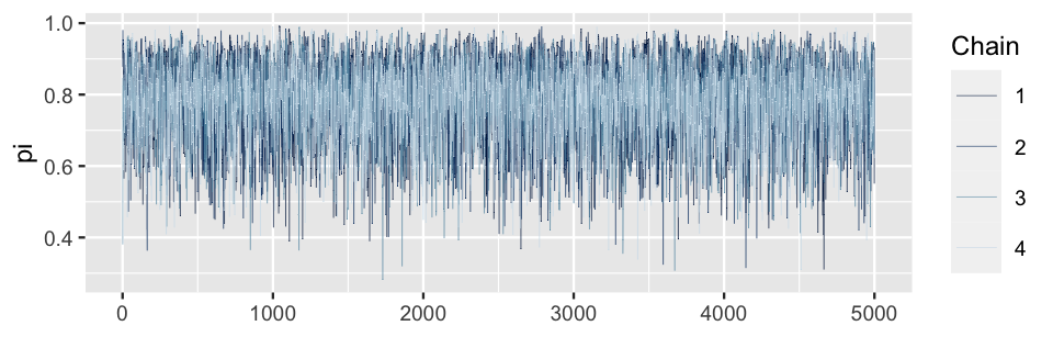
FIGURE 6.8: Trace plots of the four parallel Markov chains of \(\pi\).
Figure 6.9 zooms in on the trace plot of chain 1. In the first 20 iterations (left), the chain largely explores values between 0.57 and 0.94. After 200 iterations (right), the Markov chain has started to explore new territory, traversing a slightly wider range of values between 0.49 and 0.96. Both trace plots also exhibit evidence of the slight dependence among the Markov chain values, places where the chain tends to float up for multiple iterations and then down for multiple iterations.
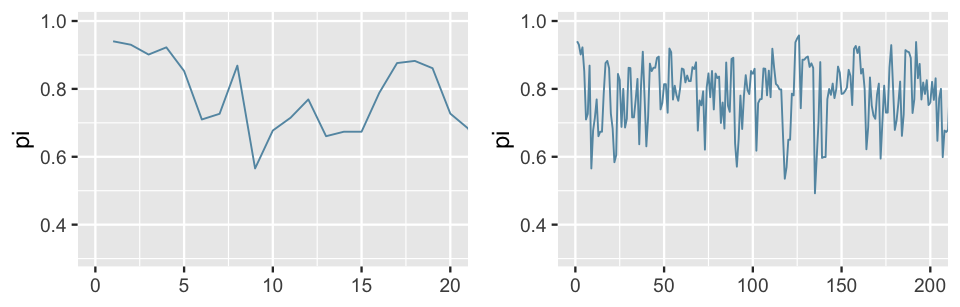
FIGURE 6.9: A trace plot of the first 20 iterations (left) and 200 iterations (right) of the first Beta-Binomial Markov chain.
Marking the sequence of the chain values, the trace plots in Figure 6.9 illuminate the Markov chains’ longitudinal behavior. We also want to examine the distribution of the values these chains visit along their journey, ignoring the order of these visits. The histogram and density plot in Figure 6.10 provide a snapshot of this distribution for the combined 20,000 chain values, 5,000 from each of the four separate chains. Notice the important punchline here: the distribution of the Markov chain values is an excellent approximation of the target Beta(11, 3) posterior model of \(\pi\) (superimposed in black). That’s a relief – that was the whole point.
Like some other plotting functions in the bayesplot package, the mcmc_hist() and mcmc_dens() functions don’t automatically include axis labels and scales.
As we’re new to these plots, we add labels and scales here using yaxis_text(TRUE) and ylab().
As we become more and more comfortable with these plots, we’ll fall back on the defaults.
# Histogram of the Markov chain values
mcmc_hist(bb_sim, pars = "pi") +
  yaxis_text(TRUE) +
  ylab("count")

# Density plot of the Markov chain values
mcmc_dens(bb_sim, pars = "pi") +
  yaxis_text(TRUE) +
  ylab("density")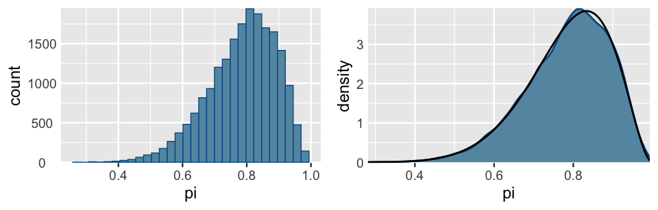
FIGURE 6.10: A histogram (left) and density plot (right) of the combined 20,000 Markov chain \(\pi\) values from the 4 parallel chains. The target pdf is superimposed in black.
6.2.2 A Gamma-Poisson example
For more practice with rstan and MCMC simulation, let’s use these tools to approximate the Gamma-Poisson posterior corresponding to (6.2) upon observing data \((Y_1,Y_2) = (2,8)\).
Recall that this involves two steps.
In step 1, we define the Gamma-Poisson model structure, specifying the three aspects upon which it depends: the data, parameters, and model.
In step 2, we simulate the posterior.
We encourage you to challenge yourself by trying this on your own first.
Your code will require two terms you haven’t yet seen, but you might guess how to use: poisson() and gamma().
Further, your code will incorporate a vector of \((Y_1,Y_2)\) variables and observations as opposed to a single variable \(Y\).
Fill in the code below to construct an MCMC approximation of the Gamma-Poisson posterior corresponding to (6.2). In doing so, run four parallel chains for 10,000 iterations each (resulting in a sample size of 5,000 per chain).
# STEP 1: DEFINE the model
gp_model <- "
  data {
    int<___> Y[2];
  }
  parameters {
    real<___> lambda;
  }
  model {
    Y ~ ___(___);
    lambda ~ ___(___, ___);
  }
"

# STEP 2: SIMULATE the posterior
gp_sim <- ___(model_code = ___, data = list(___),
              chains = ___, iter = ___, seed = 84735)
In defining the model in step 1, take note of the three aspects upon which it depends.
data
DataY[2]represents the vector of event counts, \((Y_1,Y_2)\), where the counts can be any non-negative integers in \(\{0,1,2,\ldots\}\).parameters
The model depends upon rate parameter \(\lambda\), which can be any non-negative real number.model
The model is defined by the Pois(\(\lambda\)) model for data \(Y\) and the Gamma(3,1) prior for \(\lambda\). We specify these usingpoisson()andgamma().
In step 2, we must feed in the vector of both data points, Y = c(2,8).
It follows that:
# STEP 1: DEFINE the model
gp_model <- "
  data {
    int<lower = 0> Y[2];
  }
  parameters {
    real<lower = 0> lambda;
  }
  model {
    Y ~ poisson(lambda);
    lambda ~ gamma(3, 1);
  }
"

# STEP 2: SIMULATE the posterior
gp_sim <- stan(model_code = gp_model, data = list(Y = c(2,8)),
               chains = 4, iter = 5000*2, seed = 84735)
Figure 6.11 illustrates the simulation results. First, the trace plots (top) illustrate the paths these chains take through the \(\lambda\) sample space. To this end, note that the \(\lambda\) chain values travel around the rough range from 0 to 10, but mostly remain below 7.5. Further, the histogram and density plot (bottom) provide a better look into the overall distribution of \(\lambda\) Markov chain values. The punchline: this distribution provides an excellent approximation of the Gamma(13,3) posterior (superimposed in black).
# Trace plots of the 4 Markov chains
mcmc_trace(gp_sim, pars = "lambda", size = 0.1)

# Histogram of the Markov chain values
mcmc_hist(gp_sim, pars = "lambda") +
  yaxis_text(TRUE) +
  ylab("count")

# Density plot of the Markov chain values
mcmc_dens(gp_sim, pars = "lambda") +
  yaxis_text(TRUE) +
  ylab("density")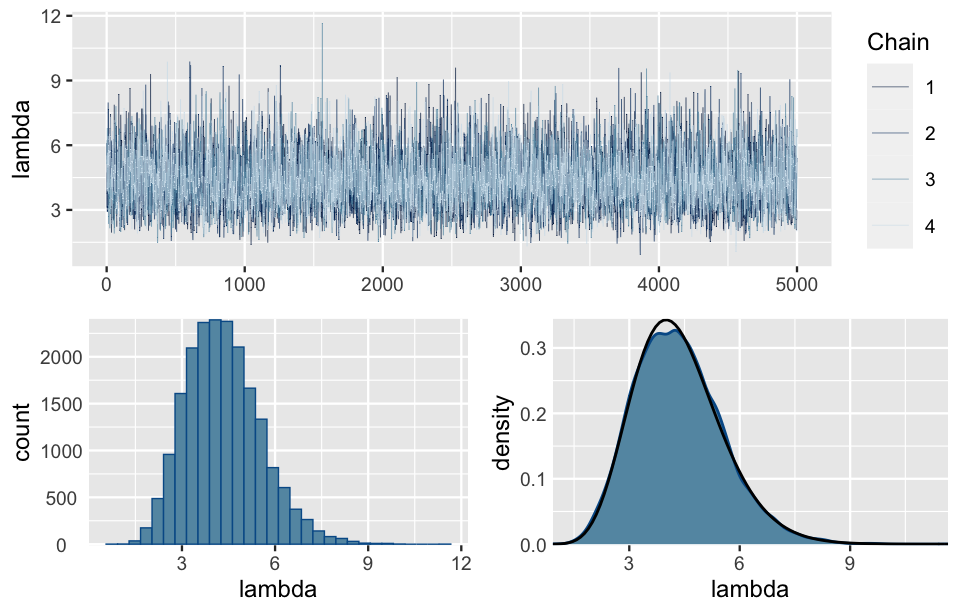
FIGURE 6.11: Trace plots of the four parallel Markov chains of \(\lambda\) (top). A histogram and density plot of the 20,000 combined Markov chain values of \(\lambda\) (bottom). The black curve represents the actual posterior pdf of \(\lambda\).
6.3 Markov chain diagnostics
Simulation is fantastic. Even when we’re able to derive a Bayesian posterior, we can use posterior simulation to verify our work and provide some intuition. More importantly, when we’re not able to derive a posterior, simulated samples provide a crucial approximation. In the MCMC examples above, we saw that the Markov chains traverse the sample space of our parameter (\(\pi\) or \(\lambda\)) and, in the end, mimic a random sample that eventually converges to the posterior. “Approximation” and “converges” are key words here – simulations aren’t perfect. This begs the following questions:
- What does a good Markov chain look like?
- How can we tell if our Markov chain sample produces a reasonable approximation of the posterior?
- How big should our Markov chain sample size be?
Answering these questions is both an art and science. There are no one-size-fits-all magic formulas that provide definitive answers here. Rather, it’s through experience that you get a feel for what “good” Markov chains look like and what you can do to fix a “bad” Markov chain. In this section, we’ll focus on a couple visual diagnostic tools that will get us started: trace plots and parallel chains. These can be followed up with and supplemented by a few numerical diagnostics: effective sample size, autocorrelation, and R-hat (\(\hat{R}\)). Utilizing these diagnostics should be done holistically. Since no single visual or numerical diagnostic is one-size-fits-all, they provide a fuller picture of Markov chain quality when considered together. Further, other excellent diagnostics exist. We focus here on those that are common and easy to implement in the software packages we’ll be using.
6.3.1 Examining trace plots
Reexamine the trace plots for the Beta-Binomial simulation in Figure 6.8. These are textbook examples of what we want trace plots to look like. Mainly, they look like a bunch of white noise with no discernible trends or notable phenomena. This nothingness implies that the chains are stable. In contrast, the hypothetical Markov chains for the same Beta-Binomial model shown in Figure 6.12 illustrate potential chain behavior that should give us pause.
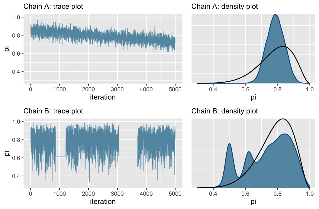
FIGURE 6.12: Trace plots (left) and corresponding density plots (right) of two hypothetical Markov chains. These provide examples of what “bad” Markov chains might look like. The superimposed black lines (right) represent the target Beta(11,3) posterior pdf.
First, consider the trace plots in Figure 6.12 (left). The downward trend in Chain A indicates that it has not yet stabilized after 5,000 iterations – it has not yet “found” or does not yet know how to explore the range of posterior plausible \(\pi\) values. The downward trend also hints at strong correlation among the chain values – they don’t look like independent noise. All of this to say that Chain A is mixing slowly. This is bad. Though Markov chains are inherently dependent, the more they behave like fast mixing (noisy) independent samples, the smaller the error in the resulting posterior approximation (roughly speaking). Chain B exhibits a different problem. As evidenced by the two completely flat lines in the trace plot, it tends to get stuck when it visits smaller values of \(\pi\).
The density plots in Figure 6.12 (right) confirm that both of these goofy-looking chains result in a serious issue: they produce poor approximations of the Beta(11,3) posterior (superimposed in black), and thus misleading posterior conclusions. Consider Chain A. Since it’s mixing so slowly, it has only explored \(\pi\) values in the rough range from 0.6 to 0.9 in its first 5,000 iterations. As a result, its posterior approximation overestimates the plausibility of \(\pi\) values in this range while completely underestimating the plausibility of values outside this range. Next, consider Chain B. In getting stuck, Chain B over-samples some values in the left tail of the posterior \(\pi\) values. This phenomenon produces the erroneous spikes in the posterior approximation.
In practice, we run rstan simulations when we can’t specify, and thus want to approximate the posterior.
This means that we won’t have the privilege of being able to compare our simulation results to the “real” posterior.
This is why diagnostics are so important.
If we see bad trace plots like those in Figure 6.12, there are some immediate steps we can take:
- Check the model. Are the assumed prior and data models appropriate?
- Run the chain for more iterations. Some undesirable short-term chain trends might iron out in the long term.
We’ll get practice with the more nuanced Step 1 throughout the book. Step 2 is easy, though it requires extra computation time.
6.3.2 Comparing parallel chains
Recall that our stan() simulation for the Beta-Binomial model produced four parallel Markov chains.
Not only do we want to see stability in each individual chain (as discussed above), we want to see consistency across the four chains.
Mainly, though we expect different chains take different paths, they should exhibit similar features and produce similar posterior approximations.
For example, the trace plots for the four parallel chains in Figure 6.8 appear similar in their randomness.
Further, in the Figure 6.13 density plots, we observe that these four chains produce nearly indistinguishable posterior approximations.
This provides evidence that our simulation is stable and sufficiently long – running the chains for more iterations likely wouldn’t produce drastically different or improved posterior approximations.
# Density plots of individual chains
mcmc_dens_overlay(bb_sim, pars = "pi") +
  ylab("density")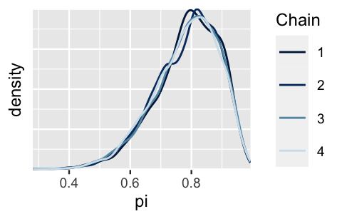
FIGURE 6.13: Density plot of the four parallel Markov chains for \(\pi\).
For a point of comparison, let’s implement a shorter Markov chain simulation for the same model. Instead of running four parallel chains for 10,000 iterations and a resulting sample size of 5,000 each, run four parallel chains for only 100 iterations and a resulting sample size of 50 each:
# STEP 2: SIMULATE the posterior
bb_sim_short <- stan(model_code = bb_model, data = list(Y = 9),
                     chains = 4, iter = 50*2, seed = 84735)
The trace plots and corresponding density plots of the short Markov chains are shown below. Though the chains’ trace plots exhibit similar random behavior, their corresponding density plots differ, hence they produce discrepant posterior approximations. In the face of such instability and confusion about which of these four approximations is the most accurate, it would be a mistake to stop our simulation after only 100 iterations.
# Trace plots of short chains
mcmc_trace(bb_sim_short, pars = "pi")

# Density plots of individual short chains
mcmc_dens_overlay(bb_sim_short, pars = "pi")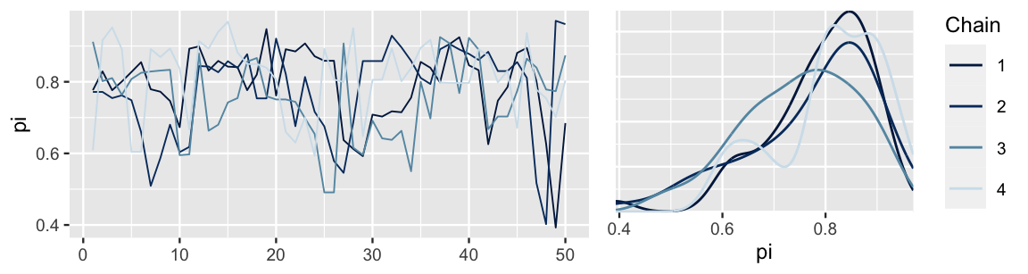
FIGURE 6.14: Trace plots and density plots of the four short parallel Markov chains for \(\pi\), each of length 50.
6.3.3 Calculating effective sample size & autocorrelation
Recall from Section 6.3.1 that the more a dependent Markov chain behaves like an independent sample, the smaller the error in the resulting posterior approximation (loosely speaking).
Though trace plots provide some visual insight into this behavior, supplementary numerical assessments can provide more nuanced information.
To begin, recall that our Markov chain simulation bb_sim produced a combined 20,000 dependent values of \(\pi\), sampled from models other than the posterior.
We then used this chain to approximate the posterior model of \(\pi\).
Knowing that the error in this approximation is likely larger than if we had used 20,000 independent sample values drawn directly from the posterior begs the following question: Relatively, how many independent sample values would it take to produce an equivalently accurate posterior approximation?
The effective sample size ratio provides an answer.
Effective sample size ratio
Let \(N\) denote the actual sample size or length of a dependent Markov chain. The effective sample size of this chain, \(N_{eff}\), quantifies the number of independent samples it would take to produce an equivalently accurate posterior approximation. The greater the \(N_{eff}\) the better, yet it’s typically true that the accuracy of a Markov chain approximation is only as good as that of a smaller independent sample. That is, it’s typically true that \(N_{eff} < N\), thus the effective sample size ratio is less than 1:
\[\frac{N_{eff}}{N}\]
There’s no magic rule for interpreting this ratio, and it should be utilized alongside other diagnostics such as the trace plot. That said, we might be suspicious of a Markov chain for which the effective sample size ratio is less than 0.1, i.e., the effective sample size \(N_{eff}\) is less than 10% of the actual sample size \(N\).
A quick call to the neff_ratio() function in the bayesplot package provides the estimated effective sample size ratio for our Markov chain sample of pi values.
Here, the accuracy in using our 20,000 length Markov chain to approximate the posterior of \(\pi\) is roughly as great as if we had used only 34% as many independent values.
Put another way, our 20,000 Markov chain values are about as useful as only 6800 independent samples (0.34 \(\cdot\) 20000).
Since this ratio is above 0.1, we’re not going to stress.
# Calculate the effective sample size ratio
neff_ratio(bb_sim, pars = c("pi"))
[1] 0.3361
Autocorrelation provides another metric by which to evaluate whether our Markov chain sufficiently mimics the behavior of an independent sample. Strong autocorrelation or dependence is a bad thing – it goes hand in hand with small effective sample size ratios, and thus provides a warning sign that our resulting posterior approximations might be unreliable. We saw some evidence of this in Chain A of Figure 6.12. Now, by the simple construction of a Markov chain, there’s inherently going to be some autocorrelation among the chain values – one chain value (\(\pi^{(i)}\)) depends upon the previous chain value (\(\pi^{(i-1)}\)), which depends upon the one before that (\(\pi^{(i-2)}\)), which depends upon the one before that (\(\pi^{(i-3)}\)), and so on. This chain of dependencies also means that each chain value depends in some degree on all previous chain values. For example, since \(\pi^{(i)}\) is dependent on \(\pi^{(i-1)}\) which is dependent on \(\pi^{(i-2)}\), \(\pi^{(i)}\) is also dependent on \(\pi^{(i-2)}\). Yet this dependence, or autocorrelation, fades. It’s like Tobler’s first law of geography: everything is related to everything else, but near things are more related than distant things. Thus, it’s typically the case that a chain value \(\pi^{(i)}\) is more strongly related to the previous value (\(\pi^{(i - 1)}\)) than to a chain value 100 steps back (\(\pi^{(i-100)}\)).
Autocorrelation
Lag 1 autocorrelation measures the correlation between pairs of Markov chain values that are one “step” apart (e.g., \(\pi^{(i)}\) and \(\pi^{(i-1)}\)). Lag 2 autocorrelation measures the correlation between pairs of Markov chain values that are two “steps” apart (e.g., \(\pi^{(i)}\) and \(\pi^{(i-2)}\)). And so on.
Let’s apply these concepts to our bb_sim analysis.
Check out the trace plot and autocorrelation plot of our simulation results in Figure 6.15.
(For simplicity, we show the results for only one of our four parallel chains.)
mcmc_trace(bb_sim, pars = "pi")
mcmc_acf(bb_sim, pars = "pi")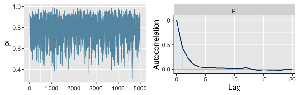
FIGURE 6.15: A trace plot (left) and autocorrelation plot (right) for a single Markov chain from the bb_sim analysis.
Again, notice that there are no obvious patterns in the trace plot. This provides one visual clue that, though the chain values are inherently dependent, this dependence is relatively weak and limited to small lags or values that are just a few steps apart. This observation is supported by the autocorrelation plot which marks the autocorrelation (y-axis) at lags 0 through 20 (x-axis). The lag 0 autocorrelation is naturally 1 – it measures the correlation between a Markov chain value and itself. From there, the lag 1 autocorrelation is roughly 0.5, indicating moderate correlation among chain values that are only 1 step apart. But then the autocorrelation quickly drops off and is effectively 0 by lag 5. That is, there’s very little correlation between Markov chain values that are more than a few steps apart. This is all good news. It’s more confirmation that our Markov chain is mixing quickly, i.e., quickly moving around the range of posterior plausible \(\pi\) values, and thus at least mimicking an independent sample.
Presuming you’ve never seen an autocorrelation plot before, we imagine that it’s not very obvious that the plot in Figure 6.15 is a “good” one. For contrast, consider the results for an unhealthy Markov chain (Figure 6.16). The trace plot exhibits strong trends, and hence autocorrelation, in the Markov chain values. This observation is echoed and further formalized by the autocorrelation plot. The slow decrease in the autocorrelation curve indicates that the dependence between chain values does not quickly fade away. In fact, there’s a roughly 0.9 correlation between Markov chain values that are a full 20 steps apart! Since its chain values are so strongly tied to the previous values, this chain is slow mixing – it would take a long time for it to adequately explore the full range of the posterior. Thus, just as with the slow mixing Chain A in Figure 6.12, we should be wary about using this chain to approximate the posterior. Let’s tie these ideas together.
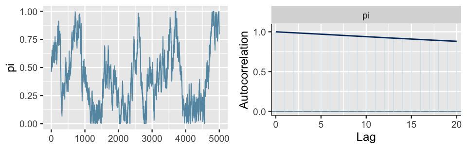
FIGURE 6.16: A trace plot (left) and autocorrelation plot (right) for a slow mixing Markov chain of \(\pi\).
Fast vs slow mixing Markov chains
Fast mixing chains exhibit behavior similar to that of an independent sample: the chains move “quickly” around the range of posterior plausible values, the autocorrelation among the chain values drops off quickly, and the effective sample size ratio is reasonably large. Slow mixing chains do not enjoy the features of an independent sample: the chains move “slowly” around the range of posterior plausible values, the autocorrelation among the chain values drops off very slowly, and the effective sample size ratio is small.
So what do we do if ours is a dreaded slow mixing chain? The first and, in our opinion best, possible solution is the tried and true “run a longer chain.” Even a slow mixing chain can eventually produce a good posterior approximation if we run it for enough iterations. Another common approach is to thin the Markov chain. For example, from our original chain of 5000 \(\pi\) values, we might keep every second value and toss out the rest: \(\left\lbrace \pi^{(2)}, \pi^{(4)}, \pi^{(6)}, \ldots, \pi^{(5000)} \right\rbrace\). Or, we might keep every ten chain values: \(\left\lbrace \pi^{(10)}, \pi^{(20)}, \pi^{(30)}, \ldots, \pi^{(5000)} \right\rbrace\). By discarding the draws in between, we remove the strong correlations at low lags. For example, \(\pi^{(20)}\) is less correlated with the previous value in the thinned chain (\(\pi^{(10)}\)) than with the previous value in the original chain (\(\pi^{(19)}\)).
For illustration only, we thin out our original bb_sim chains to just every tenth value using the thin argument in stan().
As a result, the autocorrelation drops off a bit earlier, after 1 lag instead of 5 (Figure 6.17).
BUT, since this was already a quick mixing simulation with quickly decreasing autocorrelation and a relatively high effective sample size ratio, this minor improvement in autocorrelation isn’t worth the information we lost.
Instead of a sample size of 5000 chain values, we now only have 500 values with which to approximate the posterior.
# Simulate a thinned MCMC sample
thinned_sim <- stan(model_code = bb_model, data = list(Y = 9),
                    chains = 4, iter = 5000*2, seed = 84735, thin = 10)

# Check out the results
mcmc_trace(thinned_sim, pars = "pi")
mcmc_acf(thinned_sim, pars = "pi")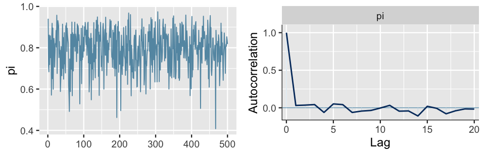
FIGURE 6.17: A trace plot (left) and autocorrelation plot (right) for a single Markov chain from the bb_sim analysis, thinned to every tenth value.
We similarly thin our slow mixing chain down to every tenth value (Figure 6.18). The resulting chain still exhibits slow mixing trends in the trace plot, but the autocorrelation drops more quickly than the pre-thinned chain. This is good, but is it worth losing 90% of our original sample values? We’re not so sure.
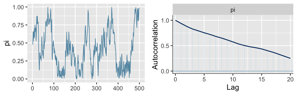
FIGURE 6.18: A trace plot (left) and autocorrelation plot (right) for a slow mixing Markov chain of \(\pi\), thinned to every tenth value.
There is a careful line to walk when deciding whether or not to thin a Markov chain.
The benefits of reduced autocorrelation don’t necessarily outweigh the loss of precious chain values.
That is, 5000 Markov chain values with stronger autocorrelation might produce a better posterior approximation than 500 chain values with weaker autocorrelation.
The effectiveness of thinning also depends in part on the algorithm used to construct the Markov chain.
For example, the rstan and rstanarm packages used throughout this book employ an efficient Hamiltonian Monte Carlo algorithm.
As such, in the current stan() help file, the package authors advise against thinning unless your simulation hogs up too much memory on your machine.
6.3.4 Calculating R-hat
Just as effective sample size and autocorrelation provide numerical supplements to the visual trace plot diagnostic in assessing the degree to which a Markov chain behaves like an independent sample, the split-\(\hat{R}\) metric (or “R-hat” for short) provides a numerical supplement to the visual comparison of parallel chains. Recall from Section 6.3.2 that, not only do we want each individual Markov chain in our simulation to be stable, we want there to be consistency across the parallel chains. R-hat addresses this consistency by comparing the variability in sampled \(\pi\) values across all chains combined to the variability within each individual chain. Before presenting a more formal definition, check your intuition.40
Figure 6.19 provides simulation results for bb_sim (top row) along with a bad hypothetical alternative (bottom row).
Based on the patterns in these plots, what do you think is a marker of a “good” Markov chain simulation?
- The variability in \(\pi\) values within any individual chain is less than the variability in \(\pi\) values across all chains combined.
- The variability in \(\pi\) values within any individual chain is comparable to the variability in \(\pi\) values across all chains combined.
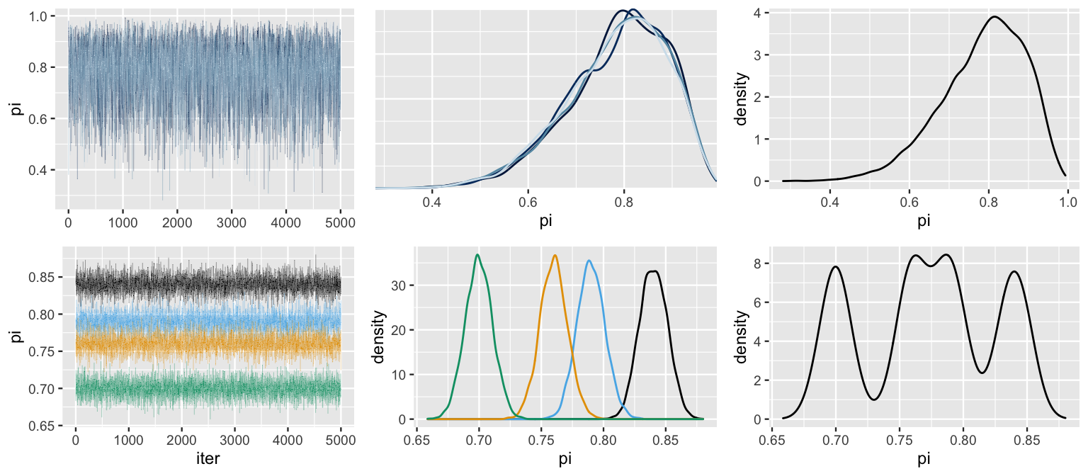
FIGURE 6.19: Simulation results for bb_sim (top row) and a hypothetical alternative (bottom row). Included are trace plots of the four parallel chains (left), density plots for each individual chain (middle), and a density plot of the combined chains (right).
To answer this quiz, let’s dig into Figure 6.19.
Based on what we learned in Section 6.3.2, we can see that bb_sim is superior to the alternative – its parallel chains exhibit similar features and produce similar posterior approximations.
In particular, the variability in \(\pi\) values is nearly identical within each chain (top middle plot).
As a consequence, the variability in \(\pi\) values across all chains combined (top right plot) is similar to that of the individual chains.
In contrast, notice that the four parallel chains in the alternative simulation produce conflicting posterior approximations (bottom middle plot), and hence an unstable and poor posterior approximation when we combine these chains (bottom right plot).
As a consequence, the range and variability in \(\pi\) values across all chains combined are much larger than the range and variability in \(\pi\) values within any individual chain.
Bringing this analysis together, we’ve intuited the importance of the relationship between the variability in values across all chains combined and within the individual parallel chains. Specifically:
in a “good” Markov chain simulation, the variability across all parallel chains combined will be roughly comparable to the variability within any individual chain;
in a “bad” Markov chain simulation, the variability across all parallel chains combined might exceed the typical variability within each chain.
We can quantify the relationship between the combined chain variability and within-chain variability using R-hat. We provide an intuitive definition of R-hat here. For a more detailed definition, see Vehtari et al. (2021). And to learn more about the exciting connection between effective sample size and R-hat, see Vats and Knudson (2018)!
R-hat
Consider a Markov chain simulation of parameter \(\theta\) which utilizes four parallel chains. Let \(\text{Var}_\text{combined}\) denote the variability in \(\theta\) across all four chains combined and \(\text{Var}_\text{within}\) denote the typical variability within any individual chain. The R-hat metric calculates the ratio between these two sources of variability:
\[\text{R-hat} \approx \sqrt{\frac{\text{Var}_\text{combined}}{\text{Var}_\text{within}}} .\]
Ideally, \(\text{R-hat} \approx 1\), reflecting stability across the parallel chains. In contrast, \(\text{R-hat} > 1\) indicates instability, with the variability in the combined chains exceeding that within the chains. Though no golden rule exists, an R-hat ratio greater than 1.05 raises some red flags about the stability of the simulation.
To calculate the R-hat ratio for our simulation, we can apply the rhat() function from the bayesplot package:
rhat(bb_sim, pars = "pi")
[1] 1
Reflecting our observation that the variability across and within our four parallel chains is comparable, bb_sim has an R-hat value that’s effectively equal to 1.
In contrast, the bad hypothetical simulation exhibited in Figure 6.19 has an R-hat value of 5.35.
That is, the variance across all chain values combined is more than 5 times the typical variance within each chain.
This well exceeds the 1.05 red flag marker, providing ample evidence that the hypothetical parallel chains do not produce consistent posterior approximations, thus the simulation is unstable.
6.4 Chapter summary
As our Bayesian models get more sophisticated, their posteriors will become too difficult, if not impossible, to specify. In Chapter 6, you learned two simulation techniques for approximating the posterior in such scenarios: grid approximation and Markov chain Monte Carlo. Both techniques produce a sample of \(N\) \(\theta\) values,
\[\left\lbrace \theta^{(1)}, \theta^{(2)}, \ldots, \theta^{(N)} \right\rbrace .\]
However, the properties of these samples differ:
- Grid approximation takes an independent sample of \(\theta^{(i)}\) from a discretized approximation of posterior pdf \(f(\theta|y)\). This approach is nicely straightforward but breaks down in more complicated model settings.
- Markov chain Monte Carlo offers a more flexible alternative. Though MCMC produces a dependent sample of \(\theta^{(i)}\) which are not drawn from the posterior pdf \(f(\theta|y)\), this sample will mimic the posterior model so long as the chain length \(N\) is big enough.
Finally, you learned some MCMC diagnostics for checking the resulting simulation quality. In short, we can visually examine trace plots and density plots of multiple parallel chains for stability and mixing in our simulation:
# Diagnostic plots
mcmc_trace(my_sim, pars = "___")
mcmc_dens_overlay(my_sim, pars = "___")
And we can supplement these visual diagnostics with numerical diagnostics such as effective sample size ratio, autocorrelation, and R-hat:
neff_ratio(my_sim, pars = "___")
mcmc_acf(my_sim, pars = "___")
rhat(my_sim, pars = "___")
6.5 Exercises
6.5.1 Conceptual exercises
- Identify the steps for the grid approximation of a posterior model.
- Which step(s) would you change to make the approximation more accurate? How would you change them?
- The chain is mixing too slowly.
- The chain has high correlation.
- The chain has a tendency to get “stuck.”
- The chain has no problems!
- The chain is mixing too slowly.
- The chain has high correlation.
- The chain has a tendency to get “stuck.”
- Why is it important to look at MCMC diagnostics?
- Why are MCMC simulations helpful?
- What are the benefits of using RStan?
- What don’t you understand about the chapter?
6.5.2 Practice: Grid approximation
- Utilize grid approximation with grid values \(\pi \in \{0, 0.25,0.5, 0.75, 1\}\) to approximate the posterior model of \(\pi\).
- Repeat part a using a grid of 201 equally spaced values between 0 and 1.
- Utilize grid approximation with grid values \(\lambda \in \{0, 1, 2, \ldots, 8\}\) to approximate the posterior model of \(\lambda\).
- Repeat part a using a grid of 201 equally spaced values between 0 and 8.
- Utilize grid approximation with grid values \(\mu \in \{5, 6, 7, \ldots, 15\}\) to approximate the posterior model of \(\mu\).
- Repeat part a using a grid of 201 equally spaced values between 5 and 15.
- Describe a situation in which we would want to have inference for multiple parameters (i.e., high-dimensional Bayesian models).
- In your own words, explain how dimensionality can affect grid approximation and why this is a curse.
6.5.3 Practice: MCMC
- What drawback(s) do MCMC and grid approximation share?
- What advantage(s) do MCMC and grid approximation share?
- What is an advantage of grid approximation over MCMC?
- What is an advantage of MCMC over grid approximation?
- You go out to eat \(N\) nights in a row and \(\theta^{(i)}\) is the probability you go to a Thai restaurant on day i.
- You play the lottery \(N\) days in a row and \(\theta^{(i)}\) is the probability you win the lottery on day i.
- You play your roommate in chess for \(N\) games in a row and \(\theta^{(i)}\) is the probability you win game i against your roommate.
- \(Y|\pi \sim \text{Bin}(20, \pi)\) with \(\pi \sim\text{Beta}(1, 1)\).
- \(Y|\lambda \sim \text{Pois}(\lambda)\) with \(\lambda \sim\text{Gamma}(4, 2)\).
- \(Y|\mu \sim \text{N}(\mu, 1^2)\) with \(\mu \sim \text{N}(0, 10^2)\).
- \(Y|\pi \sim \text{Bin}(20, \pi)\) and \(\pi \sim\text{Beta}(1, 1)\) with \(Y = 12\).
- \(Y|\lambda \sim \text{Pois}(\lambda)\) and \(\lambda \sim\text{Gamma}(4, 2)\) with \(Y = 3\).
- \(Y|\mu \sim \text{N}(\mu, 1^2)\) and \(\mu\sim\text{N}(0, 10^2)\) with \(Y = 12.2\).
- Simulate the posterior model of \(\pi\) with RStan using 3 chains and 12000 iterations per chain.
- Produce trace plots for each of the three chains.
- What is the range of values on the trace plot x-axis? Why is the maximum value of this range not 12000?
- Create a density plot of the values for each of the three chains.
- Hearkening back to Chapter 5, specify the posterior model of \(\pi\). How does your MCMC approximation compare?
- Simulate the posterior model of \(\lambda\) with RStan using 4 chains and 10000 iterations per chain.
- Produce trace and density plots for all four chains.
- From the density plots, what seems to be the most posterior plausible value of \(\lambda\)?
- Hearkening back to Chapter 5, specify the posterior model of \(\lambda\). How does your MCMC approximation compare?
References
Answer: b↩︎