Chapter 8 Posterior Inference & Prediction
Imagine you find yourself standing at the Museum of Modern Art (MoMA) in New York City, captivated by the artwork in front of you. While understanding that “modern” art doesn’t necessarily mean “new” art, a question still bubbles up: what are the chances that this modern artist is Gen X or even younger, i.e., born in 1965 or later? In this chapter, we’ll perform a Bayesian analysis with the goal of answering this question. To this end, let \(\pi\) denote the proportion of artists represented in major U.S. modern art museums that are Gen X or younger. The Beta(4,6) prior model for \(\pi\) (Figure 8.1) reflects our own very vague prior assumption that major modern art museums disproportionately display artists born before 1965, i.e., \(\pi\) most likely falls below 0.5. After all, “modern art” dates back to the 1880s and it can take a while to attain such high recognition in the art world.
To learn more about \(\pi\), we’ll examine \(n =\) 100 artists sampled from the MoMA collection.
This moma_sample dataset in the bayesrules package is a subset of data made available by MoMA itself (MuseumofModernArt 2020).
# Load packages
library(bayesrules)
library(tidyverse)
library(rstan)
library(bayesplot)
library(broom.mixed)
library(janitor)

# Load data
data("moma_sample")
Among the sampled artists, \(Y =\) 14 are Gen X or younger:
moma_sample %>%
  group_by(genx) %>%
  tally()
# A tibble: 2 x 2
  genx      n
  <lgl> <int>
1 FALSE    86
2 TRUE     14
Recognizing that the dependence of \(Y\) on \(\pi\) follows a Binomial model, our analysis follows the Beta-Binomial framework. Thus, our updated posterior model of \(\pi\) in light of the observed art data follows from (3.10):
\[\begin{split} Y | \pi & \sim \text{Bin}(100, \pi) \\ \pi & \sim \text{Beta}(4, 6) \\ \end{split} \;\;\;\; \Rightarrow \;\;\;\; \pi | (Y = 14) \sim \text{Beta}(18, 92)\]
with corresponding posterior pdf
\[\begin{equation} f(\pi | y = 14) = \frac{\Gamma(18 + 92)}{\Gamma(18)\Gamma(92)}\pi^{18-1} (1-\pi)^{92-1} \;\; \text{ for } \pi \in [0,1] . \tag{8.1} \end{equation}\]
The evolution in our understanding of \(\pi\) is exhibited in Figure 8.1. Whereas we started out with a vague understanding that under half of displayed artists are Gen X, the data has swayed us toward some certainty that this figure likely falls below 25%.
plot_beta_binomial(alpha = 4, beta = 6, y = 14, n = 100)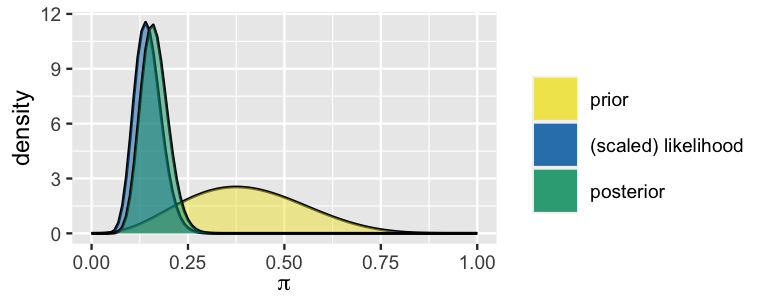
FIGURE 8.1: Our Bayesian model of \(\pi\), the proportion of modern art museum artists that are Gen X or younger.
After celebrating our success in constructing the posterior, please recognize that there’s a lot of work ahead. We must be able to utilize this posterior to perform a rigorous posterior analysis of \(\pi\). There are three common tasks in posterior analysis: estimation, hypothesis testing, and prediction. For example, what’s our estimate of \(\pi\)? Does our model support the claim that fewer than 20% of museum artists are Gen X or younger? If we sample 20 more museum artists, how many do we predict will be Gen X or younger?
- Establish the theoretical foundations for the three posterior analysis tasks: estimation, hypothesis testing, and prediction.
- Explore how Markov chain simulations can be used to approximate posterior features, and hence be utilized in posterior analysis.
8.1 Posterior estimation
Reexamine the Beta(18, 92) posterior model for \(\pi\), the proportion of modern art museum artists that are Gen X or younger (Figure 8.1). In a Bayesian analysis, we can think of this entire posterior model as an estimate of \(\pi\). After all, this model of posterior plausible values provides a complete picture of the central tendency and uncertainty in \(\pi\). Yet in specifying and communicating our posterior understanding, it’s also useful to compute simple posterior summaries of \(\pi\). Check in with your gut on how we might approach this task.
What best describes your posterior estimate of \(\pi\)?
- Roughly 16% of museum artists are Gen X or younger.
- It’s most likely the case that roughly 16% of museum artists are Gen X or younger, but that figure could plausibly be anywhere between 9% and 26%.
If you responded with answer b, your thinking is Bayesian in spirit. To see why, consider Figure 8.2, which illustrates our Beta(18, 92) posterior for \(\pi\) (left) alongside a different analyst’s Beta(4, 16) posterior (right). This analyst started with the same Beta(4, 6) prior but only observed 10 artists, 0 of which were Gen X or younger. Though their different data resulted in a different posterior, the central tendency is similar to ours. Thus, the other analyst’s best guess of \(\pi\) agrees with ours: roughly 16-17% of represented artists are Gen X or younger. However, reporting only this shared “best guess” would make our two posteriors seem misleadingly similar. In fact, whereas we’re quite confident that the representation of younger artists is between 10% and 24%, the other analyst is only willing to put that figure somewhere in the much wider range from 6% to 40%. Their relative uncertainty makes sense – they only collected 10 artworks whereas we collected 100.
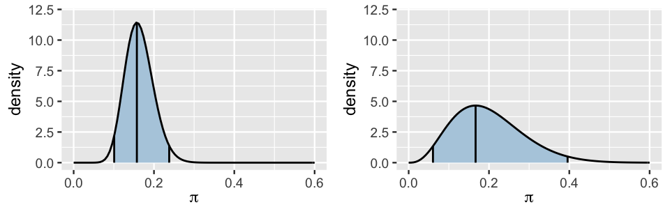
FIGURE 8.2: Our Beta(18, 92) posterior model for \(\pi\) (left) is shown alongside an alternative Beta(4, 16) posterior model (right). The shaded regions represent the corresponding 95% posterior credible intervals for \(\pi\).
The punchline here is that posterior estimates should reflect both the central tendency and variability in \(\pi\). The posterior mean and mode of \(\pi\) provide quick summaries of the central tendency alone. These features for our Beta(18, 92) posterior follow from the general Beta properties (3.2) and match our above observation that Gen X representation is most likely around 16%:
\[\begin{split} E(\pi | Y=14) & = \frac{18}{18 + 92} \approx 0.164 \\ \text{Mode}(\pi | Y=14) & = \frac{18 - 1}{18 + 92 - 2} \approx 0.157 . \\ \end{split}\]
Better yet, to capture both the central tendency and variability in \(\pi\), we can report a range of posterior plausible \(\pi\) values.
This range is called a posterior credible interval (CI) for \(\pi\).
For example, we noticed earlier that the proportion of museum artists that are Gen X or younger is most likely between 10% and 24%.
This range captures the more plausible values of \(\pi\) while eliminating the more extreme and unlikely scenarios (Figure 8.2).
In fact, 0.1 and 0.24 are the 2.5th and 97.5th posterior percentiles (i.e., 0.025th and 0.975th posterior quantiles), and thus mark the middle 95% of posterior plausible \(\pi\) values.
We can confirm these Beta(18,92) posterior quantile calculations using qbeta():
# 0.025th & 0.975th quantiles of the Beta(18,92) posterior
qbeta(c(0.025, 0.975), 18, 92)
[1] 0.1009 0.2379
The resulting 95% credible interval for \(\pi\), (0.1, 0.24), is represented by the shaded region in Figure 8.2 (left). Whereas the area under the entire posterior pdf is 1, the area of this shaded region, and hence the fraction of \(\pi\) values that fall into this region, is 0.95. This reveals an intuitive interpretation of the CI. There’s a 95% posterior probability that somewhere between 10% and 24% of museum artists are Gen X or younger:
\[P(\pi \in (0.1, 0.24) | Y = 14) = \int_{0.1}^{0.24} f(\pi|y=14) d\pi = 0.95 .\]
Please stop for a moment. Does this interpretation feel natural and intuitive? Thus, a bit anticlimactic? If so, we’re happy you feel that way – it means you’re thinking like a Bayesian. In Section 8.5 we’ll come back to just how special this result is.
In constructing the CI above, we used a “middle 95%” approach. This isn’t our only option. The first tweak we could make is to the 95% credible level (Figure 8.3). For example, a middle 50% CI, ranging from the 25th to the 75th percentile, would draw our focus to a smaller range of some of the more plausible \(\pi\) values. There’s a 50% posterior probability that somewhere between 14% and 19% of museum artists are Gen X or younger:
# 0.25th & 0.75th quantiles of the Beta(18,92) posterior
qbeta(c(0.25, 0.75), 18, 92)
[1] 0.1388 0.1862
In the other direction, a wider middle 99% CI would range from the 0.5th to the 99.5th percentile, and thus kick out only the extreme 1%. As such, a 99% CI would provide us with a fuller picture of plausible, though in some cases very unlikely, \(\pi\) values:
# 0.005th & 0.995th quantiles of the Beta(18,92) posterior
qbeta(c(0.005, 0.995), 18, 92)
[1] 0.0853 0.2647
Though a 95% level is a common choice among practitioners, it is somewhat arbitrary and simply ingrained through decades of tradition. There’s no one “right” credible level. Throughout this book, we’ll sometimes use 50% or 80% or 95% levels, depending upon the context of the analysis. Each provide a different snapshot of our posterior understanding.
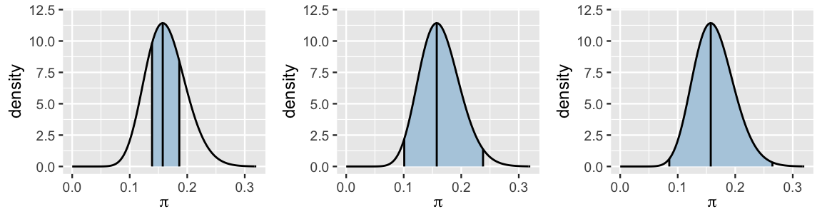
FIGURE 8.3: 50%, 95%, and 99% posterior credible intervals for \(\pi\).
Consider a second possible tweak to our construction of the CI: it’s not necessary to report the middle 95% of posterior plausible values. In fact, the middle 95% approach can eliminate some of the more plausible values from the CI. A close inspection of the 50% and 95% credible intervals in Figure 8.3 reveals evidence of this possibility in the ever-so-slightly lopsided nature of the shaded region in our ever-so-slightly non-symmetric posterior. In the 95% CI, values included in the upper end of the CI are less plausible than lower values of \(\pi\) below 0.1 that were left out of the CI. If this lopsidedness were more extreme, we should consider forming a 95% CI for \(\pi\) using not the middle, but the 95% of posterior values with the highest posterior density. You can explore this idea in the exercises, though we won’t lose sleep over it here. Mainly, this method will only produce meaningfully different results than the middle 95% approach in extreme cases, when the posterior is extremely skewed.
Posterior Credible Intervals
Let parameter \(\pi\) have posterior pdf \(f(\pi | y)\). A posterior credible interval (CI) provides a range of posterior plausible values of \(\pi\), and thus a summary of both posterior central tendency and variability. For example, a middle 95% CI is constructed by the 2.5th and 97.5th posterior percentiles,
\[(\pi_{0.025}, \pi_{0.975}) .\]
Thus, there’s a 95% posterior probability that \(\pi\) is in this range:
\[P(\pi \in (\pi_{0.025}, \pi_{0.975}) | Y=y) = \int_{\pi_{0.025}}^{\pi_{0.975}} f(\pi|y)d\pi = 0.95 .\]
8.2 Posterior hypothesis testing
8.2.1 One-sided tests
Hypothesis testing is another common task in posterior analysis. For example, suppose we read an article claiming that fewer than 20% of museum artists are Gen X or younger. Two clues we’ve observed from our posterior model of \(\pi\) point to this claim being at least partially plausible:
- The majority of the posterior pdf in Figure 8.3 falls below 0.2.
- The 95% credible interval for \(\pi\), (0.1, 0.24), is mostly below 0.2.
These observations are a great start. Yet we can be even more precise. To evaluate exactly how plausible it is that \(\pi < 0.2\), we can calculate the posterior probability of this scenario, \(P(\pi < 0.2 | Y = 14)\). This posterior probability is represented by the shaded area under the posterior pdf in Figure 8.4 and, mathematically, is calculated by integrating the posterior pdf on the range from 0 to 0.2:
\[P(\pi < 0.2 \; | \; Y = 14) = \int_{0}^{0.2}f(\pi | y=14)d\pi .\]
We’ll bypass the integration and obtain this Beta(18,92) posterior probability using pbeta() below.
The result reveals strong evidence in favor of our claim: there’s a roughly 84.9% posterior chance that Gen Xers account for fewer than 20% of modern art museum artists.
# Posterior probability that pi < 0.20
post_prob <- pbeta(0.20, 18, 92)
post_prob
[1] 0.849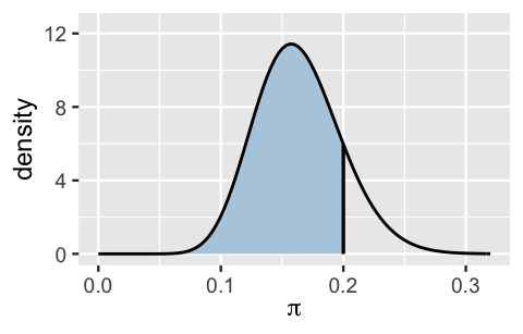
FIGURE 8.4: The Beta(18,92) posterior probability that \(\pi\) is below 0.20 is represented by the shaded region under the posterior pdf.
This analysis of our claim is refreshingly straightforward. We simply calculated the posterior probability of the scenario of interest. Though not always necessary, practitioners often formalize this procedure into a hypothesis testing framework. For example, we can frame our analysis as two competing hypotheses: the null hypothesis \(H_0\) contends that at least 20% of museum artists are Gen X or younger (the status quo here) whereas the alternative hypothesis \(H_a\) (our claim) contends that this figure is below 20%. In mathematical notation:
\[\begin{split} H_0: & \; \; \pi \ge 0.2 \\ H_a: & \; \; \pi < 0.2 \\ \end{split}\]
Note that \(H_a\) claims that \(\pi\) lies on one side of 0.2 (\(\pi < 0.2\)) as opposed to just being different than 0.2 (\(\pi \ne 0.2\)). Thus, we call this a one-sided hypothesis test.
We’ve already calculated the posterior probability of the alternative hypothesis to be \(P(H_a \; | \; Y=14) = 0.849\). Thus, the posterior probability of the null hypothesis is \(P(H_0 \; | \; Y=14) = 0.151\). Putting these together, the posterior odds that \(\pi < 0.2\) are roughly 5.62. That is, our posterior assessment is that \(\pi\) is nearly 6 times more likely to be below 0.2 than to be above 0.2:
\[\text{posterior odds } = \frac{P(H_a \; | \; Y=14)}{P(H_0 \; | \; Y=14)} \approx 5.62.\]
# Posterior odds
post_odds <- post_prob / (1 - post_prob)
post_odds
[1] 5.622
Of course, these posterior odds represent our updated understanding of \(\pi\) upon observing the survey data, \(Y =\) 14 of \(n =\) 100 sampled artists were Gen X or younger. Prior to sampling these artists, we had a much higher assessment of Gen X representation at major art museums (Figure 8.5).
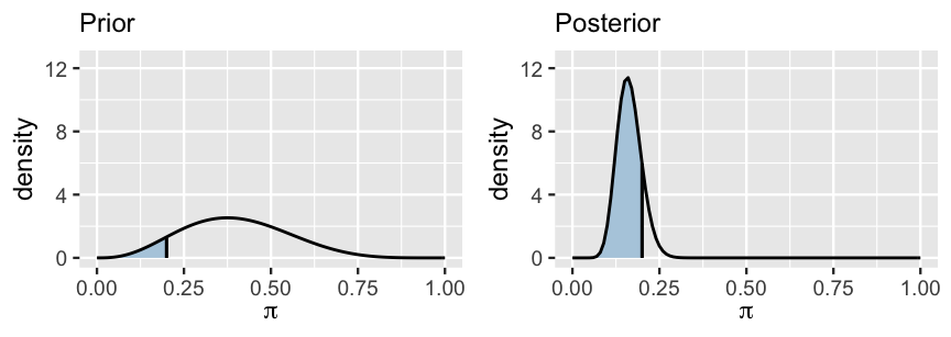
FIGURE 8.5: The posterior probability that \(\pi\) is below 0.2 (right) is contrasted against the prior probability of this scenario (left).
Specifically, the prior probability that \(\pi < 0.2\), calculated by the area under the Beta(4,6) prior pdf \(f(\pi)\) that falls below 0.2, was only 0.0856:
\[P(H_a) = \int_0^{0.2} f(\pi) d\pi \approx 0.0856 .\]
# Prior probability that pi < 0.2
prior_prob <- pbeta(0.20, 4, 6)
prior_prob
[1] 0.08564
Thus, the prior probability of the null hypothesis is \(P(H_0) = 0.914\). It follows that the prior odds of Gen X representation being below 0.2 were roughly only 1 in 10:
\[\text{Prior odds } = \frac{P(H_a)}{P(H_0)} \approx 0.093 .\]
# Prior odds
prior_odds <- prior_prob / (1 - prior_prob)
prior_odds
[1] 0.09366
The Bayes Factor (BF) compares the posterior odds to the prior odds, and hence provides insight into just how much our understanding about Gen X representation evolved upon observing our sample data:
\[\text{Bayes Factor} = \frac{\text{posterior odds }}{\text{prior odds }} .\]
In our example, the Bayes Factor is roughly 60. Thus, upon observing the artwork data, the posterior odds of our hypothesis about Gen Xers are roughly 60 times higher than the prior odds. Or, our confidence in this hypothesis jumped quite a bit.
# Bayes factor
BF <- post_odds / prior_odds
BF
[1] 60.02
We summarize the Bayes Factor below, including some guiding principles for its interpretation.
Bayes Factor
In a hypothesis test of two competing hypotheses, \(H_a\) vs \(H_0\), the Bayes Factor is an odds ratio for \(H_a\):
\[\text{Bayes Factor} = \frac{\text{posterior odds}}{\text{prior odds}} = \frac{P(H_a | Y) / P(H_0 | Y)}{P(H_a) / P(H_0)} .\]
As a ratio, it’s meaningful to compare the Bayes Factor (BF) to 1. To this end, consider three possible scenarios:
- BF = 1: The plausibility of \(H_a\) didn’t change in light of the observed data.
- BF > 1: The plausibility of \(H_a\) increased in light of the observed data. Thus, the greater the Bayes Factor, the more convincing the evidence for \(H_a\).
- BF < 1: The plausibility of \(H_a\) decreased in light of the observed data.
Bringing it all together, the posterior probability (0.85) and Bayes Factor (60) establish fairly convincing evidence in favor of the claim that fewer than 20% of artists at major modern art museums are Gen X or younger. Did you wince in reading that sentence? The term “fairly convincing” might seem a little wishy-washy. In the past, you might have learned specific cut-offs that distinguish between “statistically significant” and “not statistically significant” results, or allow you to “reject” or “fail to reject” a hypothesis. However, this practice provides false comfort. Reality is not so clear-cut. For this reason, across the frequentist and Bayesian spectrum, the broader statistics community advocates against making rigid conclusions using universal rules and for a more nuanced practice which takes into account the context and potential implications of each individual hypothesis test. Thus, there is no magic, one-size-fits-all cut-off for what Bayes Factor or posterior probability evidence is big enough to filter claims into “true” or “false” categories. In fact, what we have is more powerful than a binary decision – we have a holistic measure of our level of uncertainty about the claim. This level of uncertainty can inform our next steps. In our art example, do we have ample evidence for our claim? We’re convinced.
8.2.2 Two-sided tests
Especially when working in new settings, it’s not always the case that we wish to test a one-directional claim about some parameter \(\pi\). For example, consider a new art researcher that simply wishes to test whether or not 30% of major museum artists are Gen X or younger. This hypothesis is two-sided:
\[\begin{split} H_0: & \; \; \pi = 0.3 \\ H_a: & \; \; \pi \ne 0.3 \\ \end{split}\]
When we try to hit this two-sided hypothesis test with the same hammer we used for the one-sided hypothesis test, we quickly run into a problem. Since \(\pi\) is continuous, the prior and posterior probabilities that \(\pi\) is exactly 0.3 (i.e., that \(H_0\) is true) are both zero. For example, the posterior probability that \(\pi = 0.3\) is calculated by the area of the line under the posterior pdf at 0.3. As is true for any line, this area is 0:
\[P(\pi = 0.3 | Y = 14) = \int_{0.3}^{0.3} f(\pi | y = 14)d\pi = 0 .\]
Thus, the posterior odds, prior odds, and consequently the Bayes factor are all undefined:
\[\text{Posterior odds } = \frac{P(H_a \; | \; Y=14)}{P(H_0 \; | \; Y=14)} = \frac{1}{0} = \text{ nooooo!}\]
No problem. There’s not one recipe for success. To that end, try the following quiz.45
Recall that the 95% posterior credible interval for \(\pi\) is (0.1, 0.24). Does this CI provide ample evidence that \(\pi\) differs from 0.3?
If you answered “yes,” then you intuited a reasonable approach to two-sided hypothesis testing. The hypothesized value of \(\pi\) (here 0.3) is “substantially” outside the posterior credible interval, thus we have ample evidence in favor of \(H_a\). The fact that 0.3 is so far above the range of plausible \(\pi\) values makes us pretty confident that the proportion of museum artists that are Gen X or younger is not 0.3. Yet what’s “substantial” or clear in one context might be different than what’s “substantial” in another. With that in mind, it is best practice to define “substantial” ahead of time, before seeing any data. For example, in the context of artist representation, we might consider any proportion outside the 0.05 window around 0.3 to be meaningfully different from 0.3. This essentially adds a little buffer into our hypotheses, \(\pi\) is either around 0.3 (between 0.25 and 0.35) or it’s not:
\[\begin{split} H_0: & \; \; \pi \in (0.25, 0.35) \\ H_a: & \; \; \pi \notin (0.25, 0.35) \\ \end{split}\]
With this defined buffer in place, we can more rigorously claim belief in \(H_a\) since the entire hypothesized range for \(\pi\), (0.25, 0.35), lies above its 95% credible interval. Note also that since \(H_0\) no longer includes a singular hypothesized value of \(\pi\), its corresponding posterior and prior probabilities are no longer 0. Thus, just as we did in the one-sided hypothesis testing setting, we could (but won’t here) supplement our above posterior credible interval analysis with posterior probability and Bayes Factor calculations.
8.3 Posterior prediction
Beyond posterior estimation and hypothesis testing, a third common task in a posterior analysis is to predict the outcome of new data \(Y'\).
Suppose we get our hands on data for 20 more artworks displayed at the museum. Based on the posterior understanding of \(\pi\) that we’ve developed throughout this chapter, what number would you predict are done by artists that are Gen X or younger?
Your knee-jerk reaction to this quiz might be: “I got this one. It’s 3!” This is a very reasonable place to start. After all, our best posterior guess was that roughly 16% of museum artists are Gen X or younger and 16% of 20 new artists is roughly 3. However, this calculation ignores two sources of potential variability in our prediction:
Sampling variability in the data
When we randomly sample 20 artists, we don’t expect exactly 3 (16%) of these to be Gen X or younger. Rather, the number will fluctuate depending upon which random sample we happen to get.Posterior variability in \(\pi\)
0.16 isn’t the only posterior plausible value of \(\pi\), the underlying proportion of museum artists that are Gen X. Rather, our 95% posterior credible interval indicated that \(\pi\) might be anywhere between roughly 0.1 and 0.24. Thus, when making predictions about the 20 new artworks, we need to consider what outcomes we’d expect to see under each possible \(\pi\) while accounting for the fact that some \(\pi\) are more plausible than others.
Let’s specify these concepts with some math. First, let \(Y' = y'\) be the (yet unknown) number of the 20 new artworks that are done by Gen X or younger artists, where \(y'\) can be any number of artists in \(\{0,1,...,20\}\). Conditioned on \(\pi\), the randomness or sampling variability in \(Y'\) can be modeled by \(Y'|\pi \sim \text{Bin}(20,\pi)\) with pdf
\[\begin{equation} f(y'|\pi) = P(Y' = y' | \pi) = \binom{20}{ y'} \pi^{y'}(1-\pi)^{20 - y'} . \tag{8.2} \end{equation}\]
Thus, the random outcome of \(Y'\) depends upon \(\pi\), which too can vary – \(\pi\) might be any value between 0 and 1. To this end, the Beta(18, 92) posterior model of \(\pi\) given the original data (\(Y =\) 14) describes the potential posterior variability in \(\pi\), i.e., which values of \(\pi\) are more plausible than others.
For an overall understanding of how many of the next 20 artists will be Gen X, we must combine the sampling variability in \(Y'\) with the posterior variability in \(\pi\). To this end, weighting \(f(y'|\pi)\) (8.2) by posterior pdf \(f(\pi|y = 14)\) (8.1) captures the chance of observing \(Y' = y'\) Gen Xers for a given \(\pi\) while taking into account the posterior plausibility of that \(\pi\) value:
\[\begin{equation} f(y'|\pi) f(\pi|y=14) . \tag{8.3} \end{equation}\]
Figure 8.6 illustrates this idea, plotting the weighted behavior of \(Y'\) (8.3) for just three possible values of \(\pi\): the 2.5th posterior percentile (0.1), posterior mode (0.16), and 97.5th posterior percentile (0.24). Naturally, we see that the greater \(\pi\) is, the greater \(Y'\) tends to be: when \(\pi = 0.1\) the most likely value of \(Y'\) is 2, whereas when \(\pi = 0.24\), the most likely value of \(Y'\) is 5. Also notice that since \(\pi\) values as low as 0.1 or as high as 0.24 are not very plausible, the values of \(Y'\) that might be generated under these scenarios are given less weight (i.e., the sticks are much shorter) than those that are generated under \(\pi =\) 0.16, the most plausible \(\pi\) value.
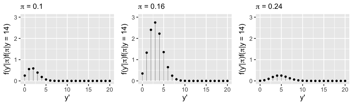
FIGURE 8.6: Possible \(Y'\) outcomes are plotted for \(\pi \in \{0.10,0.16,0.24\}\) and weighted by the corresponding posterior plausibility of \(\pi\).
Putting this all together, the posterior predictive model of \(Y'\), the number of the 20 new artists that are Gen X, takes into account both the sampling variability in \(Y'\) and posterior variability in \(\pi\). Specifically, the posterior predictive pmf calculates the overall chance of observing \(Y' = y'\) across all possible \(\pi\) from 0 to 1 by averaging across (8.3), the chance of observing \(Y' = y'\) for any given \(\pi\):
\[f(y'|y=14) = P(Y'=y' \; | \; Y=y) = \int_0^1 f(y'|\pi) f(\pi|y=14) d\pi .\]
Posterior predictive model
Let \(Y'\) denote a new outcome of variable \(Y\). Further, let pdf \(f(y'|\pi)\) denote the dependence of \(Y'\) on \(\pi\) and posterior pdf \(f(\pi|y)\) denote the posterior plausibility of \(\pi\) given the original data \(Y = y\). Then the posterior predictive model for \(Y'\) has pdf
\[\begin{equation} f(y'|y) = \int f(y'|\pi) f(\pi|y) d\pi . \tag{8.4} \end{equation}\]
In words, the overall chance of observing \(Y' = y'\) weights the chance of observing this outcome under any possible \(\pi\) (\(f(y'|\pi)\)) by the posterior plausibility of \(\pi\) (\(f(\pi|y)\)).
An exact formula for the pmf of \(Y'\) follows from some calculus (which we don’t show here but is fun and we encourage you to try if you have calculus experience):
\[\begin{equation} f(y'|y=14) = \left(\!\begin{array}{c} 20 \\ y' \end{array}\!\right) \frac{\Gamma(110)}{\Gamma(18)\Gamma(92)} \frac{\Gamma(18+y')\Gamma(112-y')} {\Gamma(130)} \;\;\; \text{ for } y' \in \{0,1,\ldots,20\}. \tag{8.5} \end{equation}\]
Though this formula is unlike any we’ve ever seen (e.g., it’s not Binomial or Poisson or anything else we’ve learned), it still specifies what values of \(Y'\) we might observe and the probability of each. For example, plugging \(y' = 3\) into this formula, there’s a 0.2217 posterior predictive probability that 3 of the 20 new artists will be Gen X:
\[f(y'=3|y=14) = \left(\!\begin{array}{c} 20 \\ 3 \end{array}\!\right) \frac{\Gamma(110)}{\Gamma(18)\Gamma(92)} \frac{\Gamma(18+3)\Gamma(112-3)} {\Gamma(130)} = 0.2217 .\]
The pmf formula also reflects the influence of our Beta(18,92) posterior model for \(\pi\) (through parameters 18 and 92), and hence the original prior and data, on our posterior understanding of \(Y'\). That is, like any posterior operation, our posterior predictions balance information from both the prior and data.
For a look at the bigger picture, the posterior predictive pmf \(f(y'|y=14)\) is plotted in Figure 8.7. Though it looks similar to the model of \(Y'\) when we assume that \(\pi\) equals the posterior mode of 0.16 (Figure 8.6 middle), it puts relatively more weight on the smaller and larger values of \(Y'\) that we might expect when \(\pi\) deviates from 0.16. All in all, though the number of the next 20 artworks that will be done by Gen X or younger artists is most likely 3, it could plausibly be anywhere between, say, 0 and 10.
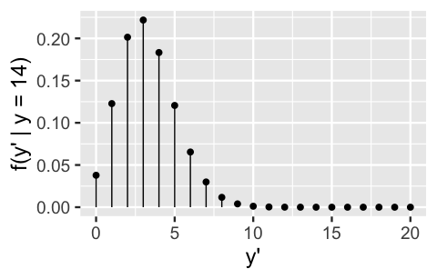
FIGURE 8.7: The posterior predictive model of \(Y'\), the number of the next 20 artworks that are done by Gen X or younger artists.
Finally, after building and examining the posterior predictive model of \(Y'\), the number of the next 20 artists that will be Gen X, we might have some follow-up questions. For example, what’s the posterior probability that at least 5 of the 20 artists are Gen X, \(P(Y' \ge 5 | Y = 14)\)? How many of the next 20 artists do we expect to be Gen X, \(E(Y' | Y = 14)\)? We can answer these questions, it’s just a bit tedious. Since the posterior predictive model for \(Y'\) isn’t familiar, we can’t calculate posterior features using pre-built formulas or R functions like we did for the Beta posterior model of \(\pi\). Instead, we have to calculate these features from scratch. For example, we can calculate the posterior probability that at least 5 of the 20 artists are Gen X by adding up the pmf (8.5) evaluated at each of the 16 \(y'\) values in this range. The result of this large sum, the details of which would fill a whole page, is 0.233:
\[\begin{split} P(Y' \ge 5 | y = 14) & = \sum_{y' = 5}^{20} f(y' | y = 14) \\ & = f(y' = 5 | y = 14) + f(y' = 6 | y = 14) + \cdots + f(y' = 20 | y = 14)\\ & = 0.233. \\ \end{split}\]
Similarly, though this isn’t a calculation we’ve had to do yet (and won’t do again), the expected number of the next 20 artists that will be Gen X can be obtained by the posterior weighted average of possible \(Y'\) values. That is, we can add up each \(Y'\) value from 0 to 20 weighted by their posterior probabilities \(f(y'|y=14)\). The result of this large sum indicates that we should expect roughly 3 of the 20 artists to be Gen X:
\[\begin{split} E(Y' | y = 14) & = \sum_{y' = 0}^{20} y' f(y' | y = 14) \\ & = 0\cdot f(y' = 0 | y = 14) + 1 \cdot f(y' = 1 | y = 14) + \cdots + 20\cdot f(y' = 20 | y = 14)\\ & = 3.273. \\ \end{split}\]
But we don’t want to get too distracted by these types of calculations. In this book, we’ll never need to do something like this again. Starting in Chapter 9, our models will be complicated enough so that even tedious formulas like these will be unattainable and we’ll need to rely on simulation to approximate posterior features.
8.4 Posterior analysis with MCMC
It’s great to know that there’s some theory behind Bayesian posterior analysis. And when we’re working with models that are as straightforward as the Beta-Binomial, we can directly implement this theory – that is, we can calculate exact posterior credible intervals, probabilities, and predictive models. Yet in Chapter 9 we’ll leave this nice territory and enter scenarios in which we cannot specify posterior models, let alone calculate exact summaries of their features. Recall from Chapter 6, that in these scenarios we can approximate posteriors using MCMC methods. In this section, we’ll explore how the resulting Markov chain sample values can also be used to approximate specific posterior features, and hence be used to conduct posterior analysis.
8.4.1 Posterior simulation
Below we run four parallel Markov chains of \(\pi\) for 10,000 iterations each. After tossing out the first 5,000 iterations of each chain, we end up with four separate Markov chain samples of size 5,000, \(\left\lbrace \pi^{(1)}, \pi^{(2)}, \ldots, \pi^{(5000)}\right\rbrace\), or a combined Markov chain sample size of 20,000.
# STEP 1: DEFINE the model
art_model <- "
  data {
    int<lower = 0, upper = 100> Y;
  }
  parameters {
    real<lower = 0, upper = 1> pi;
  }
  model {
    Y ~ binomial(100, pi);
    pi ~ beta(4, 6);
  }
"

# STEP 2: SIMULATE the posterior
art_sim <- stan(model_code = art_model, data = list(Y = 14),
                chains = 4, iter = 5000*2, seed = 84735)
Check out the numerical and visual diagnostics in Figure 8.8.
First, the randomness in the trace plots (left), the agreement in the density plots of the four parallel chains (middle), and an Rhat value of effectively 1 suggest that our simulation is extremely stable.
Further, our dependent chains are behaving “enough” like an independent sample.
The autocorrelation, shown at right for just one chain, drops off quickly and the effective sample size ratio is satisfyingly high – our 20,000 Markov chain values are as effective as 7600 independent samples (0.38 \(\cdot\) 20000).
# Parallel trace plots & density plots
mcmc_trace(art_sim, pars = "pi", size = 0.5) +
  xlab("iteration")
mcmc_dens_overlay(art_sim, pars = "pi")

# Autocorrelation plot
mcmc_acf(art_sim, pars = "pi")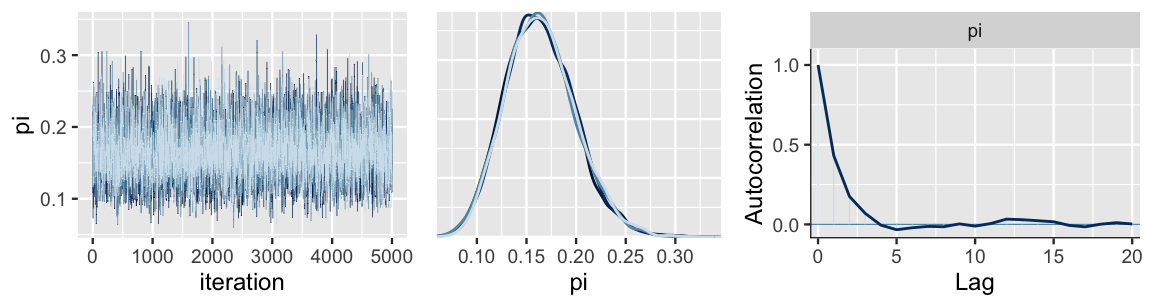
FIGURE 8.8: MCMC simulation results for the posterior model of \(\pi\), the proportion of museum artists that are Gen X or younger, are exhibited by trace and density plots for the four parallel chains (left and middle) and an autocorrelation plot for a single chain (right).
# Markov chain diagnostics
rhat(art_sim, pars = "pi")
[1] 1
neff_ratio(art_sim, pars = "pi")
[1] 0.378
8.4.2 Posterior estimation & hypothesis testing
We can now use the combined 20,000 Markov chain values, with confidence, to approximate the Beta(18, 92) posterior model of \(\pi\). Indeed, Figure 8.9 confirms that the complete MCMC approximation (right) closely mimics the actual posterior (left).
# The actual Beta(18, 92) posterior
plot_beta(alpha = 18, beta = 92) +
  lims(x = c(0, 0.35))

# MCMC posterior approximation
mcmc_dens(art_sim, pars = "pi") +
  lims(x = c(0,0.35))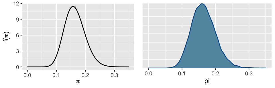
FIGURE 8.9: The actual Beta(18, 92) posterior pdf of \(\pi\) (left) alongside an MCMC approximation (right).
As such, we can approximate any feature of the Beta(18, 92) posterior model by the corresponding feature of the Markov chain.
For example, we can approximate the posterior mean by the mean of the MCMC sample values, or approximate the 2.5th posterior percentile by the 2.5th percentile of the MCMC sample values.
To this end, the tidy() function in the broom.mixed package (Bolker and Robinson 2021) provides some handy statistics for the combined 20,000 Markov chain values stored in art_sim:
tidy(art_sim, conf.int = TRUE, conf.level = 0.95)
# A tibble: 1 x 5
  term  estimate std.error conf.low conf.high
  <chr>    <dbl>     <dbl>    <dbl>     <dbl>
1 pi       0.162    0.0352    0.101     0.239
And the mcmc_areas() function in the bayesplot package provides a visual complement (Figure 8.10):
# Shade in the middle 95% interval
mcmc_areas(art_sim, pars = "pi", prob = 0.95)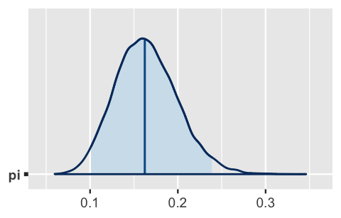
FIGURE 8.10: The median and middle 95% of the approximate posterior model of \(\pi\).
In the tidy() summary, conf.low and conf.high report the 2.5th and 97.5th percentiles of the Markov chain values, 0.101 and 0.239, respectively.
These form an approximate middle 95% credible interval for \(\pi\) which is represented by the shaded region in the mcmc_areas() plot.
Further, the estimate reports that the median of our 20,000 Markov chain values, and thus our approximation of the actual posterior median, is 0.162.
This median is represented by the vertical line in the mcmc_areas() plot.
Like the mean and mode, the median provides another measure of a “typical” posterior \(\pi\) value.
It corresponds to the 50th posterior percentile – 50% of posterior \(\pi\) values are above the median and 50% are below.
Yet unlike the mean and mode, there doesn’t exist a one-size-fits-all formula for a Beta(\(\alpha,\beta\)) median.
This exposes even more beauty about MCMC simulation: even when a formula is elusive, we can estimate a posterior quantity by the corresponding feature of our observed Markov chain sample values.
Though a nice first stop, the tidy() function doesn’t always provide every summary statistic of interest.
For example, it doesn’t report the mean or mode of our Markov chain sample values.
No problem.
We can calculate summary statistics directly from the Markov chain values.
The first step is to convert an array of the four parallel chains into a single data frame of the combined chains:
# Store the 4 chains in 1 data frame
art_chains_df <- as.data.frame(art_sim, pars = "lp__", include = FALSE)
dim(art_chains_df)
[1] 20000     1
With the chains in data frame form, we can proceed as usual, using our dplyr tools to transform and summarize.
For example, we can directly calculate the sample mean, median, mode, and quantiles of the combined Markov chain values.
The median and quantile values are precisely those reported by tidy() above, and thus eliminate any mystery about that function!
# Calculate posterior summaries of pi
art_chains_df %>%
  summarize(post_mean = mean(pi),
            post_median = median(pi),
            post_mode = sample_mode(pi),
            lower_95 = quantile(pi, 0.025),
            upper_95 = quantile(pi, 0.975))
  post_mean post_median post_mode lower_95 upper_95
1    0.1642      0.1624    0.1598   0.1011   0.2388
We can also use the raw chain values to tackle the next task in our posterior analysis – testing the claim that fewer than 20% of major museum artists are Gen X. To this end, we can approximate the posterior probability of this scenario, \(P(\pi < 0.20 | Y=14)\), by the proportion of Markov chain \(\pi\) values that fall below 0.20. By this approximation, there’s an 84.6% chance that Gen X artist representation is under 0.20:
# Tabulate pi values that are below 0.20
art_chains_df %>%
  mutate(exceeds = pi < 0.20) %>%
  tabyl(exceeds)
 exceeds     n percent
   FALSE  3080   0.154
    TRUE 16920   0.846
Soak it in and remember the point. We’ve used our MCMC simulation to approximate the posterior model of \(\pi\) along with its features of interest. For comparison, Table 8.1 presents the Beta(18,92) posterior features we calculated in Section 8.1 alongside their corresponding MCMC approximations. The punchline is this: MCMC worked. The approximations are quite accurate. Let this bring you peace of mind as you move through the next chapters – though the models therein will be too complicated to specify, we can be confident in our MCMC approximations of these models (so long as the diagnostics check out!).
| mean | mode | 2.5th percentile | 97.5 percentile | |
|---|---|---|---|---|
| posterior value | 0.16 | 0.16 | 0.1 | 0.24 |
| MCMC approximation | 0.1642 | 0.1598 | 0.1011 | 0.2388 |
8.4.3 Posterior prediction
Finally, we can utilize our Markov chain values to approximate the posterior predictive model of \(Y'\), the number of the next 20 sampled artists that will be Gen X or younger. Bonus: simulating this model also helps us build intuition for the theory underlying posterior prediction. Recall that the posterior predictive model reflects two sources of variability:
Sampling variability in the data
\(Y'\) might be any number of artists in \(\{0,1,\ldots,20\}\) and depends upon the underlying proportion of artists that are Gen X, \(\pi\): \(Y'| \pi \sim \text{Bin}(20,\pi)\).Posterior variability in \(\pi\)
The collection of 20,000 Markov chain \(\pi\) values provides an approximate sense for the variability and range in plausible \(\pi\) values.
To capture both sources of variability in posterior predictions \(Y'\), we can use rbinom() to simulate one \(\text{Bin}(20,\pi)\) outcome \(Y'\) from each of the 20,000 \(\pi\) chain values.
The first three results reflect a general trend: smaller values of \(\pi\) will tend to produce smaller values of \(Y'\).
This makes sense.
The lower the underlying representation of Gen X artists in the museum, the fewer Gen X artists we should expect to see in our next sample of 20 artworks.
# Set the seed
set.seed(1)

# Predict a value of Y' for each pi value in the chain
art_chains_df <- art_chains_df %>%
  mutate(y_predict = rbinom(length(pi), size = 20, prob = pi))

# Check it out
art_chains_df %>%
  head(3)
      pi y_predict
1 0.1301         2
2 0.1755         3
3 0.2214         5
The resulting collection of 20,000 predictions closely approximates the true posterior predictive distribution (Figure 8.7). It’s most likely that 3 of the 20 artists will be Gen X or younger, though this figure might reasonably range between 0 and, say, 10:
# Plot the 20,000 predictions
ggplot(art_chains_df, aes(x = y_predict)) +
  stat_count()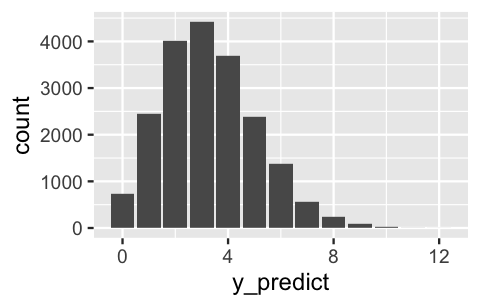
FIGURE 8.11: A histogram of 20,000 simulated posterior predictions of the number among the next 20 artists that will be Gen X or younger.
We can also utilize the posterior predictive sample to approximate features of the actual posterior predictive model that were burdensome to specify mathematically. For example, we can approximate the posterior mean prediction, \(E(Y'|Y=14)\), and the more comprehensive posterior prediction interval for \(Y'\). To this end, we expect roughly 3 of the next 20 artists to be Gen X or younger, but there’s an 80% chance that this figure is somewhere between 1 and 6 artists:
art_chains_df %>%
  summarize(mean = mean(y_predict),
            lower_80 = quantile(y_predict, 0.1),
            upper_80 = quantile(y_predict, 0.9))
   mean lower_80 upper_80
1 3.283        1        6
8.5 Bayesian benefits
In Chapter 1, we highlighted how Bayesian analyses compare to frequentist analyses. Now that we’ve worked through some concrete examples, let’s revisit some of those ideas. As you’ve likely experienced, often the toughest part of a Bayesian analysis is building or simulating the posterior model. Once we have that piece in place, it’s fairly straightforward to utilize this posterior for estimation, hypothesis testing, and prediction. In contrast, building up the formulas to perform the analogous frequentist calculations is often less intuitive.
We can also bask in the ease with which Bayesian results can be interpreted. In general, a Bayesian analysis assesses the uncertainty regarding an unknown parameter \(\pi\) in light of observed data \(Y\). For example, consider the artist study. In light of observing that \(Y = 14\) of 100 sampled artists were Gen X or younger, we determined that there was an 84.9% posterior chance that Gen X representation at the entire museum, \(\pi\), falls below 0.20:
\[P(\pi < 0.20 \; | \; Y = 14) = 0.849 .\]
This calculation doesn’t make sense in a frequentist analysis. Flipping the script, a frequentist analysis assesses the uncertainty of the observed data \(Y\) in light of assumed values of \(\pi\). For example, the frequentist counterpart to the Bayesian posterior probability above is the p-value, the formula for which we won’t dive into here:
\[P(Y \le 14 \; | \; \pi = 0.20) = 0.08 .\]
The opposite order of the conditioning in this probability, \(Y\) given \(\pi\) instead of \(\pi\) given \(Y\), leads to a different calculation and interpretation than the Bayesian probability: if \(\pi\) were only 0.20, then there’s only an 8% chance we’d have observed a sample in which at most \(Y = 14\) of 100 artists were Gen X. It’s not our writing here that’s awkward, it’s the p-value. Though it does provide us with some interesting information, the question it answers is a little less natural for the human brain: since we actually observed the data but don’t know \(\pi\), it can be a mind bender to interpret a calculation that assumes the opposite. Mainly, when testing hypotheses, it’s more natural to ask “how probable is my hypothesis?” (what the Bayesian probability answers) than “how probable is my data if my hypothesis weren’t true?” (what the frequentist probability answers). Given how frequently p-values are misinterpreted, and hence misused, they’re increasingly being de-emphasized across the entire frequentist and Bayesian spectrum.
8.6 Chapter summary
In Chapter 8, you learned how to turn a posterior model into answers. That is, you utilized posterior models, exact or approximate, to perform three posterior analysis tasks for an unknown parameter \(\pi\):
- Posterior estimation
A posterior credible interval provides a range of posterior plausible values of \(\pi\), and thus a sense of both the posterior typical values and uncertainty in \(\pi\). - Posterior hypothesis testing
Posterior probabilities provide insight into corresponding hypotheses regarding \(\pi\). - Posterior prediction
The posterior predictive model for a new data point \(Y\) takes into account both the sampling variability in \(Y\) and the posterior variability in \(\pi\).
8.7 Exercises
8.7.1 Conceptual exercises
- In estimating some parameter \(\lambda\), what are some drawbacks to only reporting the central tendency of the \(\lambda\) posterior model?
- The 95% credible interval for \(\lambda\) is (1,3.4). How would you interpret this?
- Your friend Trichelle claims that more than 40% of dogs at the dog park do not have a dog license.
- Your professor is interested in learning about the proportion of students at a large university who have heard of Bayesian statistics.
- An environmental justice advocate wants to know if more than 60% of voters in their state support a new regulation.
- Sarah is studying Ptolemy’s Syntaxis Mathematica text and wants to investigate the number of times that Ptolemy uses a certain mode of argument per page of text. Based on Ptolemy’s other writings she thinks it will be about 3 times per page. Rather than reading all 13 volumes of Syntaxis Mathematica, Sarah takes a random sample of 90 pages.
- What are posterior odds?
- What are prior odds?
- What’s a Bayes Factor and why we might want to calculate it?
- What two types of variability do posterior predictive models incorporate? Define each type such that your non-Bayesian statistics friends could understand.
- Describe a real-life situation in which it would be helpful to carry out posterior prediction.
- Is a posterior predictive model conditional on just the data, just the parameter, or on both the data and the parameter?
8.7.2 Practice exercises
- A 95% credible interval for \(\pi\) with \(\pi|y \sim \text{Beta}(4,5)\)
- A 60% credible interval for \(\pi\) with \(\pi|y \sim \text{Beta}(4,5)\)
- A 95% credible interval for \(\lambda\) with \(\lambda|y \sim \text{Gamma}(1,8)\)
- A 99% credible interval of \(\lambda\) with \(\lambda|y \sim \text{Gamma}(1,5)\)
- A 95% credible interval of \(\mu\) with \(\mu|y \sim \text{N}(10, 2^2)\)
- An 80% credible interval of \(\mu\) with \(\mu|y \sim \text{N}(-3, 1^2)\)
- Let \(\lambda|y \sim \text{Gamma}(1,5)\). Construct the 95% highest posterior density credible interval for \(\lambda\). Represent this interval on a sketch of the posterior pdf. Hint: The sketch itself will help you identify the appropriate CI.
- Repeat part a using the middle 95% approach.
- Compare the two intervals from parts a and b. Are they the same? If not, how do they differ and which is more appropriate here?
- Let \(\mu|y \sim \text{N}(-13, 2^2)\). Construct the 95% highest posterior density credible interval for \(\mu\).
- Repeat part d using the middle 95% approach.
- Compare the two intervals from parts d and e. Are they the same? If not, why not?
- What is the posterior probability for the alternative hypothesis?
- Calculate and interpret the posterior odds.
- Calculate and interpret the prior odds.
- Calculate and interpret the Bayes Factor.
- Putting this together, explain your conclusion about these hypotheses to someone who is unfamiliar with Bayesian statistics.
- Identify the posterior pdf of \(\pi\) given the observed data \(Y = y\), \(f(\pi|y)\). NOTE: This will depend upon \((y, n, \alpha, \beta, \pi)\).
- Suppose we conduct \(n'\) new trials (where \(n'\) might differ from our original number of trials \(n\)) and let \(Y' = y'\) be the observed number of successes in these new trials. Identify the conditional pmf of \(Y'\) given \(\pi\), \(f(y'|\pi)\). NOTE: This will depend upon \((y', n', \pi)\).
- Identify the posterior predictive pmf of \(Y'\), \(f(y'|y)\). NOTE: This pmf, found using (8.4), will depend upon \((y, n, y', n', \alpha, \beta)\).
- As with the example in Section 8.3, suppose your posterior model of \(\pi\) is based on a prior model with \(\alpha = 4\) and \(\beta = 6\) and an observed \(y = 14\) successes in \(n = 100\) original trials. We plan to conduct \(n' = 20\) new trials. Specify the posterior predictive pmf of \(Y'\), the number of successes we might observe in these 20 trials. NOTE: This should match (8.5).
- Continuing part d, suppose instead we plan to conduct \(n' = 4\) new trials. Specify and sketch the posterior predictive pmf of \(Y'\), the number of successes we might observe in these 4 trials.
- Identify the posterior pdf of \(\lambda\) given the observed data \(Y = y\), \(f(\lambda|y)\).
- Let \(Y' = y'\) be the number of events that will occur in a new observation period. Identify the conditional pmf of \(Y'\) given \(\lambda\), \(f(y'|\lambda)\).
- Identify the posterior predictive pmf of \(Y'\), \(f(y'|y)\). NOTE: This will depend upon \((y, y', s, r)\).
- Suppose your posterior model of \(\lambda\) is based on a prior model with \(s = 50\) and \(r = 50\) and \(y = 7\) events in your original observation period. Specify the posterior predictive pmf of \(Y'\), the number of events we might observe in the next observation period.
- Sketch and discuss the posterior predictive pmf from part d.
- Identify the posterior pdf of \(\mu\) given the observed data, \(f(\mu|y)\).
- Let \(Y' = y'\) be the value of a new data point. Identify the conditional pdf of \(Y'\) given \(\mu\), \(f(y'|\mu)\).
- Identify the posterior predictive pdf of \(Y'\), \(f(y'|y)\).
- Suppose \(y = -10\), \(\sigma = 3\), \(\theta = 0\), and \(\tau = 1\). Specify and sketch the posterior predictive pdf of \(Y'\).
8.7.3 Applied exercises
- Explain which Bayesian model is appropriate for this analysis: Beta-Binomial, Gamma-Poisson, or Normal-Normal.
- Specify and discuss your own prior model for \(\pi\).
- For the remainder of the exercise, we’ll utilize the authors’ Beta(1,2) prior for \(\pi\). How does your prior understanding differ from that of the authors?
- Using the
pulse_of_the_nationdata from the bayesrules package, report the sample proportion of surveyed adults with the opinion thatclimate_changeisNot Real At All. - In light of the Beta(1,2) prior and data, calculate and interpret a (middle) 95% posterior credible interval for \(\pi\). NOTE: You’ll first need to specify your posterior model of \(\pi\).
- What decision might you make about these hypotheses utilizing the credible interval from the previous exercise?
- Calculate and interpret the posterior probability of \(H_a\).
- Calculate and interpret the Bayes Factor for your hypothesis test.
- Putting this together, explain your conclusion about \(\pi\).
- Simulate the posterior model of \(\pi\), the proportion of U.S. adults that do not believe in climate change, with rstan using 4 chains and 10000 iterations per chain.
- Produce and discuss trace plots, overlaid density plots, and autocorrelation plots for the four chains.
- Report the effective sample size ratio and R-hat values for your simulation, explaining what these values mean in context.
- Utilize your MCMC simulation to approximate a (middle) 95% posterior credible interval for \(\pi\). Do so using the
tidy()shortcut function as well as a direct calculation from your chain values. - Utilize your MCMC simulation to approximate the posterior probability that \(\pi > 0.1\).
- How close are the approximations in parts a and b to the actual corresponding posterior values you calculated in Exercises 8.14 and 8.15?
- Suppose you were to survey 100 more adults. Use your MCMC simulation to approximate the posterior predictive model of \(Y'\), the number that don’t believe in climate change. Construct a histogram visualization of this model.
- Summarize your observations of the posterior predictive model of \(Y'\).
- Approximate the probability that at least 20 of the 100 people don’t believe in climate change.
- Explain which Bayesian model is appropriate for this analysis: Beta-Binomial, Gamma-Poisson, or Normal-Normal.
- Your prior understanding is that the average flipper length for all Adelie penguins is about 200mm, but you aren’t very sure. It’s plausible that the average could be as low a 140mm or as high as 260mm. Specify an appropriate prior model for \(\mu\).
- The
penguins_bayesdata in the bayesrules package contains data on the flipper lengths for a sample of three different penguin species. For the Adeliespecies, how many data points are there and what’s the sample meanflipper_length_mm? - In light of your prior and data, calculate and interpret a (middle) 95% posterior credible interval for \(\mu\). NOTE: You’ll first need to specify your posterior model of \(\mu\).
- You hypothesize that the average Adelie flipper length is somewhere between 200mm and 220mm. State this as a formal hypothesis test (using \(H_0\), \(H_a\), and \(\mu\) notation). NOTE: This is a two-sided hypothesis test!
- What decision might you make about these hypotheses utilizing the credible interval from the previous exercise?
- Calculate and interpret the posterior probability that your hypothesis is true.
- Putting this together, explain your conclusion about \(\mu\).
- Explain which Bayesian model is appropriate for this analysis: Beta-Binomial, Gamma-Poisson, or Normal-Normal.
- Your prior understanding is that the typical rate of loon sightings is 2 per 100 hours with a standard deviation of 1 per 100-hours. Specify an appropriate prior model for \(\lambda\) and explain your reasoning.
- The
loonsdata in the bayesrules package contains loon counts in different 100-hour observation periods. How many data points do we have and what’s the average loon count per 100 hours? - In light of your prior and data, calculate and interpret a (middle) 95% posterior credible interval for \(\lambda\). NOTE: You’ll first need to specify your posterior model of \(\lambda\).
- You hypothesize that birdwatchers should anticipate a rate of less than 1 loon per observation period. State this as a formal hypothesis test (using \(H_0\), \(H_a\), and \(\lambda\) notation).
- What decision might you make about these hypotheses utilizing the credible interval from the previous exercise?
- Calculate and interpret the posterior probability that your hypothesis is true.
- Putting this together, explain your conclusion about \(\lambda\).
- Simulate the posterior model of \(\lambda\), the typical rate of loon sightings per observation period, with rstan using 4 chains and 10000 iterations per chain.
- Perform some MCMC diagnostics to confirm that your simulation has stabilized.
- Utilize your MCMC simulation to approximate a (middle) 95% posterior credible interval for \(\lambda\). Do so using the
tidy()shortcut function as well as a direct calculation from your chain values. - Utilize your MCMC simulation to approximate the posterior probability that \(\lambda < 1\).
- How close are the approximations in parts c and d to the actual corresponding posterior values you calculated in Exercises 8.21 and 8.22?
- Use your MCMC simulation to approximate the posterior predictive model of \(Y'\), the number of loons that a birdwatcher will spy in their next observation period. Construct a histogram visualization of this model.
- Summarize your observations of the posterior predictive model of \(Y'\).
- Approximate the probability that the birdwatcher observes 0 loons in their next observation period.
References
Answer: yes↩︎